Designed by: PepsiCo Design & Innovation
Country: United States

Toblerone Gets An Attractive Makeover

Designed by: Bulletproof | Market region: Global


Iconic chocolate brand Toblerone has recently unveiled its new evolved look. The attractive redesign celebrates the brand’s uniqueness.

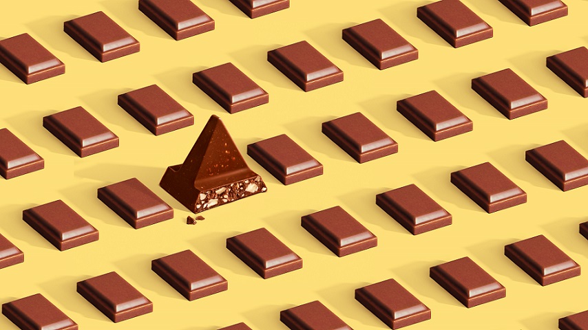
Toblerone teamed up with the London-based design agency Bulletproof to create a new brand story that “pays tribute to the importance of being stubbornly triangle in a world of squares.”

Chief Creative Officer of Bulletproof, Nick Rees, mentions:

“Looking back into a brand’s archives usually uncovers a world of craft and lost nuance. But we uncovered something much more powerful. Mr. Tobler was way ahead of his time, an activist, a maverick and a true disruptor yet he never once took his eye from his driving ambition: to make high quality, deliciously surprising chocolate experiences.”
Toblerone Gets An Attractive Makeover

The packaging

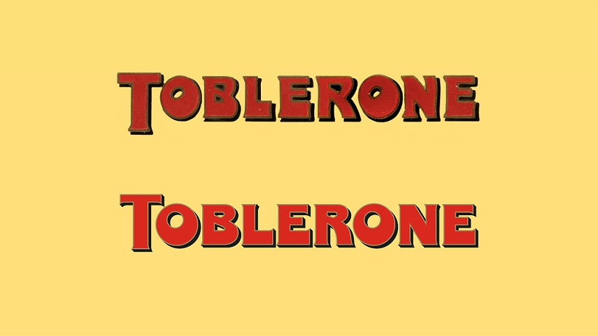
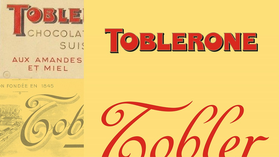
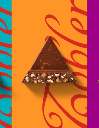
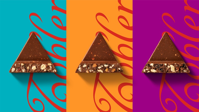
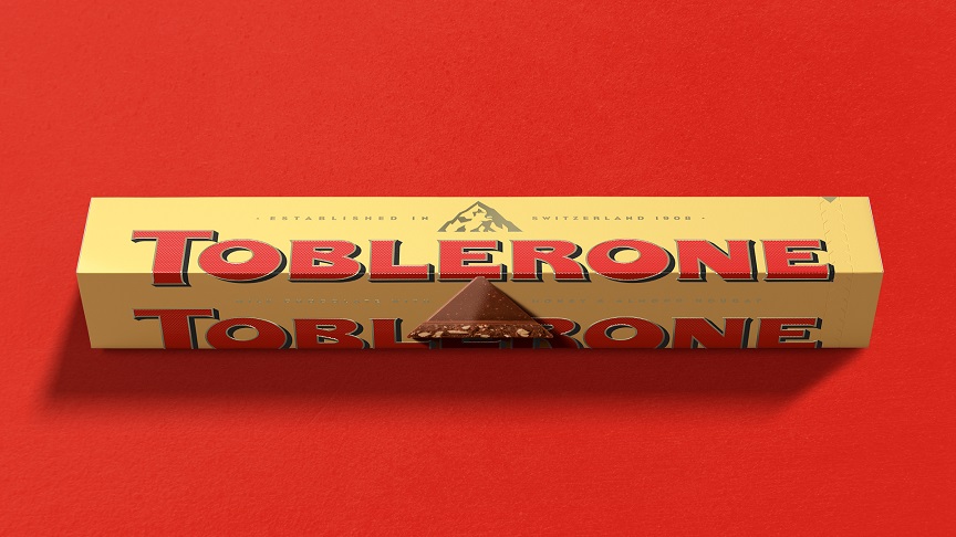
The new look of Toblerone includes redrawn mountain, Tobler signature, Toblerone wordmark, and typeface, along with vibrant illustrations that celebrate triangles and their uniqueness.

Emanuel Gävert, Global Brand Lead for Toblerone, mentions:

“Our new purpose and elevated identity marks the start of an exciting new journey for the brand, one which we hope encourages uniqueness in all its forms. As a brand, we want to effect positive change and positively influence consumer behavior, and – thanks to a truly collaborative approach between us and our agency partners – this rebrand gives us the purpose and platform to set such change in motion.”


Get the latest packaging design inspiration in your inbox:

Popular designs

Wanderers Vodka: A Blend of Nomadic Heritage and Modern Design

The spirit of freedom and adventure is encapsulated in the design of the Wanderers Vodka. Infused with steppe herbs, the complex flavor and unique aroma transport us straight to the vast plains of the Qazaqstan steppe, where nomad tribes traversed the land for thousands of years, shaping its history.

Designed by: PepsiCo Design & Innovation
Country: United States

Toblerone Gets An Attractive Makeover

13-Toblerone_Bulletproof_2022_Chunksheroed

Designed by: Bulletproof | Market region: Global


Iconic chocolate brand Toblerone has recently unveiled its new evolved look. The attractive redesign celebrates the brand’s uniqueness.

Toblerone teamed up with the London-based design agency Bulletproof to create a new brand story that “pays tribute to the importance of being stubbornly triangle in a world of squares.”

Chief Creative Officer of Bulletproof, Nick Rees, mentions:

“Looking back into a brand’s archives usually uncovers a world of craft and lost nuance. But we uncovered something much more powerful. Mr. Tobler was way ahead of his time, an activist, a maverick and a true disruptor yet he never once took his eye from his driving ambition: to make high quality, deliciously surprising chocolate experiences.”
Toblerone Gets An Attractive Makeover

The packaging

The new look of Toblerone includes redrawn mountain, Tobler signature, Toblerone wordmark, and typeface, along with vibrant illustrations that celebrate triangles and their uniqueness.

Emanuel Gävert, Global Brand Lead for Toblerone, mentions:

“Our new purpose and elevated identity marks the start of an exciting new journey for the brand, one which we hope encourages uniqueness in all its forms. As a brand, we want to effect positive change and positively influence consumer behavior, and – thanks to a truly collaborative approach between us and our agency partners – this rebrand gives us the purpose and platform to set such change in motion.”

Previous slide
Next slide
Get the latest on packaging design in your inbox: