Designed by Dunlop | Country: United States
“Tortex guitar picks are an iconic part of the fabric of rock n’ roll, like a pair of filthy leather pants and a snotty disposition. To mark Tortex’s 30th anniversary, the in-house creative department at Dunlop spotlighted the ubiquity of the brightly colored picks in the campaign “It’s More Than a Pick,” bringing together a packaging revamp and print and online pushes.
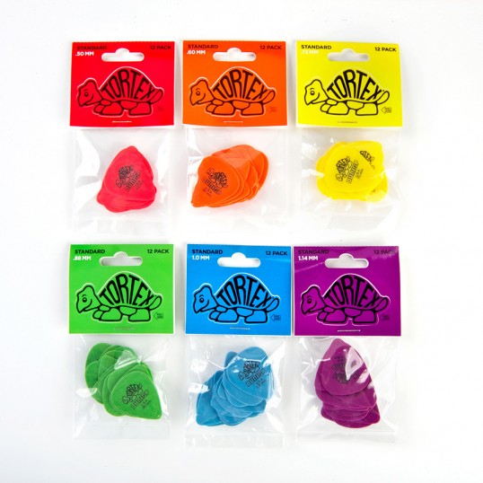
The packaging was redesigned to focus on the familiar Tortex color coding which revolutionized the industry in 1981, making them the first guitar picks to use color to denote pick gauge (thickness). The desire to “give back” to diehard Tortex users led the creative team to the idea of printing the header card on vinyl rather than paper and adding a kiss-cut to the dieline around the Tortex logo. The result? A vinyl sticker for every Tortex devotee to slap on their guitar case, guitar, amp, or groupie’s ass. Also, an infographic was designed to educate players about which Tortex picks their idols use, and which was right for their own playing style. In print, 2 page spreads for a single guitar pick were run internationally- a first in the industry.”


Before