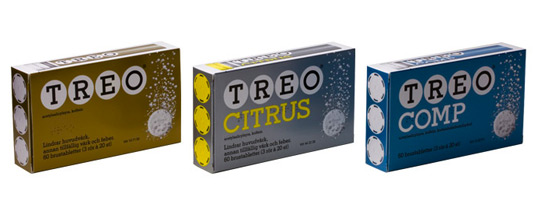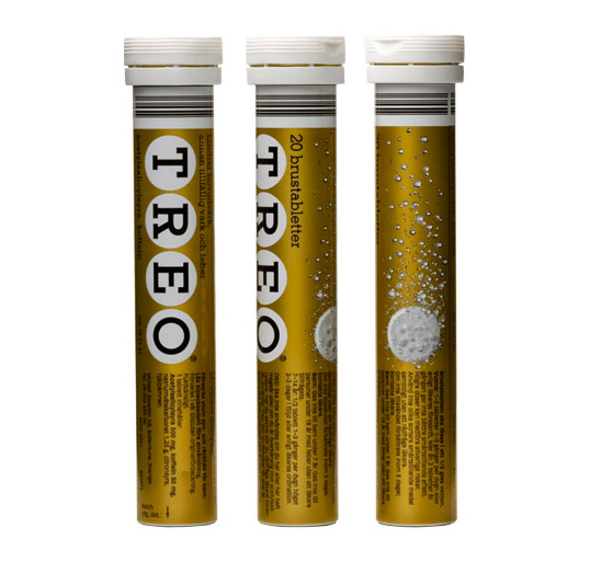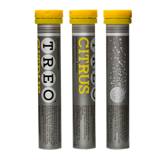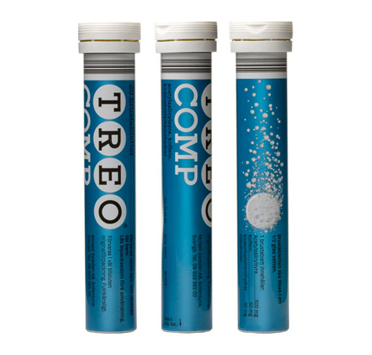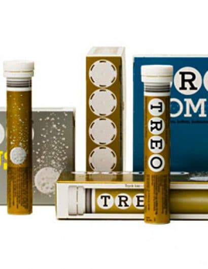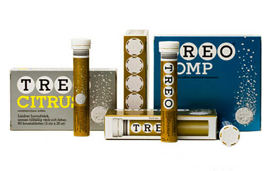
Designed by BVD | Country: Sweden | Fonts used: modified Stymie
“Challenge: Treo is a Swedish classic of the 50s and 60s, and has a very well known design. The packaging needed to become more explicit and modern without losing its iconic power.
Solution: small adjustments of typography and colour. An image that gives the impression of a tablet quickly and easily dissolving in water.”
