Designed by: PepsiCo Design & Innovation
Country: United States

Tropicana’s Branding & Packaging Redesign by Sunhouse

1

As the Original Orange Juice brand in a competitive category where consumers tend to view almost all juice as the same, Tropicana recognized a golden opportunity to deepen consumer affection and chart a path towards a vibrant future with a restaging of their brand. Collaborating with independent design agency Sunhouse, they initiated the revitalization of their identity and packaging to highlight what makes Tropicana, in the words of their new campaign, THAT juice.


“This redesign marks a pivotal moment for Tropicana. An opportunity to blend modern iconicity with decades of heritage and reinforce our leadership in the juice category,” says Mick van Ettinger, CMO at Tropicana Europe. “Sunhouse really pushed us to reconnect with our story and embrace it wholeheartedly. It’s not just about going back to our roots; it’s about celebrating who we’ve always been. Our identity and packaging now encapsulate our craftsmanship, expertise, and legacy, all whilst communicating that Tropicana is THAT juice – pure, delicious natural goodness straight from the source.”


Delving deep into Tropicana’s history, Sunhouse unearthed a treasure trove of rich narratives to elevate the brand. “From its founder, Anthony T. Rossi, who sparked a juice revolution 75 years ago by bottling fresh-pressed orange juice, to its signature blend crafted from only the highest quality oranges, handpicked and pressed within 24 hours – Tropicana possesses a legacy that no other brand can match,” remarks James Giles, Executive Creative Director at Sunhouse. “Our task was to breathe new life into the brand’s assets, showcasing these compelling stories with confidence and credibility to reinforce the message that ‘Not All Juices are Created Equal.’”


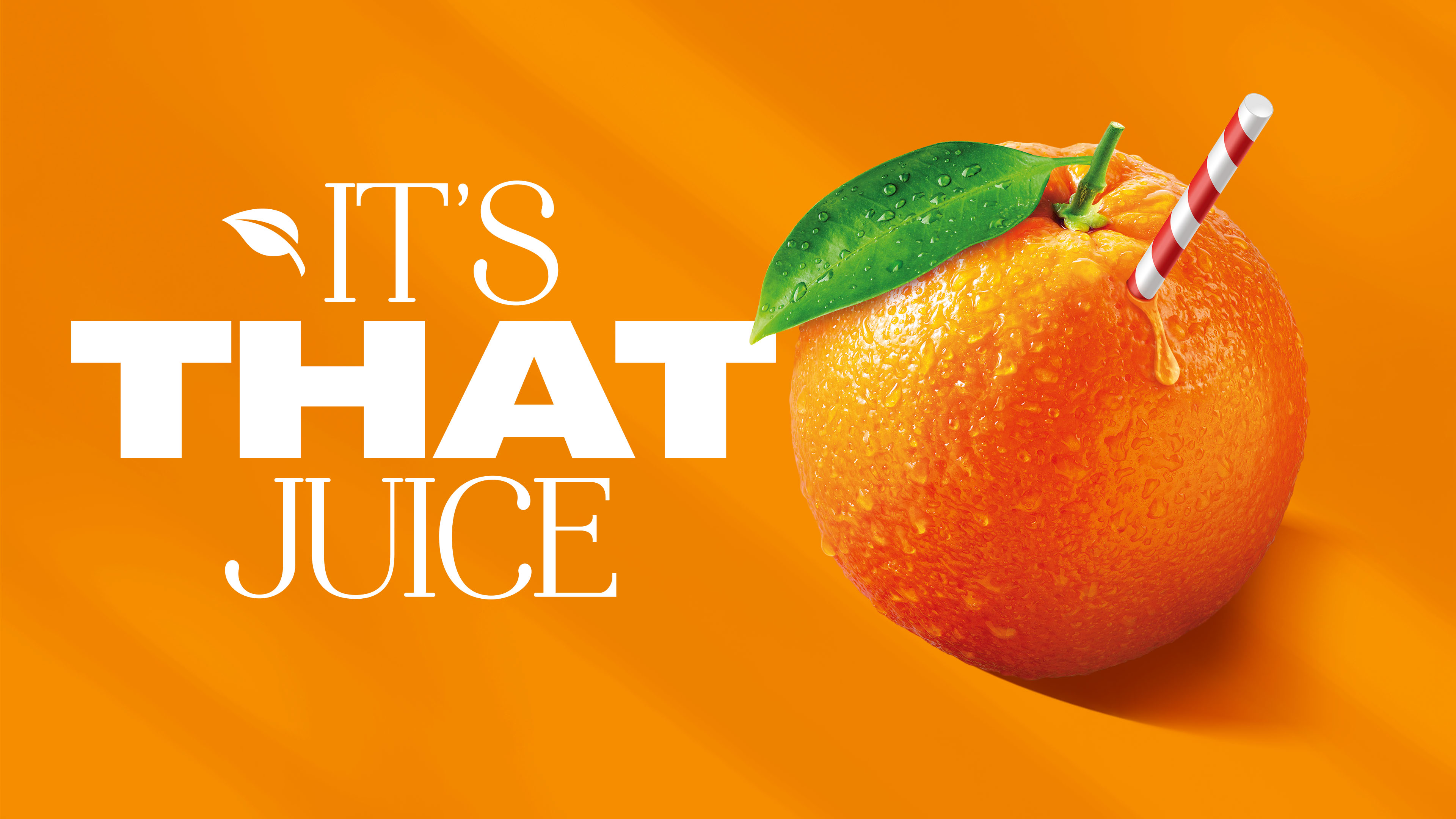
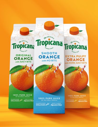
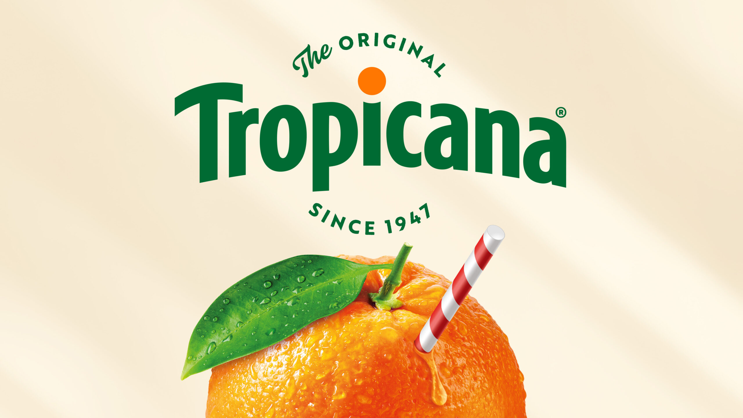
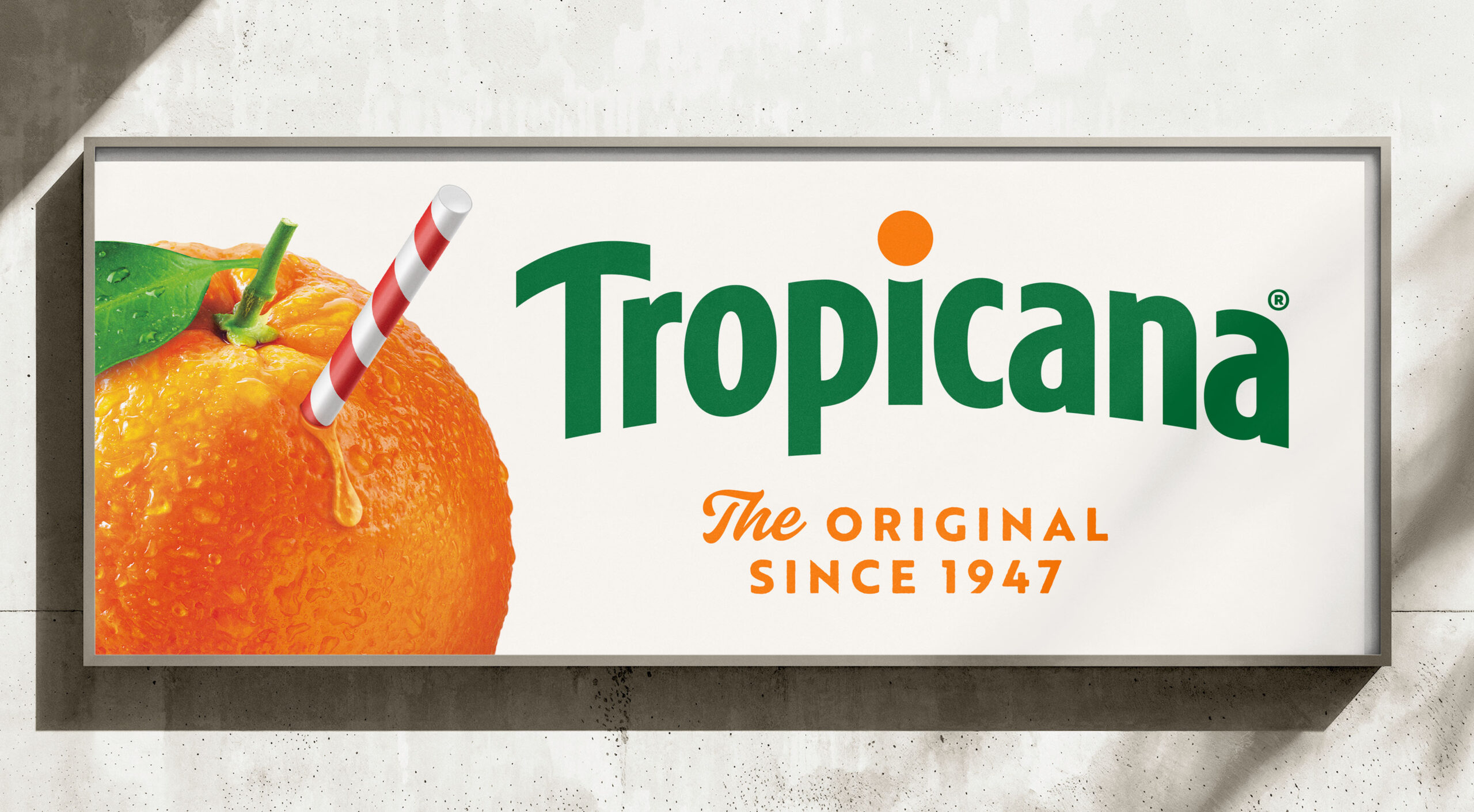
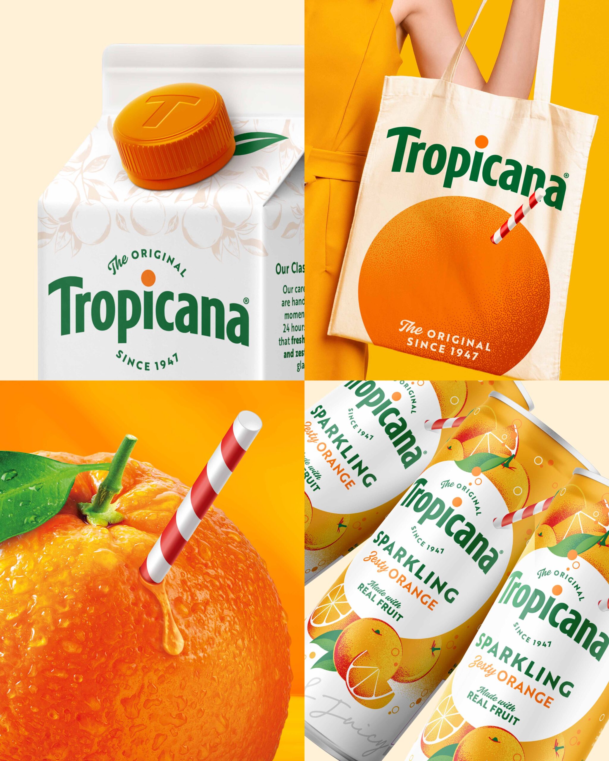
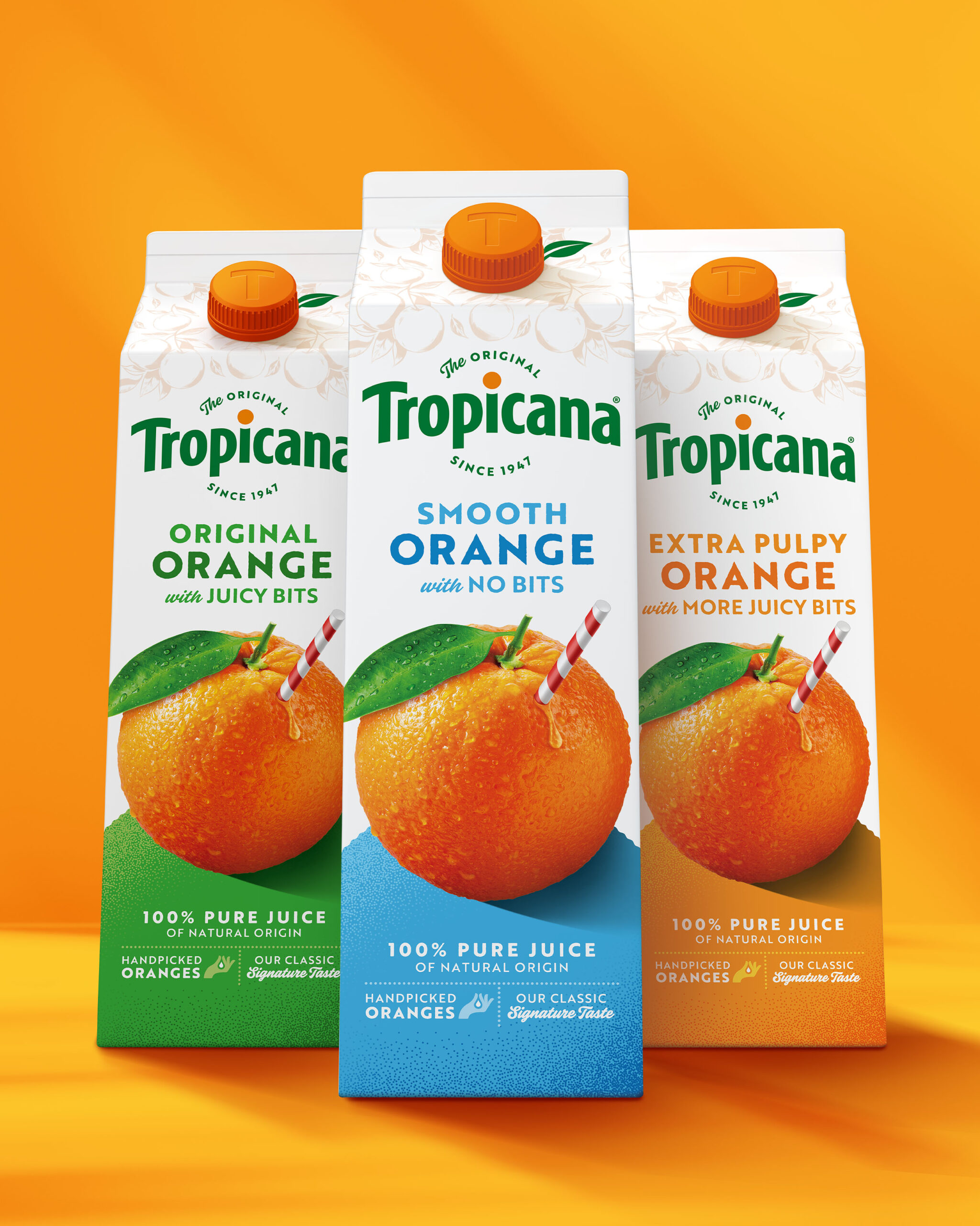
The new identity puts the orange back at the heart of the story. The evolved brand mark reintroduces the unique horizon arch with an orange punctuating the ‘i.’ Pairing this with ‘The Original since 1947,’ the brand mark now locks in the heritage story, infusing the brand with authenticity and a promise of superior quality. Tropicana’s iconic symbol, a whole orange with a red-and-white straw, has been enhanced to intensify taste appeal, whilst also establishing a more robust shape language to reinforce the brand’s dedication to providing juice directly from the source.


Final touches have been added to amplify Tropicana’s craft and authenticity, including Anthony T. Rossi’s signature, a hand-drawn illustration of oranges, and a photograph of the original grove. These elements collectively elevate the brand, making sure Tropicana stands out as a beacon of quality, expertise, and deliciousness.


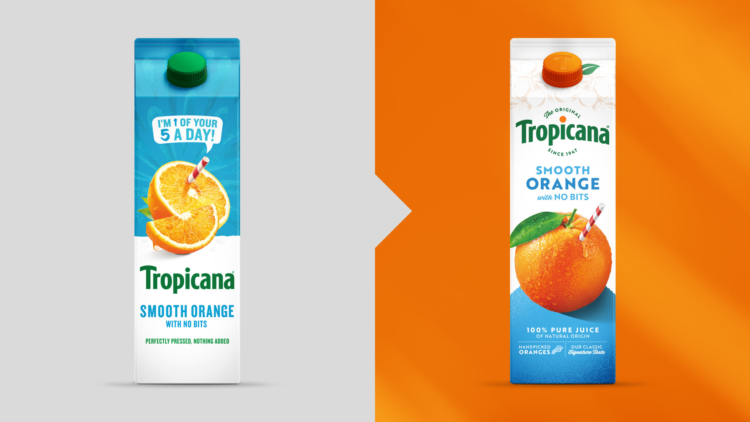
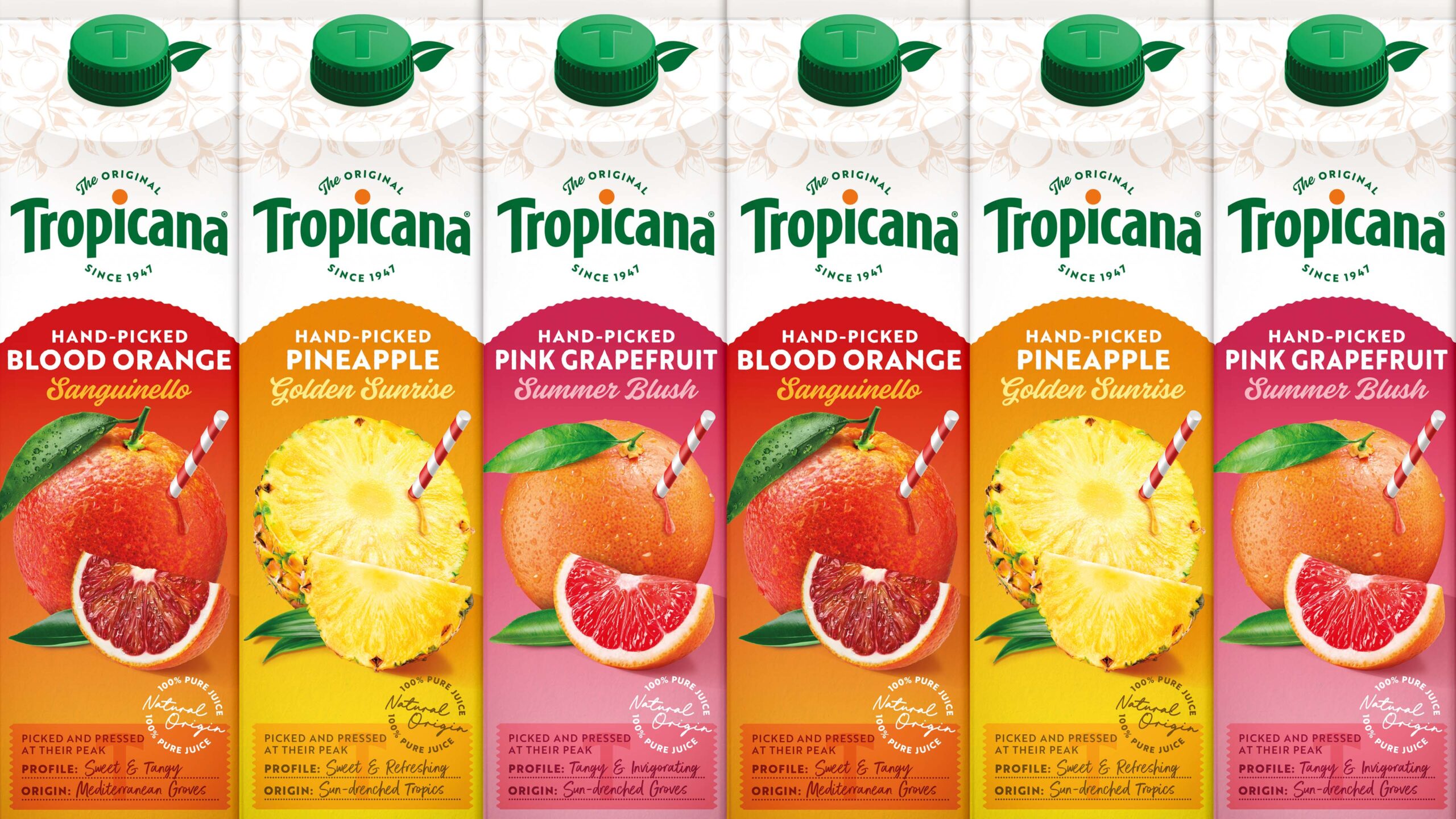
Transformed from a generic commodity that blended into the clichés of the category to an iconic brand with unmissable standout, Tropicana now celebrates its unique difference – its unparalleled dedication to delivering delicious juice straight from the source. The design builds an emotional connection with consumers while ensuring consistency to revive the brand’s status as the Original Orange Juice.


Tropicana's Branding & Packaging Redesign by Sunhouse

Tropicana's Branding & Packaging Redesign by Sunhouse

Tropicana's Branding & Packaging Redesign by Sunhouse

Tropicana's Branding & Packaging Redesign by Sunhouse

Tropicana's Branding & Packaging Redesign by Sunhouse

Tropicana's Branding & Packaging Redesign by Sunhouse

Tropicana's Branding & Packaging Redesign by Sunhouse


1

Work Category: Published Work

Get the latest packaging design inspiration in your inbox:

Popular designs

Unique Whisky Packaging Design Celebrates 40-Year Legacy

Stckmn crafted ‘The Only Drop,’ a unique whisky packaging celebrating liquid and cask unity. Featuring handcrafted paper pulp sculptures and transparent bottle designs, the project fetched £18,750 at auction, aiding Scottish youth.

Designed by: PepsiCo Design & Innovation
Country: United States

Tropicana’s Branding & Packaging Redesign by Sunhouse

1
Tropicana's Brand Revitalization by Sunhouse

As the Original Orange Juice brand in a competitive category where consumers tend to view almost all juice as the same, Tropicana recognized a golden opportunity to deepen consumer affection and chart a path towards a vibrant future with a restaging of their brand. Collaborating with independent design agency Sunhouse, they initiated the revitalization of their identity and packaging to highlight what makes Tropicana, in the words of their new campaign, THAT juice.


“This redesign marks a pivotal moment for Tropicana. An opportunity to blend modern iconicity with decades of heritage and reinforce our leadership in the juice category,” says Mick van Ettinger, CMO at Tropicana Europe. “Sunhouse really pushed us to reconnect with our story and embrace it wholeheartedly. It’s not just about going back to our roots; it’s about celebrating who we’ve always been. Our identity and packaging now encapsulate our craftsmanship, expertise, and legacy, all whilst communicating that Tropicana is THAT juice – pure, delicious natural goodness straight from the source.”


Delving deep into Tropicana’s history, Sunhouse unearthed a treasure trove of rich narratives to elevate the brand. “From its founder, Anthony T. Rossi, who sparked a juice revolution 75 years ago by bottling fresh-pressed orange juice, to its signature blend crafted from only the highest quality oranges, handpicked and pressed within 24 hours – Tropicana possesses a legacy that no other brand can match,” remarks James Giles, Executive Creative Director at Sunhouse. “Our task was to breathe new life into the brand’s assets, showcasing these compelling stories with confidence and credibility to reinforce the message that ‘Not All Juices are Created Equal.’”


The new identity puts the orange back at the heart of the story. The evolved brand mark reintroduces the unique horizon arch with an orange punctuating the ‘i.’ Pairing this with ‘The Original since 1947,’ the brand mark now locks in the heritage story, infusing the brand with authenticity and a promise of superior quality. Tropicana’s iconic symbol, a whole orange with a red-and-white straw, has been enhanced to intensify taste appeal, whilst also establishing a more robust shape language to reinforce the brand’s dedication to providing juice directly from the source.


Final touches have been added to amplify Tropicana’s craft and authenticity, including Anthony T. Rossi’s signature, a hand-drawn illustration of oranges, and a photograph of the original grove. These elements collectively elevate the brand, making sure Tropicana stands out as a beacon of quality, expertise, and deliciousness.


Transformed from a generic commodity that blended into the clichés of the category to an iconic brand with unmissable standout, Tropicana now celebrates its unique difference – its unparalleled dedication to delivering delicious juice straight from the source. The design builds an emotional connection with consumers while ensuring consistency to revive the brand’s status as the Original Orange Juice.


Tropicana's Branding & Packaging Redesign by Sunhouse

Tropicana's Branding & Packaging Redesign by Sunhouse

Tropicana's Branding & Packaging Redesign by Sunhouse

Tropicana's Branding & Packaging Redesign by Sunhouse

Tropicana's Branding & Packaging Redesign by Sunhouse

Tropicana's Branding & Packaging Redesign by Sunhouse

Tropicana's Branding & Packaging Redesign by Sunhouse


1

Work Category: Published Work

Previous slide
Next slide
Get the latest on packaging design in your inbox: