


Designed by: Butterfly Canon | Country: United Kingdom
Twinings has the distinction of being one of the world’s longest-running brands. Established in 1706, Twinings is “the go-to brand for consumers in China and South-East Asia seeking a taste of old-world western luxury.”
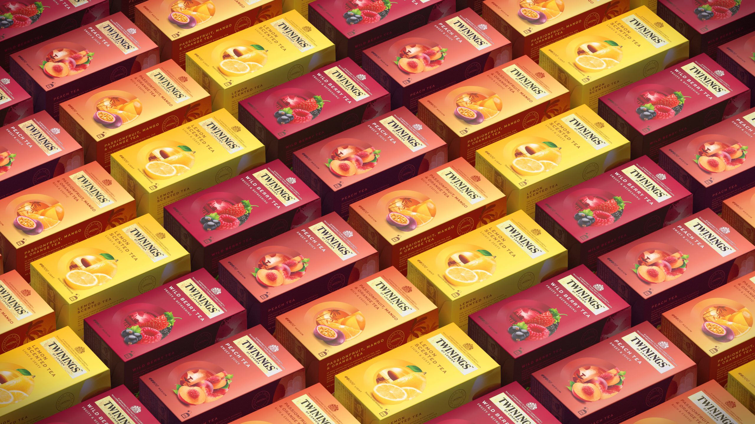
While the brand attracts customers from around the world, Twinings wanted to adopt a new look to captivate the younger generation.
The London-based design agency Butterfly Canon mentions:
“We saw the opportunity to make Twinings more relevant and distinctive to the target audience by basing our creative approach on the insight that traveling and expanding their horizons were an important part of these discerning experience seekers’ identity, with a desire for talking points to express their sophistication and knowledge.”


![]()


The packaging design strikes a balance between contemporary and traditional graphic illustrations.
“With the pack graphics, we selected the new straight Twinings International wordmark, making the branding feel more contemporary and premium; allowing the logo to be larger and have more standout on pack. Blend names and body copy were left-aligned to create pace against the centralized assets to add modernity.
Color played a crucial role in ensuring both impact on shelf and range navigation. We specified a complementary two-tone palette for each pack, executed in a unique gradient for each sub-range, to ensure each blend or flavour feels both coherent within its range and easy to differentiate not only on shelf but also in e-commerce – responsible for 50% of Twinings’ sales in China.”


