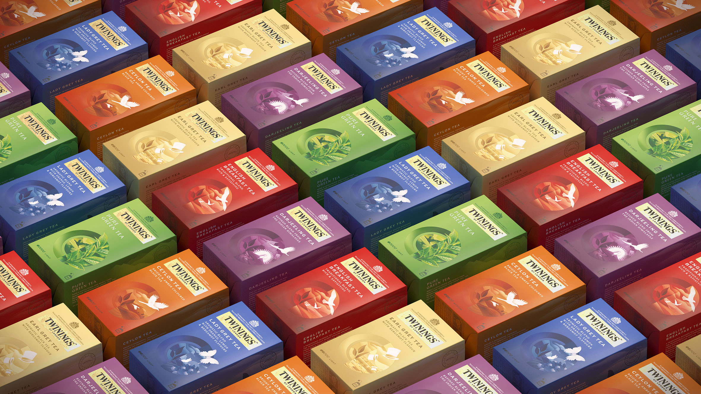
Designed by: Butterfly Cannon | Country: United Kingdom
Established in 1706, Twinings is one of the oldest running brands in the world today. The company is known for creating some of the best brands of luxury tea known to the world, such as Earl Grey and Lady Grey. While the company holds on to its old-world charms, it was finding it difficult to attract new breeds of customers.
Design agency Butterfly Cannon mentions:
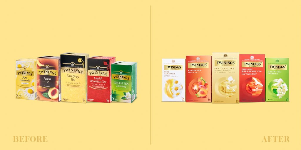
“… to a younger generation of more worldly and discerning experience seekers, this proud history and provenance was translating to a pack design that felt more ‘souvenir of old London’ than ‘cool new London luxe’. Not only that, the brand wasn’t cutting through on shelf or online. And it was hard to navigate the large number of flavors and blends within the Twinings range of Black Teas, Green Teas, Flavored Black Teas and Infusions.”
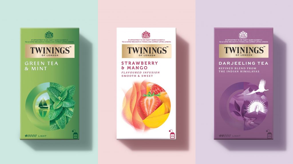
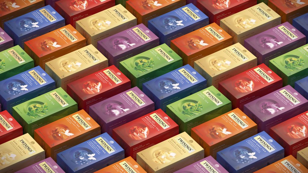
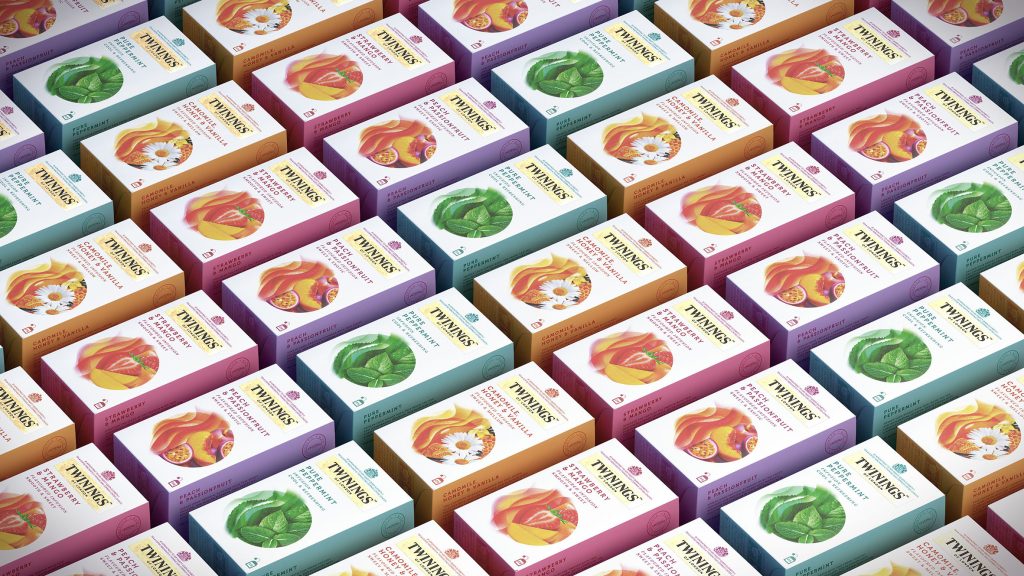
The packaging
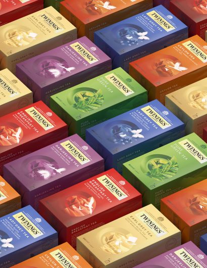
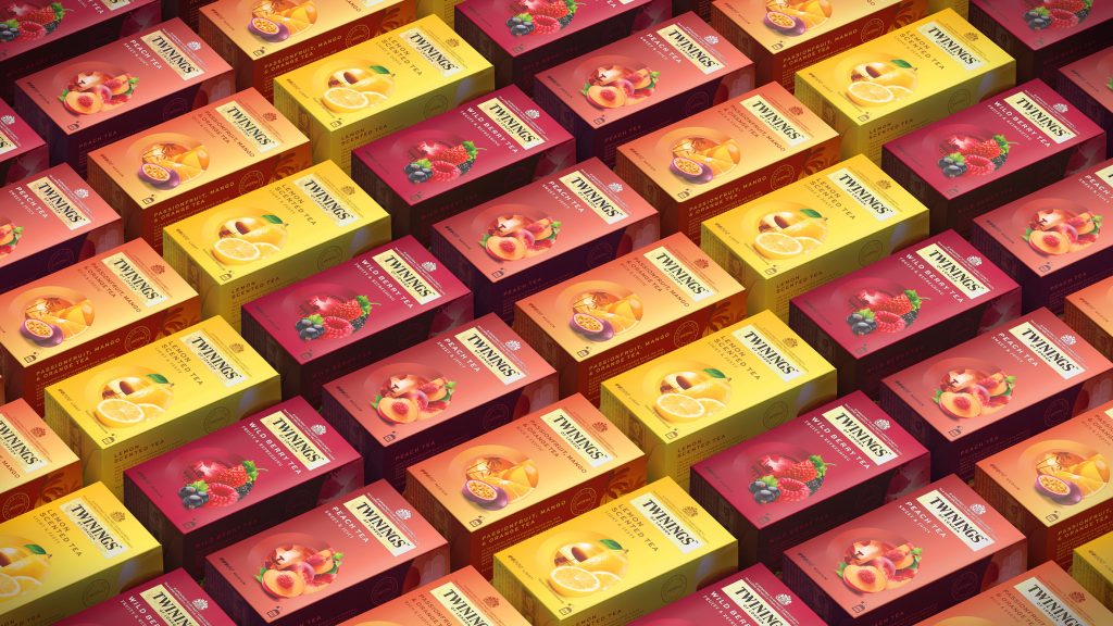
To make the brand feel more premium and contemporary, the design agency selected the Twinings International wordmark to brace the packaging. Furthermore, the packaging was executed with a two-tone color palette with different gradients for each sub-range.
“Our packaging redesign was so well received within the Twinings’ team that we were asked to create the launch campaign. Centered around our roundel device, the campaign highlights the moment of change that Twinings brings to your day, with ingredients and flavor cues passing through the roundel and transforming into uplifting iconography to convey the emotional benefit.”

