


Designed by: Morillas Brand Design | Country: Spain
Two Poles, the brand, was born when nature and science were fused. The brand is focused on combining plant-based ingredients with their synthetic counterparts. According to the branding agency, this rare mix will “inspire simple, sophisticated, and effective routines, which are more respectful to the skin and the environment.”
According to the design agency, the challenge was to highlight the various aspects of the brand that make it unique. Apart from focusing on accessibility, naturalness, and simplicity, the branding agency had to highlight the brand’s sophistication and efficacy. Morillas finally found a way to communicate the brand’s unique personality through its name: “Two Poles.”
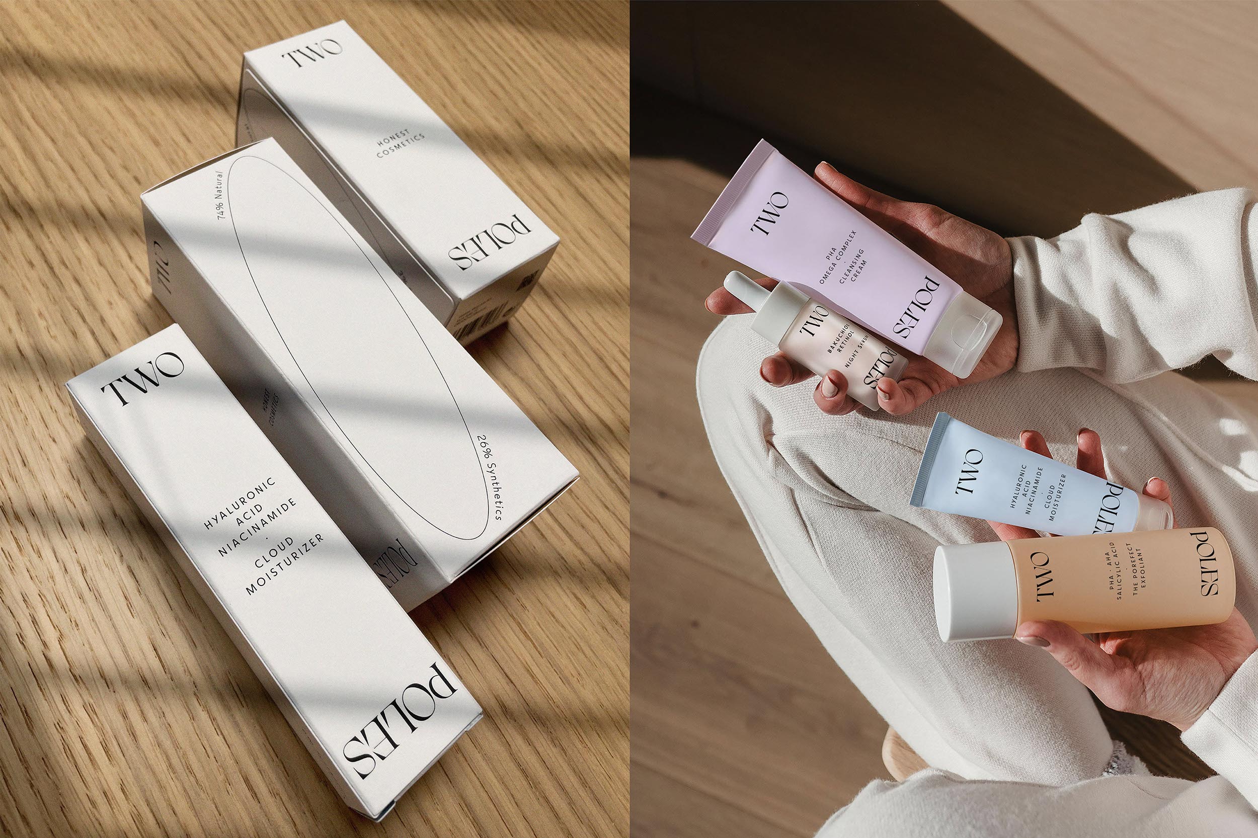
Two Poles is a name that symbolizes “the union of two realities, two ways of understanding cosmetics, proving that opposites attract, while generating a proposal with a constant game of contrasts.”


The branding agency designed the visual identity with the opposites that Two Poles signify. The oval in the center signifies the two poles of the earth dancing together in harmony. The inversion of the words also plays a significant role in the packaging and the logo designs’ attractiveness. In addition to these, light shades of color and an elegant modern typeface bring out the sophisticated personality of the brand.
Talking about the brand, Morillas mentioned the following:
“The result was a global and memorable identity, capable of telling a story that anchors the concept to the proposal’s core: the way of formulating, using an abstract, honest, and attractive concept, and an elegant, pure and powerful visual identity that leaves no one untouched.”


