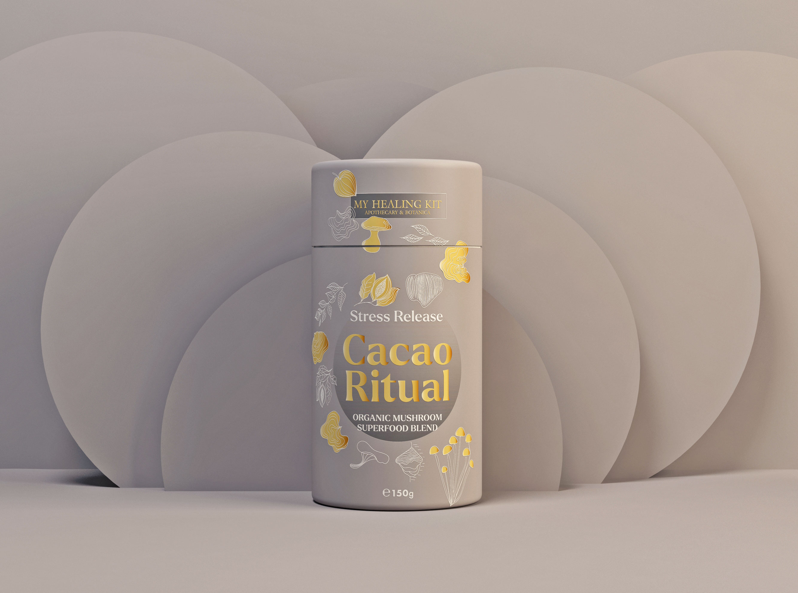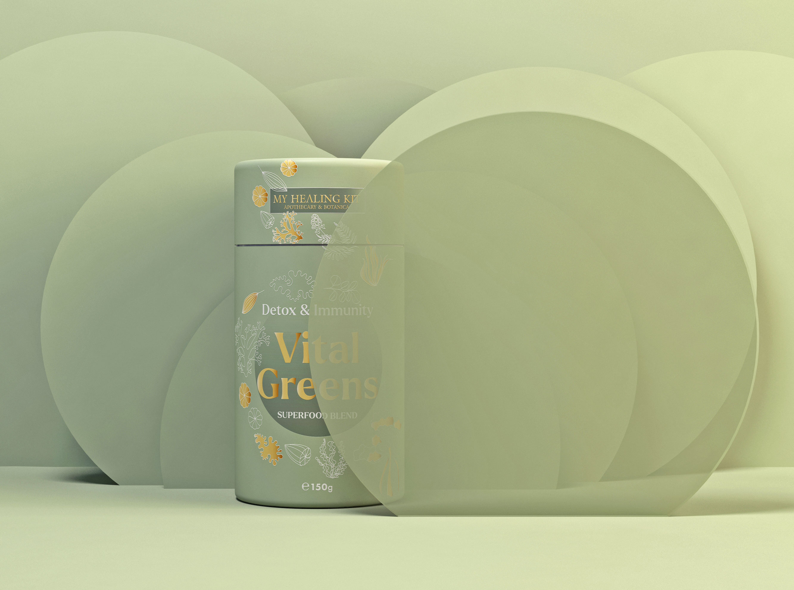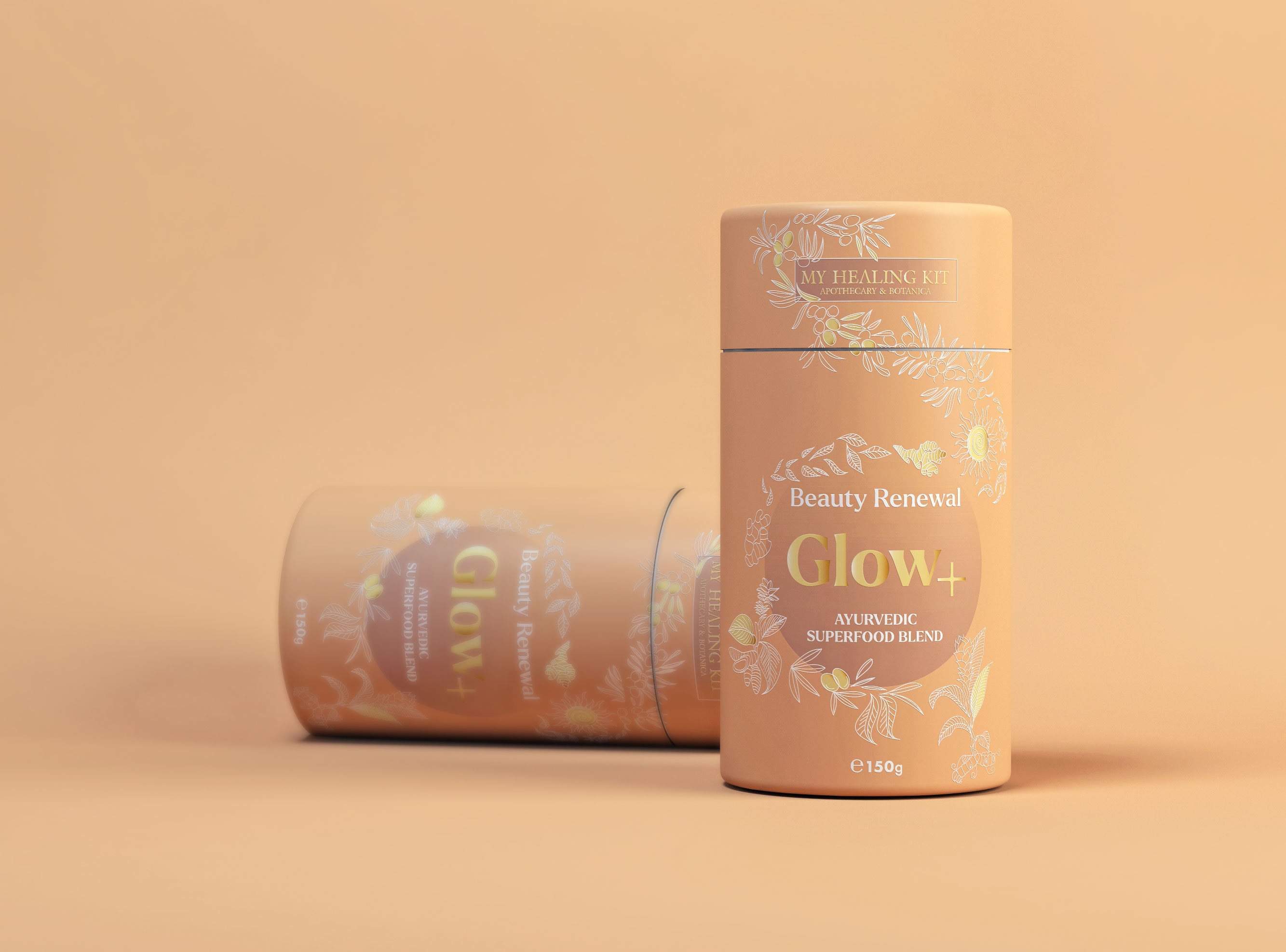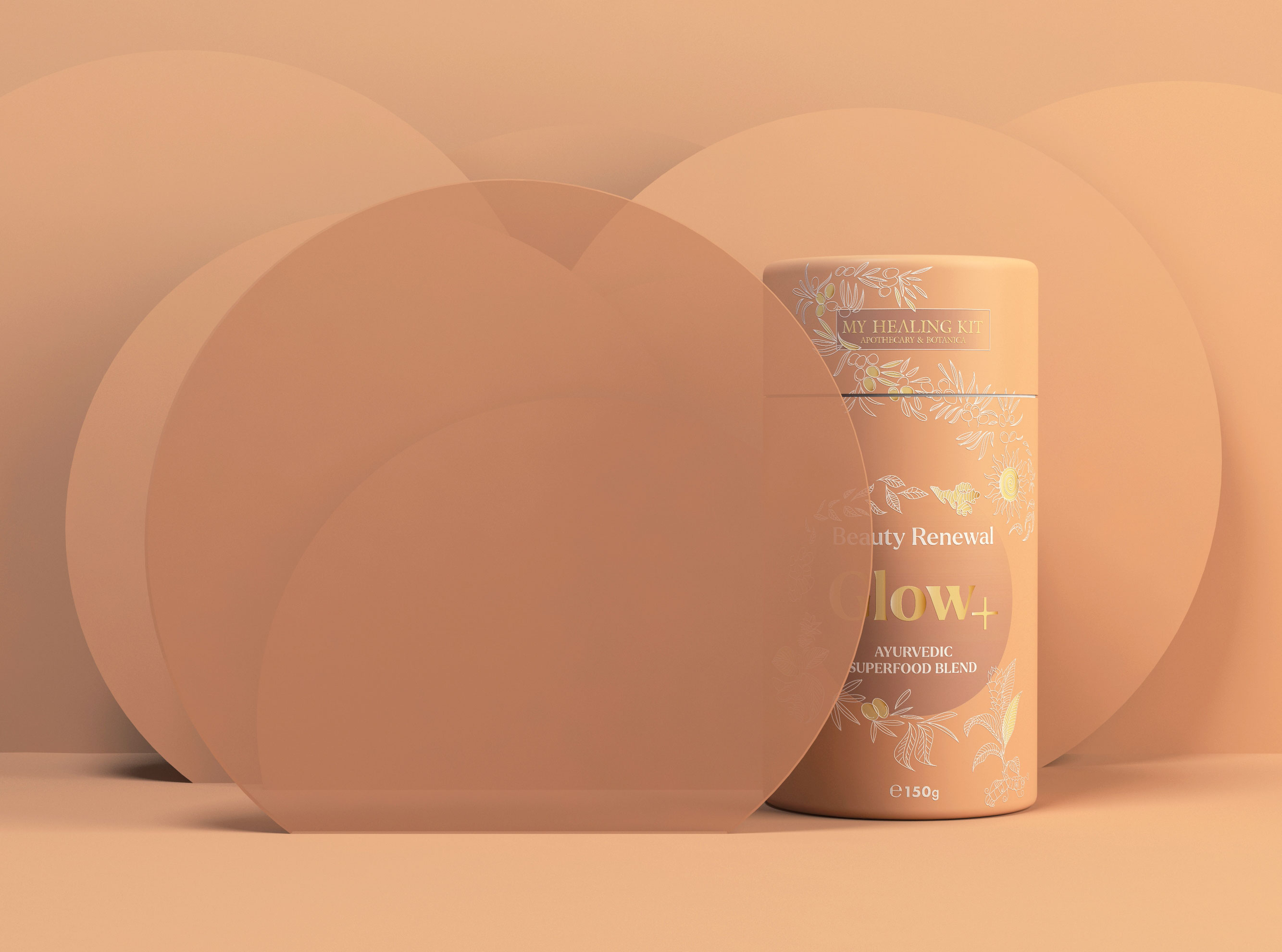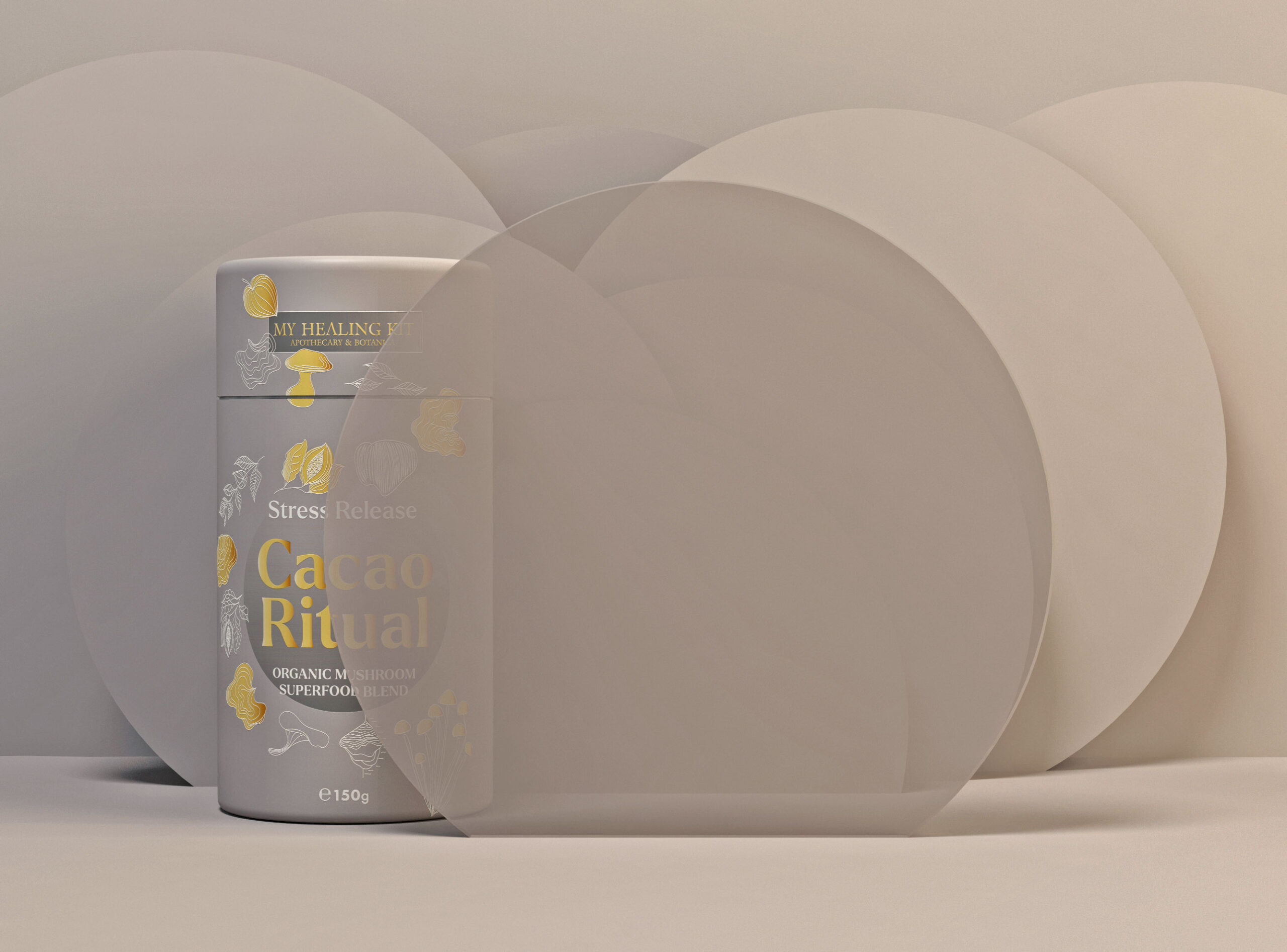
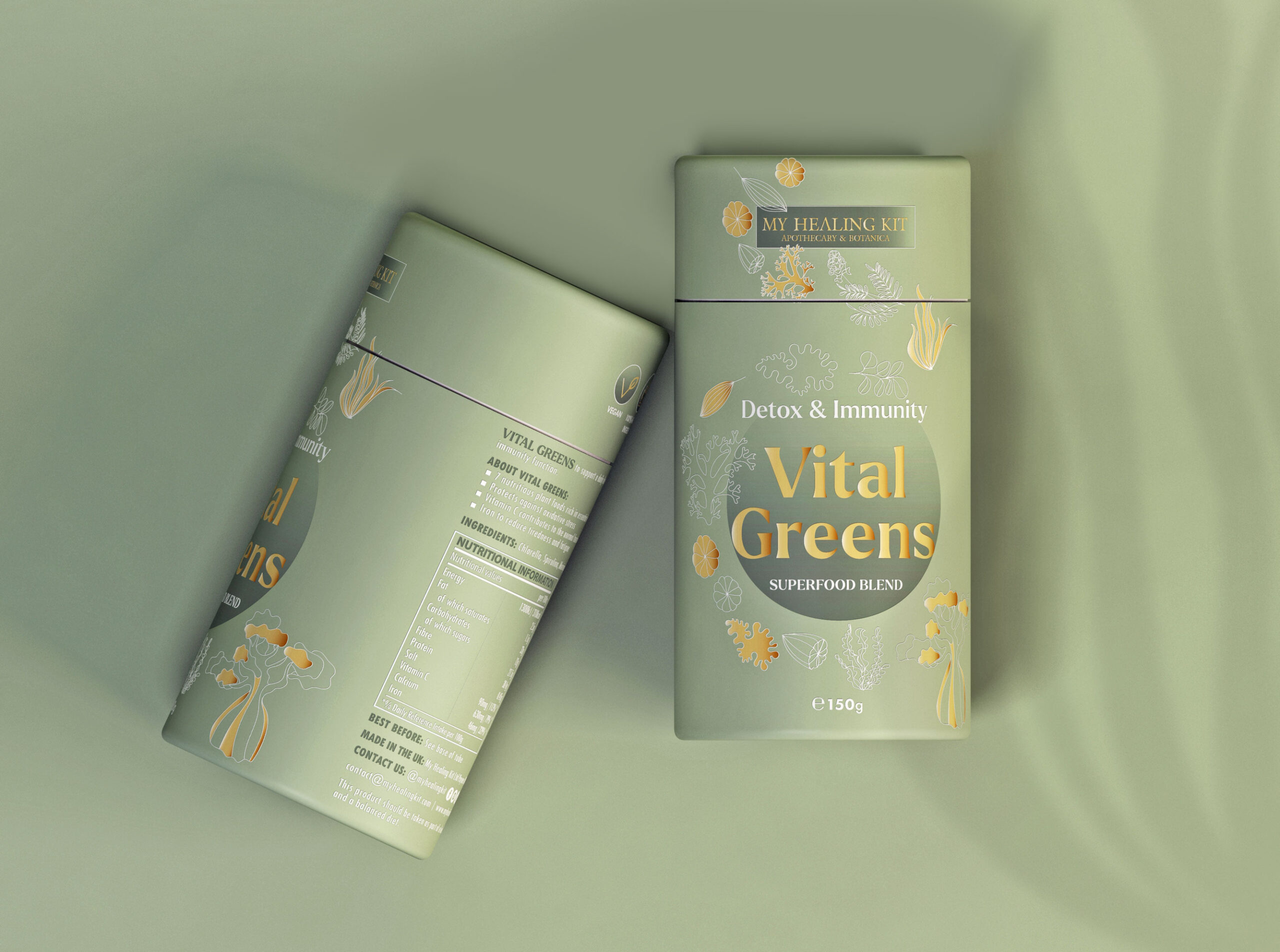
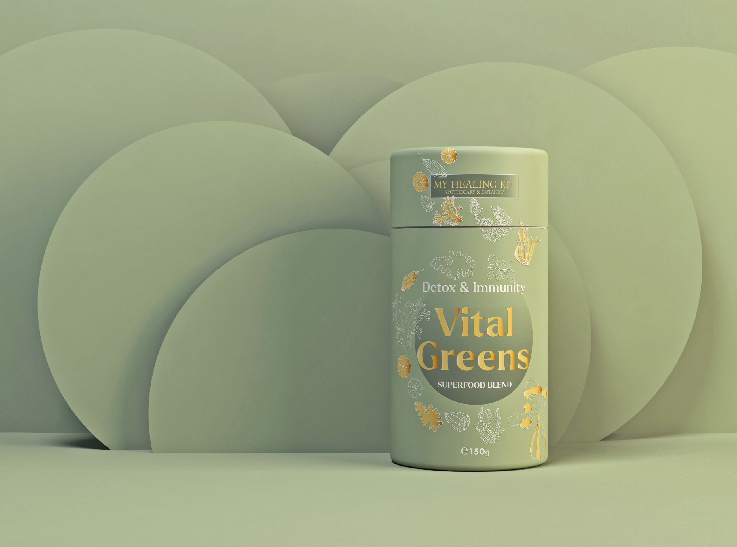
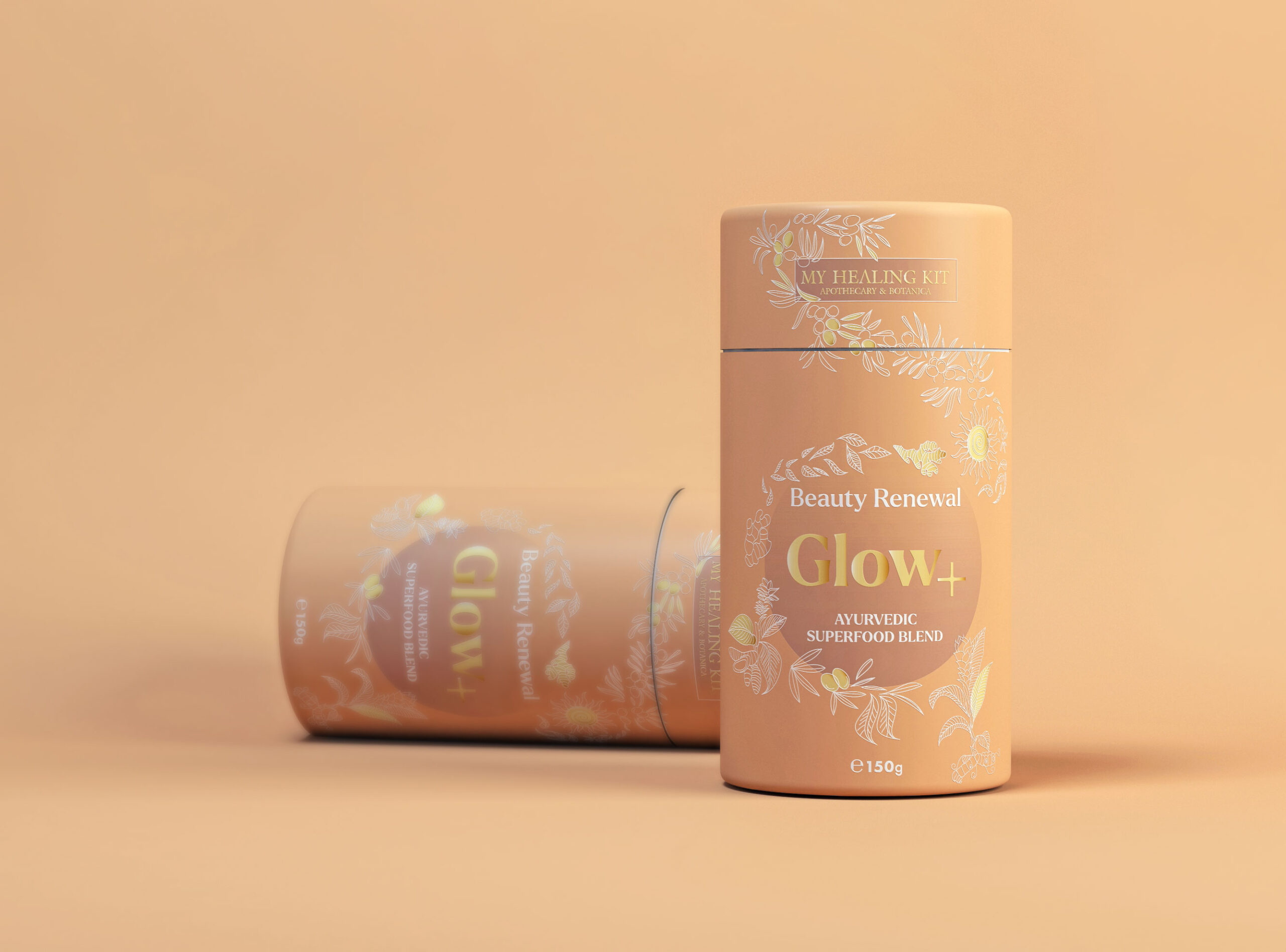
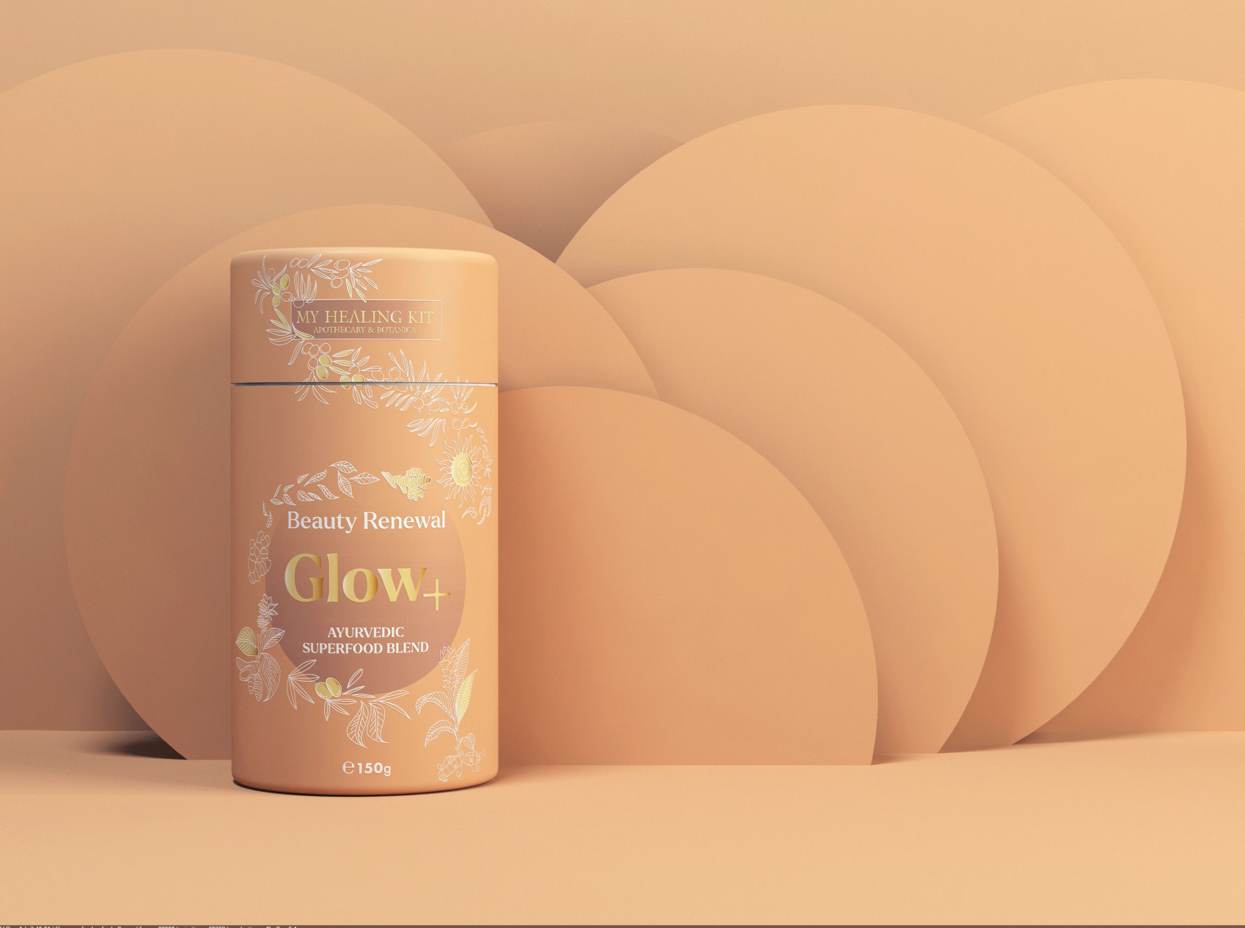
On Lovely Package, we bring you the unique packaging design for organic superfood blends. These blends are more than just supplements – they offer customers a healing hit to improve their daily lives. The brand name and mission are embodied in words like natural, healing, journey, protection, remedy, plants, power of nature, spiritual vibe, organic, protect, pure & tradition.
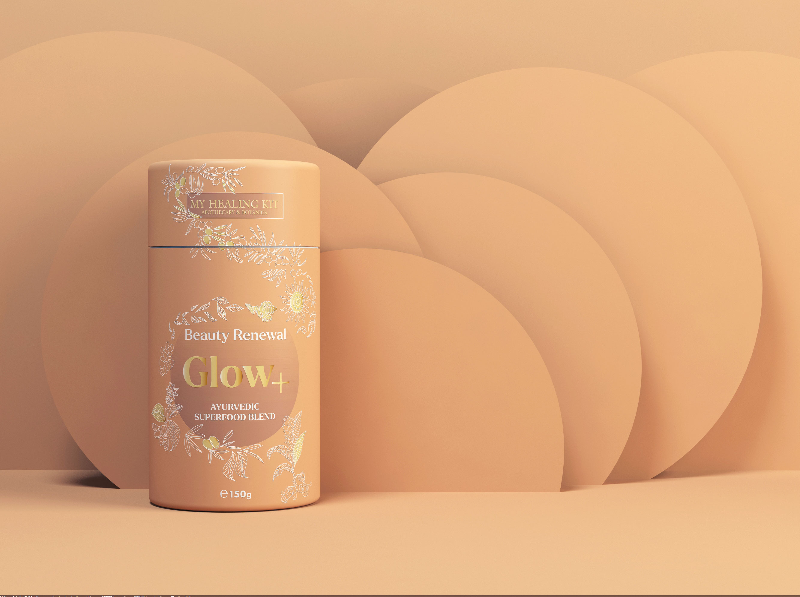
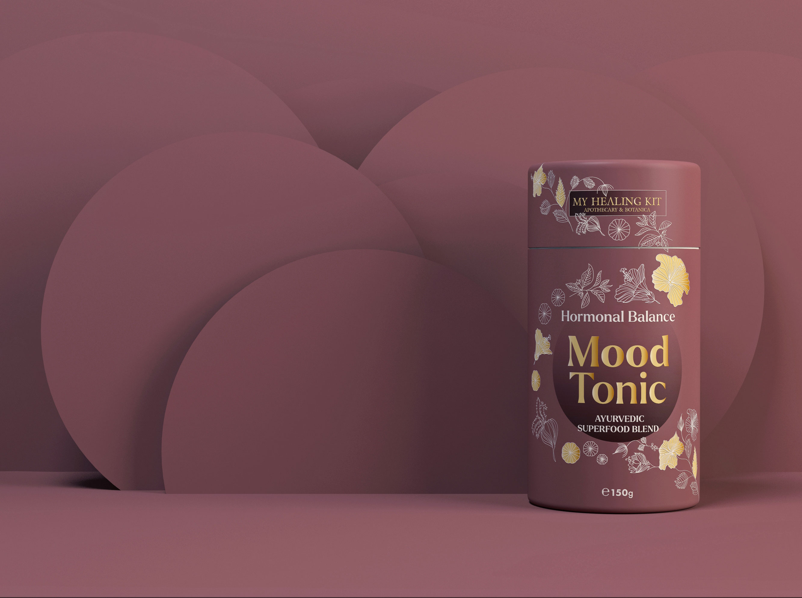
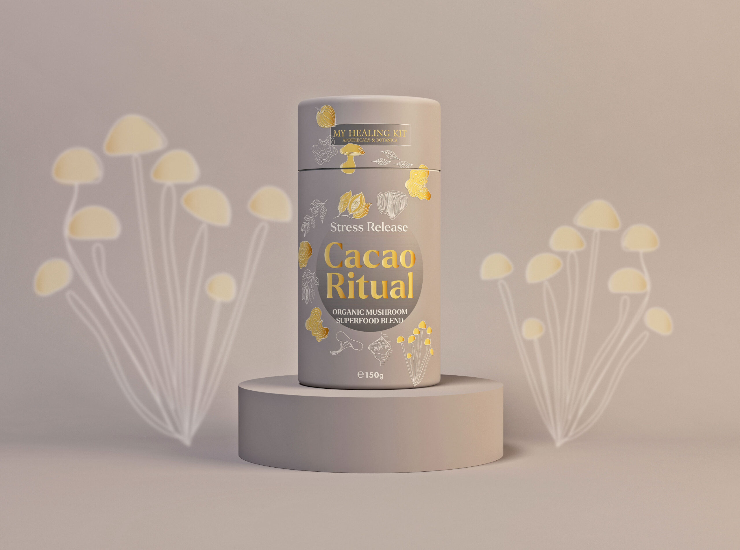
The supplement powder packaging draws inspiration from three major themes: nature and its healing power, tradition & healthy products, and people. The packaging tells the story of the brand while also serving an important functional role. The brand design style features unique elements like hand-drawn illustrations combined with a spiritual note.
The packaging colors transition from dark red to vibrant spring green, targeting a premium audience. The typography adds a more feminine and elegant note to the graphical composition.
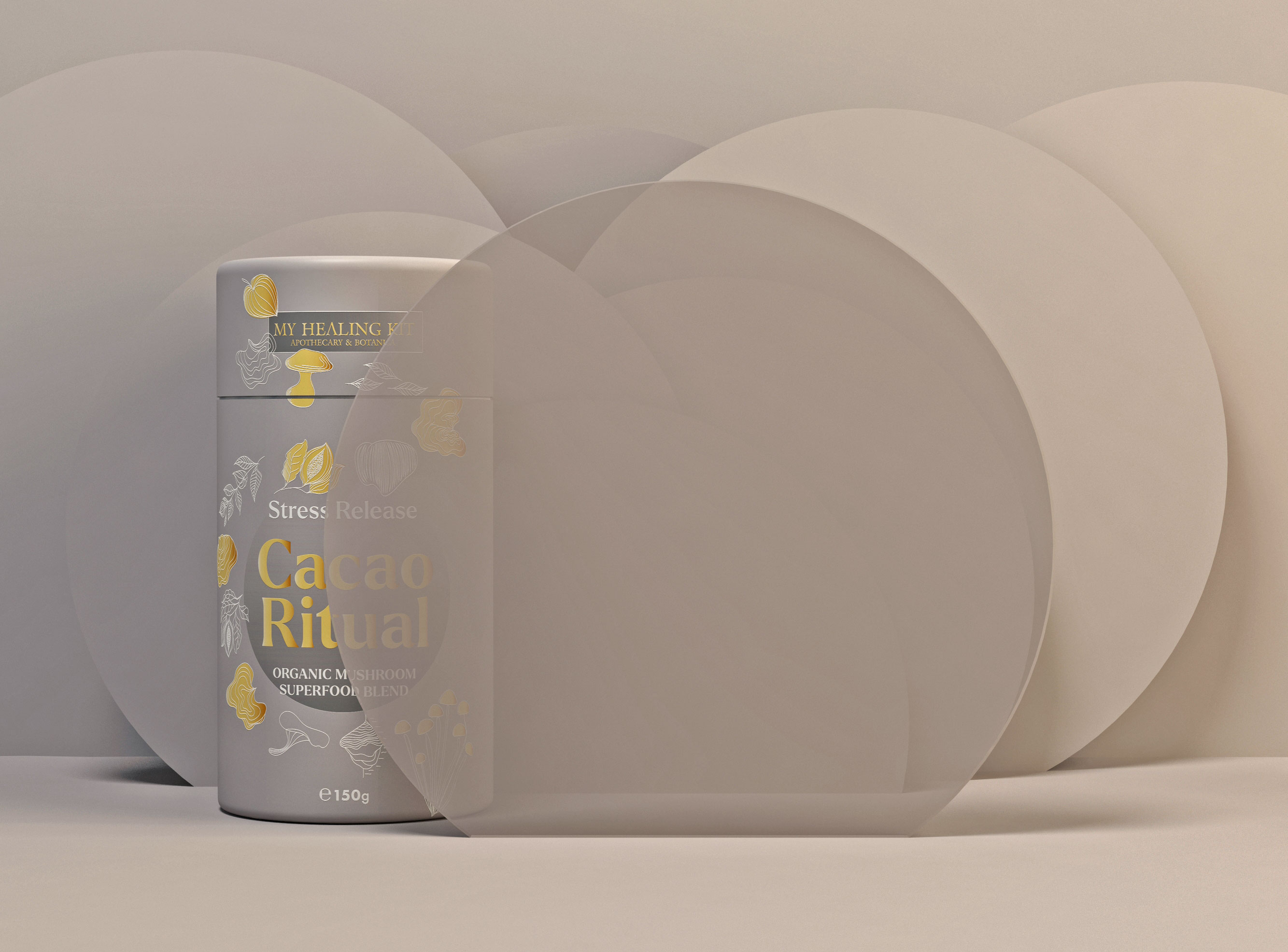
Subtle gold embossing on the superfood powder packaging describes the natural ingredients and the benefits of the product, making it easy for the consumer to understand.
This packaging design offers much flexibility for extending the product line in the near future. Its clean structure creates a personal visual connection with the audience.
The design invites customers on a spiritual journey to discover the healing power of nature’s elements, unveiling a positive and elegant design approach. All design elements, from colors to typography and packaging illustrations, visually tell the story of the product ingredients. The illustrations are displayed playfully, while the typography is strategically placed for easy readability and balanced composition. The resulting design aligns perfectly with the brand’s message and mission.
Design credits go to the talented team at Creativebydefinition, a design agency based in Bucharest, Romania. They’ve done an exceptional job with this project, from 3D modeling to graphic design, illustration, and packaging design. This project truly showcases their expertise in creating striking packaging designs for the food and beverage industry.
The supplement powder packaging draws inspiration from three major themes: nature and its healing power, tradition & healthy products, and people. The packaging tells the story of the brand while also serving an important functional role. The brand design style features unique elements like hand-drawn illustrations combined with a spiritual note.
The packaging colors transition from dark red to vibrant spring green, targeting a premium audience. The typography adds a more feminine and elegant note to the graphical composition.
Subtle gold embossing on the superfood powder packaging describes the natural ingredients and the benefits of the product, making it easy for the consumer to understand.
This packaging design offers much flexibility for extending the product line in the near future. Its clean structure creates a personal visual connection with the audience.
The design invites customers on a spiritual journey to discover the healing power of nature’s elements, unveiling a positive and elegant design approach. All design elements, from colors to typography and packaging illustrations, visually tell the story of the product ingredients. The illustrations are displayed playfully, while the typography is strategically placed for easy readability and balanced composition. The resulting design aligns perfectly with the brand’s message and mission.
Design credits go to the talented team at Creativebydefinition, a design agency based in Bucharest, Romania. They’ve done an exceptional job with this project, from 3D modeling to graphic design, illustration, and packaging design. This project truly showcases their expertise in creating striking packaging designs for the food and beverage industry.