Designed by: PepsiCo Design & Innovation
Country: United States

US Superfood Gr8nola Gets A New Look

Designed by: Deuce Studio | Country: US

London-based branding and packaging design agency Deuce Studio has been working with the US superfood brand Gr8nola for more than four years. Building upon the rebrand from four years ago, Deuce added extra layers of illustrations and colors to the packaging design.

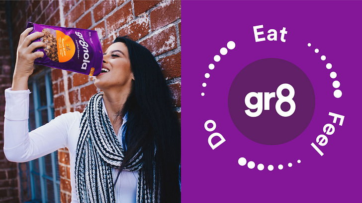
The original rebrand focused on inspiring customers to ‘eat, be and do gr8 things.’ The overall brand design language was created to cut through the noisy cereal category. While the redesign stood out from the crowd and had a significant shelf presence, the brand owners felt it was time for a refresh.
US Superfood Gr8nola Gets A New Look

The packaging

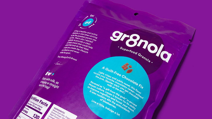
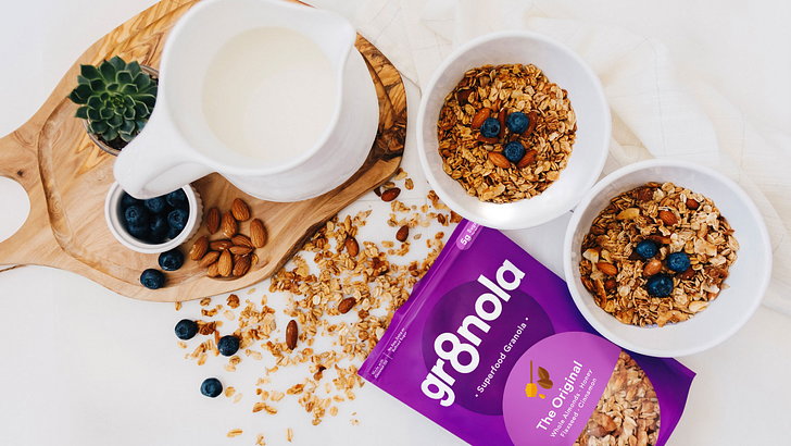
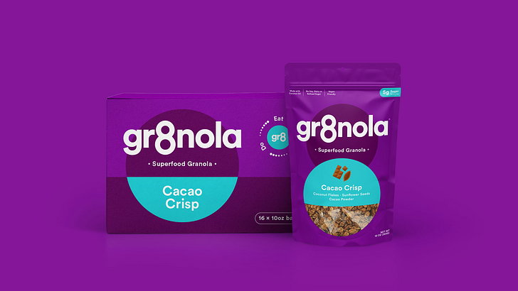
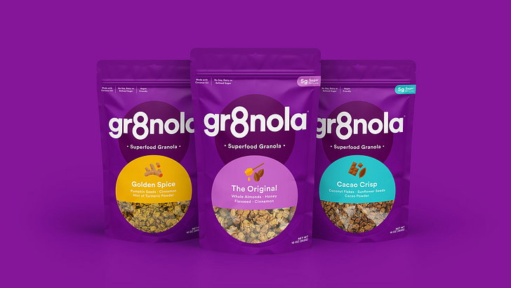
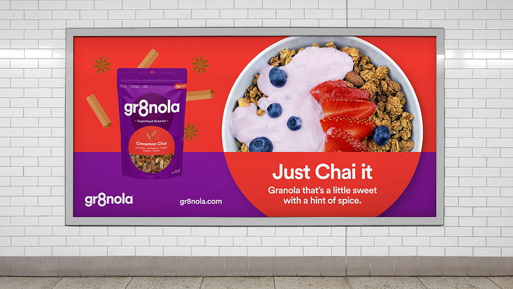
Building from the last rebrand, Deuce Studio has introduced new elements that restate the original value of the brand. In addition to fun illustrations, the design studio has created a flavor naming system, which adds an extra level of personality to the brand.

The packaging redesign is attractive and effectively communicates what the customers and potential buyers may expect from the brand. While new elements have been added to the packaging design, it retains its core personality and shelf presence.

Get the latest packaging design inspiration in your inbox:

Popular designs

Over the wave

This Kombucha originates in Lombok, Indonesia, where its paradise beaches attract hundreds of surfers eager to ride the waves. When you surf,

Burma Love Rebrand

Love at First BiteAs an extension of the Burma Superstar restaurant in San Francisco, Burma Love Foods gives diners an opportunity to

Designed by: PepsiCo Design & Innovation
Country: United States

US Superfood Gr8nola Gets A New Look

Gr8nola_03_thumb

Designed by: Deuce Studio | Country: US

London-based branding and packaging design agency Deuce Studio has been working with the US superfood brand Gr8nola for more than four years. Building upon the rebrand from four years ago, Deuce added extra layers of illustrations and colors to the packaging design.

The original rebrand focused on inspiring customers to ‘eat, be and do gr8 things.’ The overall brand design language was created to cut through the noisy cereal category. While the redesign stood out from the crowd and had a significant shelf presence, the brand owners felt it was time for a refresh.
US Superfood Gr8nola Gets A New Look

The packaging

Building from the last rebrand, Deuce Studio has introduced new elements that restate the original value of the brand. In addition to fun illustrations, the design studio has created a flavor naming system, which adds an extra level of personality to the brand.

The packaging redesign is attractive and effectively communicates what the customers and potential buyers may expect from the brand. While new elements have been added to the packaging design, it retains its core personality and shelf presence.

Previous slide
Next slide

Explore more great package design

Get the latest on packaging design in your inbox: