At Lovely Package, we love to highlight innovative packaging designs that not only stand out on the shelves but also effectively communicate the brand’s message. Today we turn our focus to Veesey, a brand that’s shaking up the dairy-free cheese category.
Once known as the ‘alternative’ to dairy, Veesey has successfully carved out a niche for itself in the growing dairy-free cheese market. To help differentiate from competitors using similar free-form language and assets and support its future growth and expansion, the brand recently decided to refresh its packaging and positioning.
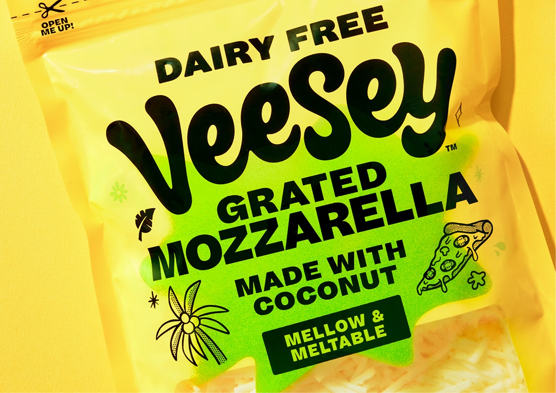
With the new positioning, ‘Intolerant to boring’, Veesey opened up a design language based on happiness, epic food, and enthusiasm. The refreshed brand intentionally shifts the narrative from the category conventions of being ‘brand-light, product-focused’ to loud and proud.
The new Veesey wordmark is lively and spontaneous with a heavy dose of soft, melted, cheesy goodness. Pack formats are bright and punchy, embracing a bright yellow brand block to unashamedly lean into the cheese vernacular, instead of the category-standard pastels and whites. Bright colour explosions act as short-form expressions of enjoyment and positivity, aiding product navigation. Hand-rendered doodles indicate serving suggestions and position Veesey as an essential meal ingredient.
The copywriting and on-pack messaging also embrace positivity. Statements are short, sharp, and filled with adjectives and descriptions highlighting taste, flavour, and enjoyment. Since its relaunch, Veesey has become a modern non-cheese cheese brand that’s hard to miss in chillers and challenges consumers to rethink their perceptions of what dairy-free cheese should look like.
Take a look at some of the images showcasing the new Veesey packaging!