Designed by: PepsiCo Design & Innovation
Country: United States

Vero Gelato Packaging Design

Designed by: Marka Works | Country: Turkey

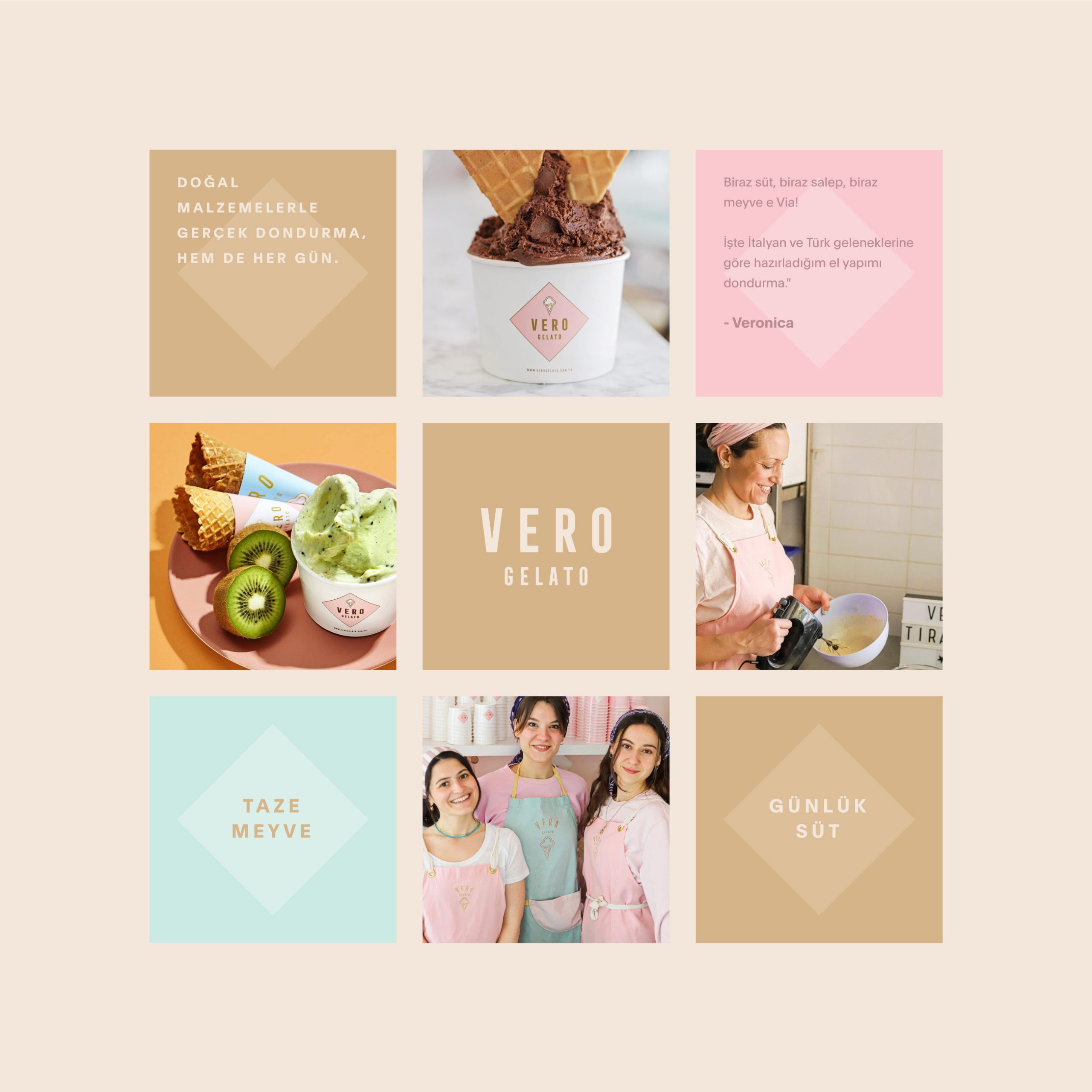
Veronica, the founder of Vero Gelato, hand makes her popular Italian ice creams. Vero Gelato is an Italian word meaning “real ice cream.” The founder uses select ingredients and Turkish milk to create some of the best gelatos.

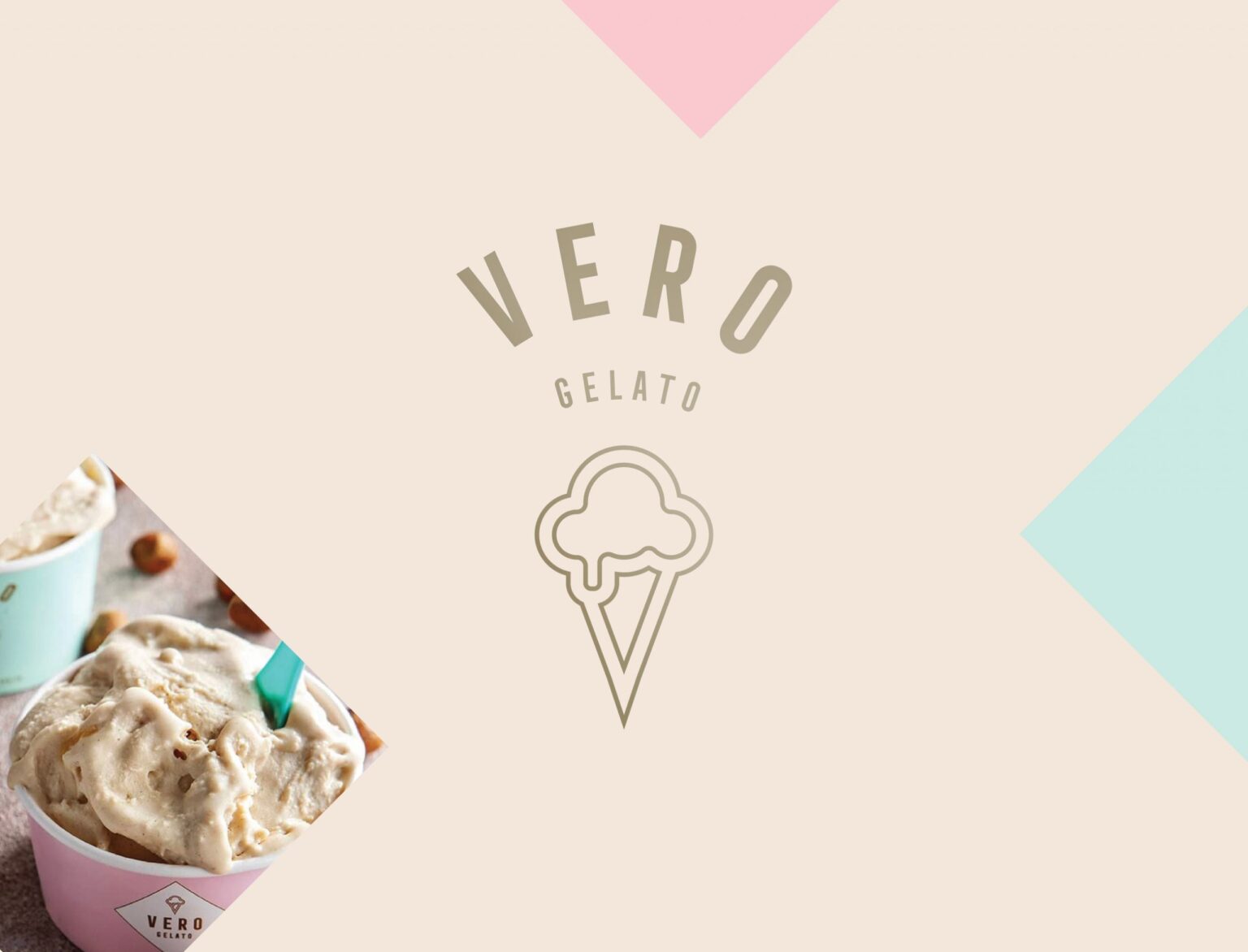
The design team created a minimal logo that represents these delicious Italian gelatos.

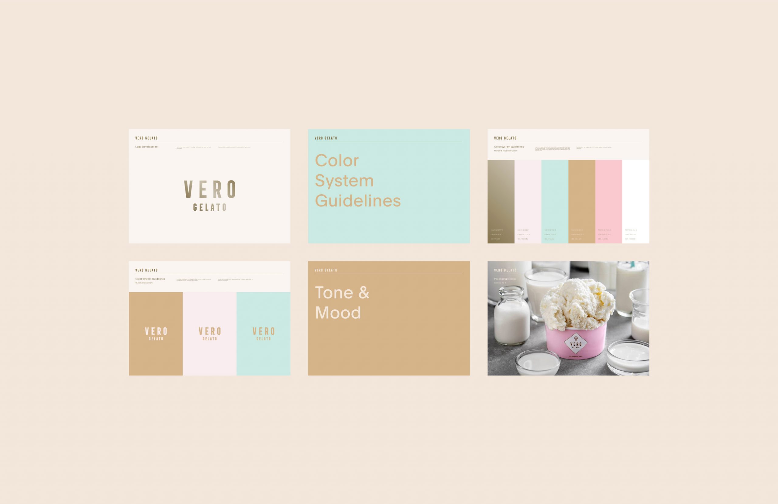
For a timeless and prestigious feel, we decided to create a minimal and bold logo with a representative logo symbol of melting ice cream.

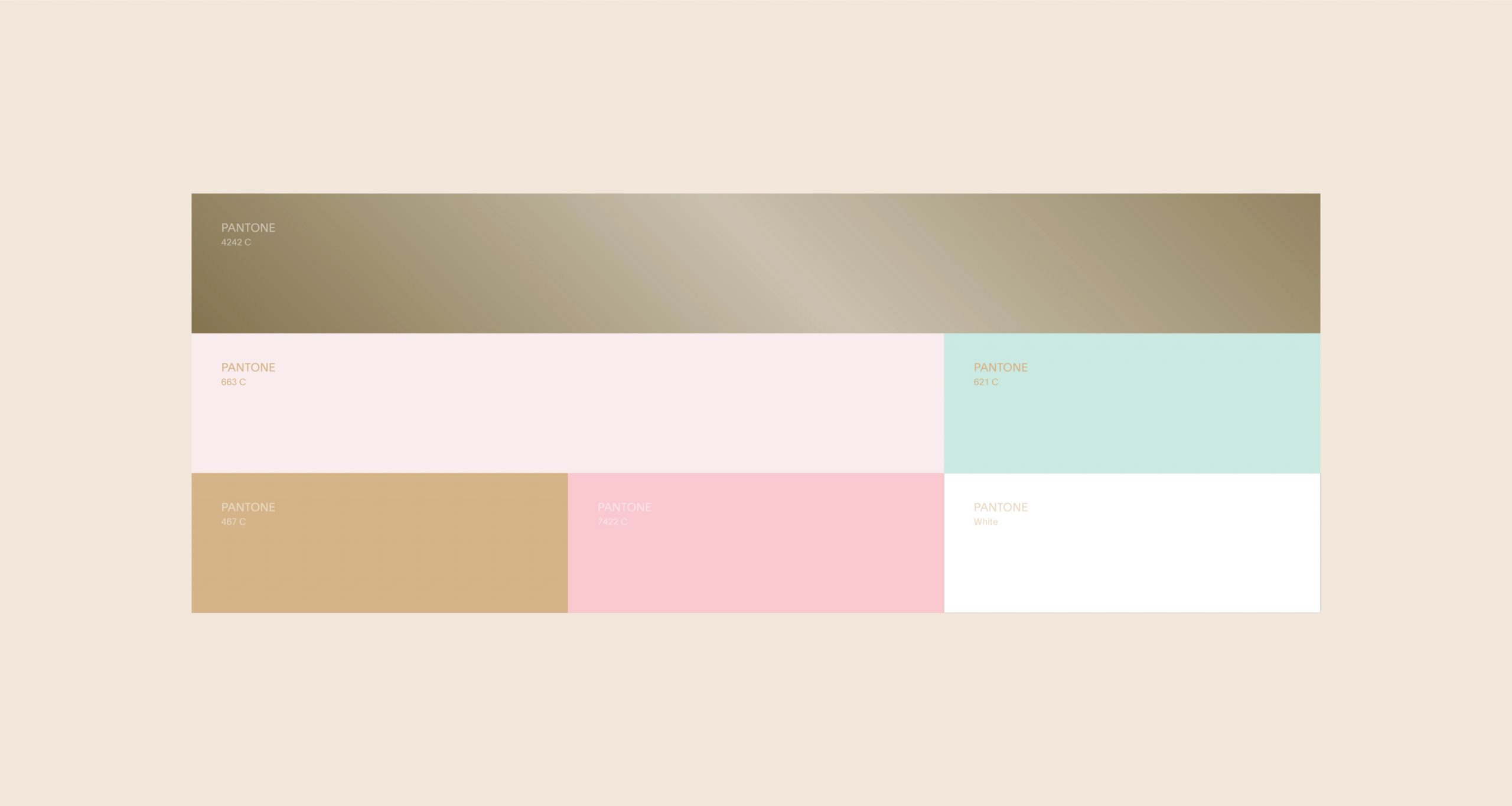
To create a sweet candy-like association, me and my team decided to select a soft pastel color palette. For the highlight of the logo, we picked gold, because this way the logo looks more luxurious and prestigious, even on a pastel background.
Vero Gelato Packaging Design

The packaging

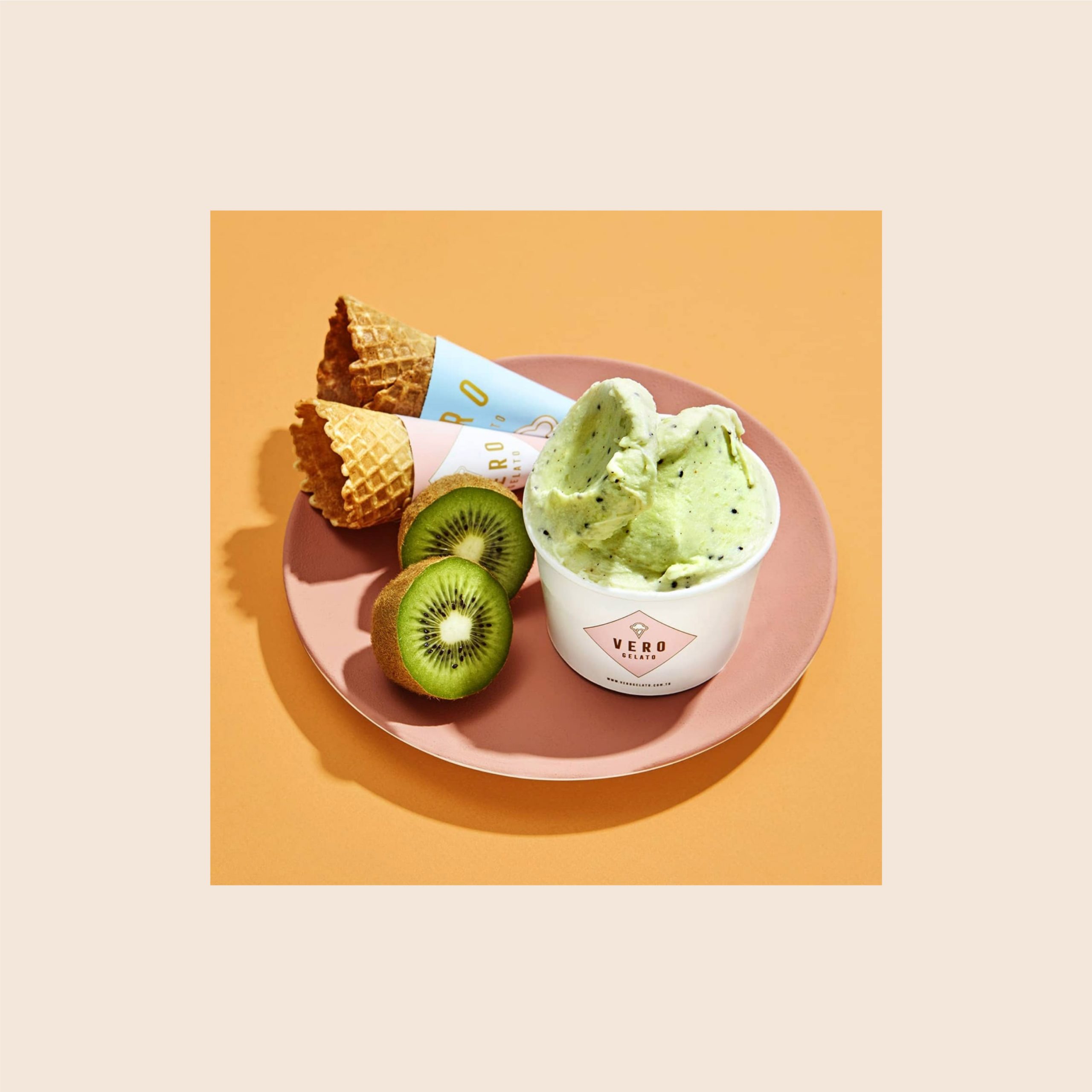
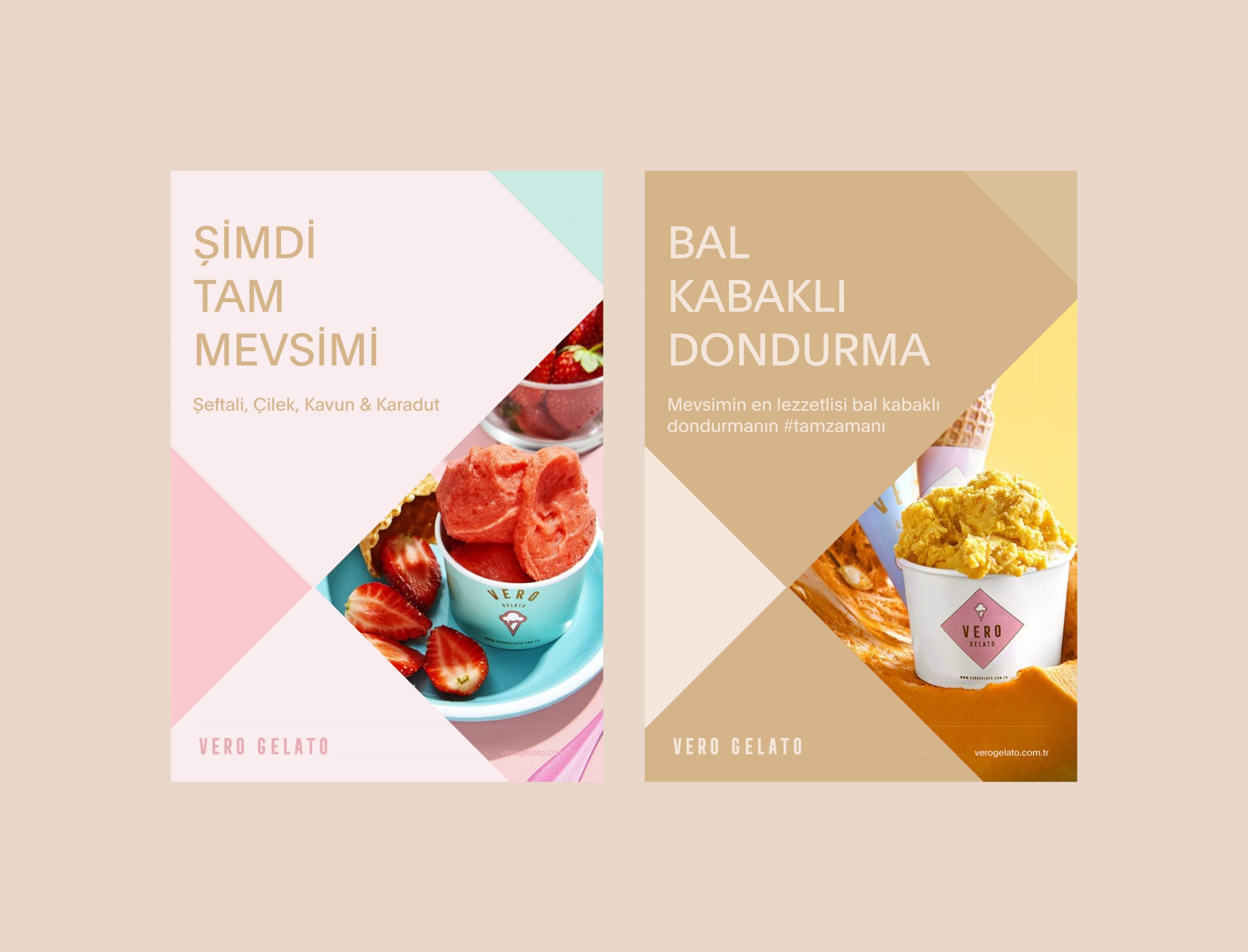
Veronica approached Marka Works, an Istanbul-based branding agency, to create packaging designs that would attract ice cream lovers. The branding agency created uncomplicated designs over a simple background to create elegant packaging illustrations.

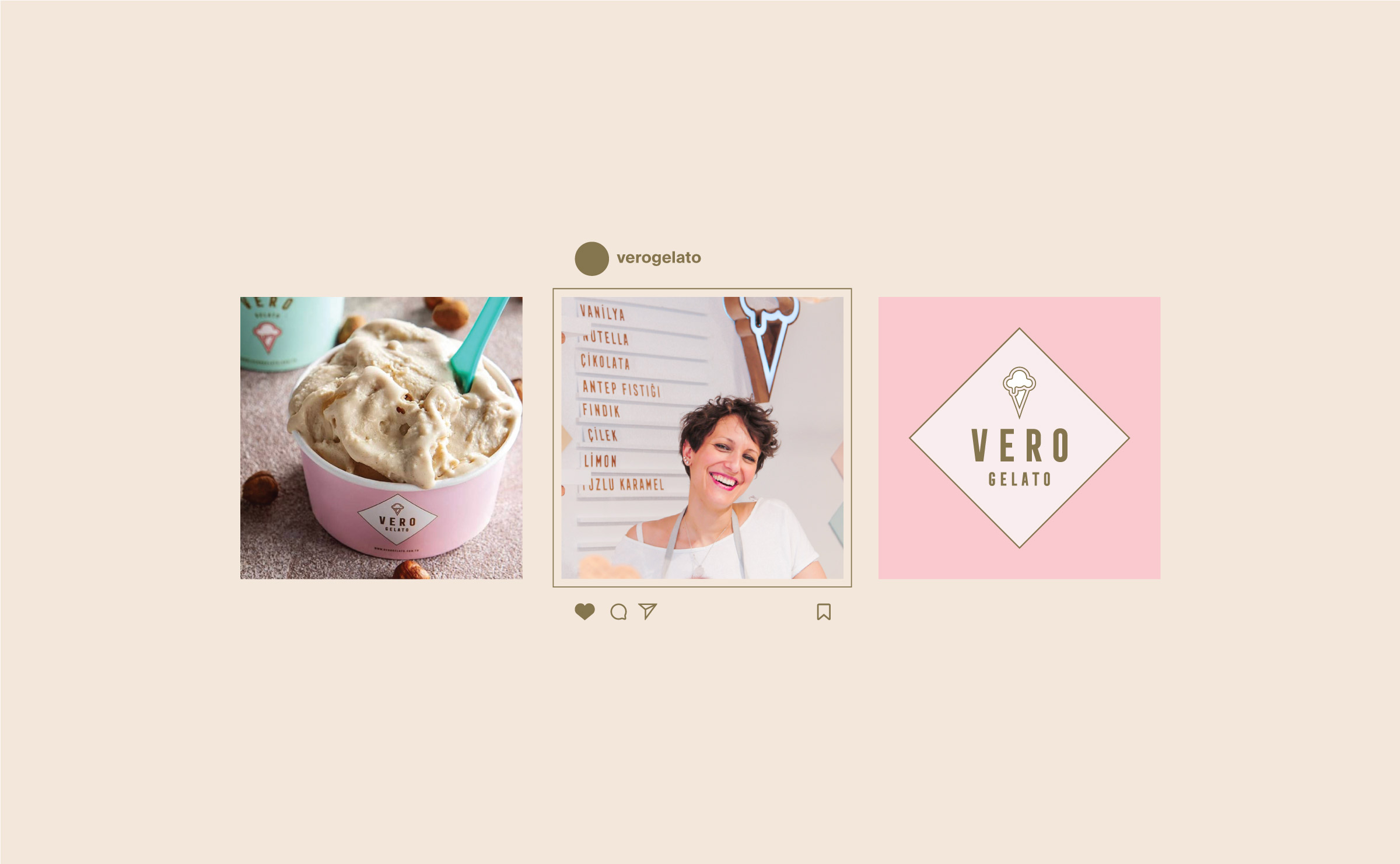
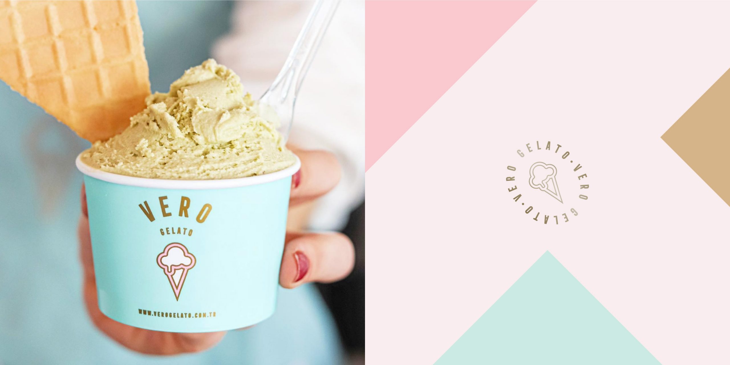
As for the packaging, we came up with a simple and eye-catching design with a plain background color and the logo in front separated with a colored box or simply pasted on. This way, the design looks bold and elegant, attracting the eyes of ice cream lovers with its soft colors and simple design.


Get the latest packaging design inspiration in your inbox:

Popular designs

Designed by: PepsiCo Design & Innovation
Country: United States

Vero Gelato Packaging Design

05-4-scaled-1

Designed by: Marka Works | Country: Turkey

Veronica, the founder of Vero Gelato, hand makes her popular Italian ice creams. Vero Gelato is an Italian word meaning “real ice cream.” The founder uses select ingredients and Turkish milk to create some of the best gelatos.

The design team created a minimal logo that represents these delicious Italian gelatos.

For a timeless and prestigious feel, we decided to create a minimal and bold logo with a representative logo symbol of melting ice cream.

To create a sweet candy-like association, me and my team decided to select a soft pastel color palette. For the highlight of the logo, we picked gold, because this way the logo looks more luxurious and prestigious, even on a pastel background.
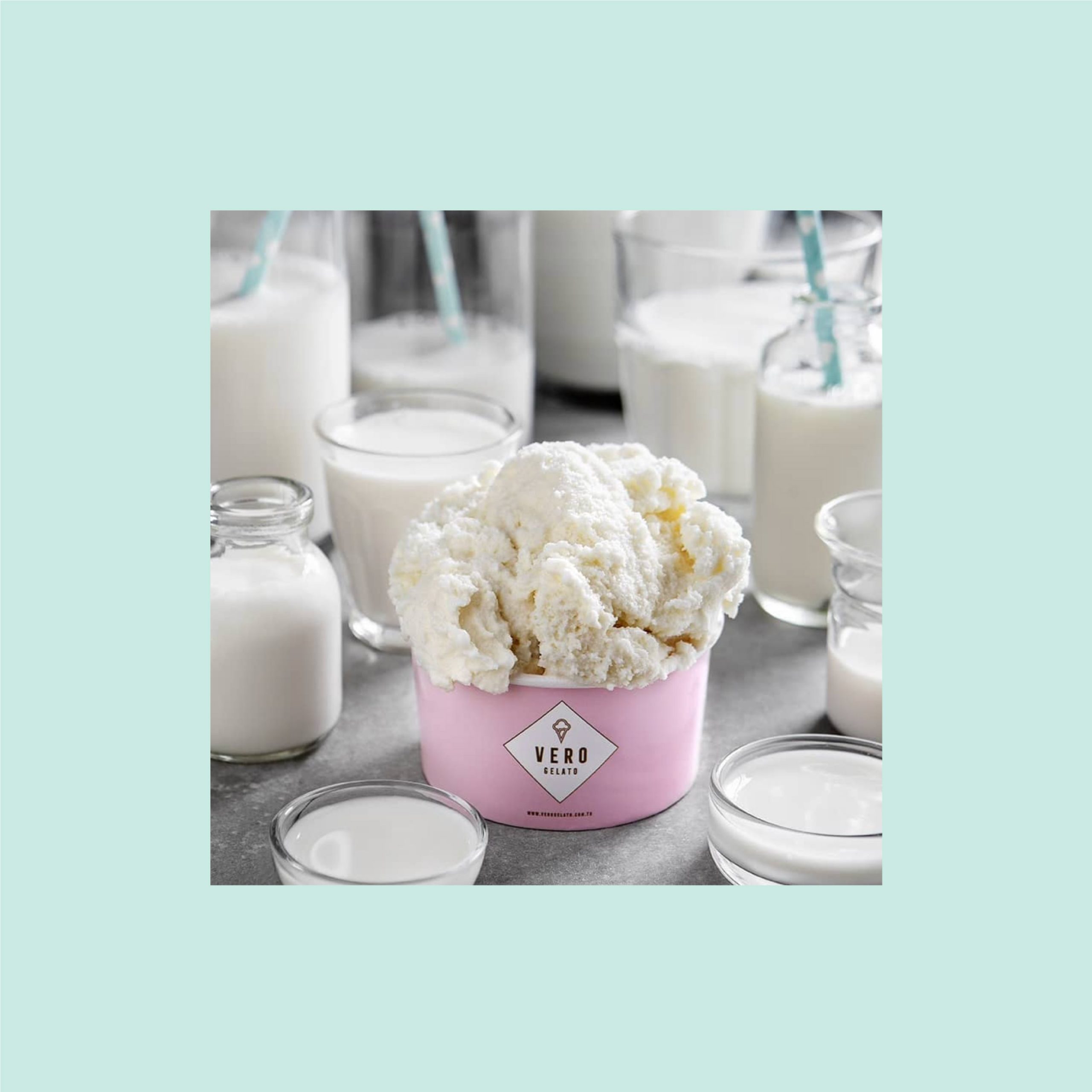
Vero Gelato Packaging Design

The packaging

Veronica approached Marka Works, an Istanbul-based branding agency, to create packaging designs that would attract ice cream lovers. The branding agency created uncomplicated designs over a simple background to create elegant packaging illustrations.

As for the packaging, we came up with a simple and eye-catching design with a plain background color and the logo in front separated with a colored box or simply pasted on. This way, the design looks bold and elegant, attracting the eyes of ice cream lovers with its soft colors and simple design.

Previous slide
Next slide
Get the latest on packaging design in your inbox: