Designed by: PepsiCo Design & Innovation
Country: United States

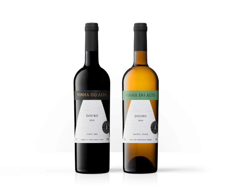
Vinha Do Alto Wine Packaging Design

1

Designed by:  Bisarro Design Studio | Country: Portugal

UNESCO has announced the area surrounding the Douro River as a classified landscape. The area is known for its vineyards and wineries. One such famous winery is the Quinta da Formigosa. The winery is located in Chanceleiros do Douro to the right of the river.

Quinta da Formigosa is located in Chanceleiros do Douro, on the right bank of the Douro River, and uniquely framed in the UNESCO classified landscape. Among its references is the Vinha do Alto red and the Vinho do Alto white. These wines were developed with the enological consulting of Duplo PR.

These wines are named after the vineyard from which they are born. It is a hillside vineyard, planted at altitude, which overlooks the right bank of the Douro River. From this terroir are born elegant and exuberant wines in the fruit and freshness that surrounds them.”
Vinha Do Alto Wine Packaging Design

The packaging

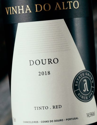
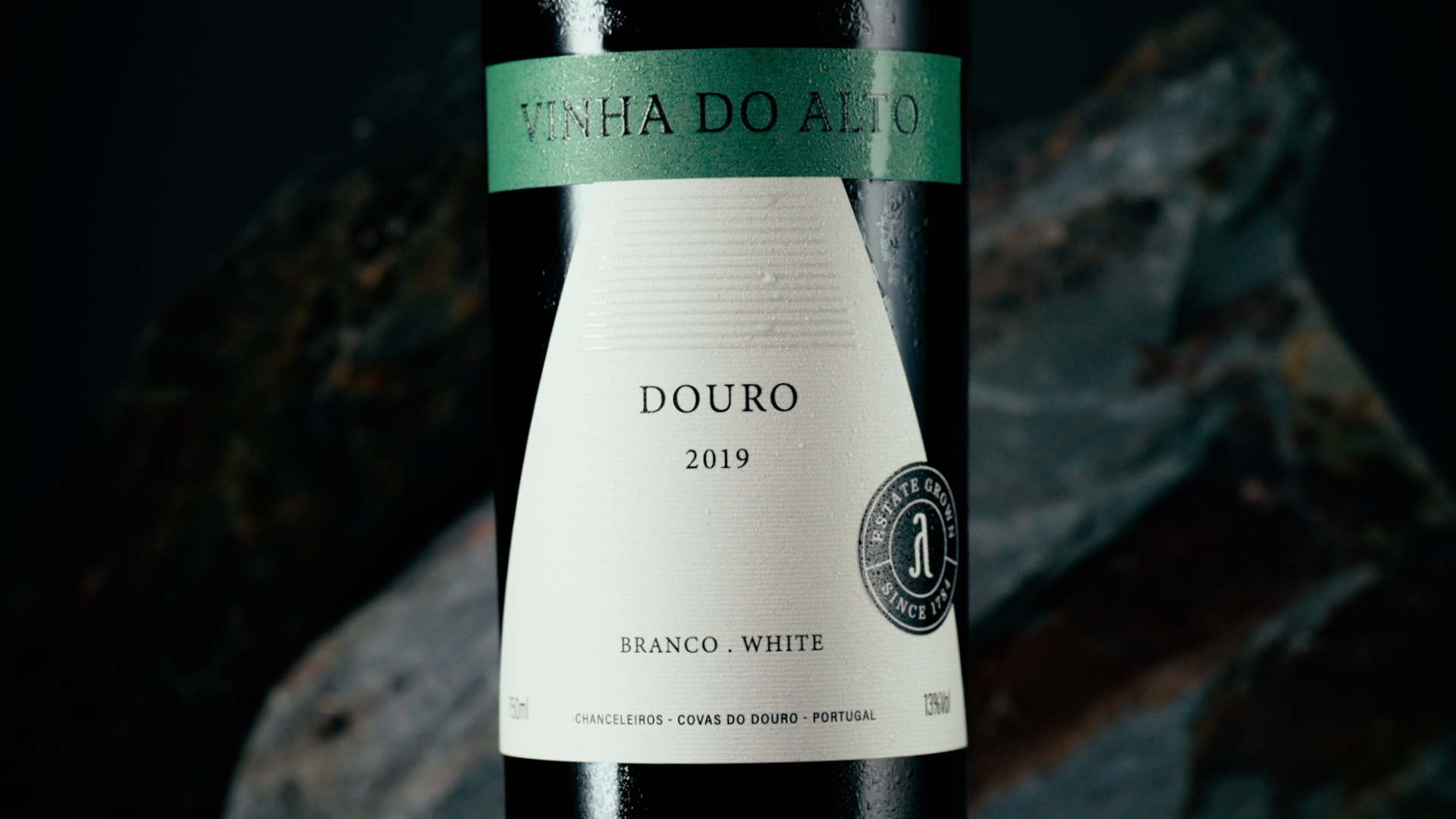
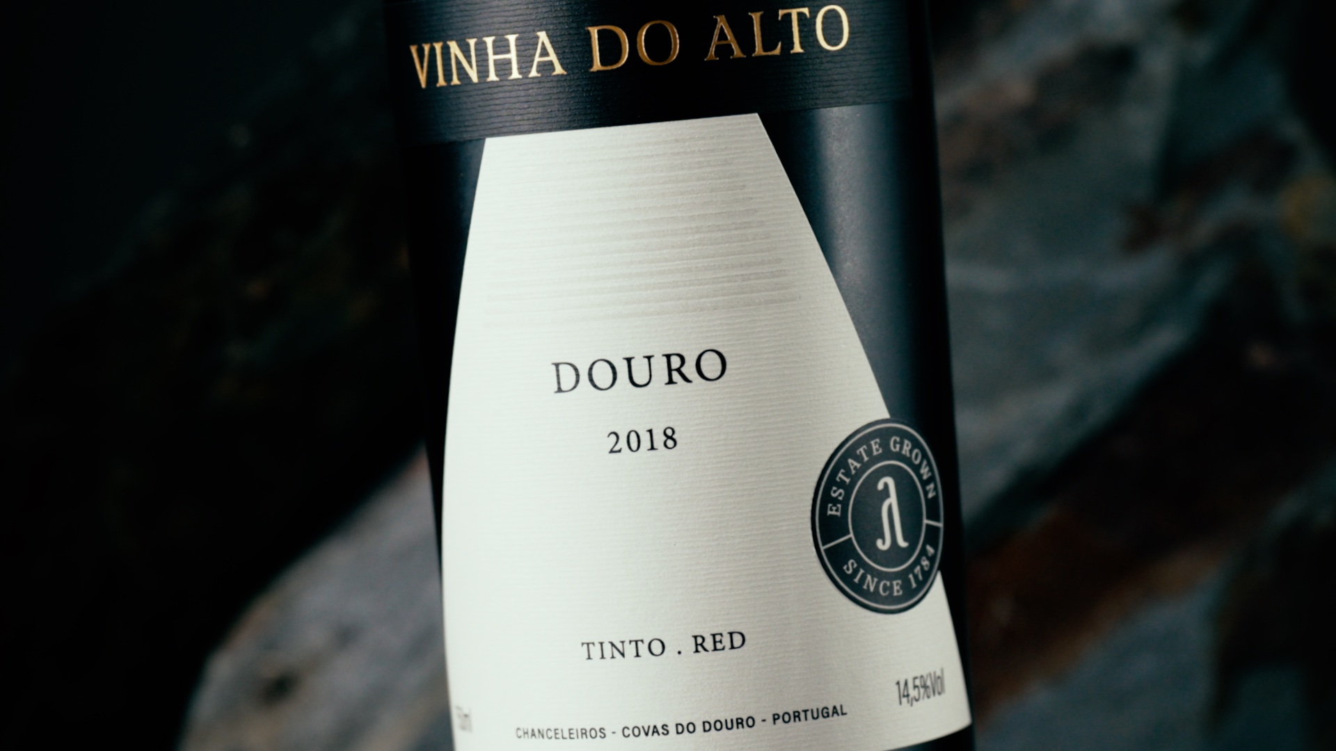
Quinta da Formigosa approached Bisarro Design Studio, a Vila Real-based creative agency, to create packaging designs that would depict the brand’s elegant nature. The design studio used geometric patterns and symbols to highlight the characteristics of the vineyard. Furthermore, the textured paper symbolizes the wine-growing regions adjacent to the Douro River.

“The paper used is Fasson® Alinea Blanc from Avery Dennison, which has a horizontal texture and therefore completes the label design. In the Douro wine-growing region, it is the hillsides flanked by lines of vines that make the landscape unique in the world; this label presents this, symbolically: on the one hand, the textured lines of the paper, the geometry of the triangle that represents the mountain, and the horizontal lines highlighted in uv varnish, on top.

Also, the name of the wine and the seal are highlighted with braille varnish. The highlight on the seal creates the illusion of being a separate element of the label, which gives it more depth.

The label was produced by VOX Artes Gráficas (Canelas, Porto).  

The photos are by Lino Silva and the videos and stills are by André Macedo.”

1

Get the latest packaging design inspiration in your inbox:

Popular designs

Designed by: PepsiCo Design & Innovation
Country: United States

Vinha Do Alto Wine Packaging Design

1
Vinha 1

Designed by:  Bisarro Design Studio | Country: Portugal

UNESCO has announced the area surrounding the Douro River as a classified landscape. The area is known for its vineyards and wineries. One such famous winery is the Quinta da Formigosa. The winery is located in Chanceleiros do Douro to the right of the river.

Quinta da Formigosa is located in Chanceleiros do Douro, on the right bank of the Douro River, and uniquely framed in the UNESCO classified landscape. Among its references is the Vinha do Alto red and the Vinho do Alto white. These wines were developed with the enological consulting of Duplo PR.

These wines are named after the vineyard from which they are born. It is a hillside vineyard, planted at altitude, which overlooks the right bank of the Douro River. From this terroir are born elegant and exuberant wines in the fruit and freshness that surrounds them.”
Vinha Do Alto Wine Packaging Design

The packaging

Quinta da Formigosa approached Bisarro Design Studio, a Vila Real-based creative agency, to create packaging designs that would depict the brand’s elegant nature. The design studio used geometric patterns and symbols to highlight the characteristics of the vineyard. Furthermore, the textured paper symbolizes the wine-growing regions adjacent to the Douro River.

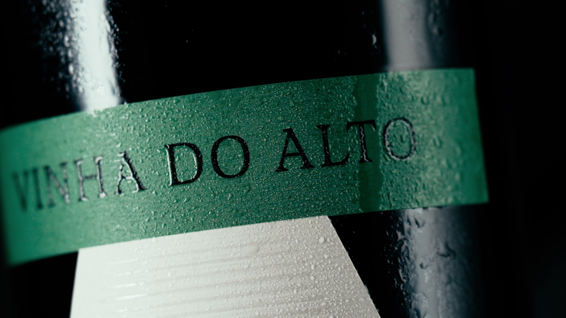
“The paper used is Fasson® Alinea Blanc from Avery Dennison, which has a horizontal texture and therefore completes the label design. In the Douro wine-growing region, it is the hillsides flanked by lines of vines that make the landscape unique in the world; this label presents this, symbolically: on the one hand, the textured lines of the paper, the geometry of the triangle that represents the mountain, and the horizontal lines highlighted in uv varnish, on top.

Also, the name of the wine and the seal are highlighted with braille varnish. The highlight on the seal creates the illusion of being a separate element of the label, which gives it more depth.

The label was produced by VOX Artes Gráficas (Canelas, Porto).  

The photos are by Lino Silva and the videos and stills are by André Macedo.”

https://www.youtube.com/watch?v=flaky4avfKI

1

Explore more great package design

Get the latest on packaging design in your inbox: