Designed by: PepsiCo Design & Innovation
Country: United States

Viscova Vodka

Viscova Vodka

Designed by Sasquatch Agency | Country: United States

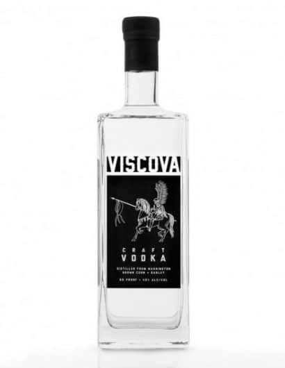
“The Viscova Vodka package is inspired by the renowned Polish Winged Hussars, the elite Polish Calvary unit of the 16th to 18th centuries. The clean black label shows an illustrated image of a proud, mounted winged Hussar with a traditional long lance.

John and Steve Vissotzky, two brothers of Polish descent, founded Double V Distillery in 2009, and make the traditional small batch Viscova Vodka in copper stills in Battle Ground, Wash. The brand name and label graphic pay homage to the ancestral roots of the two brothers.

The label was screen-printed to give the bottle a clean, streamlined aesthetic. The black-on-clear look and unique shape of the bottle were designed to standout on the crowded vodka shelves of liquor and grocery stores.

Sasquatch’s internal team on the project consisted of Creative Director Ben Jenkins, who also served as copywriter, and Senior Design Director Kristin Casaletto, who designed and illustrated the label.”

Get the latest packaging design inspiration in your inbox:

Popular designs

The Bra Guru

Most women are wearing the wrong size bra and that is a fact. The Bra Guru® is the first and only professional

The Port Vodka Lemon Water

Overview: In response to my client’s vision for a Cape Cod themed beverage brand, I embarked on the journey to create The Port

Designed by: PepsiCo Design & Innovation
Country: United States

Viscova Vodka

lovely-package-viscova-vodka

Viscova Vodka

Designed by Sasquatch Agency | Country: United States

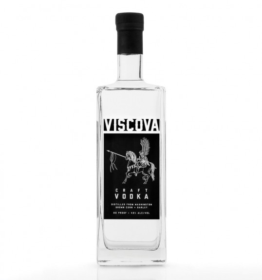
“The Viscova Vodka package is inspired by the renowned Polish Winged Hussars, the elite Polish Calvary unit of the 16th to 18th centuries. The clean black label shows an illustrated image of a proud, mounted winged Hussar with a traditional long lance.

John and Steve Vissotzky, two brothers of Polish descent, founded Double V Distillery in 2009, and make the traditional small batch Viscova Vodka in copper stills in Battle Ground, Wash. The brand name and label graphic pay homage to the ancestral roots of the two brothers.

The label was screen-printed to give the bottle a clean, streamlined aesthetic. The black-on-clear look and unique shape of the bottle were designed to standout on the crowded vodka shelves of liquor and grocery stores.

Sasquatch’s internal team on the project consisted of Creative Director Ben Jenkins, who also served as copywriter, and Senior Design Director Kristin Casaletto, who designed and illustrated the label.”

Explore more great package design

Get the latest on packaging design in your inbox: