Designed by Reynolds and Reyner | Country: Ukraine
“Objective: In 2011 Reynolds and Reyner finished two huge projects redesigning international brands of paints. After that they were asked to develop a new visual identity for a small Finnish company which was planning to enter the U.S. market. Without the past, unlike the majority of existing brands in the segment, but believing in the future, the key to access the market was a package design. “We don’t just need – we must! stand out” – this phrase has become the basis at work on a new brand identity.
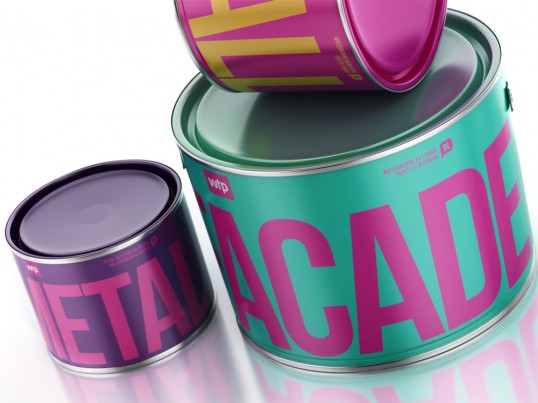
Process: How to create a brand that stands out? We need to find the design solution that hasn’t been used by any of the competitors. At the same time showing the main features of the company – friendliness, quality and innovation. WTP is not just a manufacturer of paints – it’s an assistant, always ready to help, suggest and defend from the hassles and problems. Repairs with WTP is simple, convenient and fast and this is what in it’s simple design.
Results: No doubt, WTP is the most friendly and remarkable brand of paints on the shelf now. WTP has no corporate colors – it have the corporate identity, common for each design element – from business cards to packaging. Every item is bright and memorable combination of colors and objects that all together form whole the entire brand. The next step is to prove that the product is as high quality as its outer shell. But this is another story.”