Designed by: PepsiCo Design & Innovation
Country: United States

Wally

Wally

Designed by Character | Country: United States

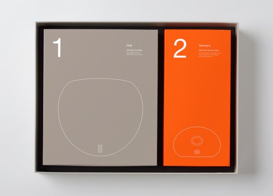
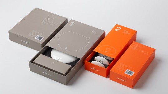
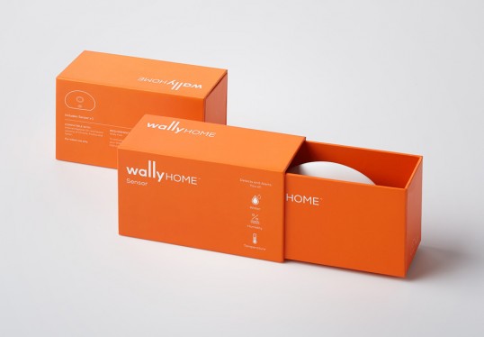
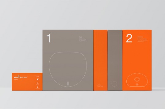
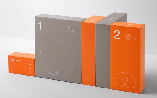
“Wally is a sensor system that detects and alerts homeowners to water leaks and changes in humidity via their mobile device. Character created an identity system that extended across consumer touch points. Branding elements included website, mobile app, and retail packaging.

The new Wally identity needed to establish a sense of trust and warmth. Consumers needed to feel assured that this is a product that they could rely on to protect their homes. By extending the two ‘L’s in Wally, Character crafted a logotype that subtly yet playfully represented the way the sensors communicate with the main hub via wiring in the walls.”

Wally

Wally

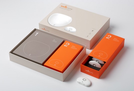
“Character designed simple line illustration and info graphics to illustrate the ease of use of the product. Designed for flexibility, the packaging system accommodates various separate elements and the starter kit. The structural elements and unboxing experience highlight the simplicity of the setup process.”

Wally

Wally

Wally


Get the latest packaging design inspiration in your inbox:

Popular designs

Over the wave

This Kombucha originates in Lombok, Indonesia, where its paradise beaches attract hundreds of surfers eager to ride the waves. When you surf,

The Bra Guru

Most women are wearing the wrong size bra and that is a fact. The Bra Guru® is the first and only professional

The Port Vodka Lemon Water

Overview: In response to my client’s vision for a Cape Cod themed beverage brand, I embarked on the journey to create The Port

Designed by: PepsiCo Design & Innovation
Country: United States

Wally

lovely-package-wally-1

Wally

Designed by Character | Country: United States

“Wally is a sensor system that detects and alerts homeowners to water leaks and changes in humidity via their mobile device. Character created an identity system that extended across consumer touch points. Branding elements included website, mobile app, and retail packaging.

The new Wally identity needed to establish a sense of trust and warmth. Consumers needed to feel assured that this is a product that they could rely on to protect their homes. By extending the two ‘L’s in Wally, Character crafted a logotype that subtly yet playfully represented the way the sensors communicate with the main hub via wiring in the walls.”

Wally

Wally

“Character designed simple line illustration and info graphics to illustrate the ease of use of the product. Designed for flexibility, the packaging system accommodates various separate elements and the starter kit. The structural elements and unboxing experience highlight the simplicity of the setup process.”
Wally

Wally

Wally


Previous slide
Next slide

Explore more great package design

Get the latest on packaging design in your inbox: