Designed by: PepsiCo Design & Innovation
Country: United States

Whistler’s Storm Combines The Best Of Two Worlds: Tea And Alcohol

Designed By Sand Creative | Country: United Kingdom

We’ve all heard stories from our parents and grandparents about how people from earlier generations would experiment with various recipes to create something new and unique. The world has moved on at an accelerated speed from the world our grandparents lived. However, our appetite for experimenting with food and drinks has only increased. The latest experiment comes from master brewer Whistler’s Storm.

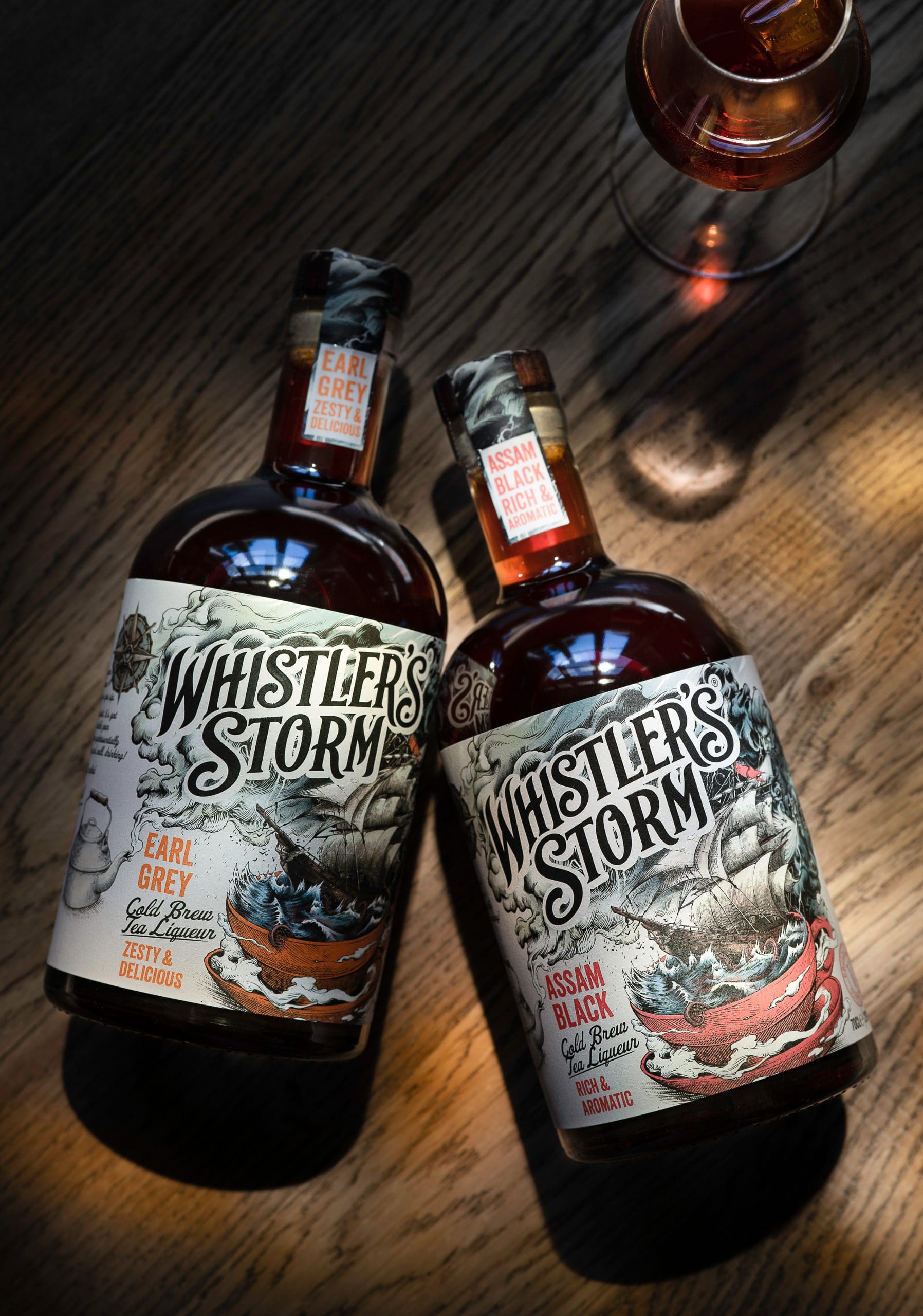
The latest alcoholic tea drink, Whistler’s Storm, has combined Earl Grey and Assam Black to provide the consumers with a unique drinking experience. The master brewers use the best quality tea leaves to craft the alcoholic brew. Only select tea leaves, which are organic and free of harmful elements, make it to the brewery.
Whistler’s Storm Combines The Best Of Two Worlds: Tea And Alcohol

Whistler’s Storm Combines The Best Of Two Worlds: Tea And Alcohol

Whistler’s Storm Combines The Best Of Two Worlds: Tea And Alcohol

Whistler’s Storm Combines The Best Of Two Worlds: Tea And Alcohol

Whistler’s Storm Combines The Best Of Two Worlds: Tea And Alcohol

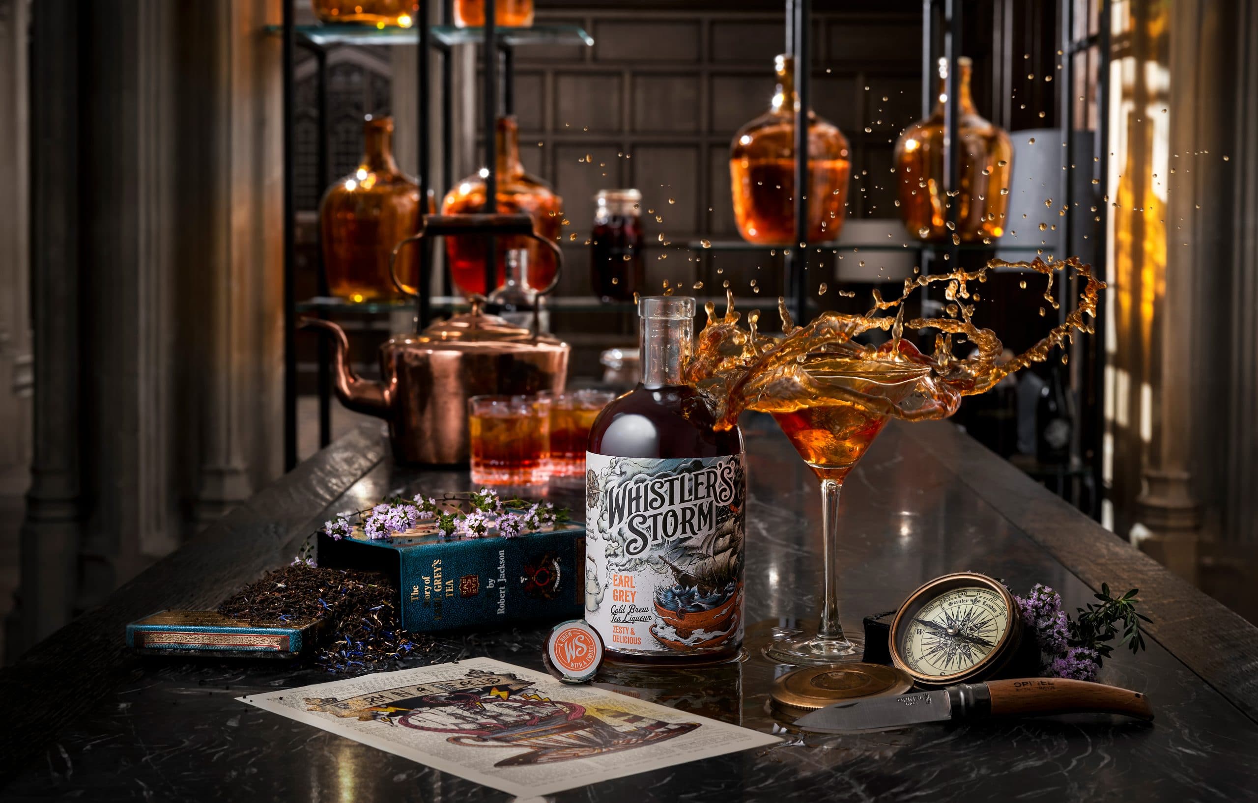
Whistler’s Storm is a refreshing drink and is both gluten-free and vegan friendly. The alcohol-infused tea can be enjoyed in varied ways: one may use it to prepare cocktails or gulp it up on the rocks.

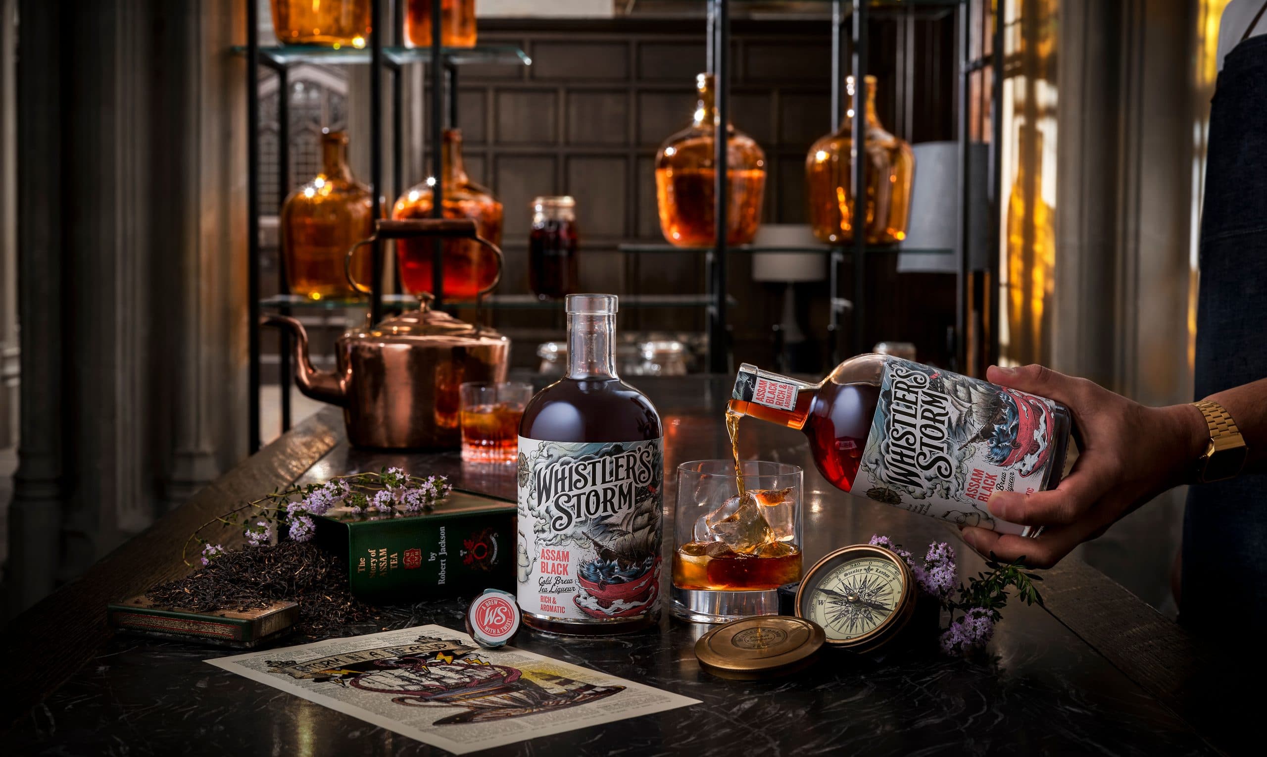
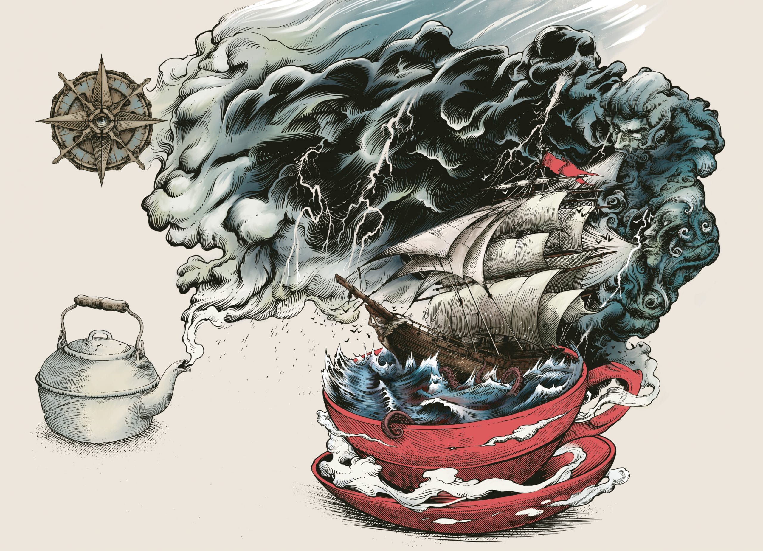
Whistler’ Storm approached Sand Creative to create an effective design: something that would attract the customers easily. The inspiration was right there in front of their very eyes in the form of the brand name, Whistler’s Storm. Sand Creative used the name as an inspiration to work up a “Storm in a teacup.”

The illustration on the label is very impactful. The visual showcases a kettle with steam coming out of it, which shapeshifts into a raging storm over a sea, contained in a teacup.

Premium uncoated paper has been used to print the label. While retro-style color combinations have been used for the illustration, they have a modern look and feel.

Get the latest packaging design inspiration in your inbox:

Popular designs

Far Out Bar

Description: Far Out Bar is a cutting-edge packaging design project created for High Life Farms’ macrodose THC chocolate bars. This project involved

Pure Persian Honey

When we look closely at honey packaging, they are almost all in the usual format, and the ultimate in creativity is that

Designed by: PepsiCo Design & Innovation
Country: United States

Whistler’s Storm Combines The Best Of Two Worlds: Tea And Alcohol

Designed By Sand Creative | Country: United Kingdom

We’ve all heard stories from our parents and grandparents about how people from earlier generations would experiment with various recipes to create something new and unique. The world has moved on at an accelerated speed from the world our grandparents lived. However, our appetite for experimenting with food and drinks has only increased. The latest experiment comes from master brewer Whistler’s Storm.

The latest alcoholic tea drink, Whistler’s Storm, has combined Earl Grey and Assam Black to provide the consumers with a unique drinking experience. The master brewers use the best quality tea leaves to craft the alcoholic brew. Only select tea leaves, which are organic and free of harmful elements, make it to the brewery.
Whistler’s Storm Combines The Best Of Two Worlds: Tea And Alcohol

Whistler’s Storm Combines The Best Of Two Worlds: Tea And Alcohol

Whistler’s Storm Combines The Best Of Two Worlds: Tea And Alcohol

Whistler’s Storm Combines The Best Of Two Worlds: Tea And Alcohol

Whistler’s Storm Combines The Best Of Two Worlds: Tea And Alcohol

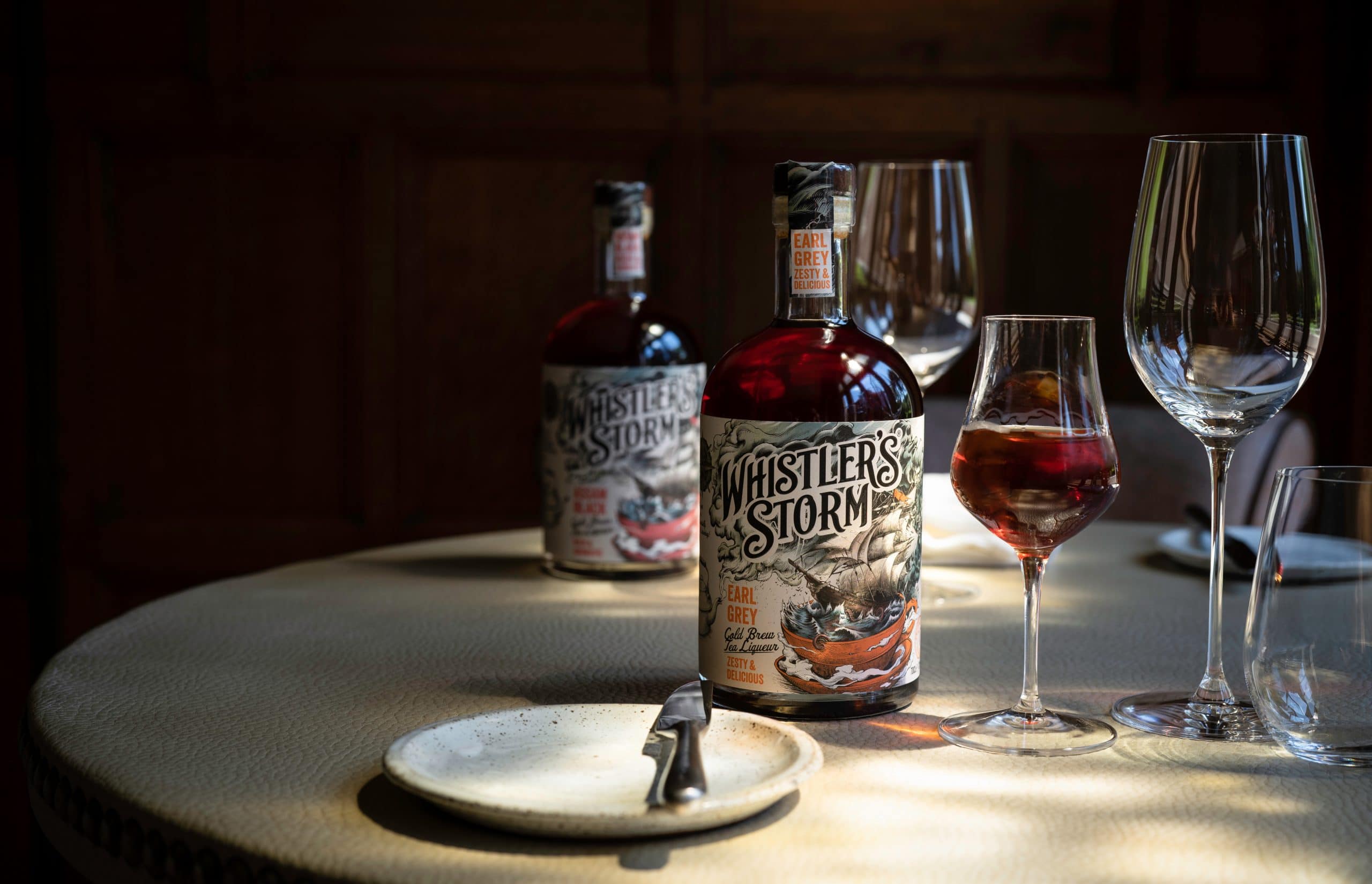
Whistler’s Storm is a refreshing drink and is both gluten-free and vegan friendly. The alcohol-infused tea can be enjoyed in varied ways: one may use it to prepare cocktails or gulp it up on the rocks.

Whistler’ Storm approached Sand Creative to create an effective design: something that would attract the customers easily. The inspiration was right there in front of their very eyes in the form of the brand name, Whistler’s Storm. Sand Creative used the name as an inspiration to work up a “Storm in a teacup.”

The illustration on the label is very impactful. The visual showcases a kettle with steam coming out of it, which shapeshifts into a raging storm over a sea, contained in a teacup.

Premium uncoated paper has been used to print the label. While retro-style color combinations have been used for the illustration, they have a modern look and feel.

Previous slide
Next slide
Get the latest on packaging design in your inbox: