Designed by: PepsiCo Design & Innovation
Country: United States

Wow Coffee Branding And Packaging Design

Designed by: Palma Design Studio  | Country: Portugal

Wow, the Portugal-based coffee roaster, believes that “the coffee producers are the real protagonists” when it comes to creating the experience of specialty coffee for the customers. Keeping the passion and dedication of the coffee producers in mind, Wow is working on building a strong relationship with coffee growers from different parts of the world.

Before the rebranding, Wow was previously designed to be young, “pop” and playful as a way of trying to speak to a general audience. The outcome was a bold design with many colors and Aztec patterns. And after the rebranding, Wow’s products reached a high standard of 92 points (SCA), ready for Professional Barista Competitions, by this way opening doors into Michelin Star restaurants, which started a channel to luxury targets.”
Wow Coffee Branding And Packaging Design

The packaging

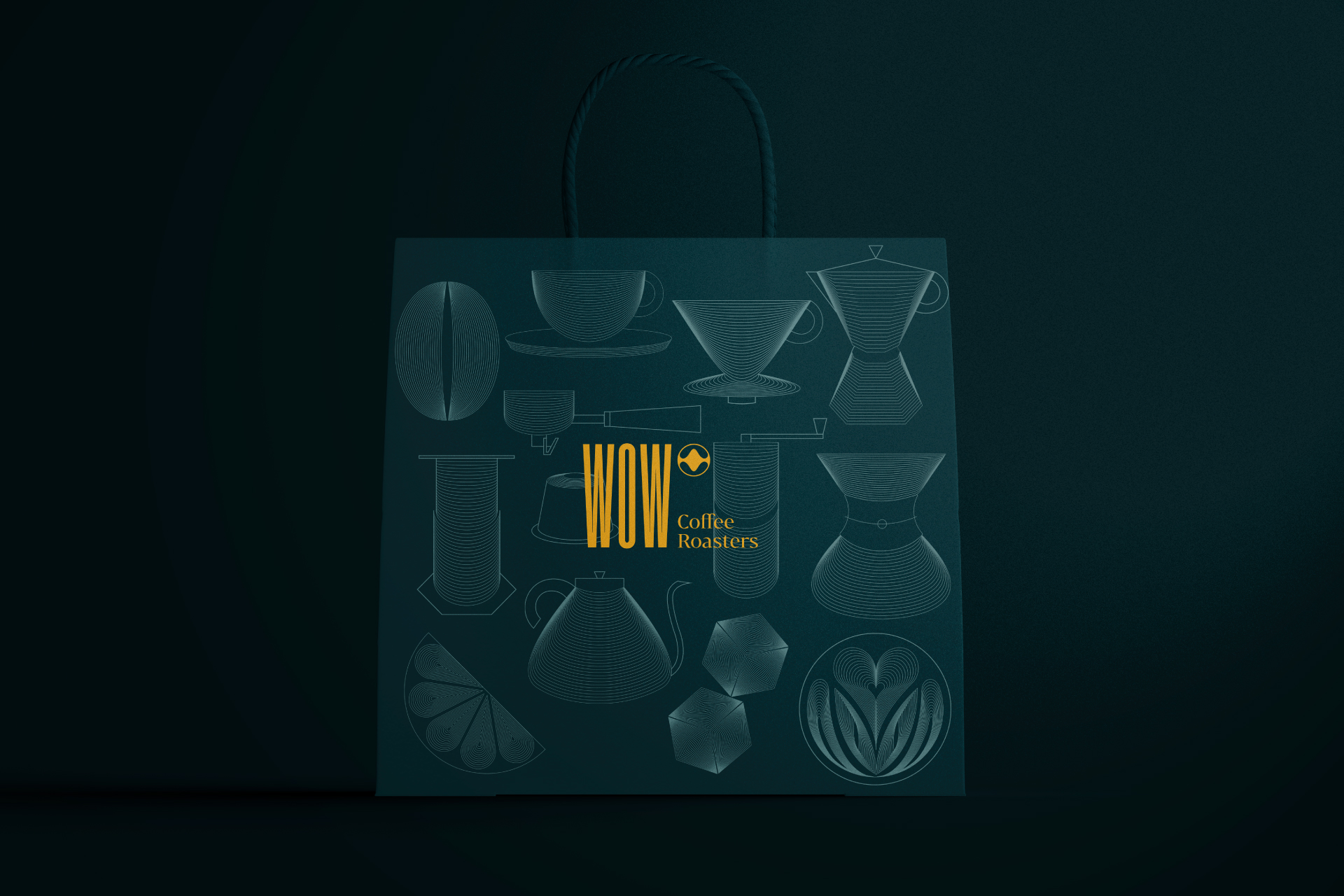
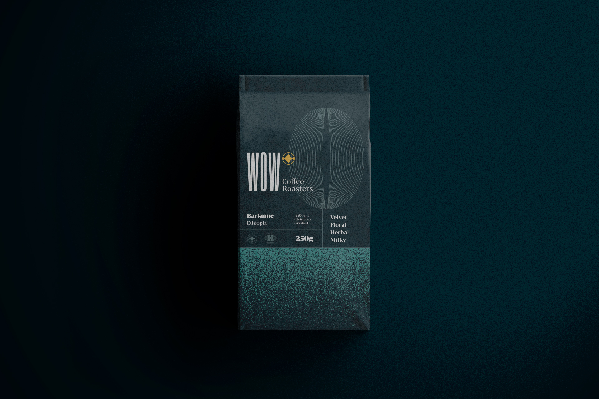
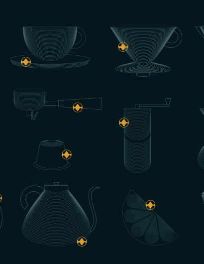
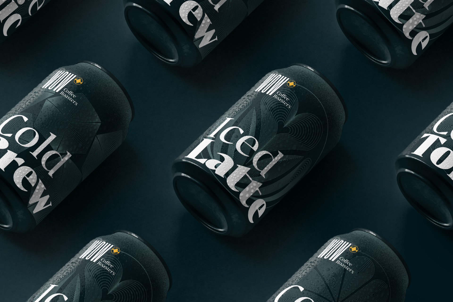
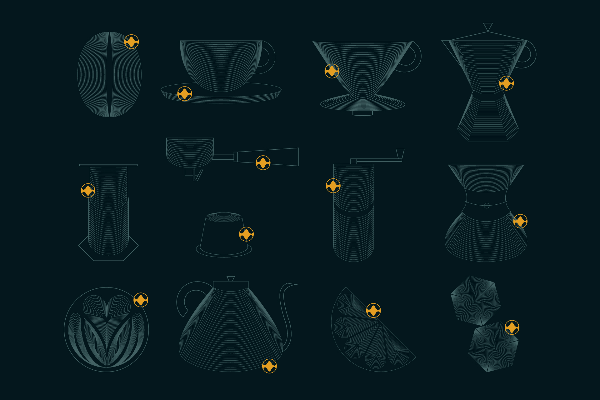
One of the highlights of the packaging design is the use of literal and abstract illustrations. The design concept was inspired by the taste and smell experienced during coffee testing. Palma Design Studio, the Lisbon-based creative agency, used the concept for the branding and packaging design.

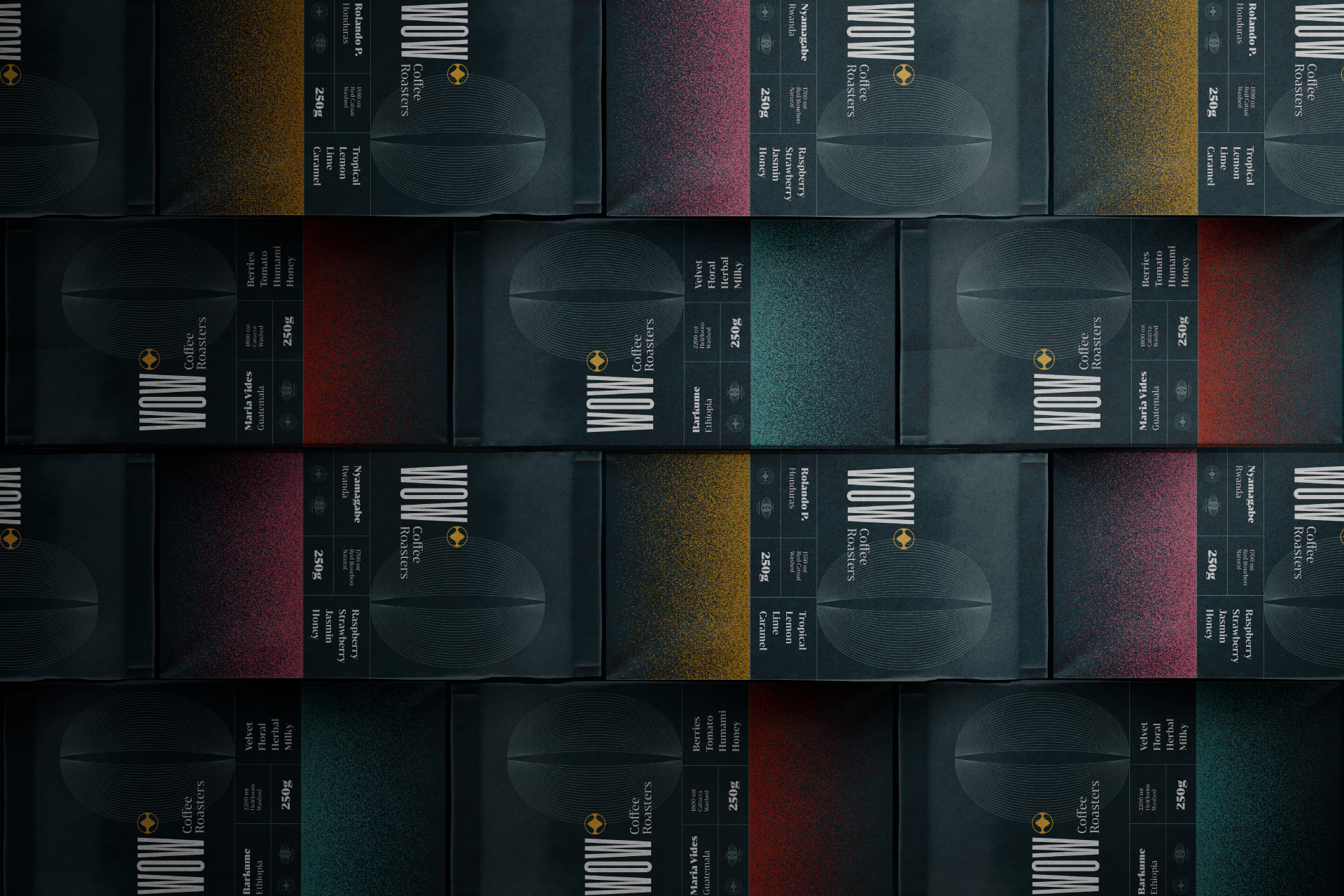
“The main concept is based on the journey of taste and smell in the experience during a coffee tasting. This journey is represented as a Wave. It comes and goes, evolving in a fluid complexity along the mouth, represented in the icon and illustrations throughout the brand. The textures used are graphic representations of ground coffee, followed by the color variations picturing the many aromatic compounds present in a coffee bean.”

Get the latest packaging design inspiration in your inbox:

Popular designs

The Bra Guru

Most women are wearing the wrong size bra and that is a fact. The Bra Guru® is the first and only professional

Far Out Bar

Description: Far Out Bar is a cutting-edge packaging design project created for High Life Farms’ macrodose THC chocolate bars. This project involved

Over the wave

This Kombucha originates in Lombok, Indonesia, where its paradise beaches attract hundreds of surfers eager to ride the waves. When you surf,

Designed by: PepsiCo Design & Innovation
Country: United States

Wow Coffee Branding And Packaging Design

wow_presentation_6

Designed by: Palma Design Studio  | Country: Portugal

Wow, the Portugal-based coffee roaster, believes that “the coffee producers are the real protagonists” when it comes to creating the experience of specialty coffee for the customers. Keeping the passion and dedication of the coffee producers in mind, Wow is working on building a strong relationship with coffee growers from different parts of the world.

Before the rebranding, Wow was previously designed to be young, “pop” and playful as a way of trying to speak to a general audience. The outcome was a bold design with many colors and Aztec patterns. And after the rebranding, Wow’s products reached a high standard of 92 points (SCA), ready for Professional Barista Competitions, by this way opening doors into Michelin Star restaurants, which started a channel to luxury targets.”
Wow Coffee Branding And Packaging Design

The packaging

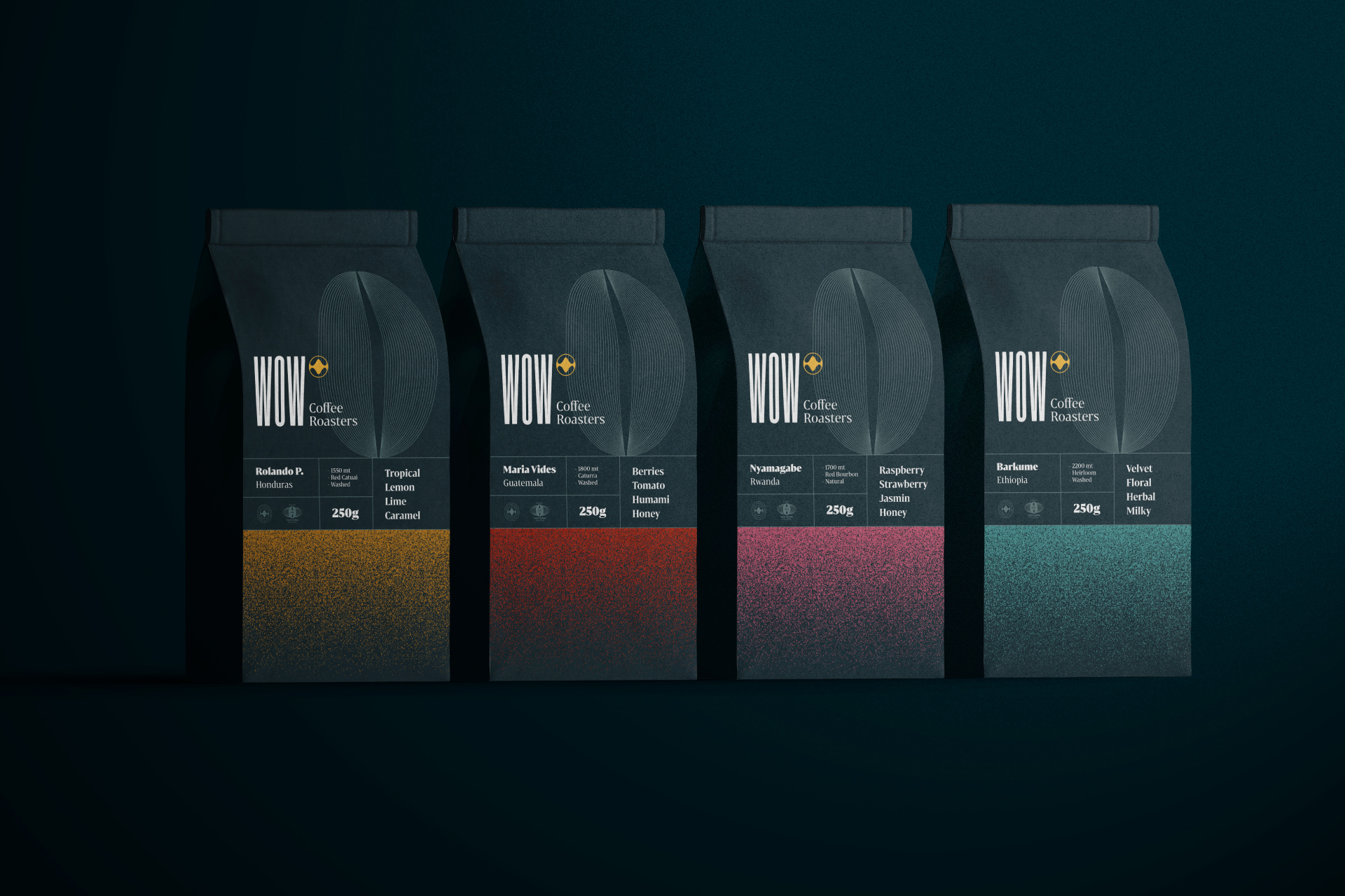
One of the highlights of the packaging design is the use of literal and abstract illustrations. The design concept was inspired by the taste and smell experienced during coffee testing. Palma Design Studio, the Lisbon-based creative agency, used the concept for the branding and packaging design.

“The main concept is based on the journey of taste and smell in the experience during a coffee tasting. This journey is represented as a Wave. It comes and goes, evolving in a fluid complexity along the mouth, represented in the icon and illustrations throughout the brand. The textures used are graphic representations of ground coffee, followed by the color variations picturing the many aromatic compounds present in a coffee bean.”

Previous slide
Next slide

Explore more great package design

Get the latest on packaging design in your inbox: