Designed by Pearlfisher | Country: United Kingdom
“Pearlfisher has created the brand identity, tone of voice and name for Wyld Wood Premium Organic cider from Westons Cider. Westons Wyld Wood is the new brand name for Westons Premium Organic cider. Made from organic apples and pears, Wlyd Wood is a delicious premium organic cider. The new name emphasises the cider’s organic and natural quality and references the orchards in which the apples and pears are grown. The name helps to draw the consumer into the brand’s provenance and the ‘Y’ in ‘Wyld’ is a reference to the Wye Valley, which is at the heat of the cider industry.
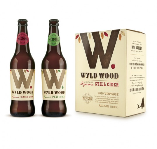
The new brand identity is a bold and iconic mark with an organic essence that creates brand stand out on shelf and behind the bar. The ‘W’ logotype creates a symbolic representation of two tree trunks. The piece of fruit next to the ‘W’ indicates flavour and also suggests the way the fruit naturally falls from the trees. The colour of the leaves further works to differentiate the flavour of the cider, with red leaves for classic and green leaves for pear. The ‘W’ logotype also works to differentiate between still and sparkling cider, with a dark brown for vintage still and a metallic gold for sparkling. The premium quality of the cider is represented with a foil gilding to further promote the specialness of the product.
Pearlfisher Creative Director Natalie Chung, comments, “ The new identity is bold, allowing Wyld Wood to stand proud on shelf next to other cider brands. The name and design emphasises the brand’s organic and premium quality but also connects with the core brand truth and provenance rather than relying on stereotypical organic cues.”