


Designed by: YNL DESIGN
Art Direction & Design : Liz Yoona Lee
Brand Design : SoHee Kim, Minji Seo, Kwangsu Shin, Eunah Kim
Country: South Korea
THE CLIENT
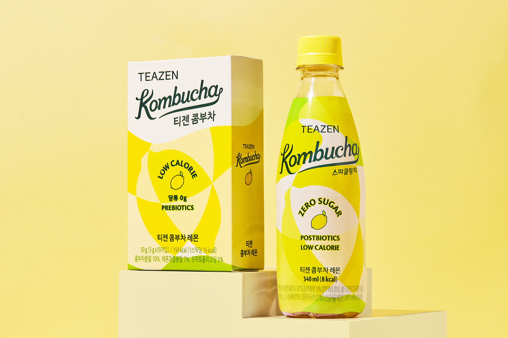
TEAZEN, a tea specialty company dedicated to promoting a vibrant and health-conscious lifestyle centered around tea, has introduced a highly popular stick drink brand called Kombucha, boasting a market share of 7-80%. Renowned for its commitment to health, TEAZEN Kombucha has carved a niche as a nutritious beverage by reducing sugar and calories while incorporating probiotics. They also offer Ready-To-Drink (RTD) products designed for the convenience of those leading busy lives.
THE OBJECTIVE
In its pursuit to cater to diverse customer preferences and establish itself as the next-generation tea leader, TEAZEN Kombucha enlists YNL Design to create a brand concept rooted in the emerging Kombucha Culture. This involves crafting an iconic Brand Identity (BI) and artistic graphic motifs that resonate with the MZ generation. Recognizing that the existing TEAZEN Kombucha brand had been overly reliant on models, YNL Design seeks to redefine the brand’s identity, shifting the focus from models to the product’s unique features. Their aim is to develop a robust BI that captures the attention of the young MZ generation, not just as consumers of Kombucha but as individuals with distinct personalities, fostering an Instagram-worthy and alluring drink culture.


THE SOLUTION
YNL Design harnesses the ‘Kombucha Culture’ concept to create a BI and graphic motif characterized by a free-spirited and artistic pop-art aesthetic. These design elements exude a creative and distinctive essence that sets TEAZEN Kombucha apart in the competitive beverage market. The strategy is to elevate TEAZEN Kombucha into a trendy and widely appealing brand. The ‘Kombucha Culture’ BI takes the form of a logo with an exuberant and artistic flair, perfectly aligning with TEAZEN Kombucha’s vision for the MZ generation, projecting a contemporary and stylish image.
THE GRAPHIC MOTIF
The graphic motif reimagines fruit shapes with elegant curves, visually symbolizing the fresh and sweet flavors of TEAZEN Kombucha, conveying a rejuvenating and lively experience. YNL Design also extends its creativity to package designs for TEAZEN Kombucha’s five flavors. These designs incorporate a vibrant color scheme that intuitively connects with each flavor, visually articulating the vivacious and spirited drinking culture of the MZ generation. Furthermore, a systematic package family system has been established, considering future scalability for additional flavor expansions.


