Designed by: PepsiCo Design & Innovation
Country: United States

Zena Syrah Rosé Wine Packaging Design

Designed by: Holy Studio | Country: Brazil

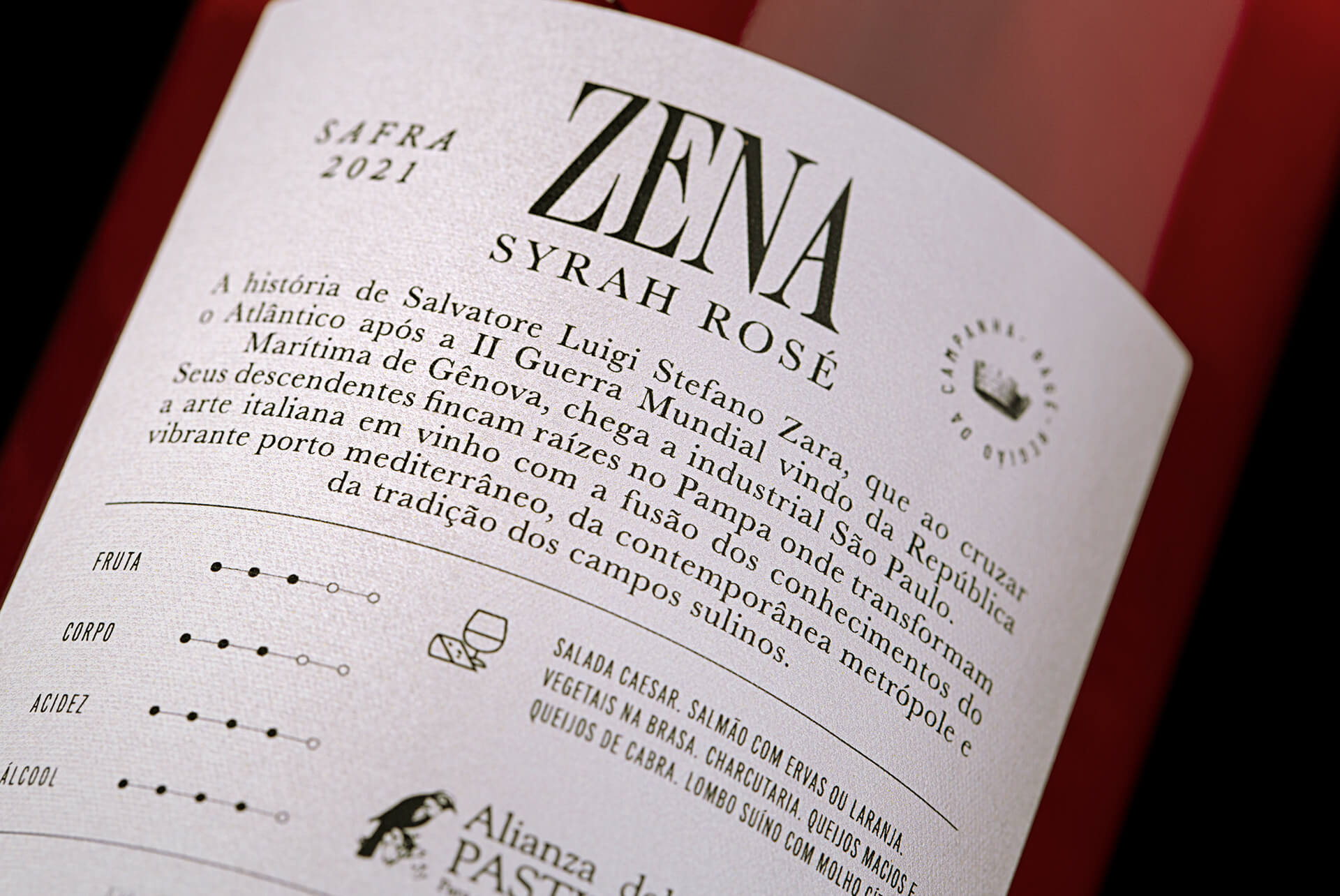
Zena Syrah Rosé Wine is a fitting tribute to the rich legacy of the Zara family. The brand traces its roots to a time when Salvatore Luigi Stefano Zara arrived in the industrial city of São Paulo, Brazil from the Maritime Republic of Genoa after World War II.

Estancia Paraizo wines are popular because their labels depict legends of the region dating back a couple of centuries.

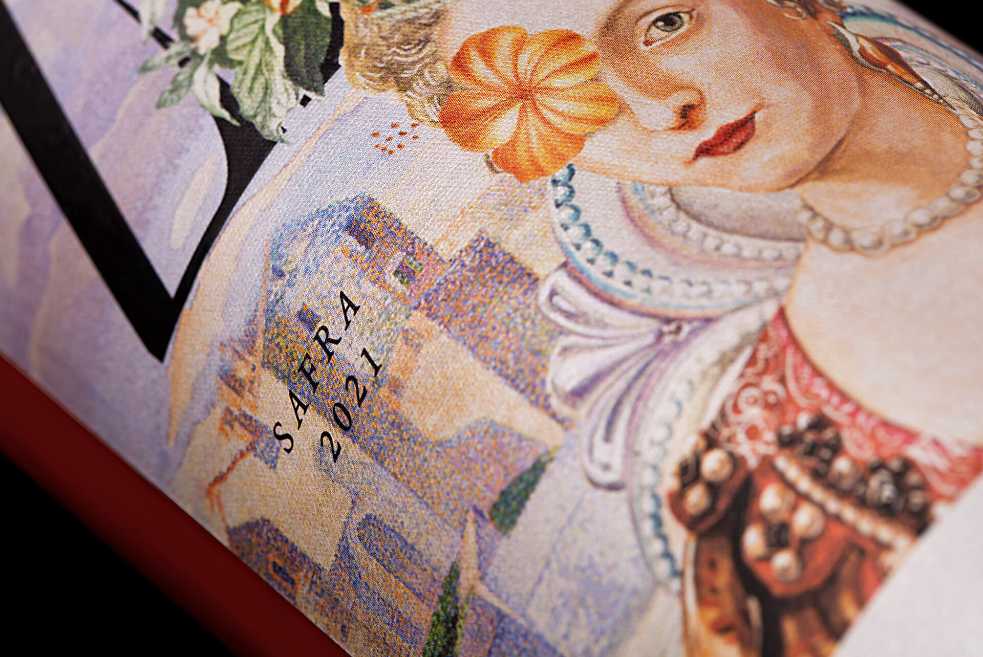
“…This time would be no different. His descendants put down roots in the Pampa Gaucho where they transform Italian art into wine with the fusion of the knowledge of the vibrant Mediterranean port, the contemporary metropolis and the tradition of the southern countryside, a colorful and inviting tribute to the matriarch of the family, here personified in a queen that symbolizes the victory of crossing the sea.

Zena Syrah Rosé Wine Packaging Design

The packaging

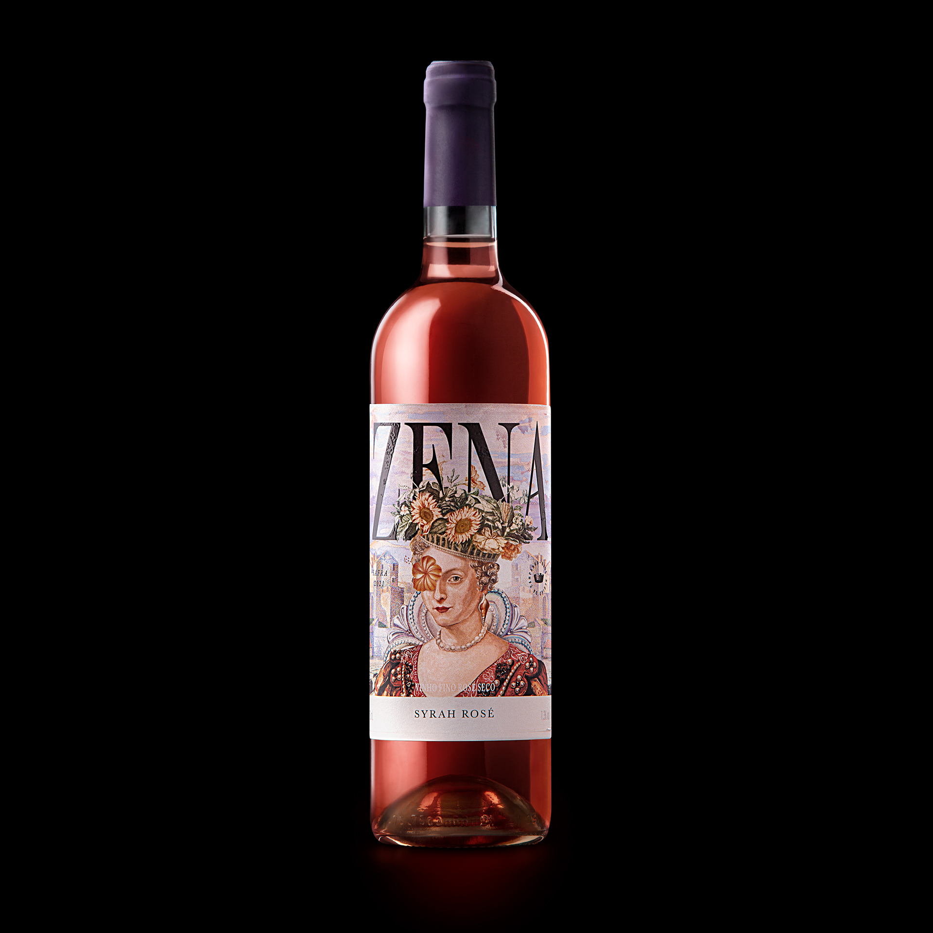
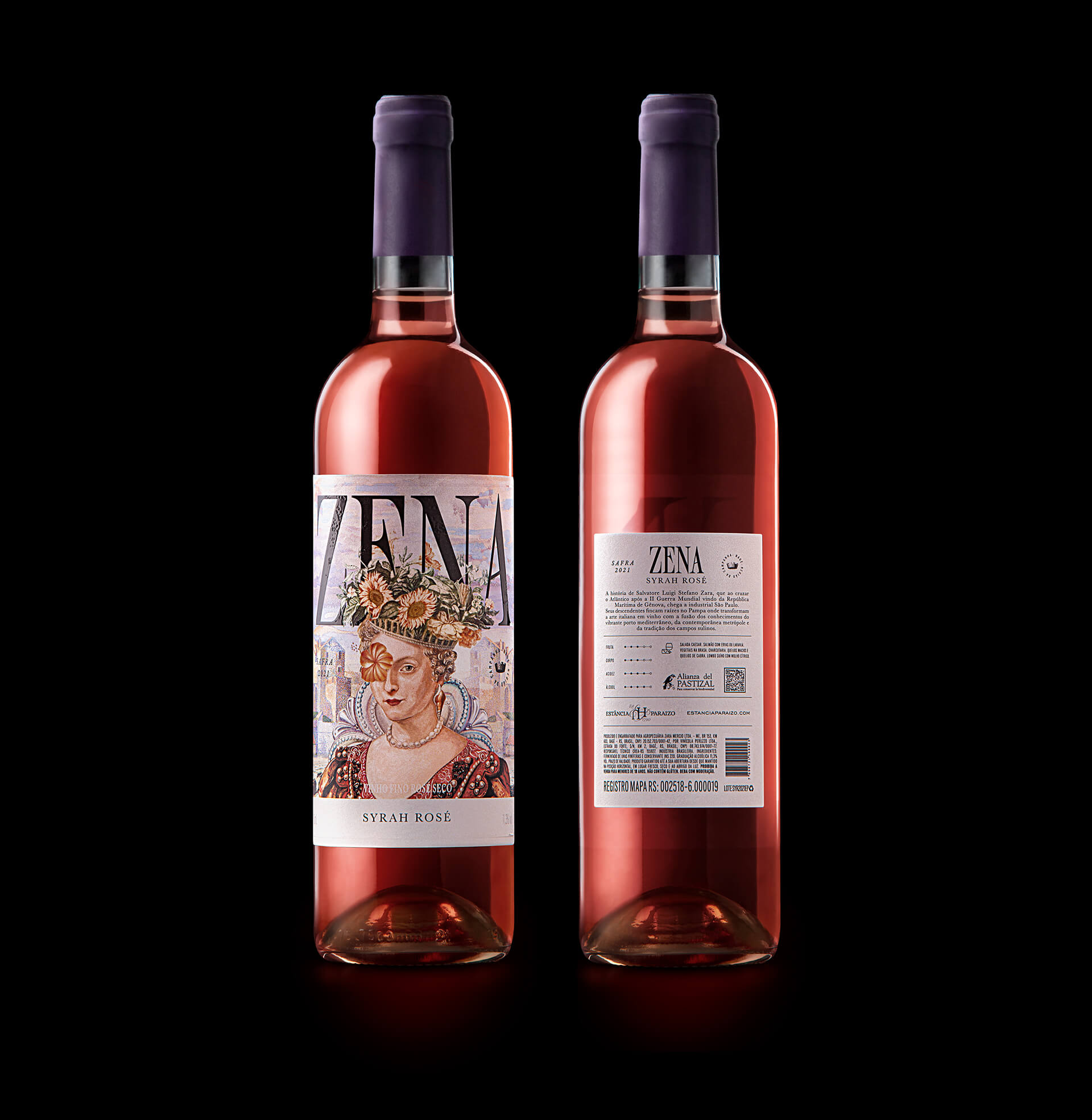
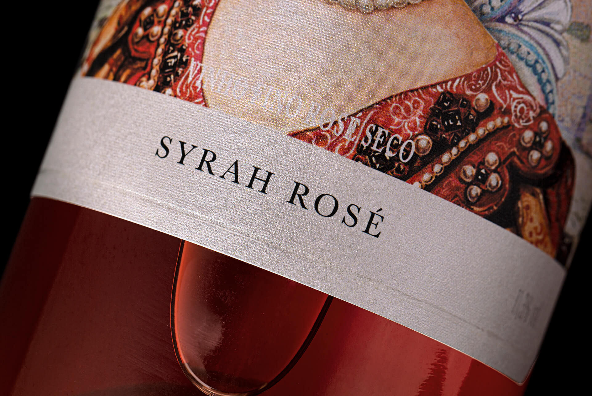
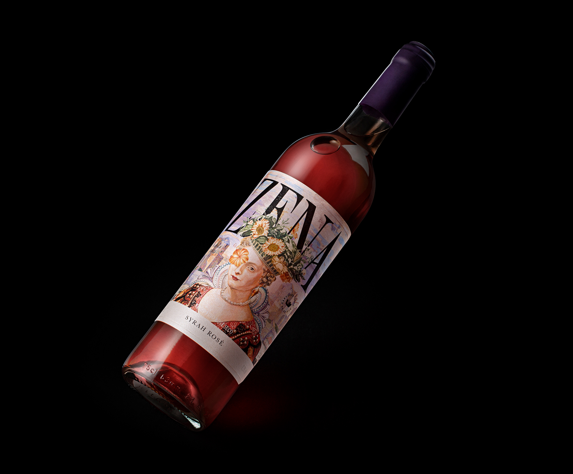
The wine brand partnered with the Porto Alegre-based design agency, Holy Studio, to create a packaging design that reveals the joy of crossing the sea. The colorful packaging design oozes sophistication and grace.

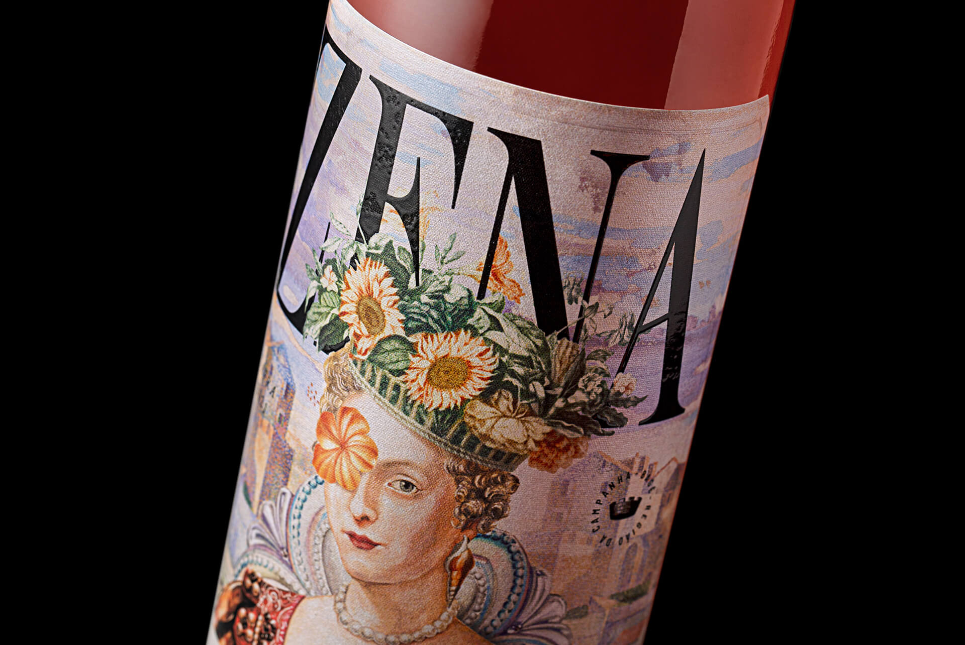
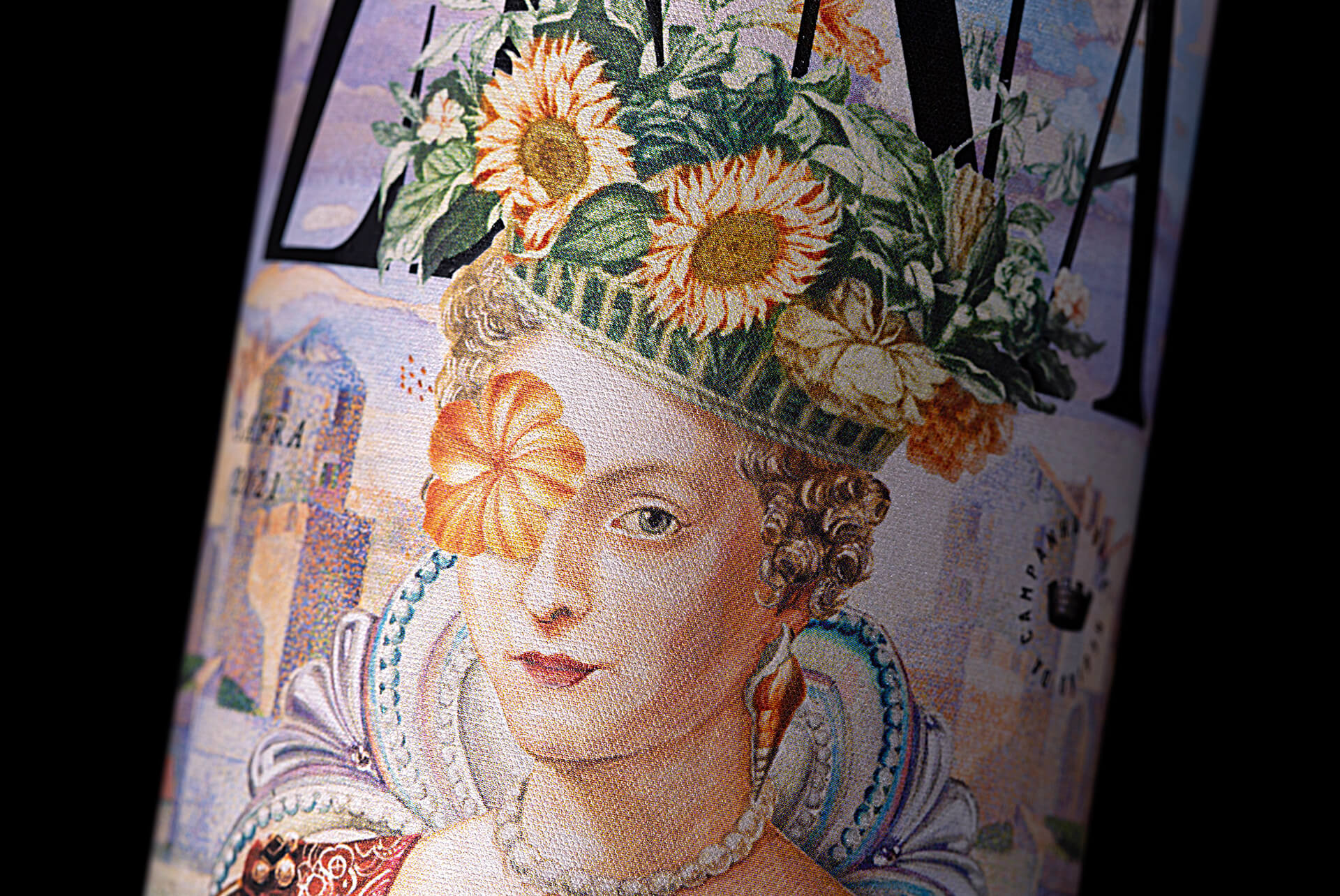
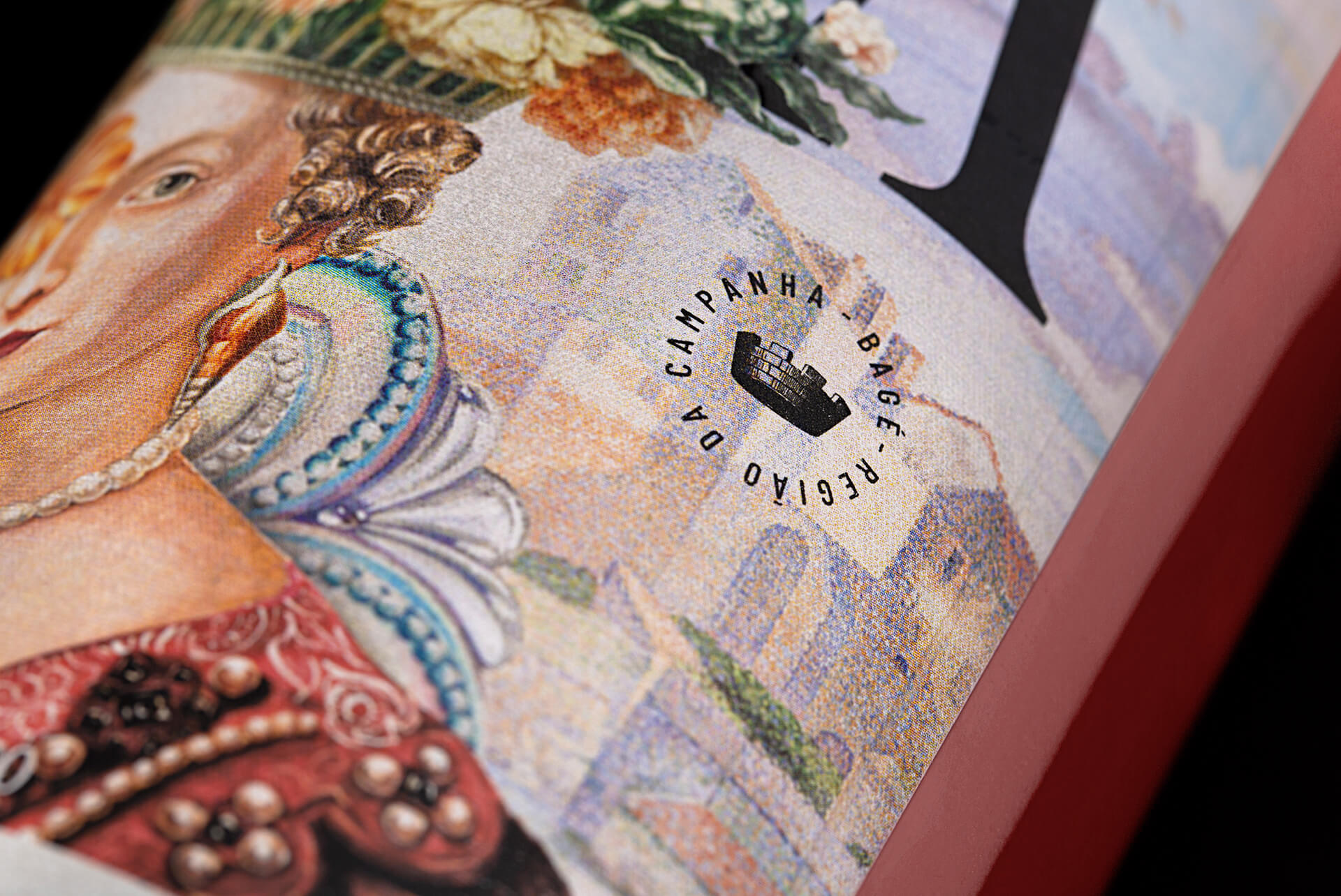
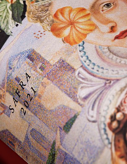
“A label that offers light, refreshing and relaxed moments without losing elegance and quality. Anchored in a fantastical and colorful historical context, the texture and graphic style of the label seek to refer to the region of Italy, as if on a canvas.

Marine details such as shells, pearls and twilight colors inspired by different artistic techniques such as watercolors and frescoes, create the illusion that the wine is, in fact, a work of art portrayed through the ages.”


Get the latest packaging design inspiration in your inbox:

Popular designs

Laphroaig’s Wellington Boot-Inspired Gift Packaging Design

Laphroaig leverages story-telling to engage new drinkers, transforming the iconic green wellies into a giftable, reusable packaging for their single malt whisky. The wellie-inspired design disrupts traditional Scotch packaging, adding a playful touch to the brand’s history.

Designed by: PepsiCo Design & Innovation
Country: United States

Zena Syrah Rosé Wine Packaging Design

HOL_ZENA_6

Designed by: Holy Studio | Country: Brazil

Zena Syrah Rosé Wine is a fitting tribute to the rich legacy of the Zara family. The brand traces its roots to a time when Salvatore Luigi Stefano Zara arrived in the industrial city of São Paulo, Brazil from the Maritime Republic of Genoa after World War II.

Estancia Paraizo wines are popular because their labels depict legends of the region dating back a couple of centuries.

“…This time would be no different. His descendants put down roots in the Pampa Gaucho where they transform Italian art into wine with the fusion of the knowledge of the vibrant Mediterranean port, the contemporary metropolis and the tradition of the southern countryside, a colorful and inviting tribute to the matriarch of the family, here personified in a queen that symbolizes the victory of crossing the sea.

Zena Syrah Rosé Wine Packaging Design

The packaging

The wine brand partnered with the Porto Alegre-based design agency, Holy Studio, to create a packaging design that reveals the joy of crossing the sea. The colorful packaging design oozes sophistication and grace.

“A label that offers light, refreshing and relaxed moments without losing elegance and quality. Anchored in a fantastical and colorful historical context, the texture and graphic style of the label seek to refer to the region of Italy, as if on a canvas.

Marine details such as shells, pearls and twilight colors inspired by different artistic techniques such as watercolors and frescoes, create the illusion that the wine is, in fact, a work of art portrayed through the ages.”

Previous slide
Next slide
Get the latest on packaging design in your inbox: