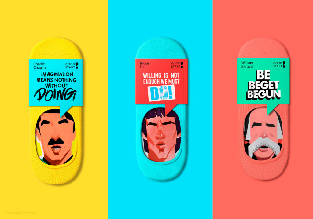
Discover 'Good Start', a new sock brand designed to motivate. Each pack contains seven pairs of socks, each adorned with motivational quotes from famous personalities, intended
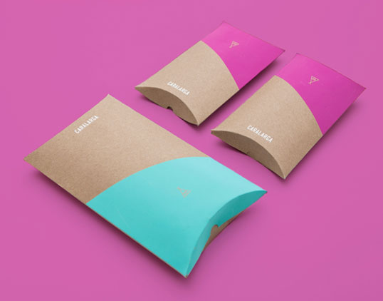
Designed by Sociedad Anónima | Country: Mexico “Caralarga is a Mexican jewelry design firm. This project included the creation of visual identity and the design of
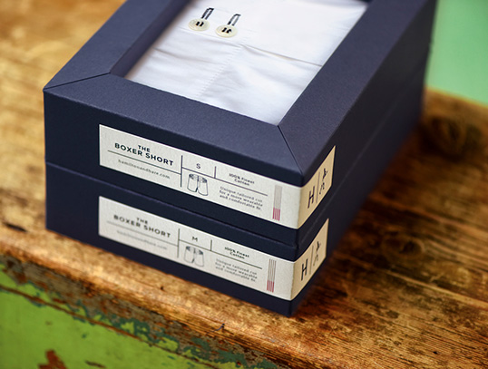
Designed by Design Bridge | Country: United Kingdom “Hamilton and Hare was launched in London in 2012. Inspired by the original boxing short, worn in the
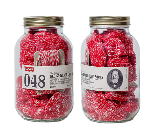
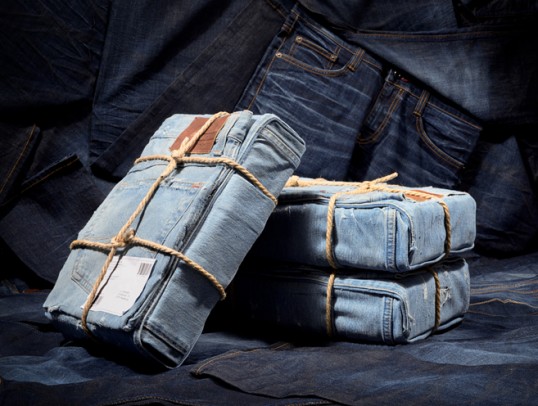
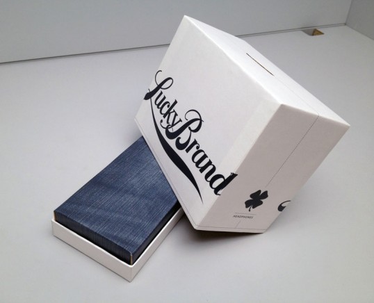
Designed by Mad Projects | Country: Unites States “To launch Levi’s Basics, the brand’s new line of men’s socks, t-shirts and underwear, Mad Projects (the licensee
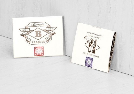
Designed by KNOCK Inc. | Country: United States “This entrepreneur launched his business offering high-quality shoelaces; when it came time to expand his line, he needed
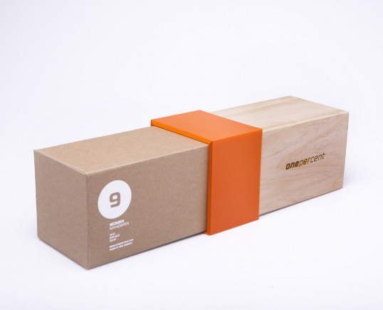
Designed by Ryan Romanes | Country: New Zealand “Collectively 8 people were involved in the production of these boxes. Main contributors included a carpenter, digital printers,
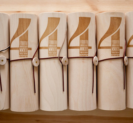
Designed by Jeff Sheldon | Country: United States “To celebrate 4 years of Ugmonk we created a special Limited Edition 4th Anniversary Set featuring a custom
Designed by Mark Kaiser & Annie Lenon | Country: United States “Early proto-types for some packaging I’ve been developing with industrial designer Annie Lennon for our