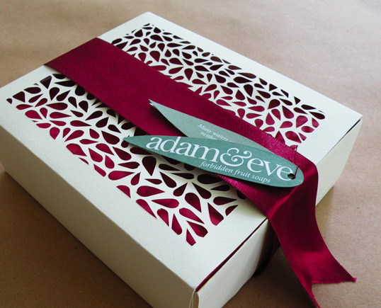
Designed by Rachel Dangerfield | Country: United States “I saw this project from beginning to end. From carving molds for the soap shape to choosing the
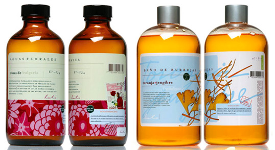
Designed by Bernstein-Rein | Country: United States “This boutique getaway focuses on personalized customer experiences, so overall branding and touchpoints create a refreshing, zen-like feel. Inspiration
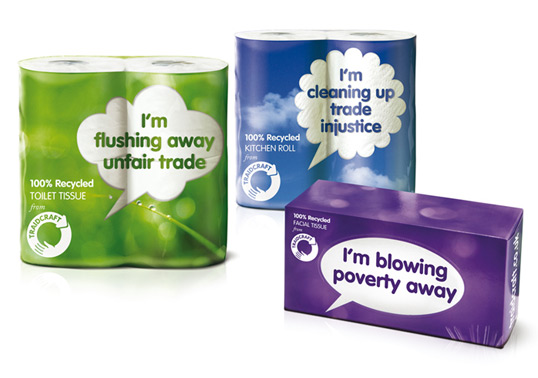
Designed by Studio Blackburn | Country: United Kingdom Traidcraft was established in 1979 as a response to poverty, and are the UK’s leading fair trade organization.
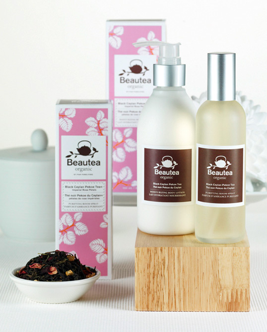
Designed by Pure Living | Country: Canada “The challenge behind Beautea was to develop a line that reflected the earthy naturalness of an Organic Bath &
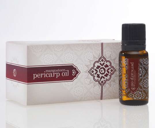
Designed by Struck | Country: United States “There’s something rather regal about the mangosteen fruit. Maybe it’s the deep color of the rind, or the pure
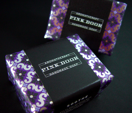
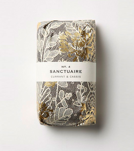
With gold foiling and beautiful patterns offset by simple labeling, this lovely soap is made by Fringe Alchemy. If any of our readers know who designed