Designed by Coley Porter Bell | Country: United Kingdom
“Brand design agency Coley Porter Bell is creating a new identity for Morrisons’ extensive own brand range as part of the retailer’s push to strengthen the brand and increase the share of its own products bought by customers.
The exercise which aims to transform Morrisons’ own label into a coherent own brand is the biggest design brief in the UK this year. It covers 17,000 products and variants and will roll out over the next 18 months.

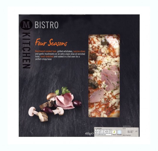
The first work will be seen this month with the relaunch of Morrisons’ ready meals under the ‘M Kitchen’ banner. Other sub brands and product areas will follow in subsequent months.
The redesign builds on Morrisons’ brand strengths particularly in fresh food and the quality and knowledge of its staff. Morrisons is Britain’s second largest food manufacturer and has more qualified butchers bakers and fishmongers in store than any of its rivals.

The new packaging unites these themes by focusing on the quality of the food and the human touch behind the brand. This is expressed in hand-drawn typography and through imagery that celebrates the quality of the food.
Said Vicky Bullen, CEO of Coley Porter Bell: “This is an immense strategic, creative and executional challenge. But it is also a unique brief because it is rare for a large retailer to consider their entire portfolio at once. It has allowed Morrisons to do fascinating category defining marketing and it has allowed us to give their own-label a visual and strategic coherence that will help sales better reflect the quality of their products.”

Carol Turner, Head of Design at Morrisons said the redesign is part of a broader programme of change at Morrisons. “Our desire to build a strong own brand is part of our ambition for Morrisons to be different and better than ever. The new designs help us to achieve this, bringing to life our brand, building a strong food culture, communicating the care that goes into making each and every one of our products and changing perceptions of our business.”