Designed by BrandMe | Country: United Kingdom
“Building on BrandMe’s radical redesign of Foster’s in 2010, the growing success of its Gold and Radler line extensions and the brand’s 2013 crowning as number 1 UK off-trade lager, BrandMe were commissioned by brand owner HEINEKEN to reposition and redesign Foster’s core proposition.
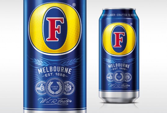
The brief was to capitalise on the 125th anniversary of the brand and assert the brand’s long standing brewing heritage and product credentials, as a lager crafted in the Melbourne heat in 1888 for ultimate refreshment.”


“The new design responds to consumer research and their demand for a quality beer offering good value. This was achieved by maintaining Foster’s premise and image as contemporary with a sunny, informal and inclusive personality and restating its provenance.”

“John Wynne, co-owner and Creative Director of BrandMe says:
“We wanted to demonstrate that Foster’s has a really interesting history and being specific to Melbourne helped to reinforce this credibility. From a branding perspective, to be able to take the word ‘Foster’s’ off the primary pack face is evidence that there is real confidence in the brand mark moving forward. Foster’s now has an iconic presentation and can innovate using just the strong identity roundel, a clear brand signifier for the consumer, to hold the range together.”