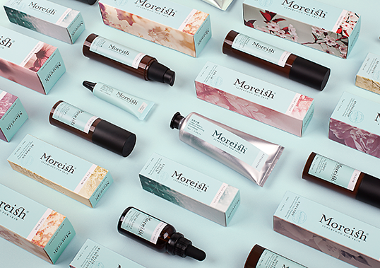
Designed by Milk | Country: New Zealand “The luxury segment is experiencing the strongest growth in skincare. Moreish was an existing, but underperforming range in pharmacy.
Designed by Milk | Country: New Zealand “The luxury segment is experiencing the strongest growth in skincare. Moreish was an existing, but underperforming range in pharmacy.
Designed by Milk | Country: New Zealand “Our brief from long-term personal care client API was to deliver an eco-friendly, ‘department-store-type’ brand into supermarkets at an
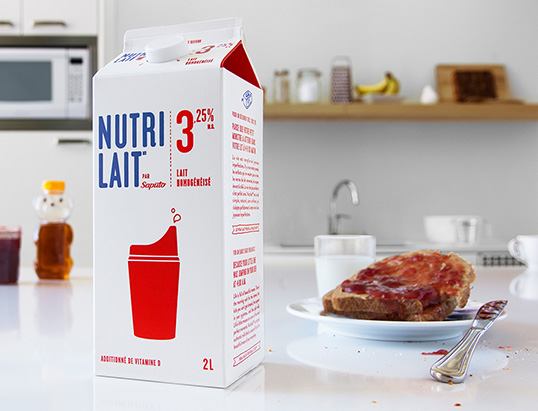
Designed by TAXI | Country: Canada “For its new brand identity, Nutrilait’s simplicity is featured. Far from the image of an immaculate and perfect lifestyle used
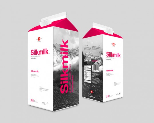
Designed by Darkoo | Country: Hungary “I wanted to make a “half minimalistic” style conceptual package, with a traditional font of Switzerland. Different types of milks
Designed by Cassandra Cappello | Country: Canada “This is a student project for an invented brand and redesign of a line of milk and juice cartons.
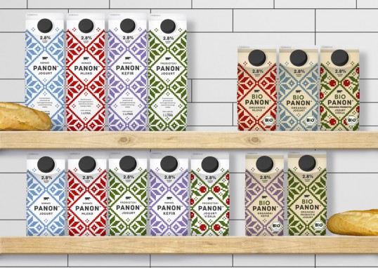
Designed by Peter Gregson | Country: Serbia “Peter Gregson Studio designed the packaging and ID for new brands of organic and non-organic milk, yogurt and kefir
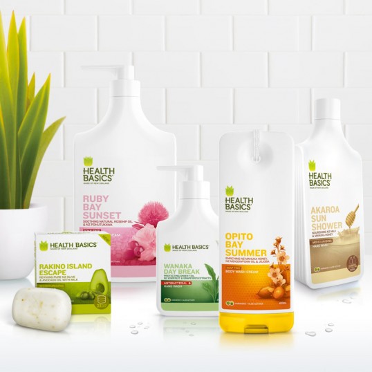
Designed by Milk | Country: New Zealand “The New Zealand story is not a new one to consumers, but it’s a compelling and evocative differential in
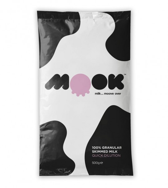
Designed by Hello | Country: United Kingdom “Mook is a powdered milk product used by caterers. We were briefed to produce a quirky, humorous brand to
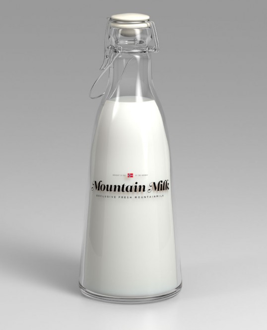
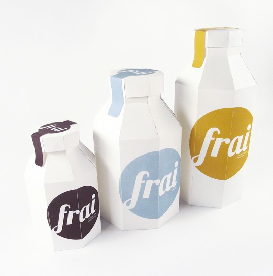
Designed by Anders Drage | Country: Norway “I love milk. But unfortunately milk never tastes the same outside Norway. I needed to make my self a
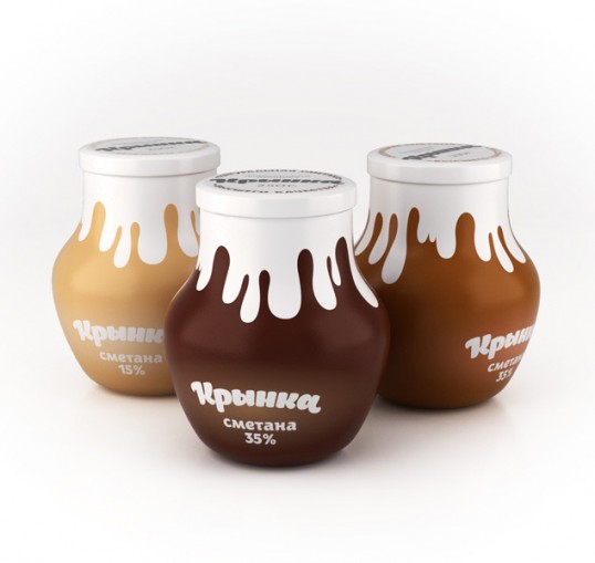
Designed by Pavel Kulinsky | Country: Russia “Student concept for coffee cream packaging. The name “Krinka” is Ukrainian for a jug of milk or cream. I