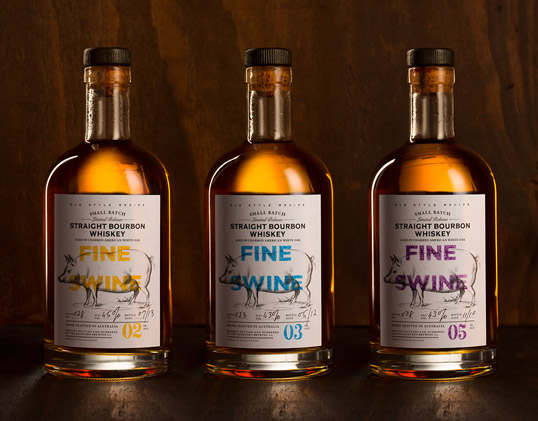
“This is a whiskey pulled together from a patchwork history of influences, in-jokes, and muddy adventures. It’s straight bourbon, made the traditional American way, but distilled in Australia. The name itself comes from the owner, who had previously gotten his hands dirty on the family pig farm. For all that, the labels are designed to evoke a premium product, made with care.”
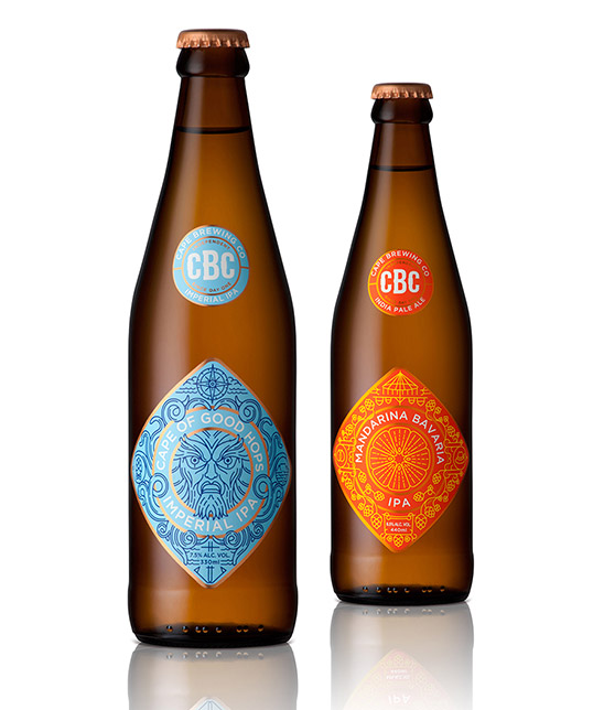
Designed by Jane Says & MUTI | Country: South Africa
“We were commissioned by design studio Jane Says to illustrate two labels for the Cape Brewing
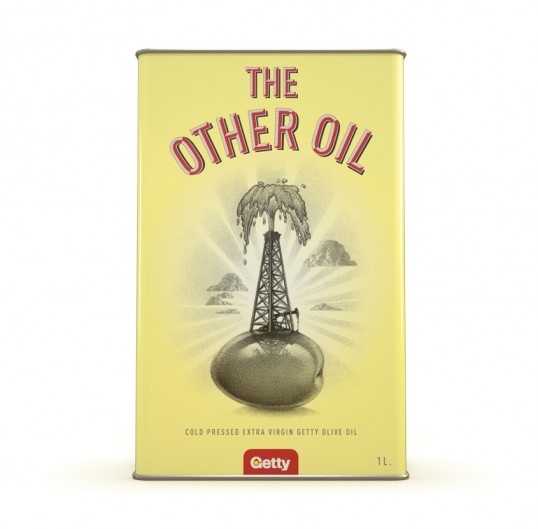
 Company, a South African producer of craft beer. Both beers have a distinct flavour profile and story behind them which served as inspiration for the designs.”
“Our brief to create original packaging design for a new Extra Virgin Olive Oil produced by The Getty
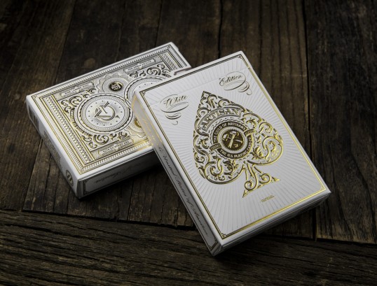
 Family in South Africa and the only element to the design brief that was mandatory was to ensure that we used the “Old Oil Logo” from yesteryear. As a result the whole design began to take on a deliberately retro feel, including the choice of colour, typography etc. with illustration by Doug Powell, all done locally.”
“The Artisan White Edition playing cards, like the previous Black Edition, were designed by South African
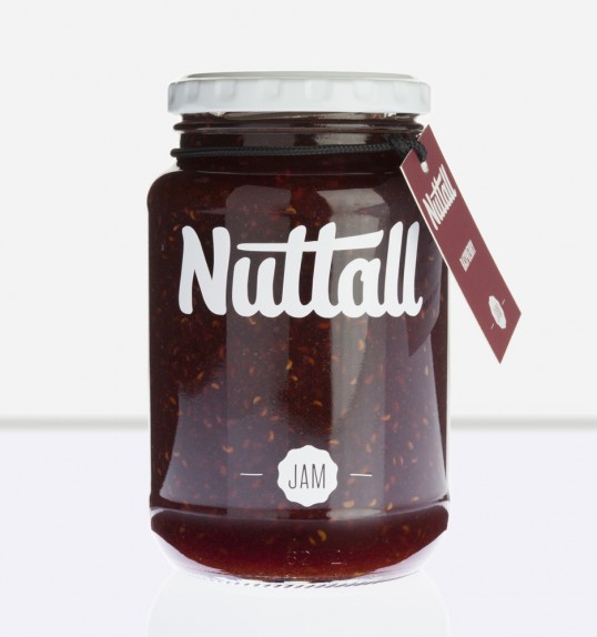
 artist Simon Frouws and feature elegant gold foil hot stamped onto ultra-lux white paper. They were produced using FSC-certified papers derived from sustainable forests, vegetable-based inks and starch-based laminates. These are also available in a collector’s set with two White Edition Decks and two Black Edition decks in a beautiful laser etched wooden box.”
“Nuttall is a small, family-run business. Their delicious range of jams and preserves gets sold mostly at farmers’ markets
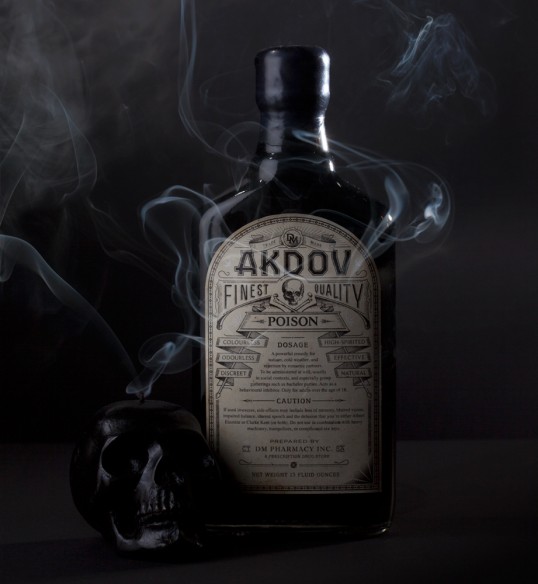
 in the Overberg. That said, the brand has big ambitions, and wants to communicate a fresh, fun approach to a fairly traditional product. The final design solution is cost-effective, but supremely eye-catching.”
“Akdov is an ‘underground’ alcohol. Its very name is cryptic – the word ‘vodka’ spelt backwards. Designed with tongue
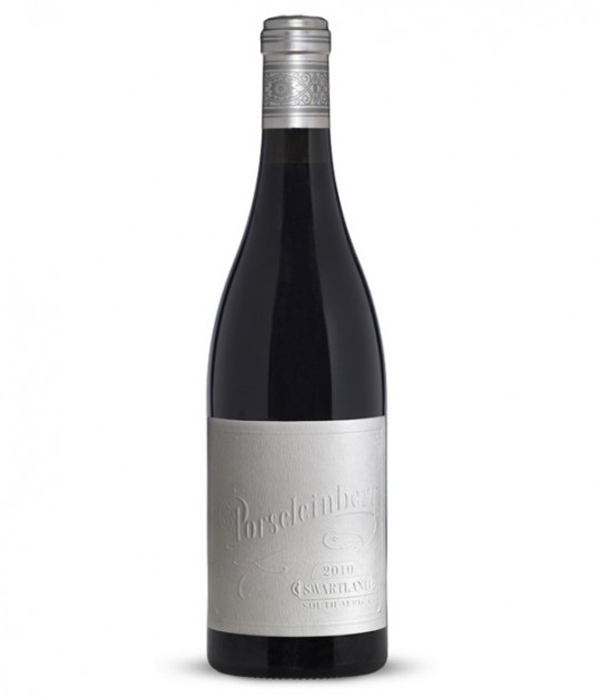
 firmly in cheek, the bottle takes its cues from old-fashioned poison products. The ultimate aim is to create a brand that is coveted only by those in the know.”
“Porseleinberg, situated on top of a mountain in the Swartland has just released its first vintage. This wine is
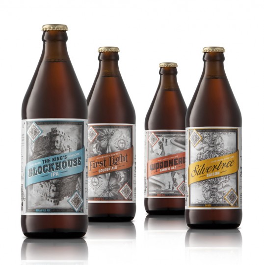
 one of the most anticipated releases of all the new wine releases in South Africa this year, even though we designed the label two years ago. The aim was to design a premium wine that is both ‘green’ and unique. We proposed a wine label that that made use of the absolute minimum amount of printing. Letterpress printing has the smallest carbon footprint of all printing methods, so the owners of the farm decided to buy their own 1940’s Heidelberg printer, and the winemaker took on the position of printer himself. It took a year to get the letterpress machine restored and up and running on the mountain, and another year for the wine to mature. The name Porseleinberg translates to Porcelain Mountain and the fragile white label draws its inspiration from porcelain, whilst the motifs on the neck and the blue colour on the back is derived from Delft tiles, which were a popular feature in historical Cape Dutch homes.”
“Born as a response to the one-dimensional beer culture in South Africa, The Devil’s Peak Brewing Company (DPBC) produces brews unlike any other beer you’re likely to find locally. The designs reflect the intricacy of the different beer styles and the brewer’s passion to create beers with unique character and depth. Craftsmanship, idiosyncratic style and the underlying belief of ‘truth to material’ – where the insides inform the outside – equals 4 distinctive styles with 4 equally standout designs. Recently released, the designs are already winning public attention at beer appreciation festivals and on Facebook and twitter.”
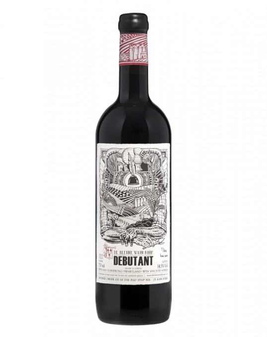
Designed by The De Kleine Wijn Koöp | Country: South Africa “The De Kleine Wijn Koöp is a circle of friends, made up of sommeliers and
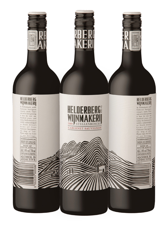
 graphic artists. As we deal with wine on a daily basis, every now and then we stumble upon a wine too small to fit into a particular winemaker’s series or … Read more
“A new design we did for a winery in Stellenbosch. The black is all high-build. Instead of filling the white space with a texture we filled it with an embossed illustration of clouds above the mountain. Makes for an overall very visual and tactile design.”