Latest in package design
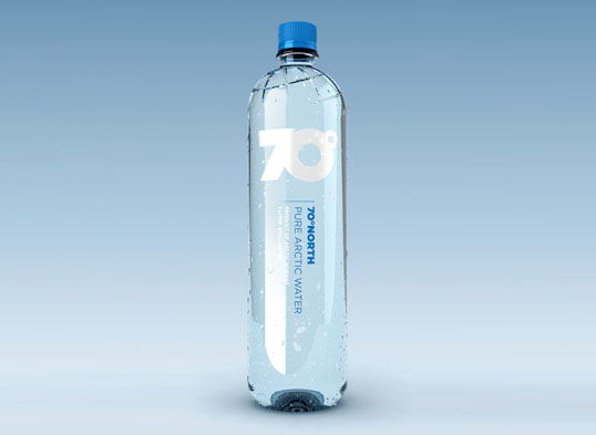
Designed by Tank | Country: Norway Jens Styve from the Norwegian design company Tank sent us this beautiful work for 70º North Pure Arctic Water. The
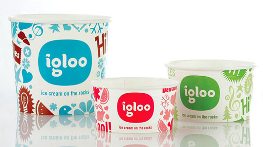
Designed by Anna Geslev | Country: Israel Fun and colorful packaging for Igloo Ice Cream created by Israeli designer Anna Geslev. 1
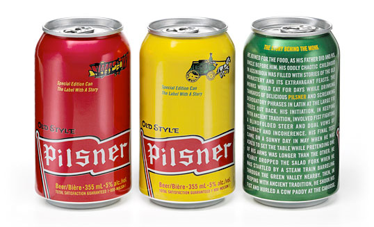
Designed by TAXI | Country: Canada TAXI came up with these great special edition cans for Pilsner beer. Each design pulls one of the irreverant illustrations
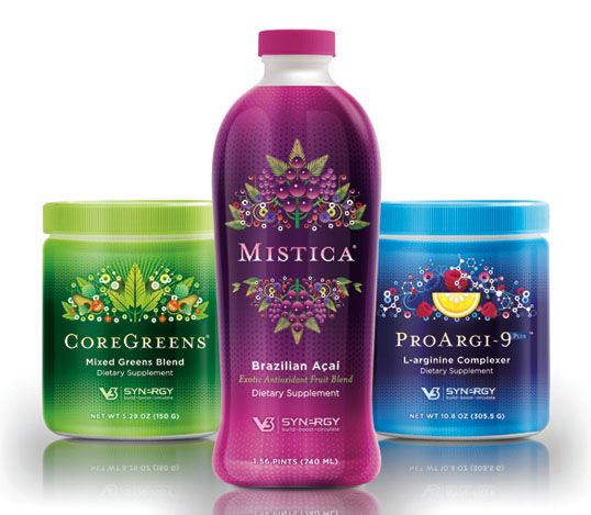
Moxie Sozo sent us this great work for Synergy V3. The unique product illustrations and vibrant colors really help set this apart from it’s competion.
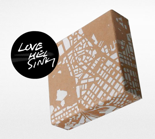
This is a great example of how low-tech, and low-budget can still look great. “LOVE HELSINKI is a coffee table exhibition about interesting and stunning things

“Hand-made ceramic glazed container in the form of an olive fruit, with a bottleneck in the shape of a branch and an olive leaf formed tag.
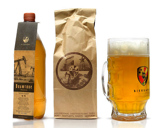
Russian based Fuerzza created these concepts for Beirbank, a raw and unfiltered beer. The brown bag package is great, I could see these being a big
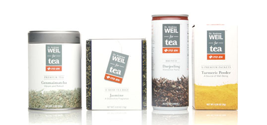
“Ito En partnered with Dr. Andrew Weil to develop a new line of high end ready to drink teas for the novice tea drinker and the
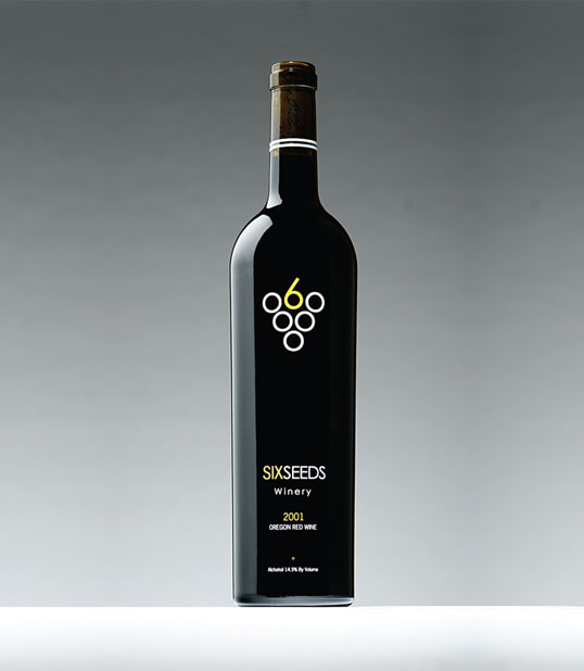
Nice work sent into us from Evan at Pancake Breakfast. I love the cleaverness of the identity.
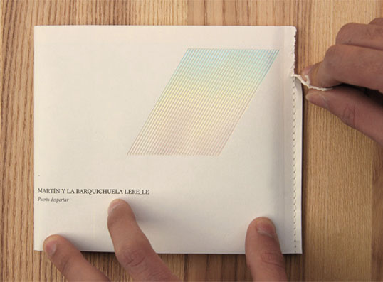
“A folded and stitched poster becomes an envelope that keeps a jewel-box inside. The title of the CD is “Puerto Despertar” (Port Awakening), hence a bundle
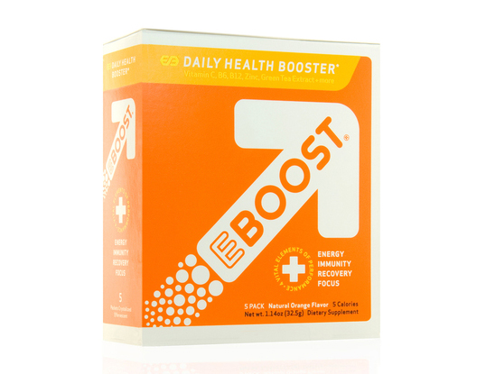
Nice, simple, modern and energetic design for EBOOST by the folks at Pro-Am.
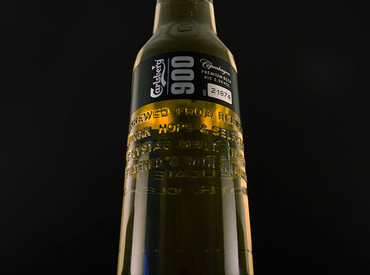
Some more great work being sent in from Sweden. Sanela Osmancevic alerted us to this amazing limited edition beer for Carlsberg. Credit goes to JDO for
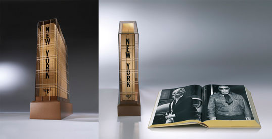
Swedish designer Henrik Persson of Become just brought this lovely book package to our attention. I love the amount of work and thought that went into
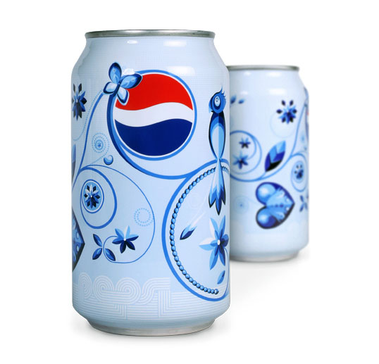
Another lovely design from jKaczmarek. “As part of a campaign where the concepts of Pepsi commercials grew beyond the television, jKaczmarek designed and illustrated packaging that
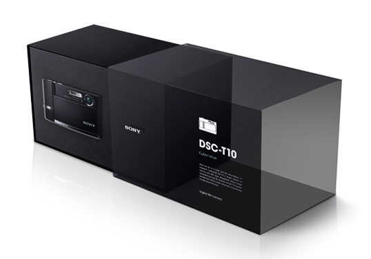
jKaczmarek has designed some nice packaing for Sony utilizing an acetate sleeve in a creative and functional fashion.
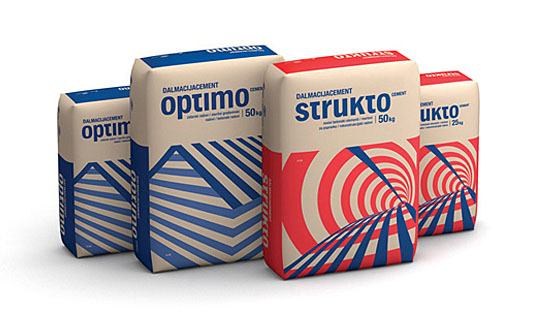
Most cement companies probably don’t care what their packaging looks like since their product is purely needs based. Apparently Croatian based TRIDVAJEDAN thinks otherwise, as their
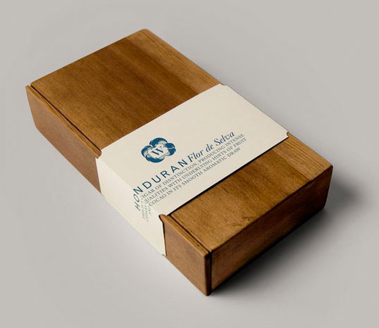
Great student work by Eli Horn for Weatherbey’s Fine Tobacco. “Branding for boutique cigar shop, Weatherbey’s Fine Tobacco. Inspired by gentleman’s clubs, barber shops, lingering smoke,
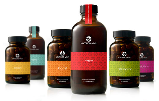
Designed by Zeus Jones | Country: United States Beautiful packaging for Immuno Viva all natural antioxidant supplements. The use of the bold colors and creative product
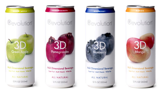
Nice clean packaging with plenty of appetite appeal. I’d like to give credit for this design, but I have no idea who produced it. “3D blends
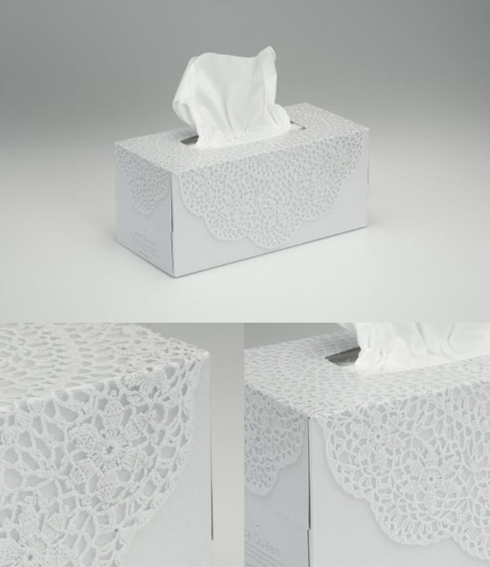
“People often cover something they cherish with beautiful lace to protect it without obscuring it. With this thought in mind, the objective was to apply the


