Latest in package design
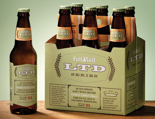
“An easy-drinking albeit wicked awesome limited edition lager from our ace crew of libitionary wunderkinds.” I love the playfull writing that dominites this retro styled desig
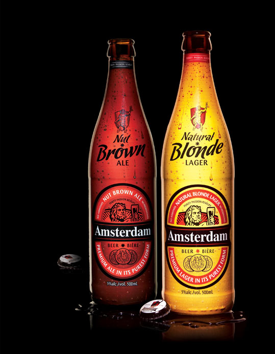
Designed by Brand&Tonic | Country: Canada Beautiful 500mL bottels for Amsterdam’s Nut Brown Ale and Natural Blonde Lager. Brand&Tonic continue to bang out the hits.
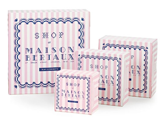
Interesting clothing packaging designed by HarrimanSteel. “In 2007, Eley Kishimoto joined forces with famous Soho patisserie Maison Berteaux. Called Shop at Maison Bertaux, it’s where fashion
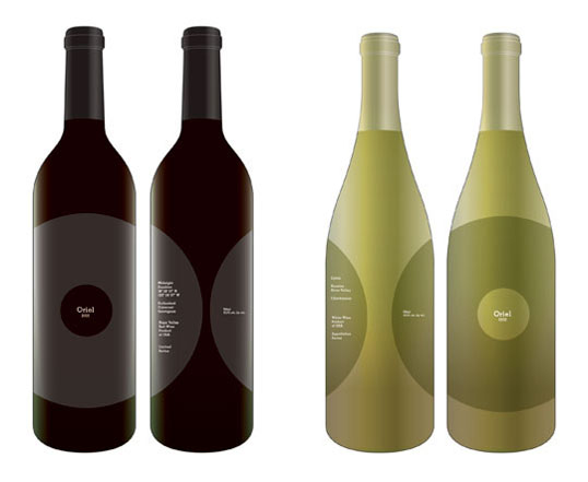
FFFFOUD this design. It looks to be a concept of some sort as I couldn’t find any reference on the Oriel Wines website. If anyone has
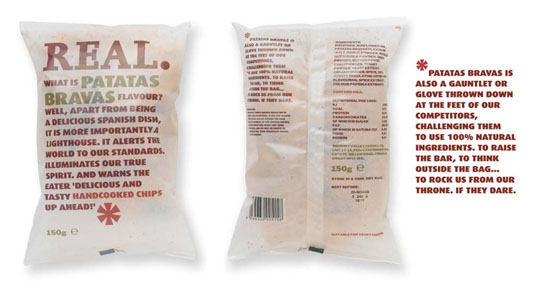
I’m a sucker for witty, well thought out, copy driven design. The use of a semi-translucent substrate is an interesting approach a product like chips. Designed
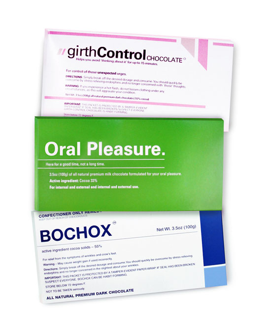
Jo-Nanda at Bloomsberry & Co sent us these “not so serious but delicious” chocolate bars designed by Out of the Blue. Girth Control, Oral Pleasure, Bochox,
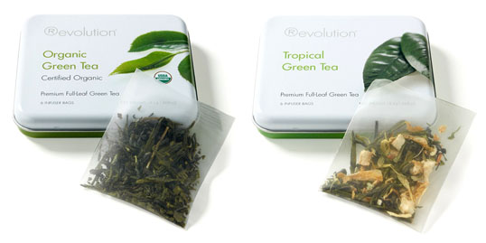
More great package from Revolution, this time in the form of their various teas. I really like the unique tins, such a welcome change from the
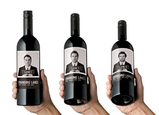
“Changing Lanes is the collaboration of two wine makers, Justin Lane and Mark Lane, who, by sheer coincidence, share the same last name. The wine is
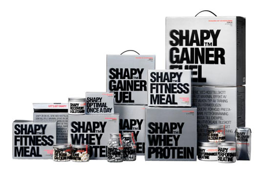
I love the energy that this packaging evokes, so fitting for it’s category. “To use the design to emphasise the basic, concrete idea behind the whole
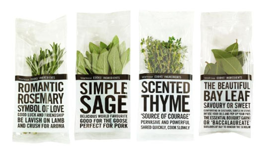
“Waitrose Herbs have a lot to say for themselves. Each minimally packaged pot carries bold tabloid style text, telling you everything you may not already know
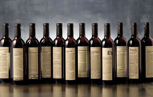
Amazing concept driven design by Sandstrom Partners. “With tweleve different labels for a single vintage of Willamette Valley Pinot Noir, The Cost Vineyard labels are created
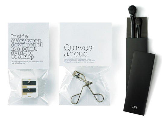
“Given that the established brands in the beauty industry invest billions (with a ‘b’) on product and brand advertising, we were tasked with launching a new
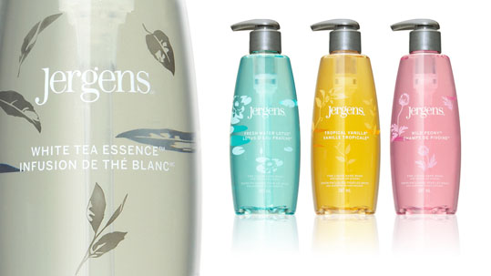
Nice clean, upscale packaging for Jergens fine liquid hand wash. Designed by Toronto based Brand&Tonic.
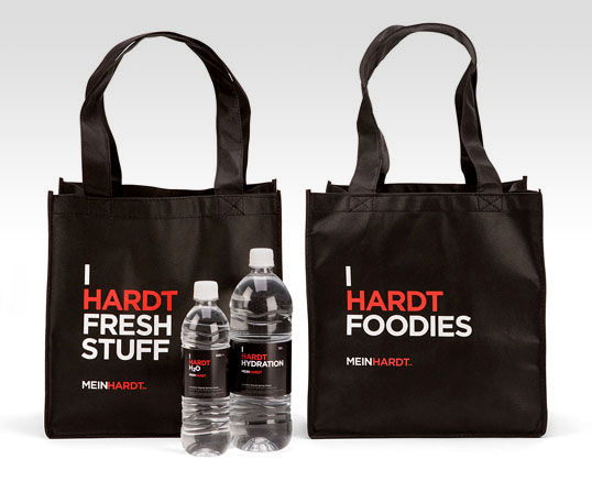
TAXI Vancouver has done a great job re-branding Meinhardt. The simple execution and play on the store’s name is a nice touch. “Linda Meinhardt started her
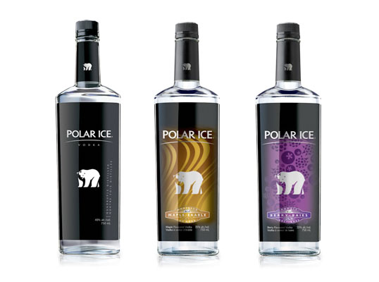
What you can’t see in this photo is the unique label placement for Polar Ice Vodka. Pigeon Branding + Design took advantage of the crystal clear
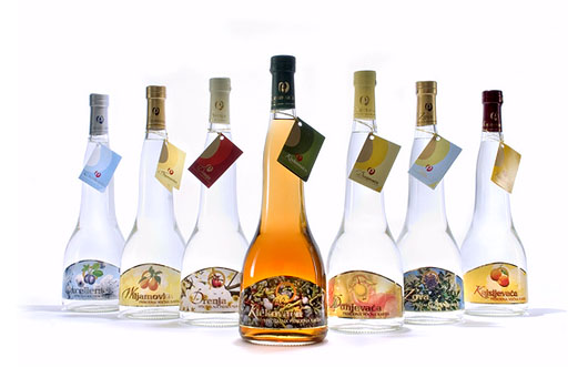
I found this set of lovely bottles on Flickr, but there wasn’t any background information regarding what they are or who designed them. They look like
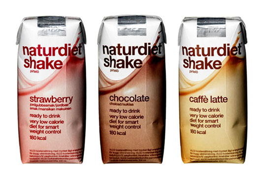
“A clear communication and uniform design was developed for the whole series, with a focus on the brand Naturdiet. The design is white and airy. On
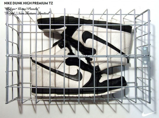
This Nike Dunk Hi Premium is dedicated to Tokyo and the Panda that can be seen at Ueno Park. The cage box is such a creative
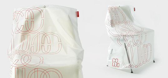
How do you package office chairs? With a slip cover of course. Design Project has come up with a very clean and effective solution for contemporary
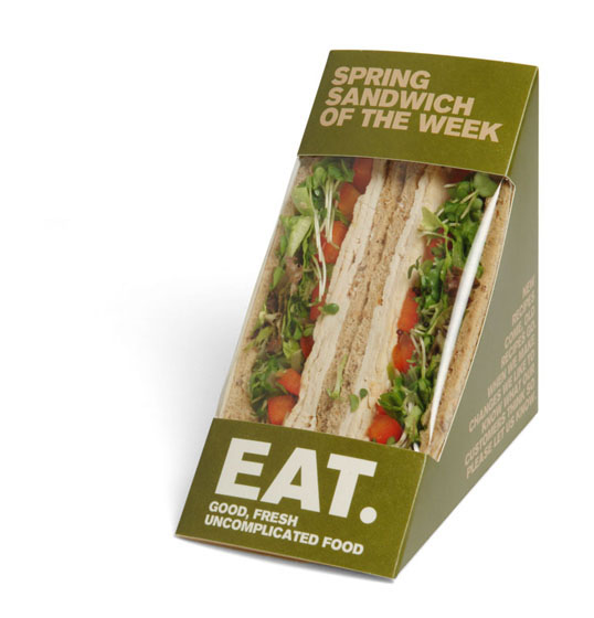
“In 2006 EAT came back to Pentagram to ask us to undertake an evolution of their brand communication, in order to bring the company’s identity in-line


