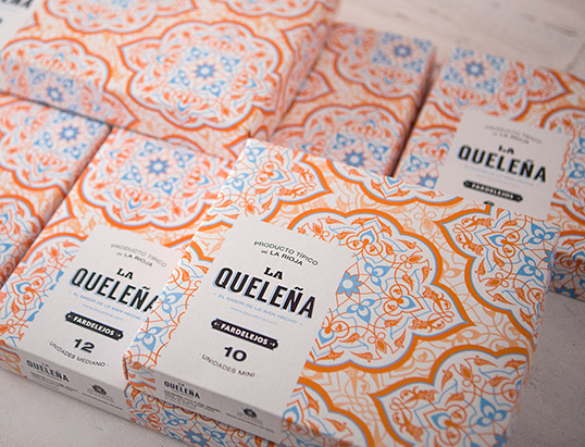
“Using a graphic code that reminds us of the Arabian value of the origin of the dessert (the use of
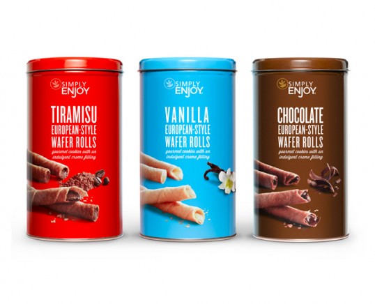
 almonds is important in all Arabian desserts) a frame was created in which each of the packaging models reinforces the visual coherence of the whole range, making the provenance and birth of the recipe more understandable.”
“Task: Strategic redesign of the Simply Enjoy range to reflect the brand’s new super premium offer and positioning.
Scope:
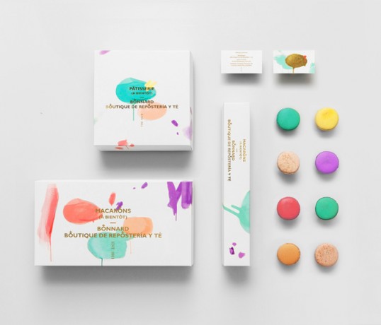
 Brand strategy, identity design, tone of voice and packaging graphics.
Solution: A design that speaks to luxurious indulgence, focusing on the pleasures of food from around the world through vibrant color and photography that highlights the artisanal-style of the range.”
“Bonnard is a Mexican french-inspired tea and confectionary shop.
The brand’s distinct brush strokes and color selection are based on Pierre Bonnard’s postimpressionist paintings. The simple art direction, together with french words and phonetics round up the brand’s gallic concept effortlessly, spontaneously and efficiently.
Our approach with clean, sans-serif typography gives Bonnard a luxurious feel mostly associated with high-end fashion brands.The gold foil stamp and clean type directly contrasts and at the same time elevates the would-be informal paint marks.
The rounded cross icon detail found in the wording relates to the shapes of macaroons, one of Bonnard’s prime delicacies.”
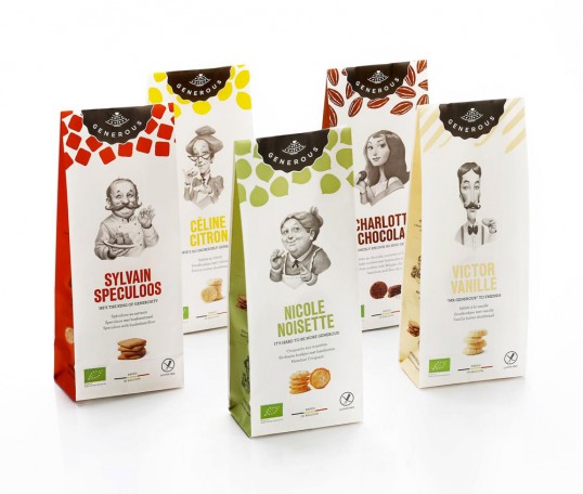
Designed by Bowling | Illustration: Jens Claessens | Country: Belgium “The idea was to create a family and to give each flavour a matching personality.”
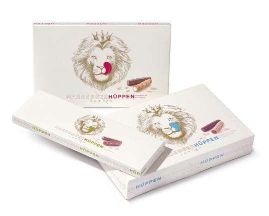
“Hardegger bakes original Zurich Hüppen from a decades-old secret family recipe, using only natural ingredients. Geissbühler was briefed to
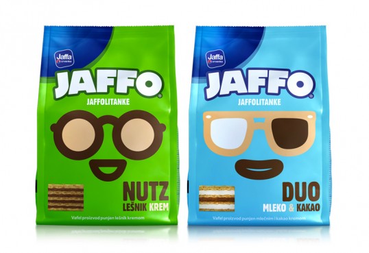
 give the traditional Company a refreshing Deign and Image without losing the value of old traditions. That’s how Geissbühler came up with the Lion as it is the main symbol of Zurich. With the coloured tongues it gives it all a twinkle in the eye and puts it into modern times.”
“JAFFO brand of Serbian Company – Jaffa, needed some help with creating a new brand strategy
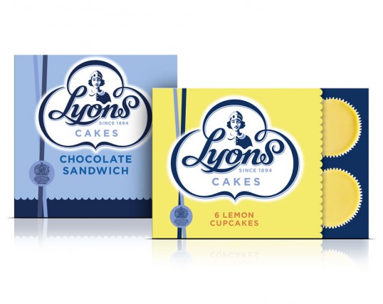
 that would ensure its further existence.
We created the entire visual identity having in mind the fact that it should communicate, above all, with the youngest population. At the end of the creative process, the entire brand was transformed, except for its name which remained the same.
Five different, imaginary characters were created as a part of the new communicational platform, representing 5 different flavors, each with its own name, look, and characteristics. That way we managed to realize the client`s idea to have a brand mascot, by creating characters whose faces appear on the packages themselves, as mascots.”
“This month sees the launch of newly designed packaging for Lyons cakes. Briefed to explore and celebrate the brand’s
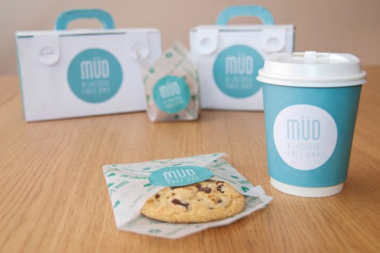
 rich heritage, the new look plays back to its famous history of teashops and its waitresses from the 1890s.
With a long-‐standing tradition for ‘proper’ cakes, the brand was renowned for its nippy waitresses serving up affordable tea and cake to the masses. Having lost its way over the years, the redesign focused on communicating the brand’s story in a relevant and contemporary manner.”
“The aim of this project was to design a packaging for take away. Nowadays there are
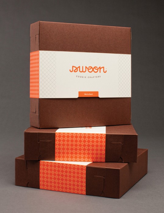
 infinite types of fast foods which offer take away, that’s why we chose to narrow it down to a special sector of the market. We chose to focus on lactose intolerance, offering take away dairy-free breakfasts! At Müd we offer cupcakes, donuts, cookies and loaf cakes which you can combine with coffee, tea or hot chocolate and everything is without lactose!Feel free to add any type of dairy-free milk that you want such as almond, rice, oat, etc.We offer two different packagings, one for the combination of coffee and cookie/loaf cake and a bigger one of coffee and muffin/donut.Everything comes with two different kind of stickers, both applied on the sides of the packagings, ones with what there’s inside of the packaging and the other ones with emotional sentences about your mood. Finally we wanted to create a brand specialized in dairy-free products but with a modern graphic style which could easily reach to a bigger target.”
“Originally called PS-Sweets, this custom sugar-cookie maker was ready for a complete rebrand to spur new business nationwide and
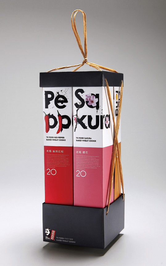
 position the company for the future. We created a new name, color palette and more elevated look and feel (via letterpress printing primarily) for the packaging and identity that embodied the premium fun of the product. To keep costs containable for this small company, we elected for a ready-made box and put effort into a custom band to enclose it.”
TK Food created four brand new flavors of their baked wheat cookies. Cherry blossom flavor is clear and sweet; oolong tea flavor; salty snacks flavor and spicy mustard flavor. TK Food uses unique baking technique to blend various flavors with creativity. Every flavor contains 20 packages within a strip of rectangle. Four different flavors are collected in a rectangular box to express the brand’s novelty and variety.