Designed by: PepsiCo Design & Innovation
Country: United States

Brand Identity And Packaging Design: Alcyon Sea Salt

Designed by: Alex Nereuta | Country: Canada

The Arseneau family wanted to share the richness of the Magdalen Islands, a magical place in Quebec, Canada. The family got together to craft “quality sea salt that combines sustainable methods and superior taste.” The sea salt is procured from waters surrounding the Magdalen Islands, “where the St. Lawrence River meets the Atlantic.”

Alcyon Sea Salt, a family-owned brand, teamed up with Alex Nereuta, a senior art director, to create the brand identity and a packaging design system that would highlight the uniqueness of the location, along with communicating the inspiring story of the Arseneau lineage.

We wanted to evoke a strong sense of connection to the natural elements from which the salt is sourced and to the Arseneau family story, while maintaining a curated and elevated aesthetic that reflects the product: quality, purity and authenticity.

Brand Identity And Packaging Design: Alcyon Sea Salt

The packaging

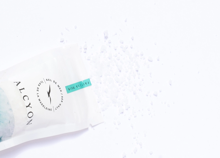
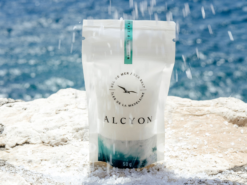
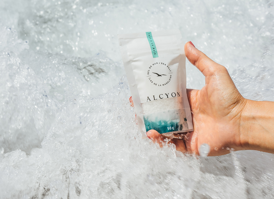
Inspired by the uncomplicated idea of sea and salt, Alex Nereuta created packaging designs that communicate the richness of the Magdalen Islands. The packaging label also displays traditional family photos to share the inspirational story of the Arseneaus.

“Our photographic approach mixes vintage family photos with custom product photography in both outdoor and indoor settings, while keeping an editorial feel by combining lifestyle and food photography. The typography is likewise a mix of serif and contrasting sans-serif typefaces, exaggerated kerning and generous line spacing to evoke a feeling of freshness and airiness into our messaging and storytelling.

Get the latest packaging design inspiration in your inbox:

Popular designs

Burma Love Rebrand

Love at First BiteAs an extension of the Burma Superstar restaurant in San Francisco, Burma Love Foods gives diners an opportunity to

Far Out Bar

Description: Far Out Bar is a cutting-edge packaging design project created for High Life Farms’ macrodose THC chocolate bars. This project involved

Over the wave

This Kombucha originates in Lombok, Indonesia, where its paradise beaches attract hundreds of surfers eager to ride the waves. When you surf,

Designed by: PepsiCo Design & Innovation
Country: United States

Brand Identity And Packaging Design: Alcyon Sea Salt

2

Designed by: Alex Nereuta | Country: Canada

The Arseneau family wanted to share the richness of the Magdalen Islands, a magical place in Quebec, Canada. The family got together to craft “quality sea salt that combines sustainable methods and superior taste.” The sea salt is procured from waters surrounding the Magdalen Islands, “where the St. Lawrence River meets the Atlantic.”

Alcyon Sea Salt, a family-owned brand, teamed up with Alex Nereuta, a senior art director, to create the brand identity and a packaging design system that would highlight the uniqueness of the location, along with communicating the inspiring story of the Arseneau lineage.

We wanted to evoke a strong sense of connection to the natural elements from which the salt is sourced and to the Arseneau family story, while maintaining a curated and elevated aesthetic that reflects the product: quality, purity and authenticity.

Brand Identity And Packaging Design: Alcyon Sea Salt

The packaging

Inspired by the uncomplicated idea of sea and salt, Alex Nereuta created packaging designs that communicate the richness of the Magdalen Islands. The packaging label also displays traditional family photos to share the inspirational story of the Arseneaus.

“Our photographic approach mixes vintage family photos with custom product photography in both outdoor and indoor settings, while keeping an editorial feel by combining lifestyle and food photography. The typography is likewise a mix of serif and contrasting sans-serif typefaces, exaggerated kerning and generous line spacing to evoke a feeling of freshness and airiness into our messaging and storytelling.

Previous slide
Next slide

Explore more great package design

Get the latest on packaging design in your inbox: