Latest in package design

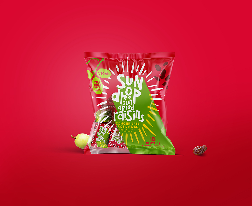
This concept by Joost Identities underlies the redesigned packaging for Sundrop Raisins In this design the grape acts as the central point of a sundial symbolizing
Popular designs
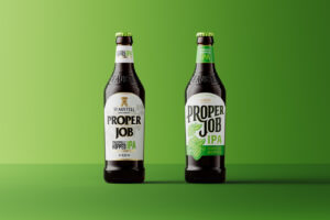
Revamping the Packaging Design of St Austell Brewery’s IPA, Proper Job: A Collaboration between Thirst and Tobias Hall
Discover the refreshing redesign of St Austell Brewery’s award-winning IPA, Proper Job. Thirst and Tobias Hall collaborate to merge the brand’s ale legacy with modern appeal, reinvigorating its identity for all generations.

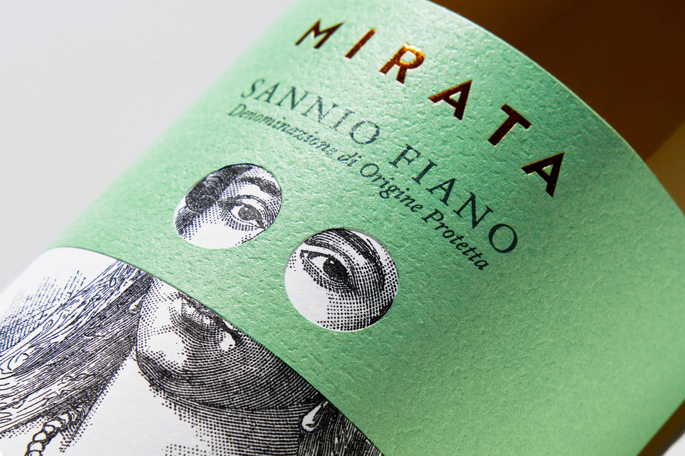
Discovering Mirata Wines: A New Wine Packaging Design
Discover the transformative allure of Mirata wines La Guardiaense, where a mask doesn’t just cover but also reveals. Prepare for your new wine discovery, as Mirata wines add a fresh touch to your palate.
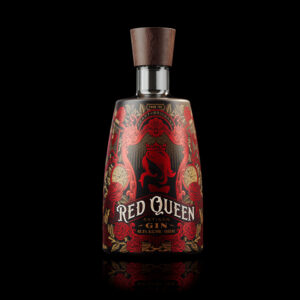
Red Queen Artisan Gin: A Blend of Handcrafted Elegance and Unique Label Design
Discover Red Queen Artisan Gin, a juniper-forward spirit with citrus notes & a hint of rose, handcrafted in Brisbane City. The gin’s label design reflects its masterful and delicate composition.
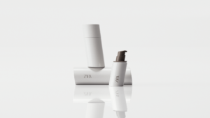
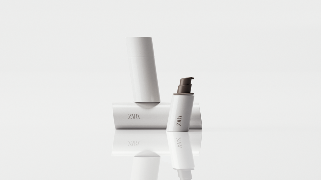
ZARA SKIN: More Sustainable and Refillable Packaging Design
Discover ZARA SKIN: a revolutionary skincare range reflecting ZARA’s minimalist aesthetic. With refillable, nature-inspired packaging, the line champions conscious consumption and environmental responsibility, offering an inclusive range of products for the 21st-century consumer.
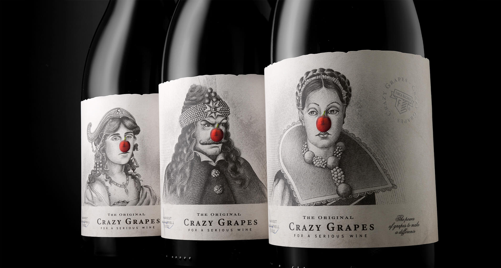
Transformative Power of Wine: Introducing Crazy Grapes
Discover the transformative power of wine with Crazy Grapes. These Monatrell grapes have the magical ability to turn a simple meal into a tribute, a date into an experience, and a gray evening into a party.


