Mollydooker Wine
December 16, 2008 | 4 Comments
Designed by Mash | Country: Australia
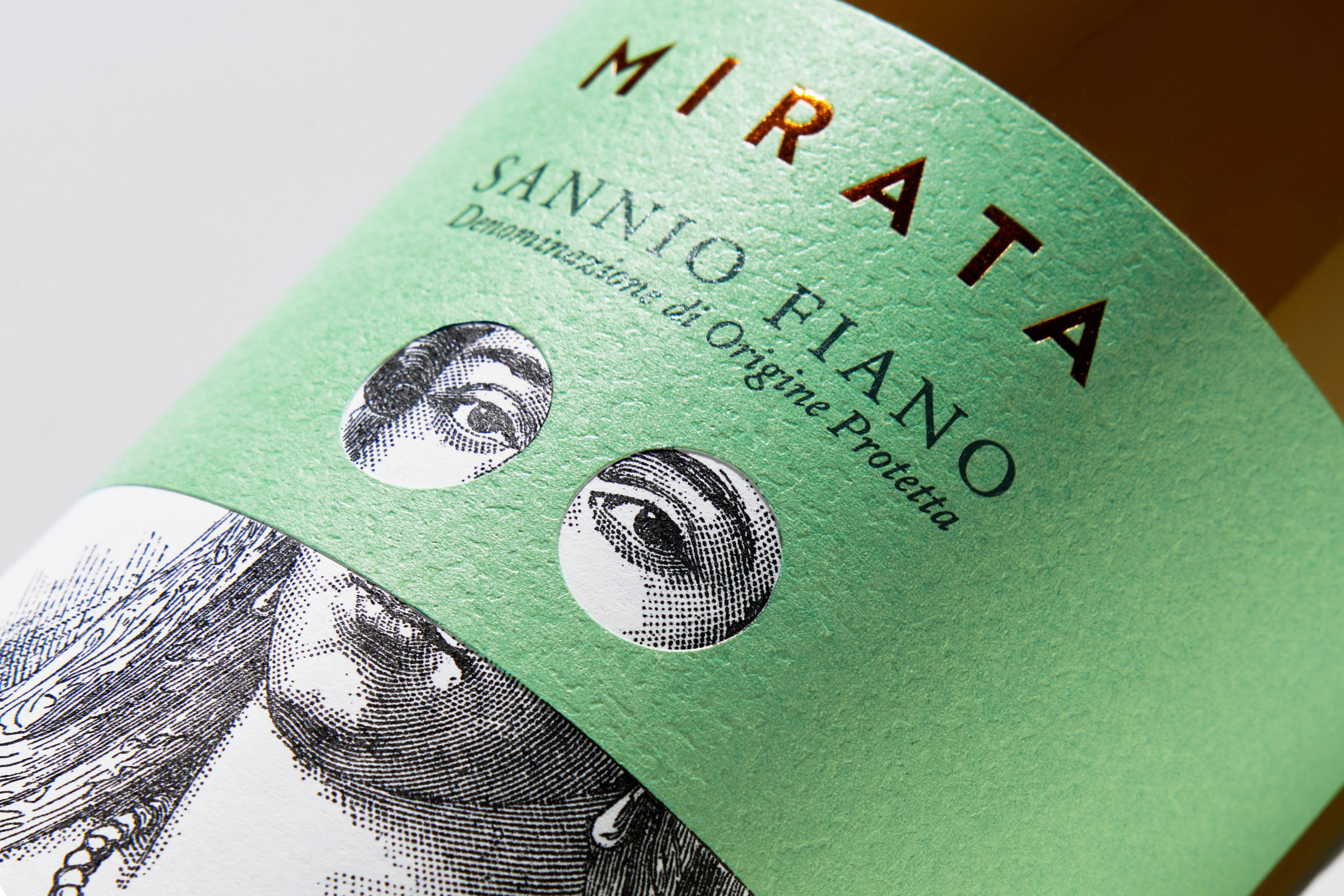
“Mollydooker, slang for left handed. Both proprietors of the Mollydooker Wines brand are left handed, hence the brand name. The brand identity has been created to go against the grain of the ‘same old’ wine branding approach. The aim was to create visual communication for a brand with its own personality, not just another player in the wine industry.
Tall Tales – Real Food Restaurant
December 16, 2008 | 4 Comments
Designed by Duffy & Partners | Country: United States | Fonts used: Trade Gothic, Clarendon
“Minneapolis based Duffy & Partners used their creative design and branding expertise in creating the logo, food container packaging and other interior design elements for Gander Mountain’s new Tall Tales-Real Food Restaurants.
Tall Tales-Real Food Restaurant is another extraordinary example of showing how design needs to be part of our everyday life and strengthens Duffy’s leadership with in the hospitality industry! There is really a lot of dimension behind its concept.”
Brandscents
December 16, 2008 | 1 Comment
Designed by Turnstyle | Country: United States | Fonts used: Helvetica
“Does your brand stink? At Turnstyle we asked ourselves some tough questions: Is innovation in the air? What does integrity smell like? What about dedication or humanity?What about Hard Work? How does that smell? Should a Fortune 100 company smell like a fortune? And what if a Fortune 1,000,000 Company smells like a million bucks?”
Condamine
December 15, 2008 | No Comments
Designed by Hanna Backman | Country: Sweden
“Visual identity to a collection of wines from Mont Taucha. Quality leaps in the first three, while the two prestigious wines symbolizes thumbs up and excellent.”
Uvita de Plata
December 15, 2008 | No Comments
Design by Tridimage | Country: Argentina | Fonts used: Helvetica and Flemish Script. See more Copperplate Scripts
“The Argentine package design agency Tridimage created the brand and package design for Uvita de Plata, an Argentine contemporary Varietal Wine brand produced by RPB . Tridimage took advantage of the expressive possibilities of the metalized Tetra Pak container to differentiate the new brand in its crowded category.”
Evo Hair Products
December 15, 2008 | 3 Comments
Designed by Mash | Country: Australia | Fonts used: Helvetica
“Evo is a brand that has its own unique personality and culture, in stark contrast to an industry filled with ‘more of the same’ type approaches. The Evo brand personality is honest, but at the same time tests the consumer with ridiculous claims. Are you dumb enough to believe our claims? In this way, Evo makes the consumer stop and think. Evo is cheeky, humorous and slightly twisted.
Sound ID 300
December 15, 2008 | 1 Comment
Designed by Andrew Pollak | Country: United States | Fonts used: Helvetica
Widex
December 14, 2008 | 1 Comment
Designed by Mads Jakob Poulsen | Country: Denmark
“The dual layered package+sleave makes the soundwave come to life on this multi award winning packaging design for Widex hearing aids released worldwide fall 2007. The soundwave spells the Widex-payoff ‘High Definition Hearing’.
The video (see after the jump) + pictures of this package quickly circulated the globe on the internet and by word of mouth.”
Passanha Oil
December 14, 2008 | 1 Comment
Designed by Base & Michael Young | Country: United States
“Michael Young was commissioned by Base and Passanha Oil to design this new glass bottle. The Passanha brand dates to 1749 and this bottle marks the re-launch of this historical olive oil company.”
Svegro
December 14, 2008 | 3 Comments
Designed by Amore | Country: Sweden | Fonts used: Handsome (the Pro version emulates real handwriting with contextual alternates), Mrs Eaves
“The job for the new Svegro packaging design is simple; to inspire food lovers to use loads of locally grown salad and herbs in their cooking. The new design began rolling out in stores in June 2008. Two months later, Svegro is already seeing results from buyers wanting much more products. This is the power of Love at First Sight®. Brand identity and corporate identity, including logotype, naming and packaging design.”