Latest in package design
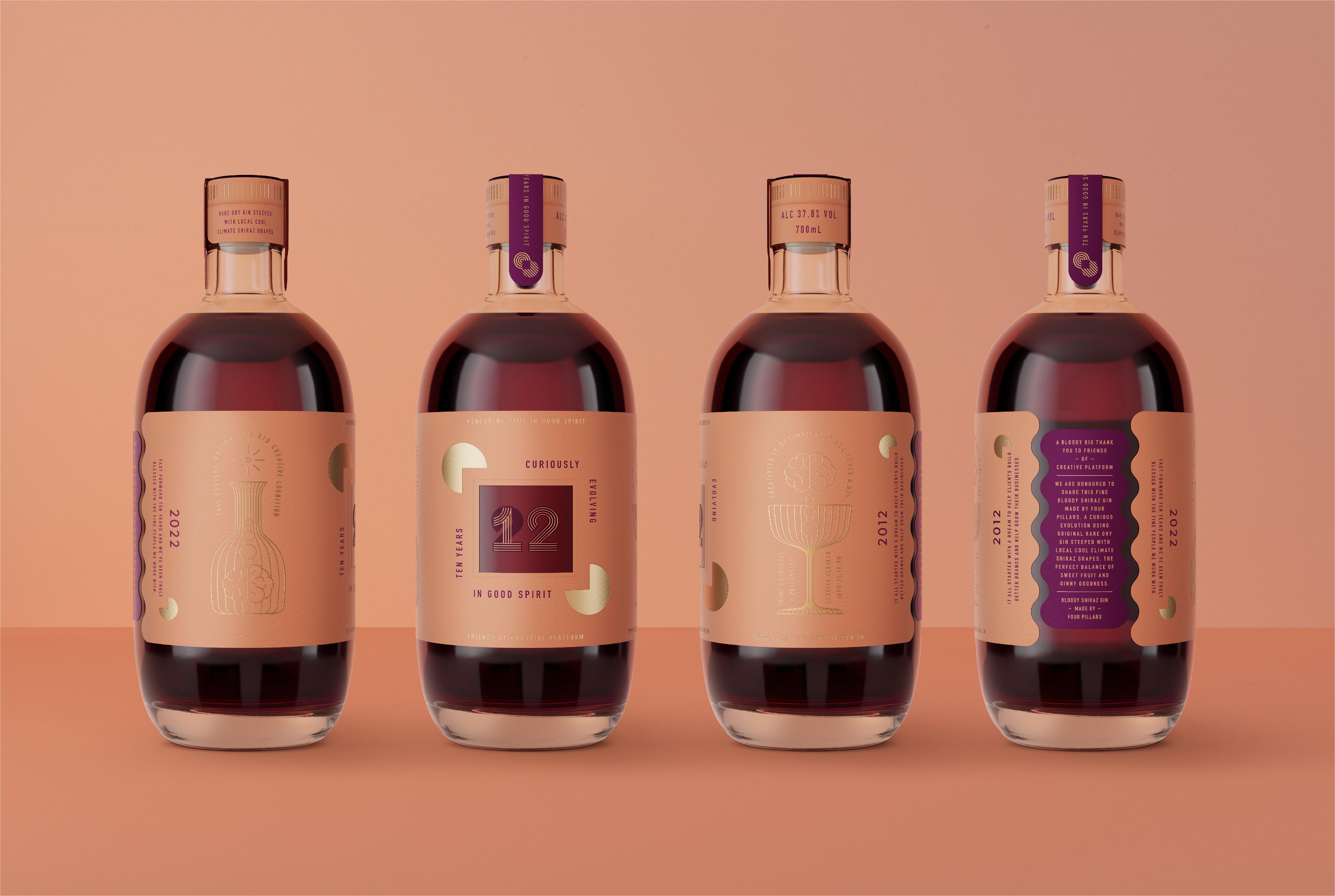
Four Pillars combined their efforts with Creative Platform, a Sydney-based branding agency, to highlight the brand’s “quality, care, and honesty.” The branding agency created simple packaging
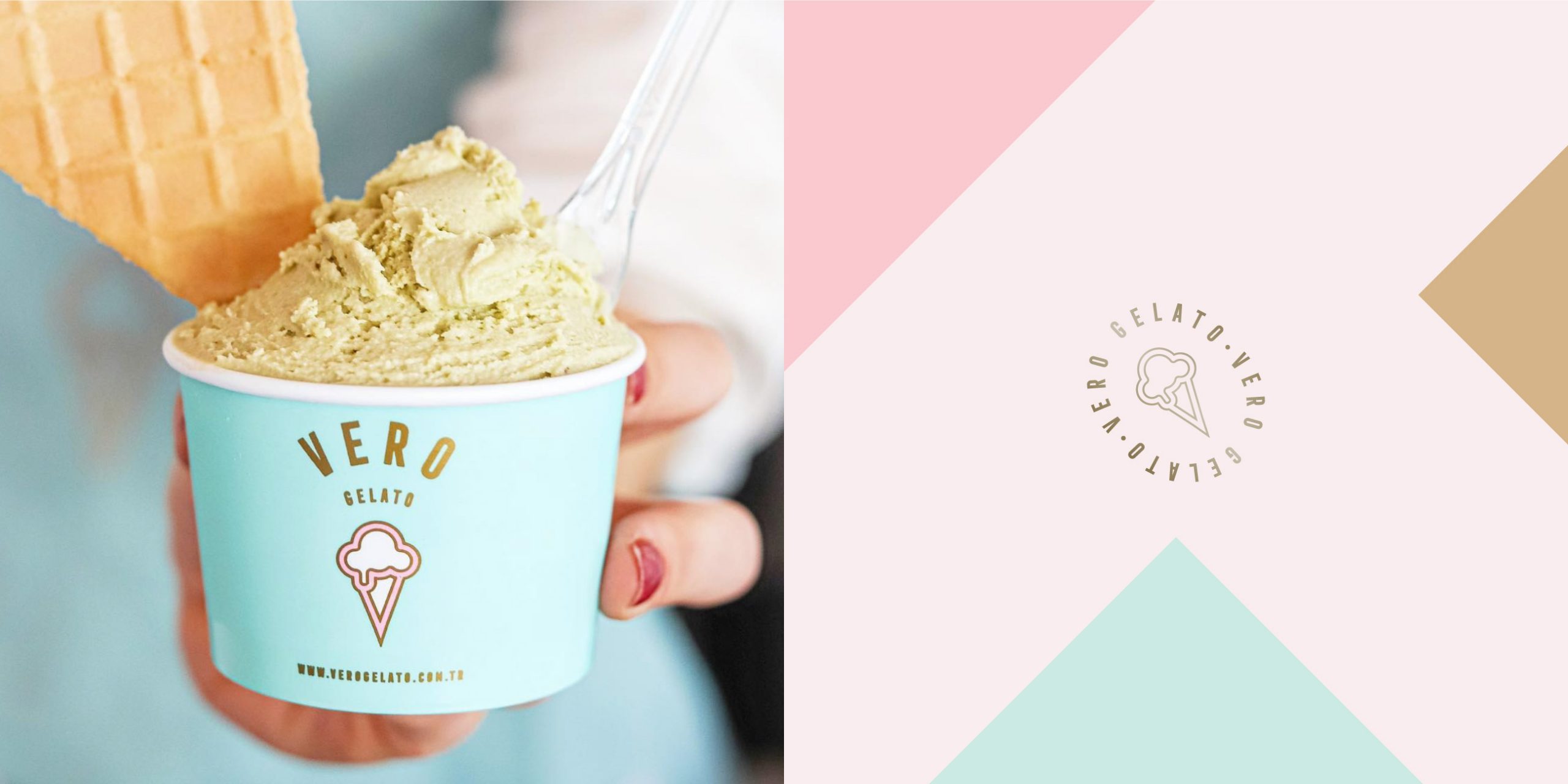
Veronica approached Marka Works, an Istanbul-based branding agency, to create packaging designs that would attract ice cream lovers. The branding agency created uncomplicated designs over a
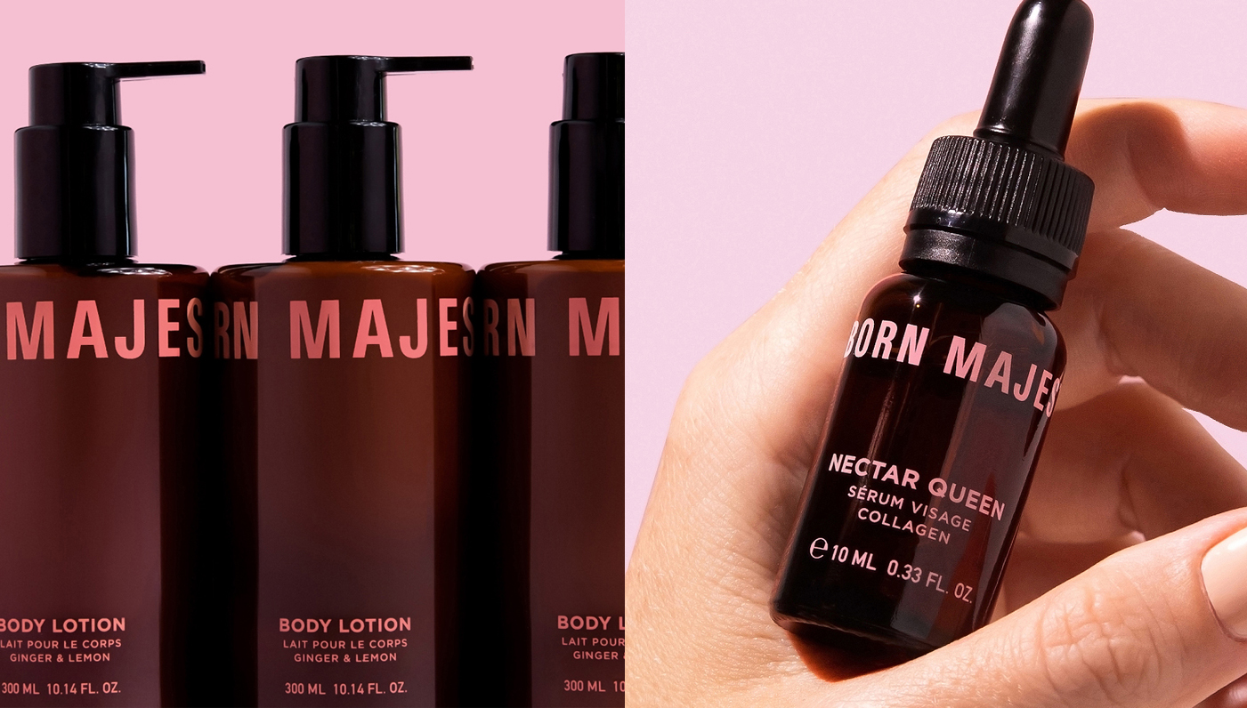
“The color pink is considered a feminine definition stereotype so we decided to turn this viewpoint around, adopting it unapologetically as the primary color of the
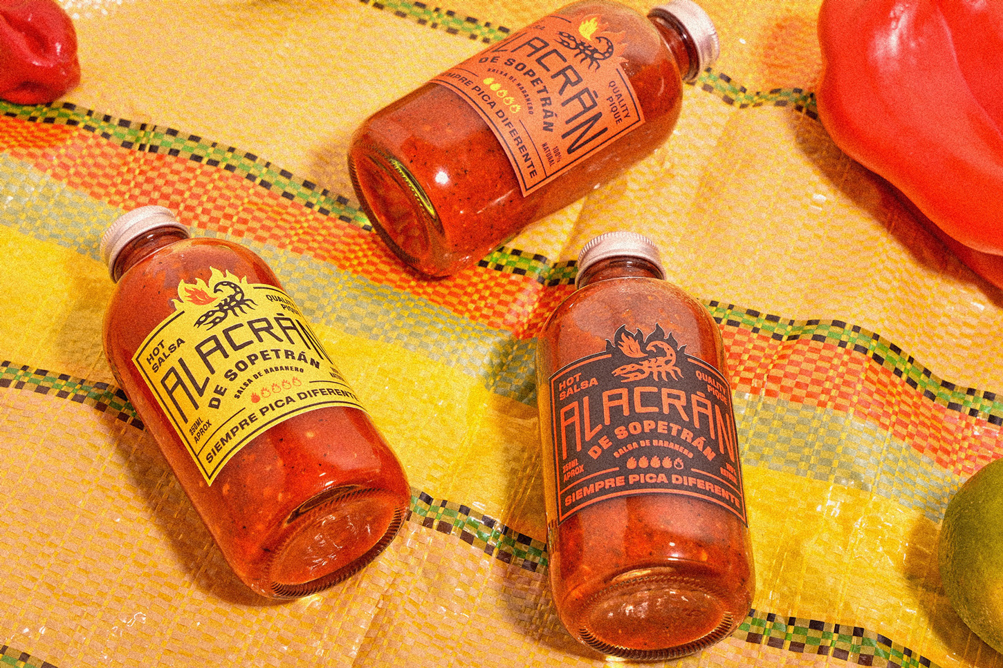
When a graphic agency launches its products, it is obviously going to be something else. The branding agency used the product launch as an opportunity to
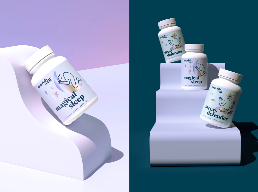
Inspired by the founder’s attractive personality, Riser created “a clean brand with attitude.” The packaging designs are uncomplicated and clearly illustrate the benefits of each product.
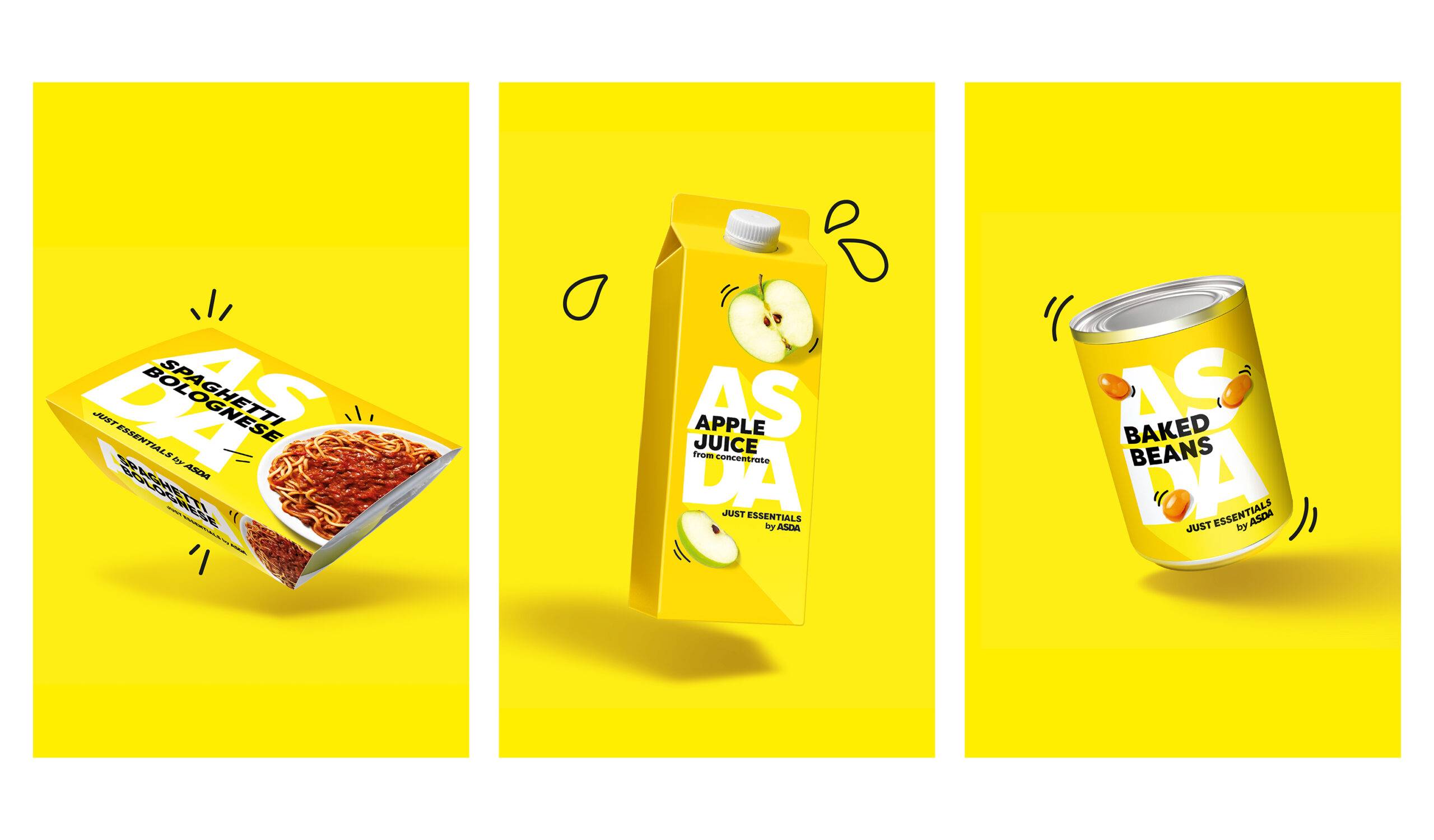
“The existing design felt tired, stale and dull. The white, value design held negative brand perceptions, with customers feeling ashamed to buy into the range. The
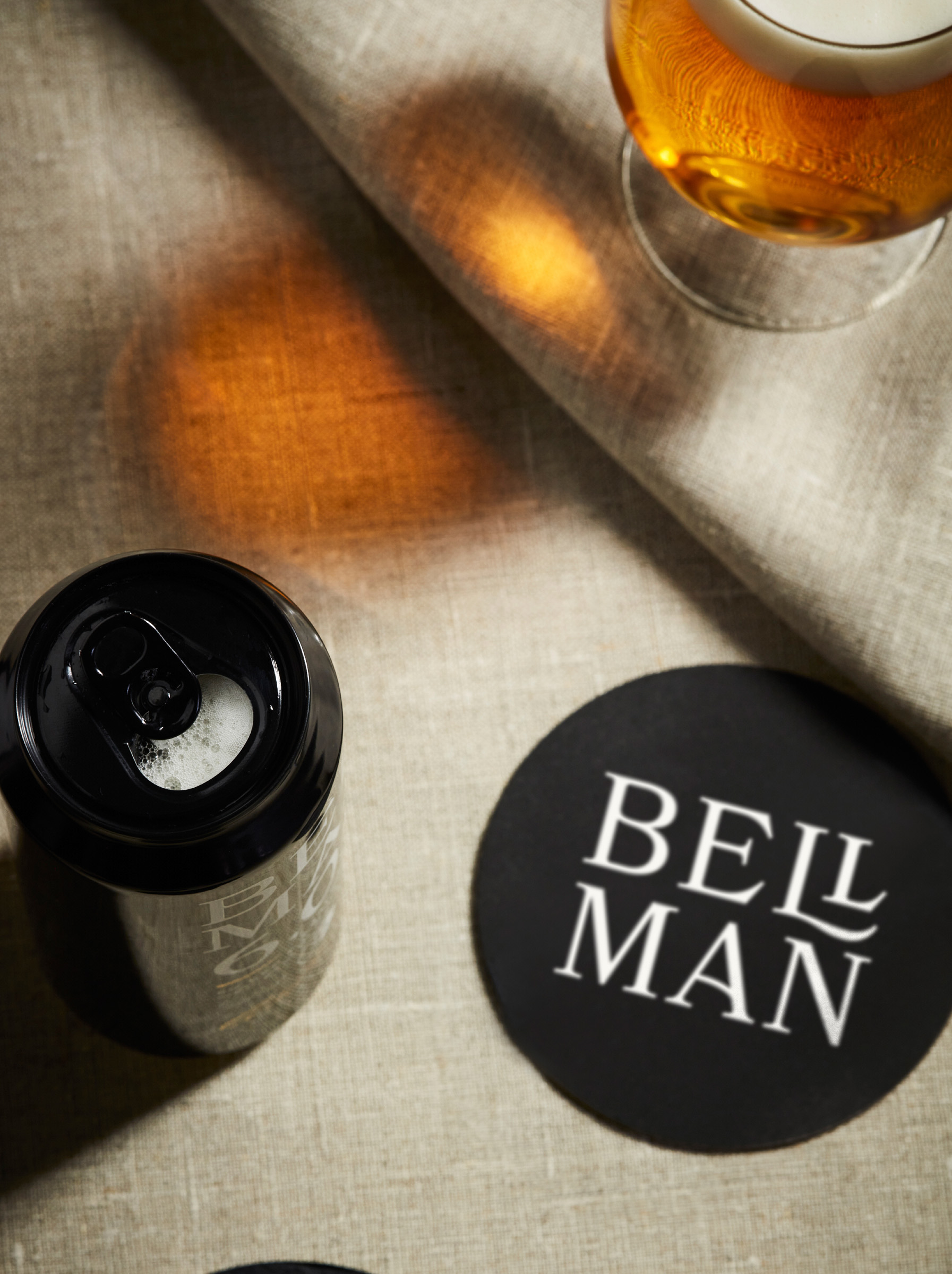
Bellman approached Everland, a Scandinavian boutique agency, to create packaging designs that would reflect “the craft and care that goes into one of Sweden’s most classic
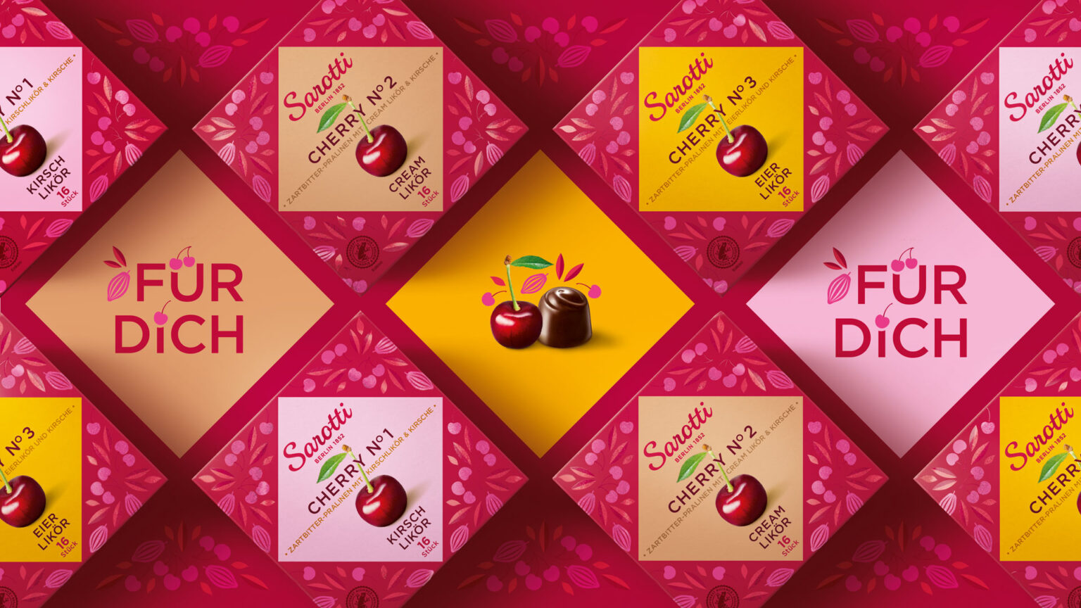
““The aim was to develop a modern, emotional packaging design that reflects the premium quality of the chocolates and also appeals to a younger target group.
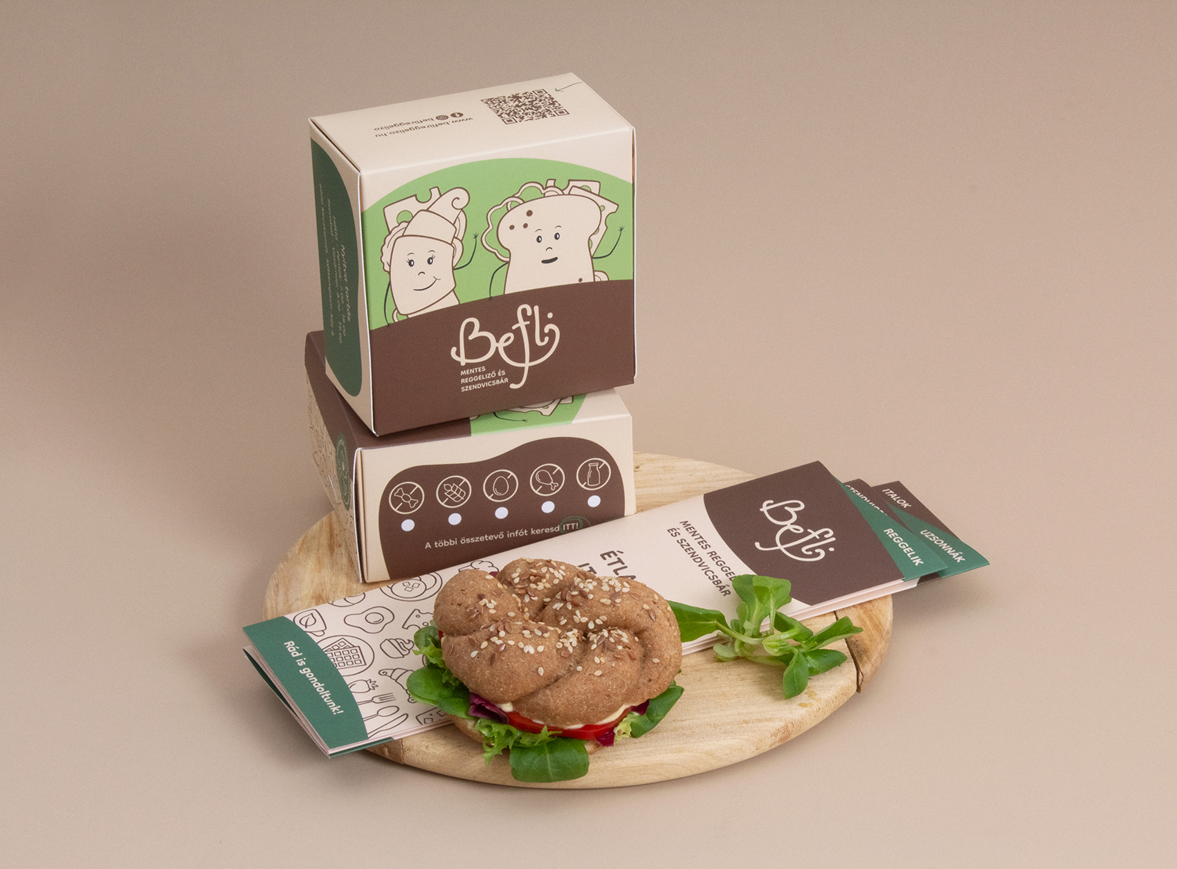
Befli approached Hollóka Grafikai Műhely, a Budapest-based graphic design studio, to create packaging illustrations that would stand apart from the crowd and highlight the uniqueness of
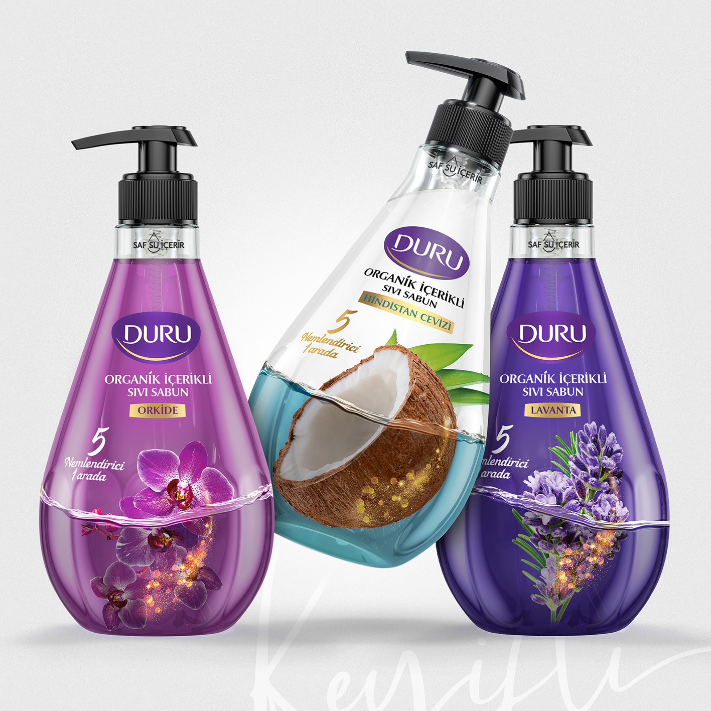
Duru partnered with Keyifli Fikirler, an Istanbul-based packaging agency, to create label designs that would highlight the organic nature of the product. The agency designed different
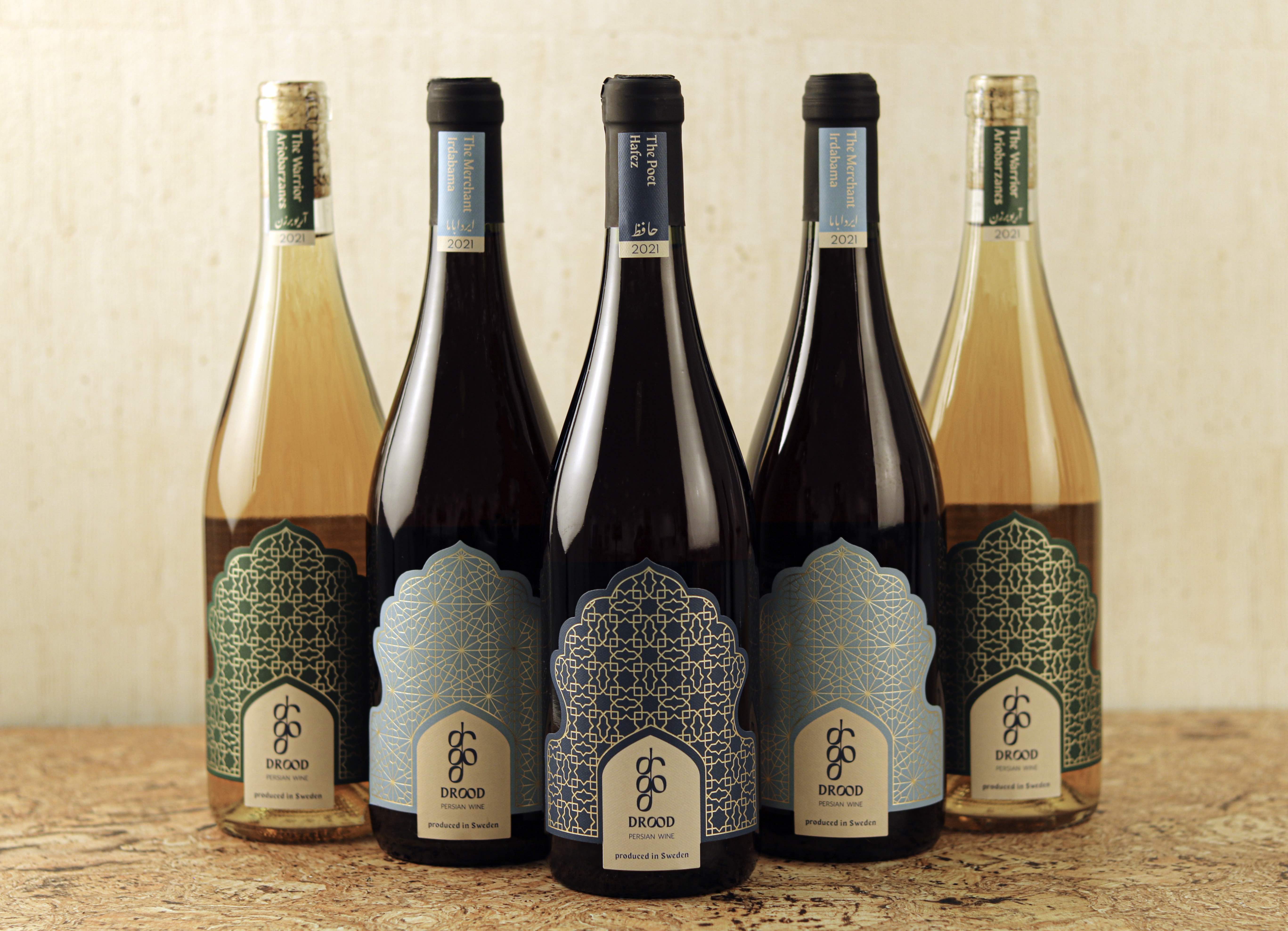
“Since Persian wine dates back many centuries, I wanted to find a font that gives an ancient feel to the project. At the same time, I
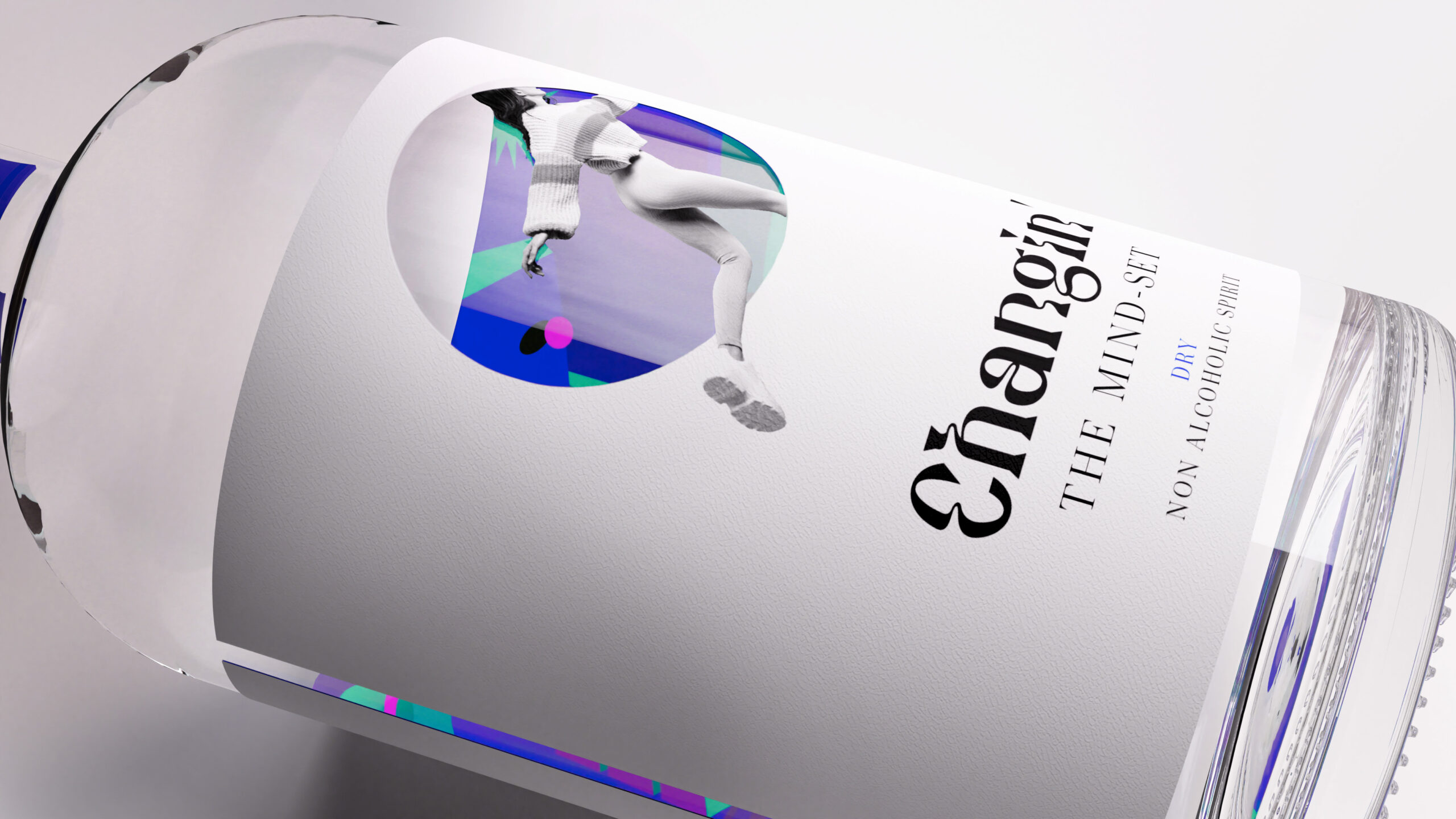
Baries Design, a Düsseldorf-based packaging design agency, created label illustrations that highlight the positive experiences associated with the brand. The color palettes and typography evoke psychedelic
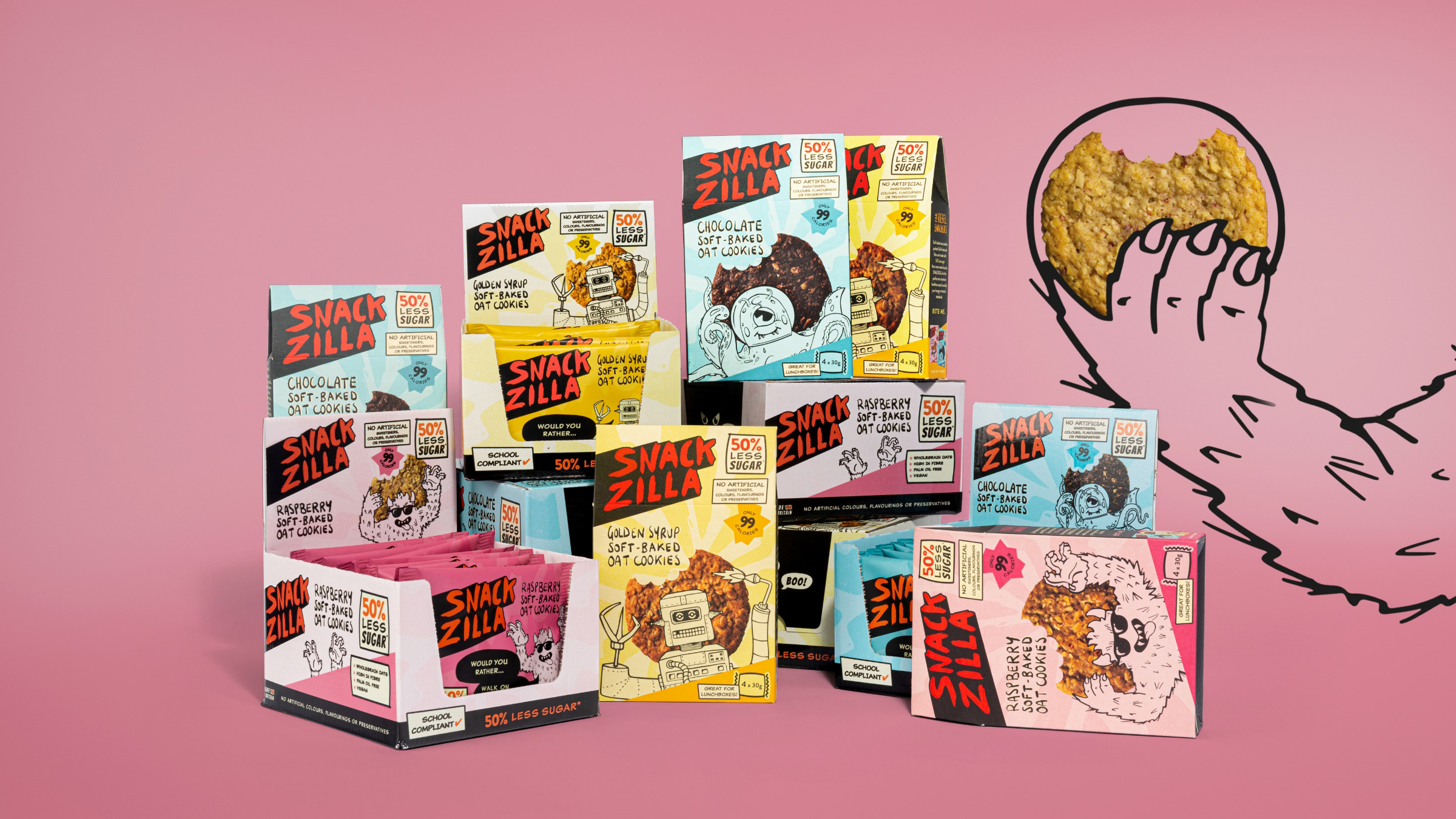
Snackzilla approached Kingdom & Sparrow, a Falmouth-based branding agency, to create packaging illustrations that would attract 5 to 13 years old children. The branding agency used
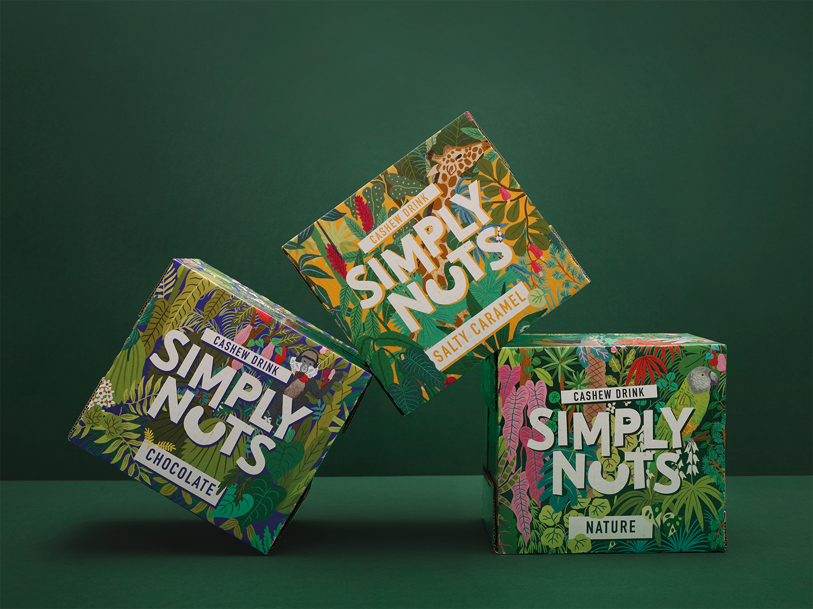
“Handmade illustrations with natural motifs from Benin's jungle as well as a power animal per variety and together with the intense color code offer a clear
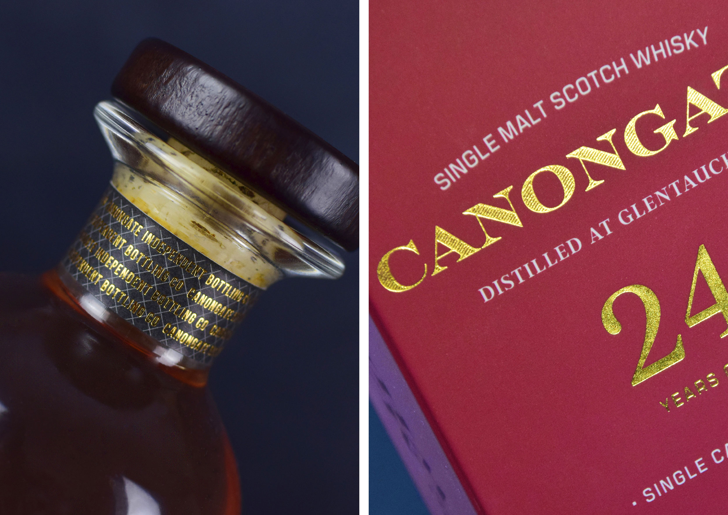
The Perfect Fifth approached Hutton Creative Design, an Inverclyde-based branding agency, to create packaging designs that would reveal the sophisticated nature of the products. The design
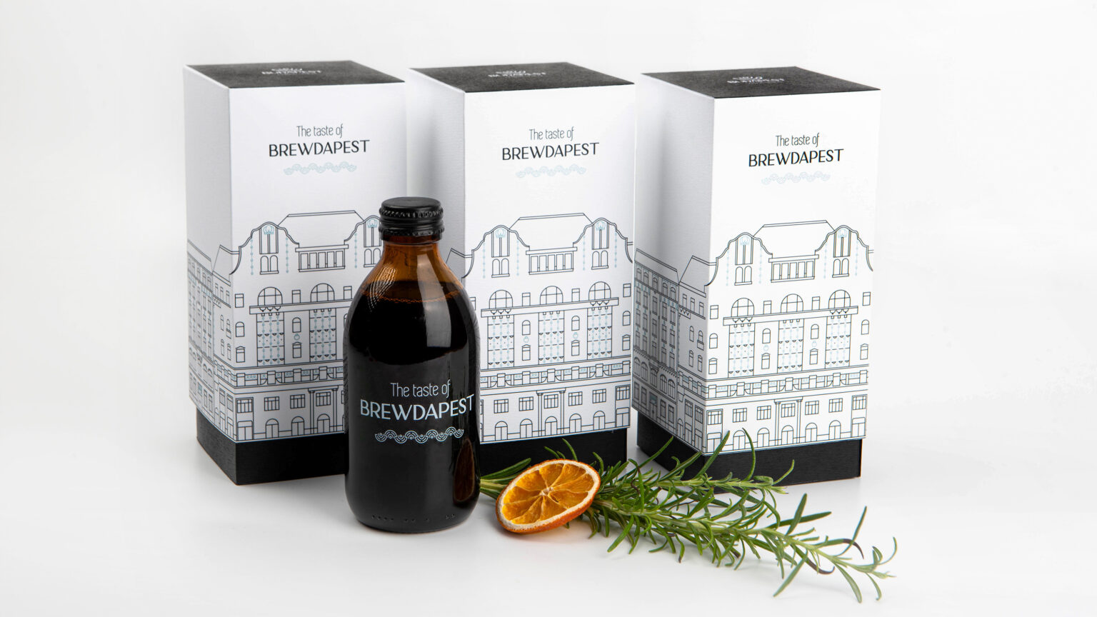
Covin Art School used sophisticated illustrations, which include a range of color palettes and three art deco palaces of the city streets, for the packaging designs.
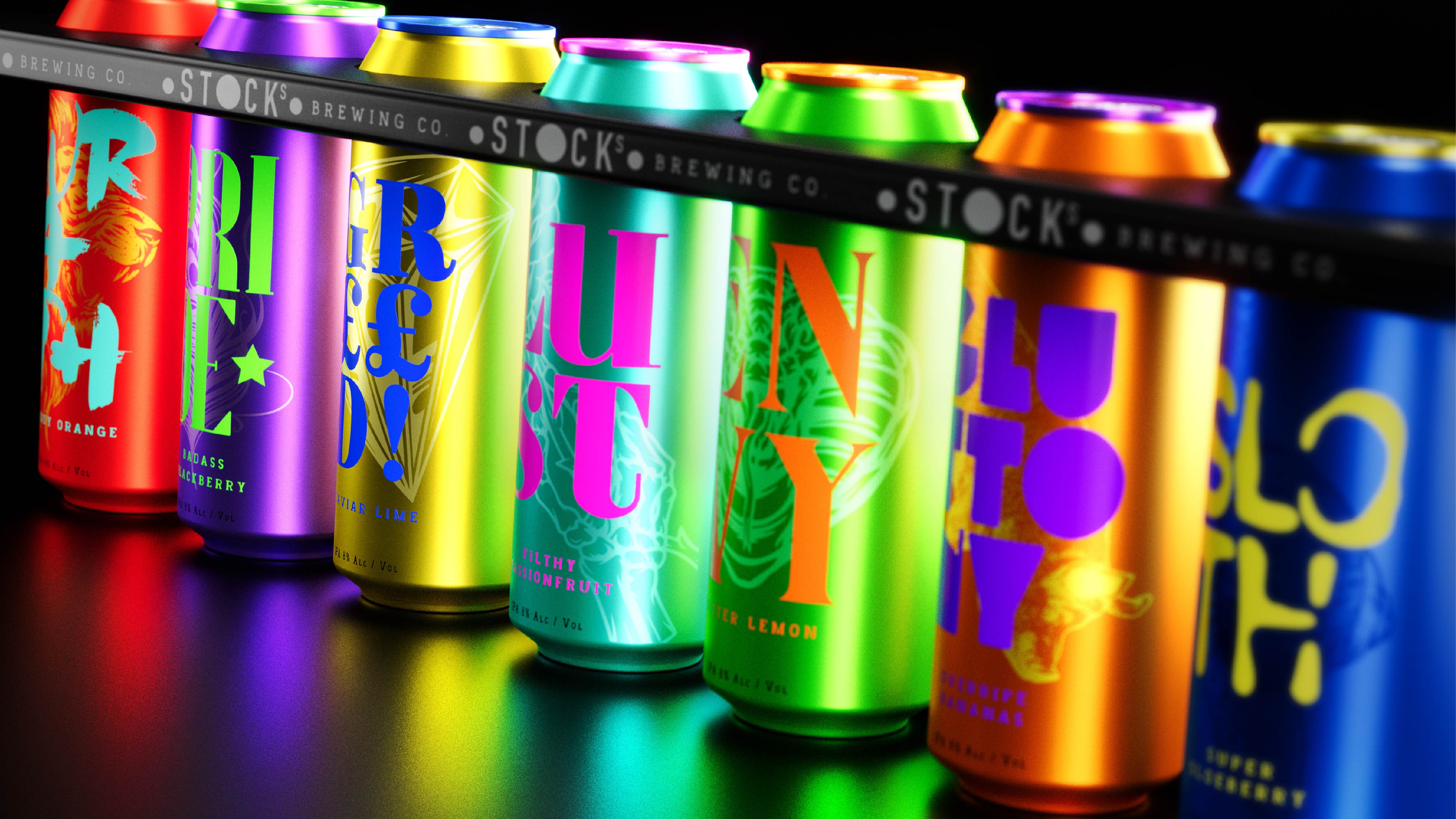
“Every Halloween, we look forward to creating a concept that shocks, spooks and surprises,” comments Andy Briscoe, Associate Creative Director at JDO. “Our concept for Stocks
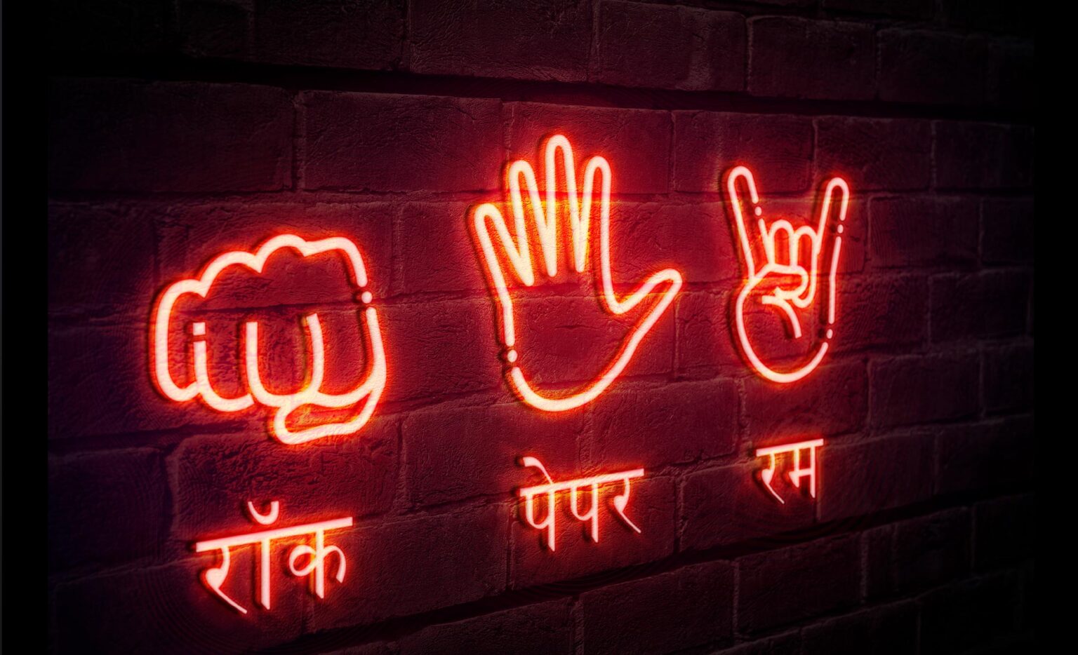
Good Barrel Distillery teamed up with Firstbase, a Delhi-based branding agency, to create packaging designs that would highlight India’s new wave of thinkers and risk-takers. The
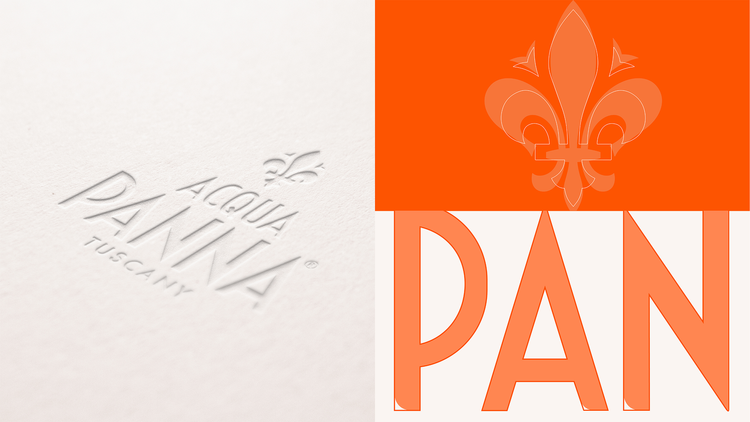
Acqua Panna partnered with FutureBrand, a Milan-based branding agency, to create packaging designs that would highlight the brand's premium nature. FutureBrand based its designs around the
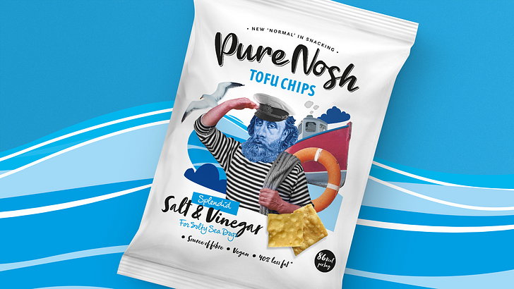
Alan Gilbody at Slice Design Limited commented, “We rooted the brand in 'The new normal in snacking' and use juxtaposing collages that mirror the surprising combination


