Latest in package design
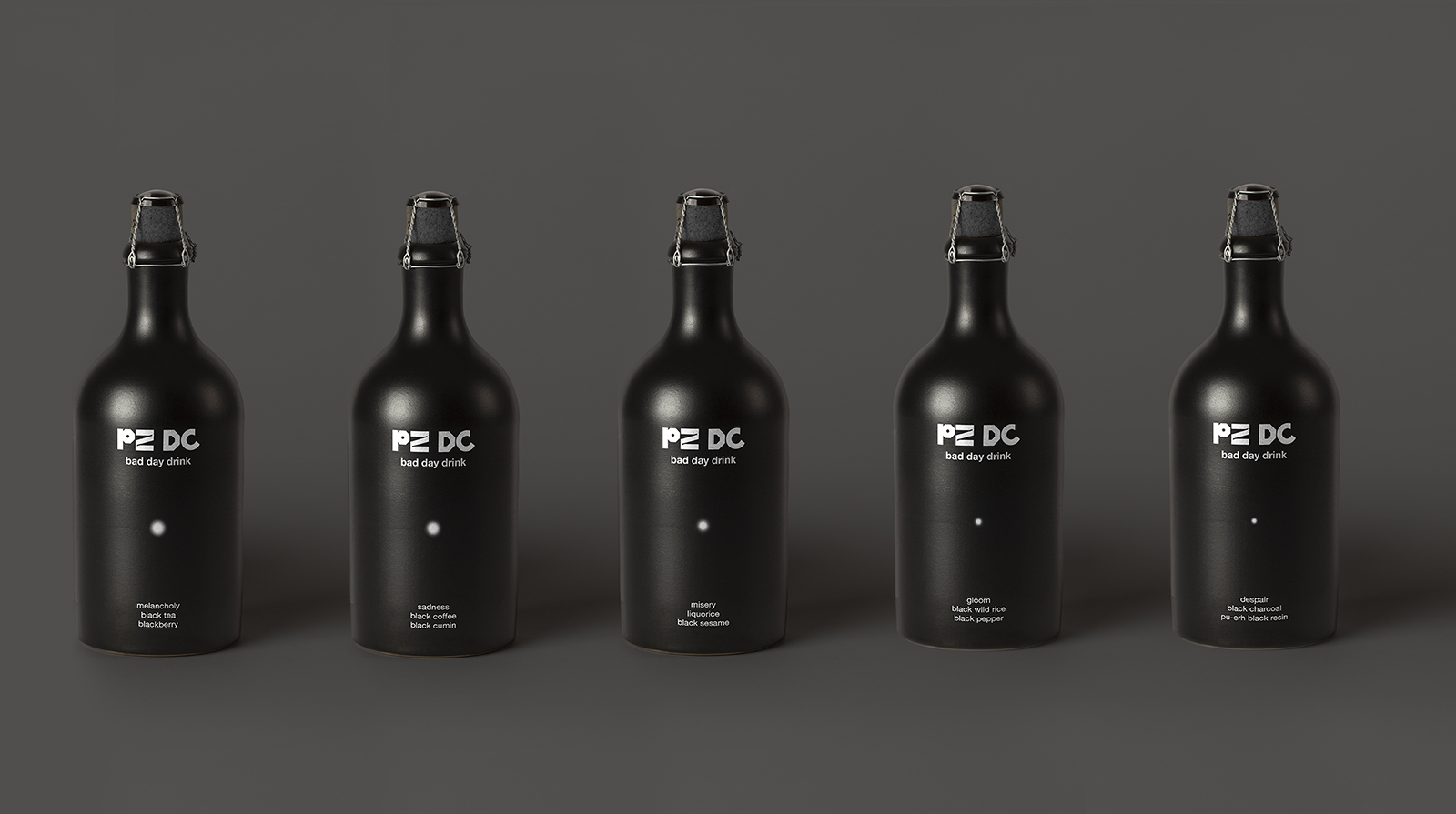
“The design represents the correlation between the dismayed state of mind and hopefulness — light at the end of the tunnel. The more upset we are,
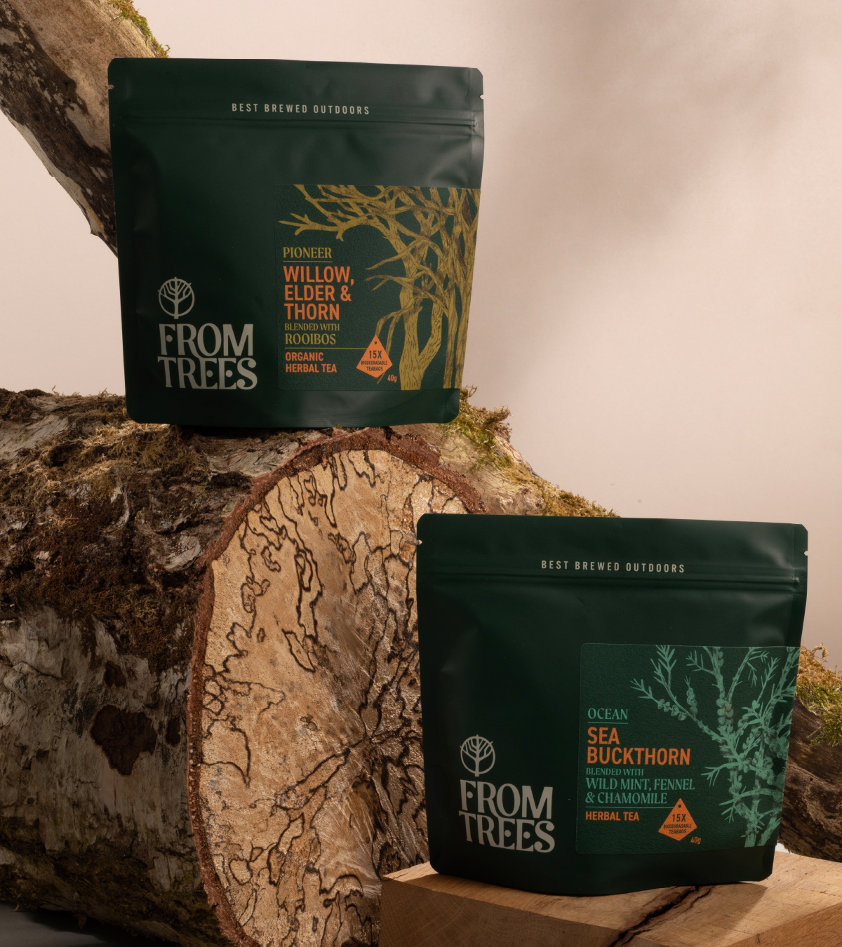
Kingdom & Sparrow “created a unique tea brand” that speaks directly to nature lovers and explorers. Furthermore, the packaging designs highlight the From Trees experience to
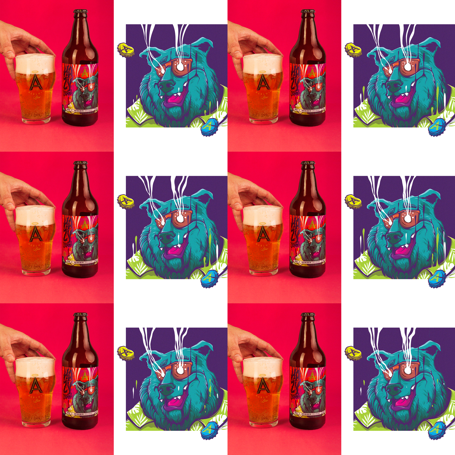
“For the launch of its new product, the brewery brings, to the delight of any good beer connoisseur, a striking Ipa, with a floral aroma, pleasant

Commodore’s Gin is made in Croatia using a refined formula. The flavors of pine wood forest bursts into the mouth, but once you let it settle,
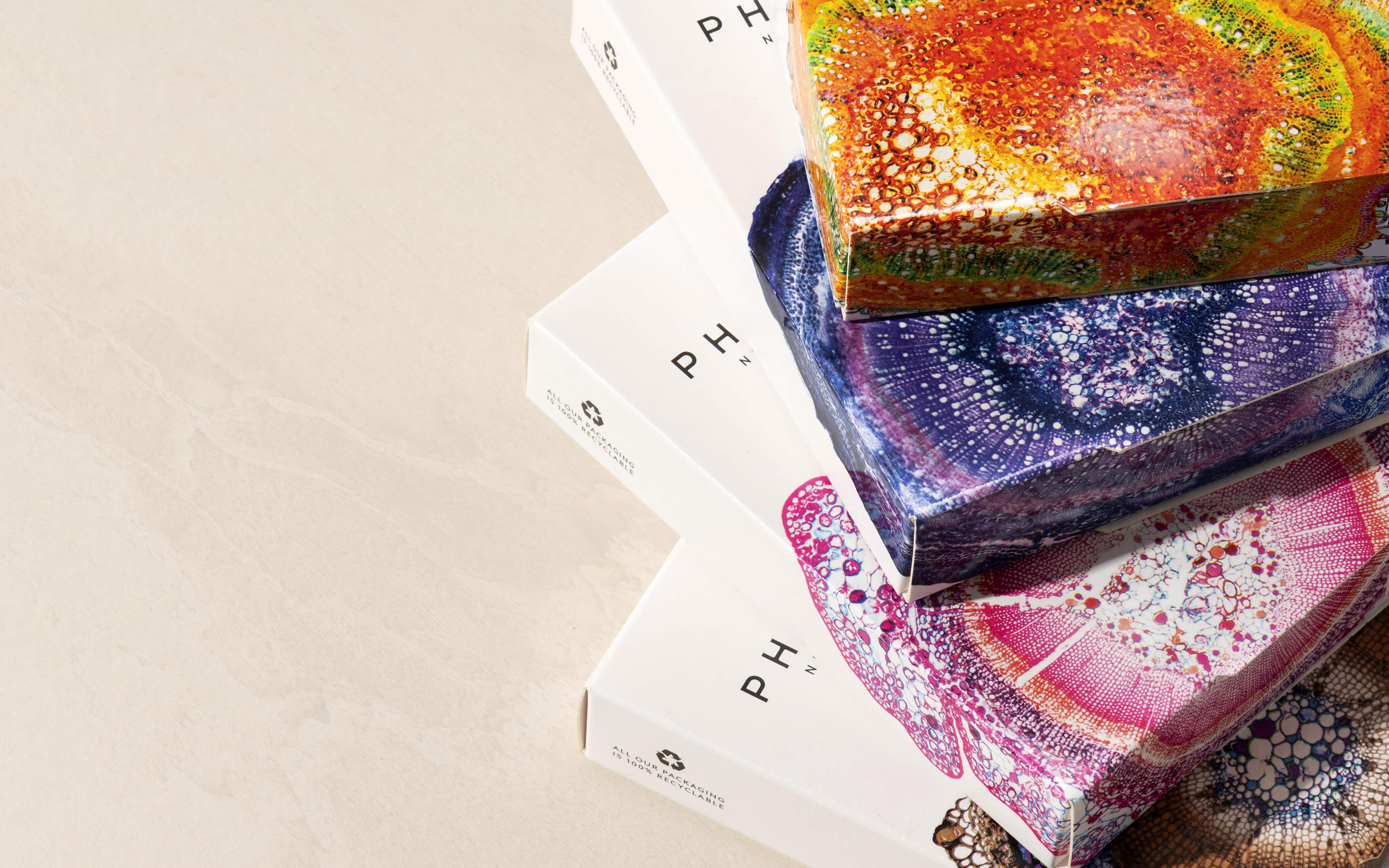
While the packaging is simple, the complexity of the stem cross-section micrographs is breathtaking. Phyto Nectars combined its efforts with the UK-based design agency, Mid-Air Studio,
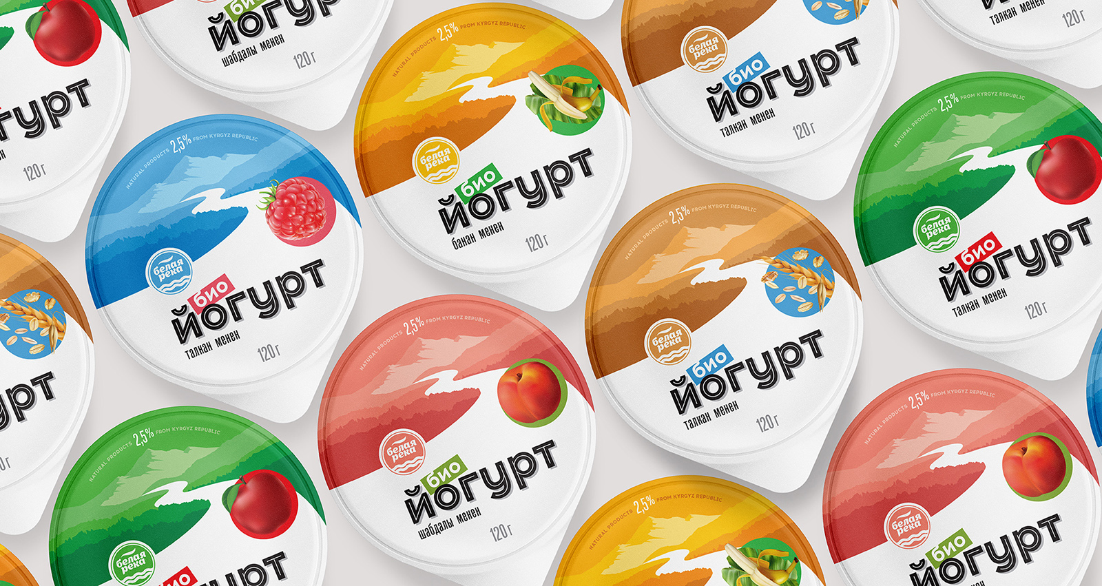
White River Dairy teamed up with Alexey Lysogorov, a Bishkek-based design artist, to create a packaging system that would highlight the company’s values. One of the

Kombucha partnered with Fin Studio, a Ho Chi Minh City-based design agency, to create packaging designs that would perfectly summarize the physical and mental balance the
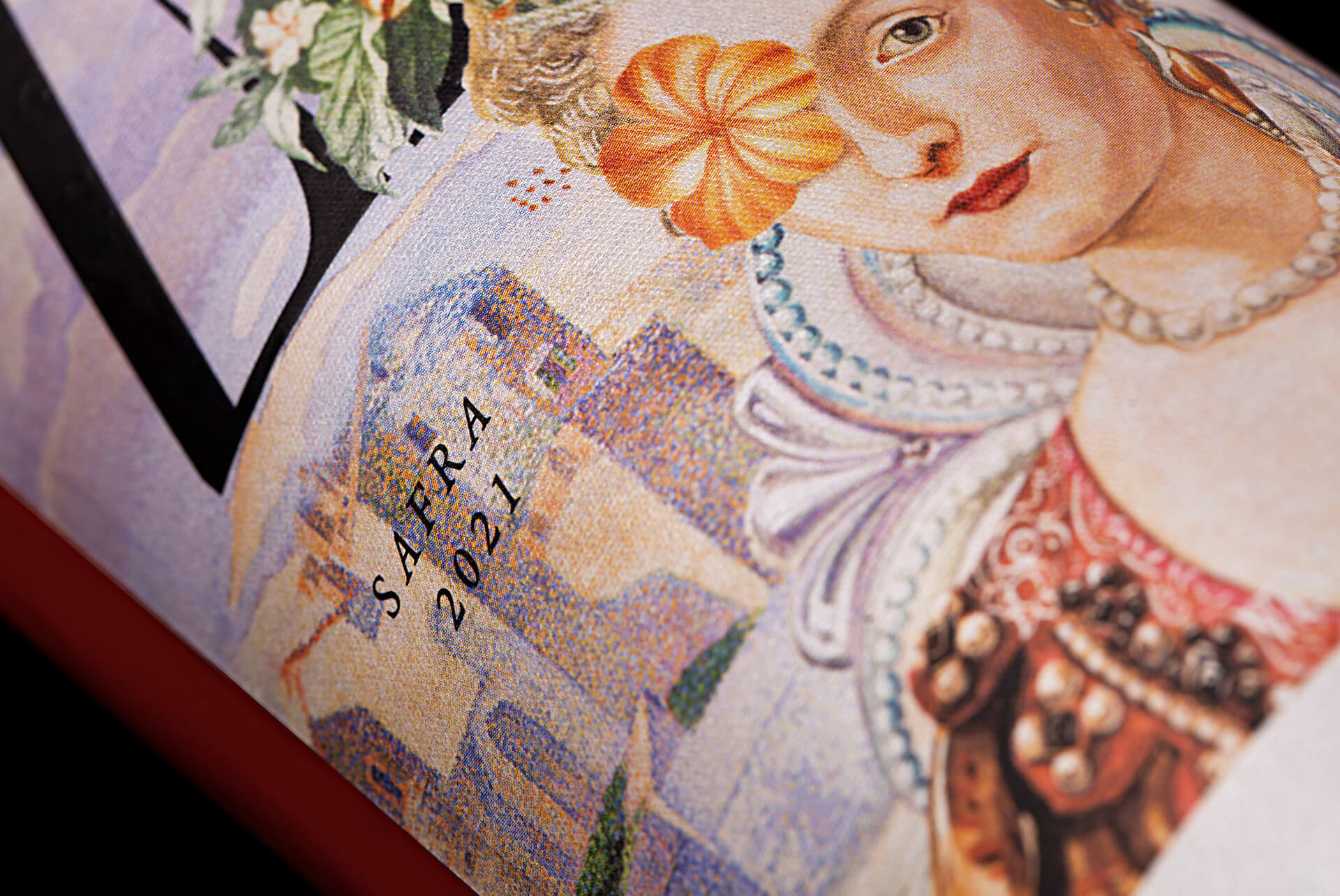
The wine brand partnered with the Porto Alegre-based design agency, Holy Studio, to create a packaging design that reveals the joy of crossing the sea. The
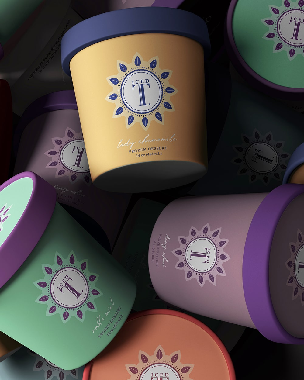
Iced T combined their efforts with Athens-based graphic artist, Sophia Georgopoulou, to create designs that would highlight the best of both worlds. The minimal design approach,
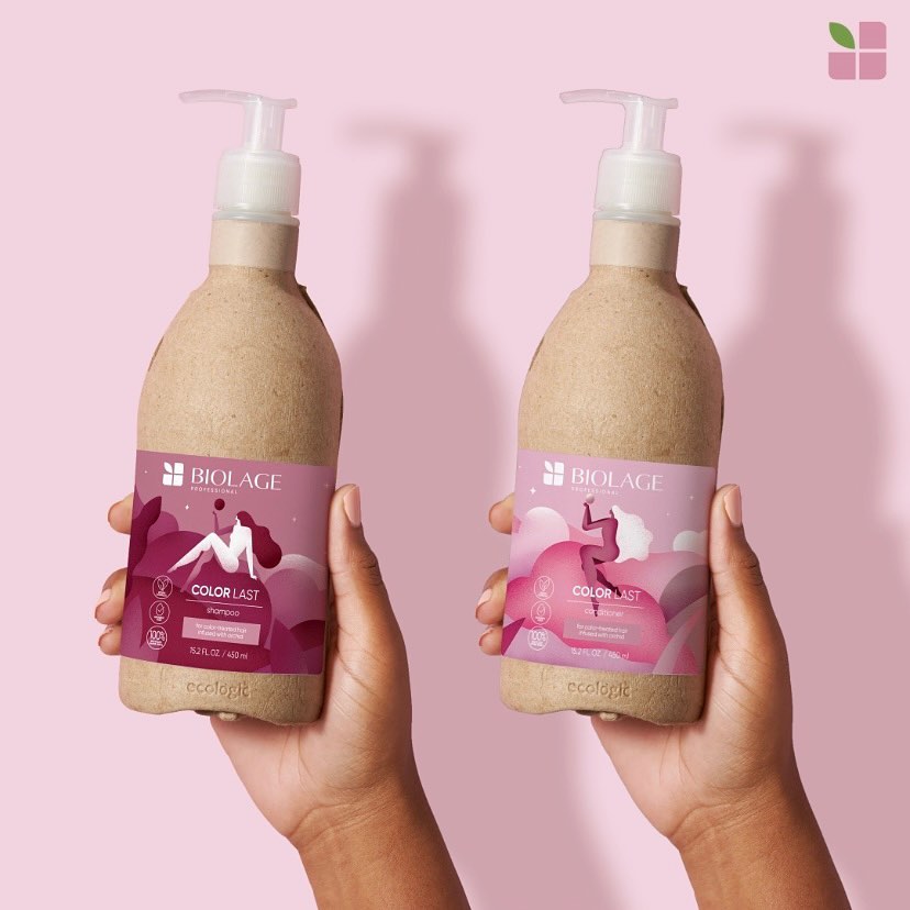
L'Oréal teamed up with the London-based graphic artist, Bárbara Malagoli, to create a compelling packaging design for Biolage. The packaging celebrates Mother Earth by depicting a
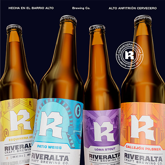
“…we were able to build its essence and transmit all its DNA, finding a great idea to transmit it and complementing it with its visual identity
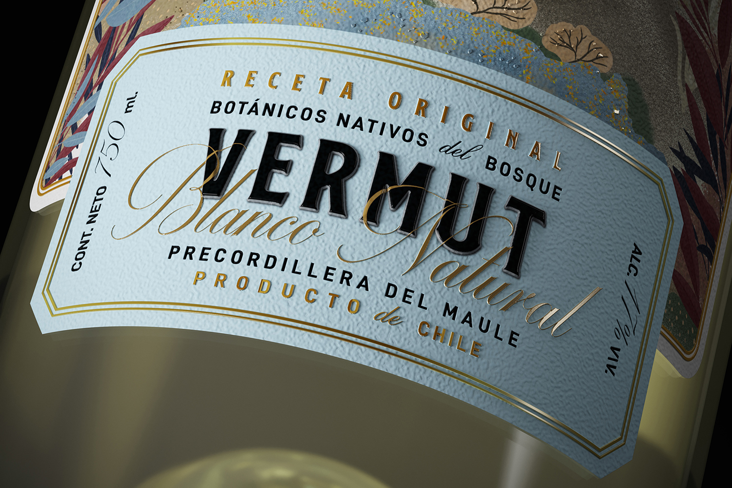
Betina and Paulo collaborated with the Mendoza-based creative agency, Zig Design Studio, to create compelling packaging designs for the brand. The illustration on the label depicts
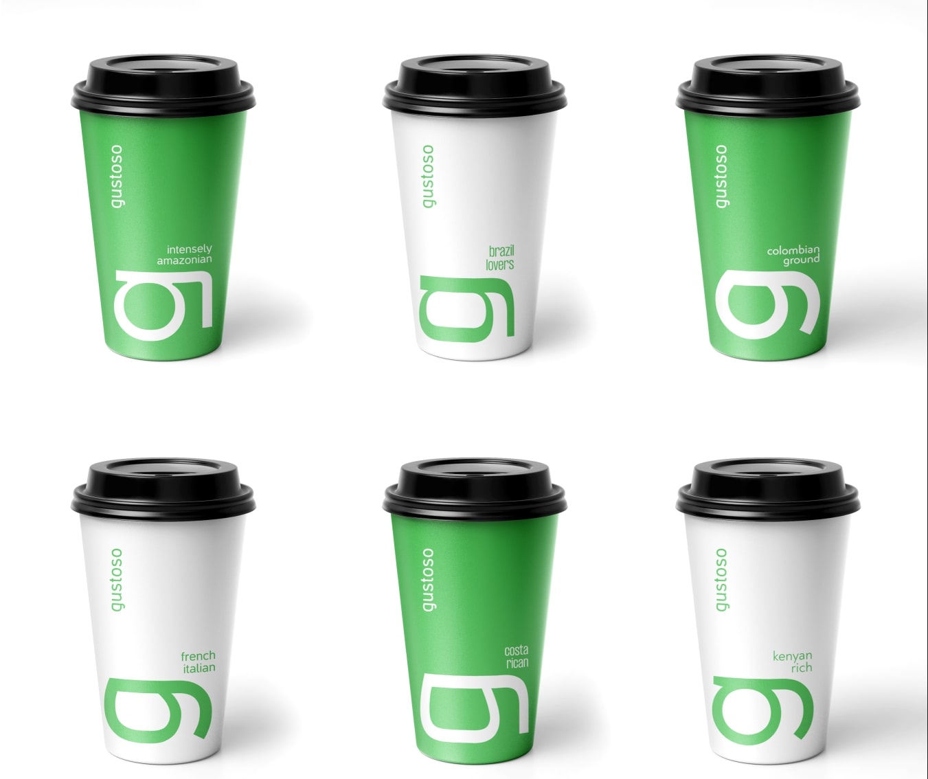
Brandten maintained a minimalist approach while creating the packaging design for the coffee brand. The design house expanded the company’s first letter, “g,” to convey the
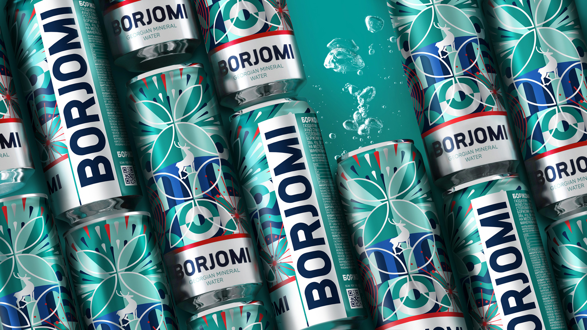
Borjomi partnered with the Athens-based graphic artist Antonia Skaraki to create compelling packaging designs for their limited edition Borjomi Gregorian Mineral Water. The packaging is based
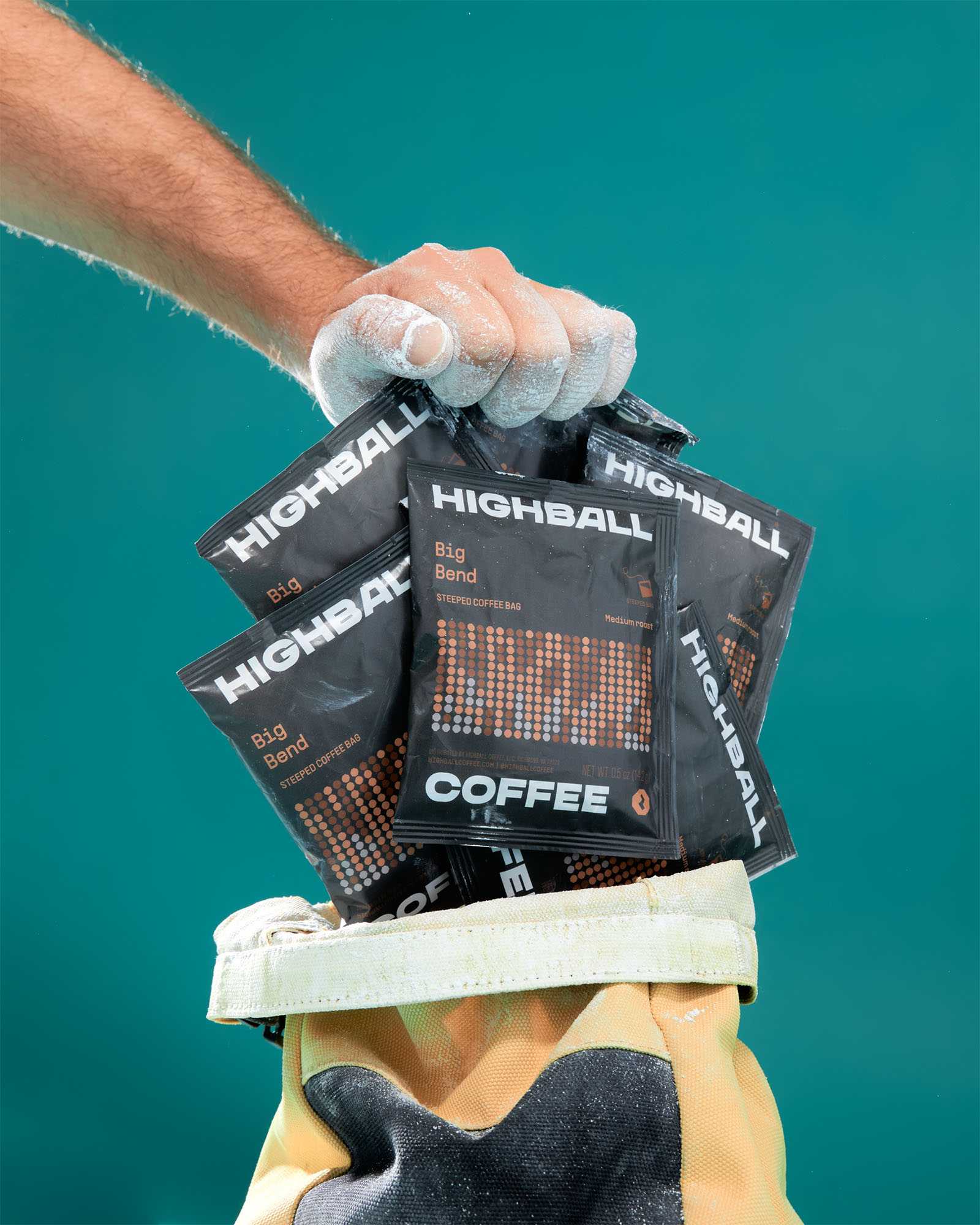
“The packaging has been designed to make their coffee bags instantly recognizable, attention-grabbing and climbing inspired in its naming as well as graphic system…”
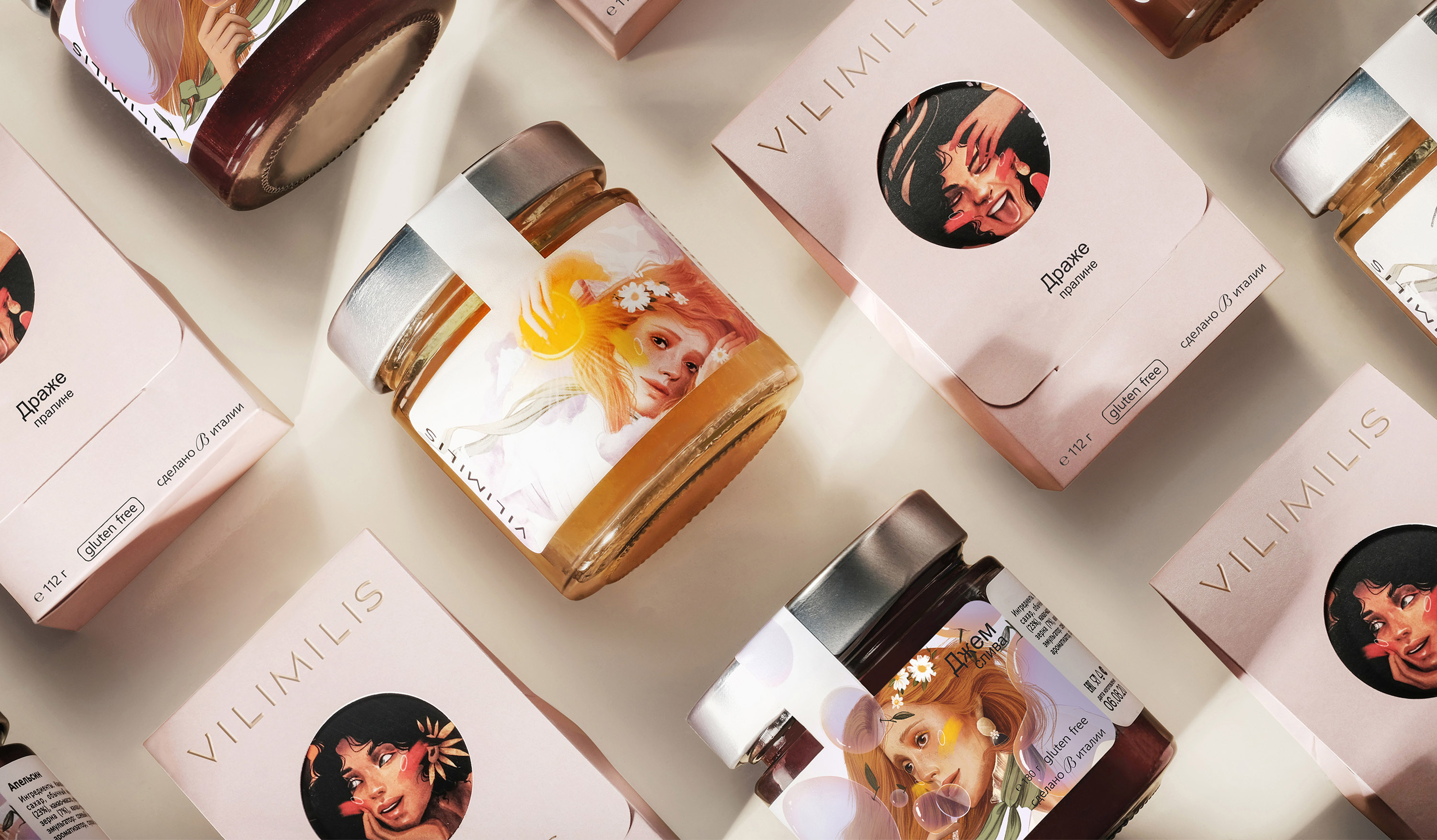
The packaging is based on the idea of ‘escapism.’ The illustration of the window on the packaging depicts the inner world of a woman and her
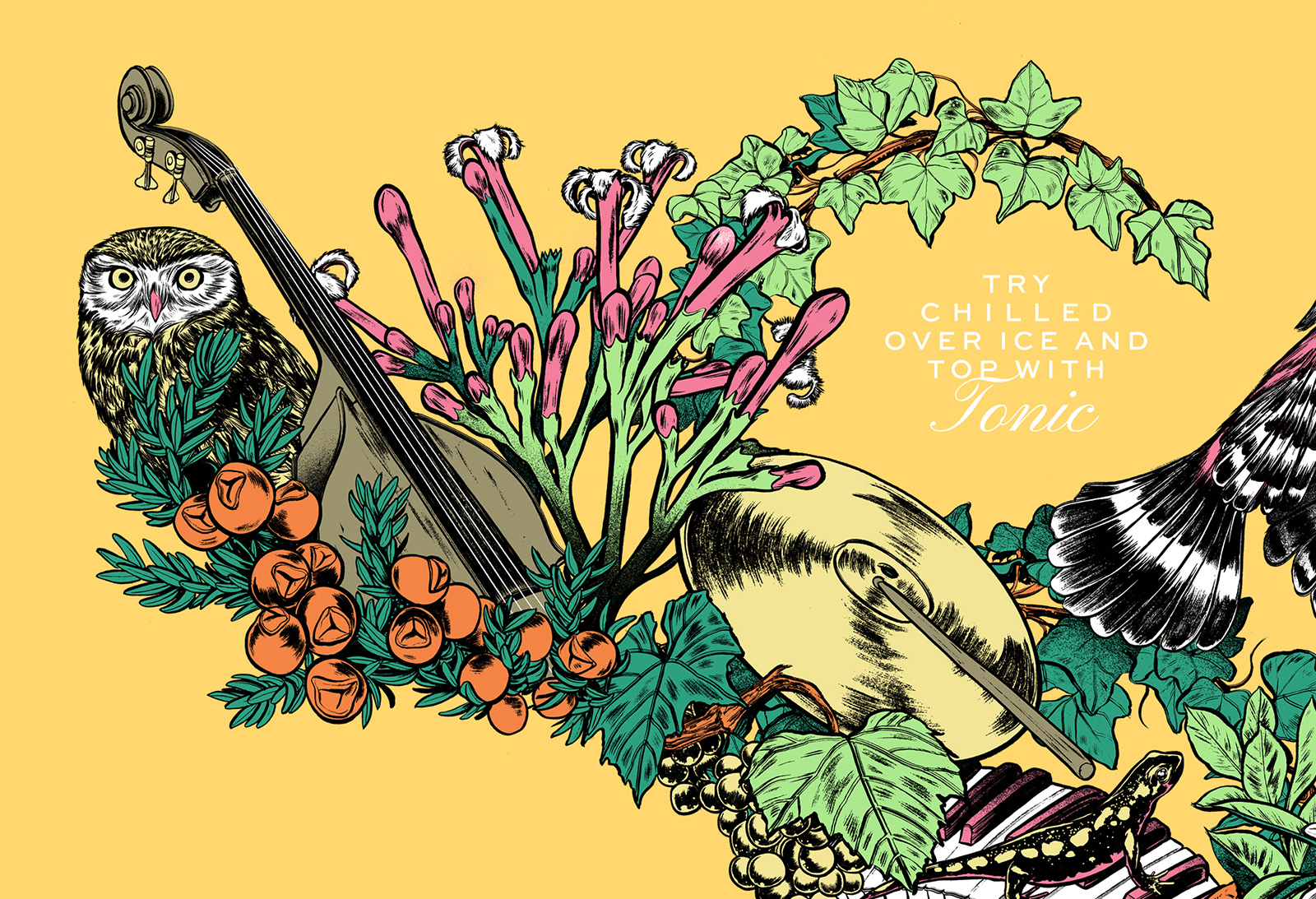
Inspired by the music of the Beat generation and the picturesque setting of Douro, Volta Studio began its creative process. The colorful illustrations on the bottle
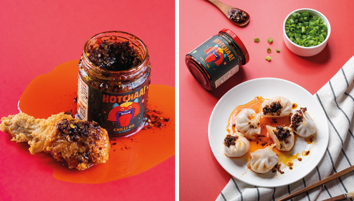
Anita teamed up with the Mumbai-based graphic designer, Norma Rodricks, to create the branding and packaging for Hotchaa! The highlight of the packaging is the use
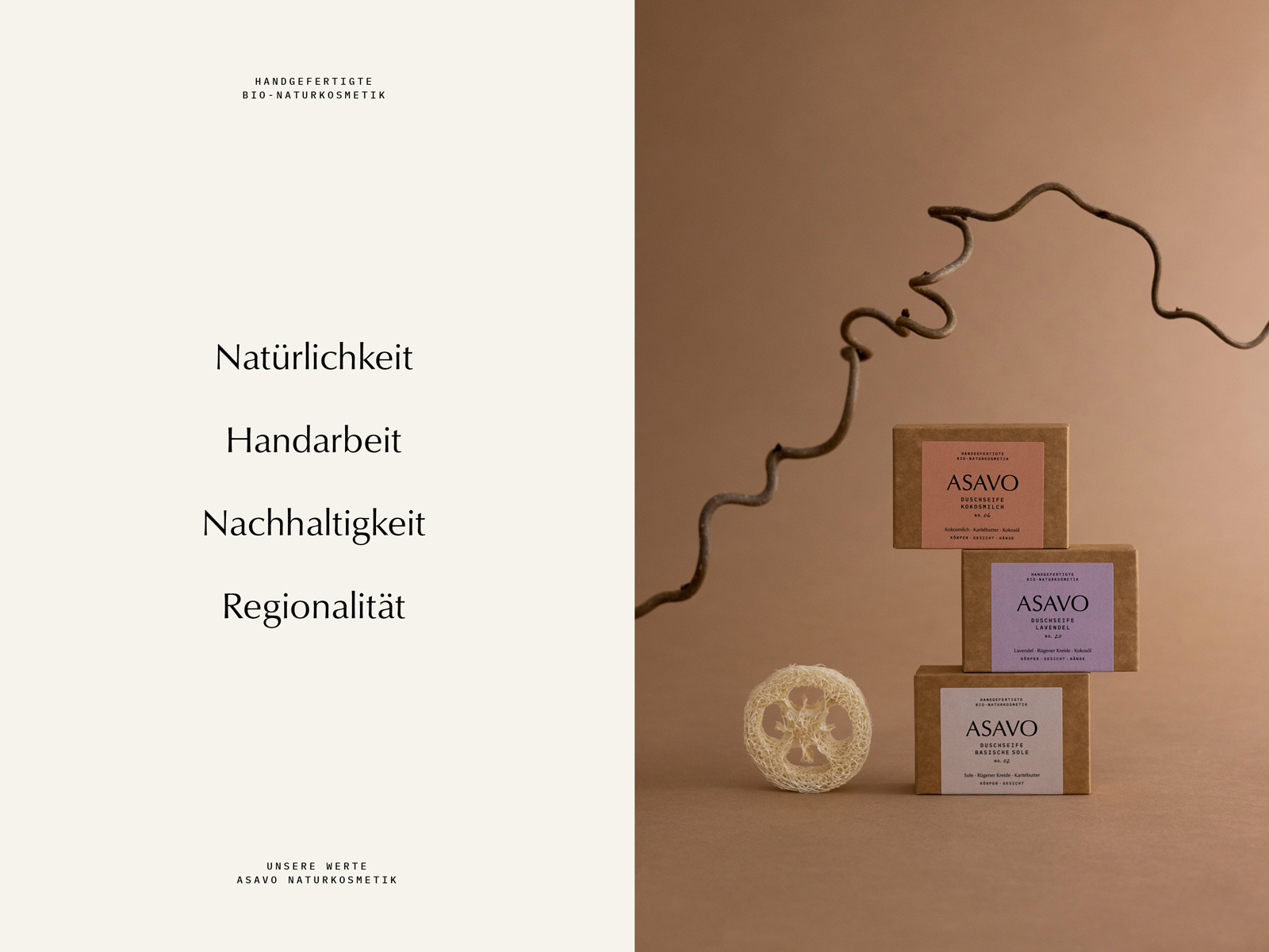
Bettina partnered with Caroline Rubik, a Cologne-based art director, to create the packaging designs for her products. Caroline's creations are in line with the company's values
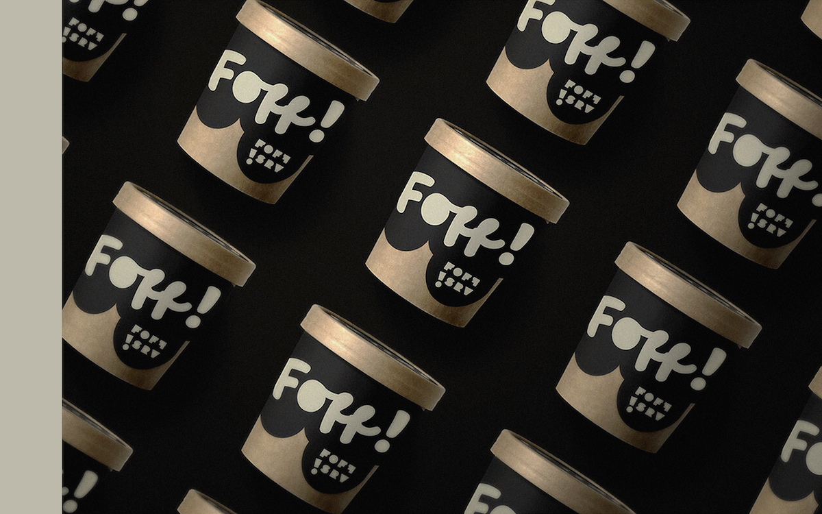
Foff teamed up with the Vancouver-based design agency, Jade Ratcliffe Creative, to create the packaging design of the brand’s new line of ice creams. The black-and-gold


