Latest in package design
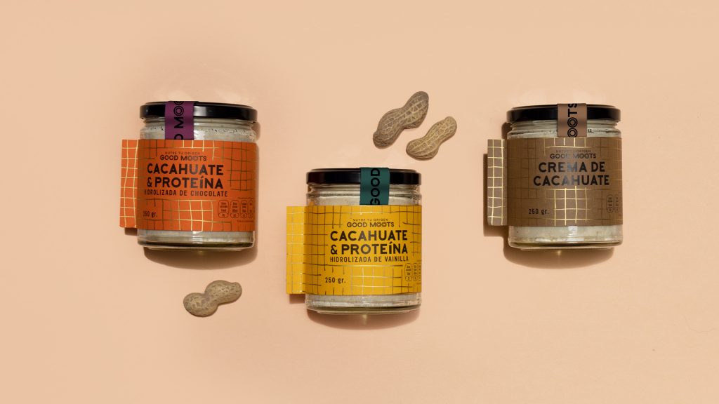
Good Moots is a combination of two words from English and Mayan origins. Good in English means, well, good, unless you want it to mean something
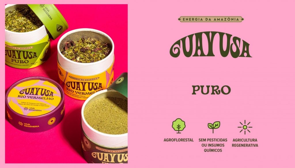
Found in the Amazon rainforest, the Guayusa plant is high in caffeine. The packaging designs of the tea line were created to highlight the origins of
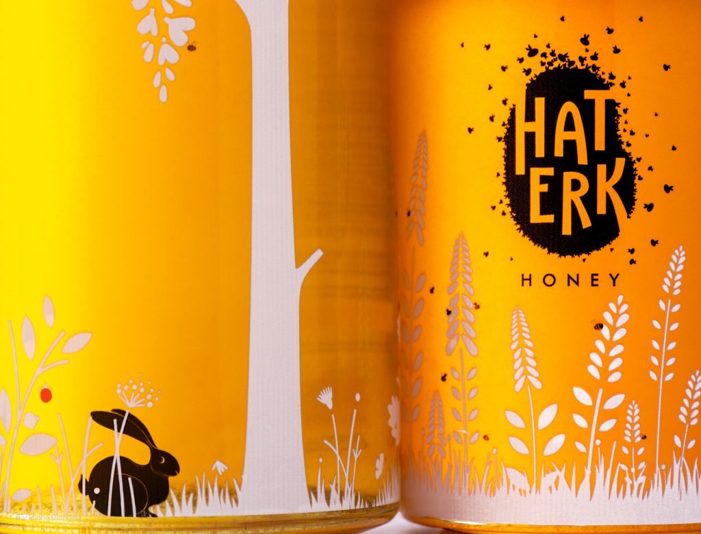
“‘Haterk’ is a village where many of the products were first produced. From Haterk, many paths have been laid in search of ecologically pure, fresh, produce
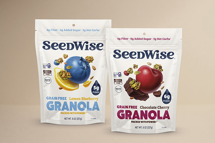
“After thriving in the bread aisle for 25 years, we felt it was time to take our expert baking skills into the snacking industry. We’re confident
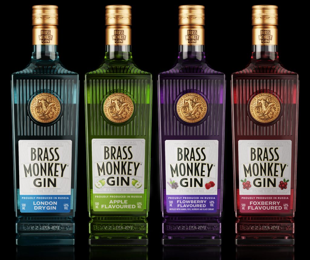
Jacomy Mayne Studio, a Mendoza-based multiple award-winning branding and packaging boutique studio, created the classy packaging which recreates the nostalgia of the 1920s when jazz and
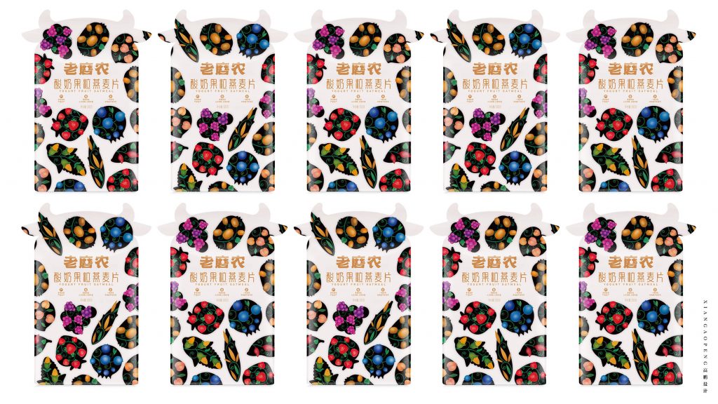
Designed by branding agency Xiangaopeng, the packaging of Yogurt Nut Oatmeal is designed to attract customers and communicate the benefits of the product.
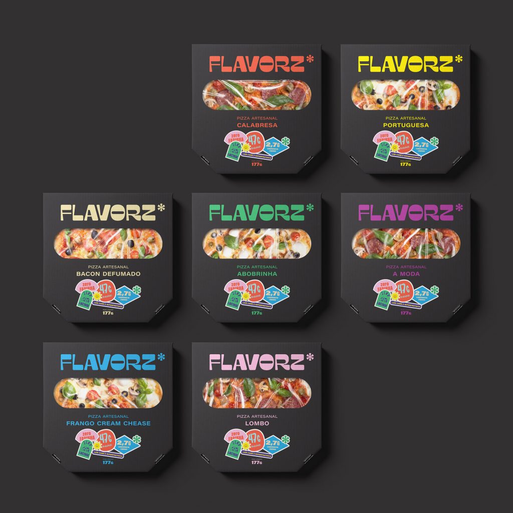
“The asterisk that accompanies the name is the graphic symbol that carries the other attributes that are inserted in the brand DNA and a way to
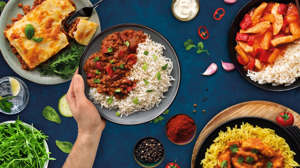
The challenge for StormBrands was to create a brand identity powerful enough to stand out from the crowd in the highly competitive and noisy market segment.
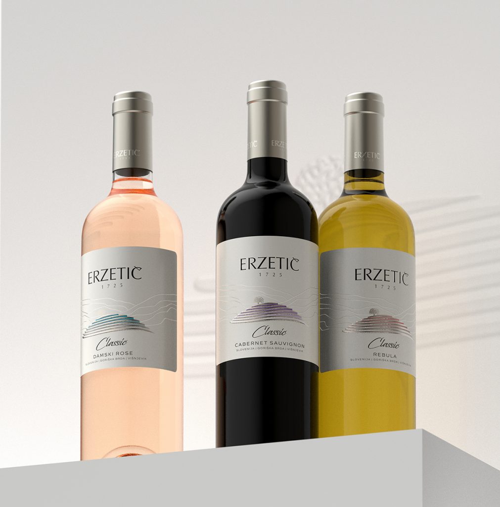
The packaging design is simple yet oozes sophistication. The image of the tree atop a hill transports one close to the serenity of nature.
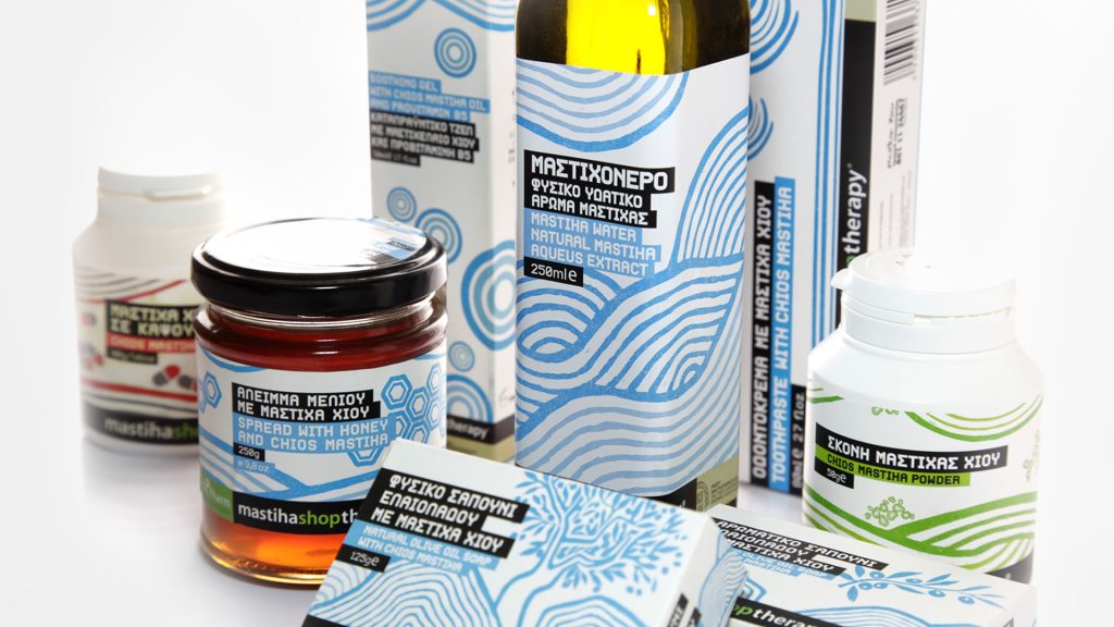
The prime idea behind the project was to highlight the origins and the health benefits of the parapharmaceutical products Mastihashop manufactures.
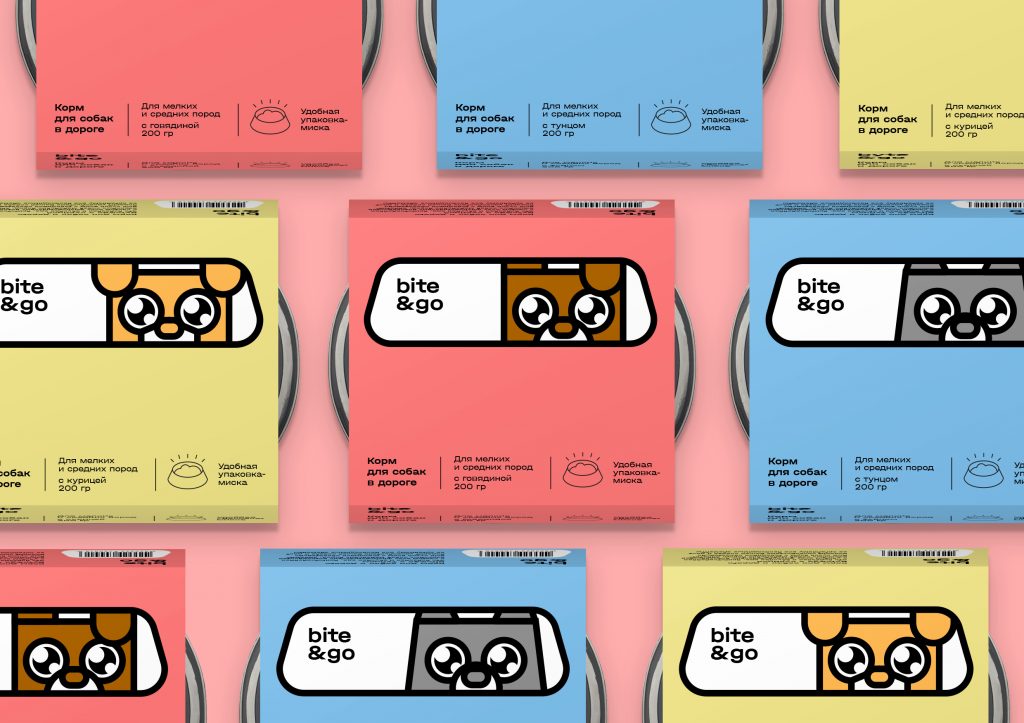
The student design concept by Anastasiya Kuprina focuses on easing the challenges of feeding a dog while traveling.

“The design also features a dramatic tear through the heavy paper label, graphically telling the story of the oceanic divide and the rum’s journey between the
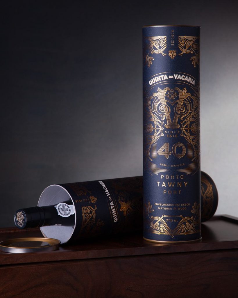
“The collection of four bottles of 10, 20, 30 and 40 years is carried in a case inspired by an old suitcase, in a clear allusion
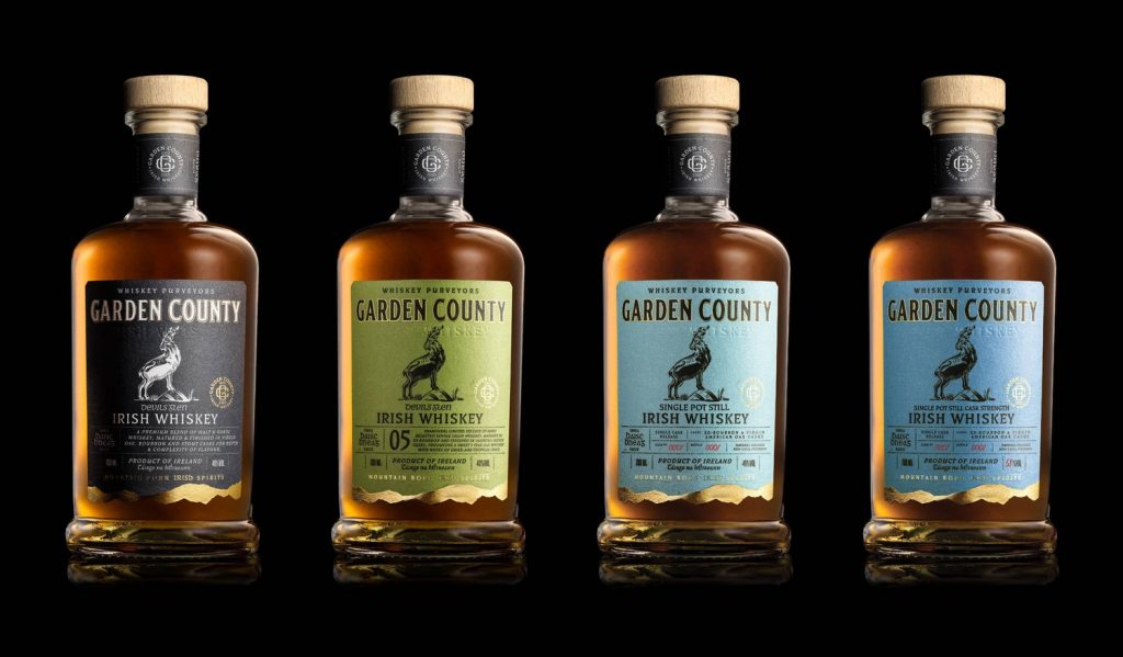
While the packaging is contemporary, it does highlight the product’s Irish roots. The earthy colors, together with the fonts and the legendary Púca, add to the
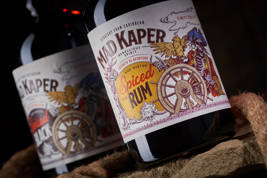
“The visual style for the label design of Mad Kaper rums is designed in the style of pirate posters and adventure novels… the stylized illustration of
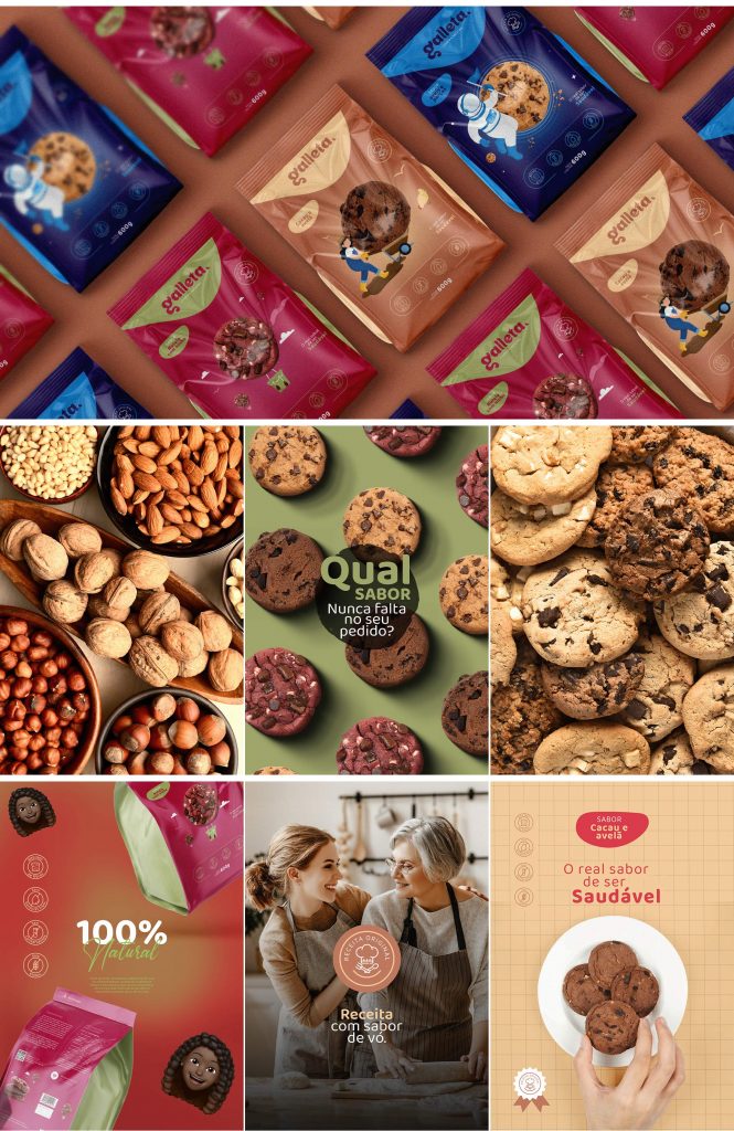
The brand owner of Galleta approached Studio Camus to create a “friendly, fun, clean, and modern” brand identity and packaging design to attract international customers.
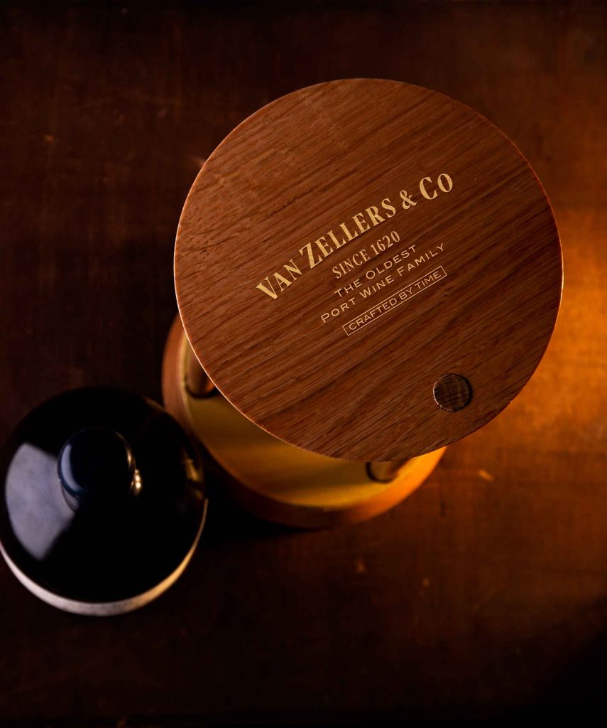
Van Zellers & Co Very Old Tawny Porto was created in 1968 and has never seen the light of day ever since, making this port wine
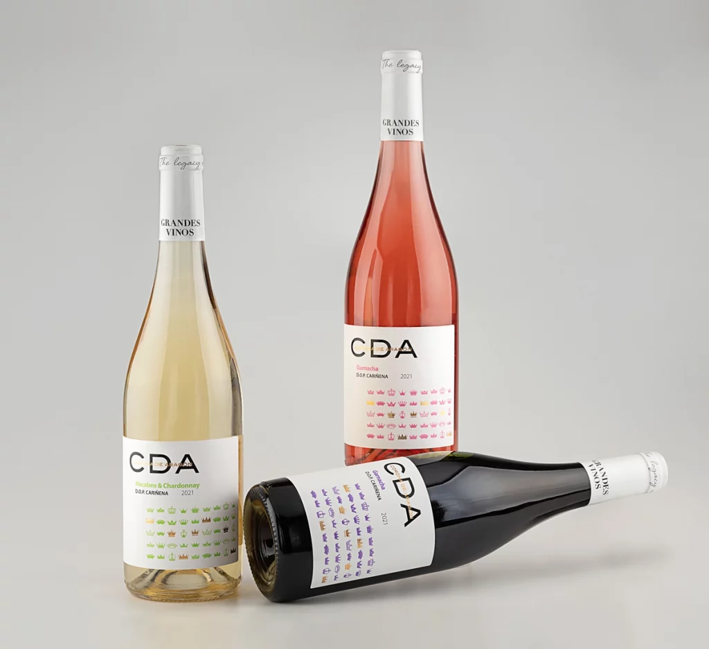
Moving away from the traditional design and obsolete typography, the brand now follows a new design concept to cater to modern consumers.
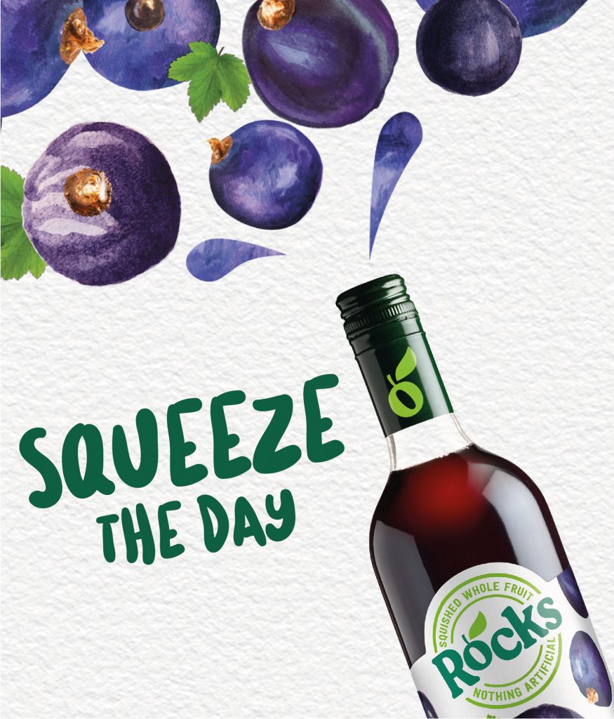
The brand refresh focuses on highlighting the simple ingredients and the mouthwatering flavors. Family (and friends) completely avoided the use of Photoshop-style images, typically associated with
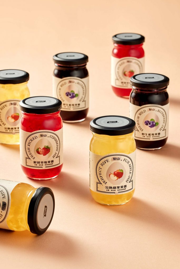
The new packaging follows the brand’s spirit: “to make every bite of jam a fresh one.” Each flavor comes with a unique packaging that visually communicates


