Latest in package design
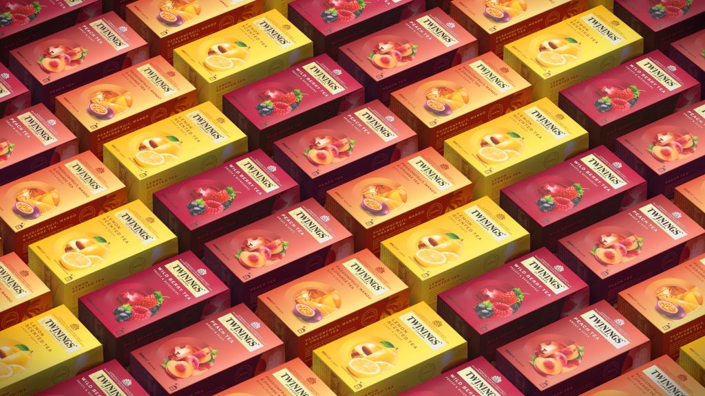
While the brand attracts customers from around the world, Twinings wanted to adopt a new look to captivate the younger generation.
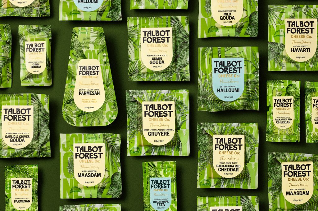
Onfire took the challenge of creating designs that would communicate the unique personality of the brand. The design agency took inspiration from the brand’s forest origins,
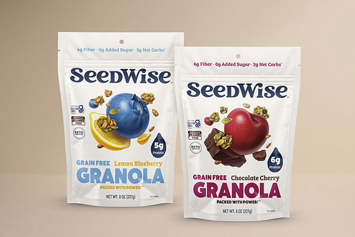
“We developed a spirited & modern logotype with the roundness that embodies the wholesome satisfaction of the snacks. Then we dialed up the flavor, big time.
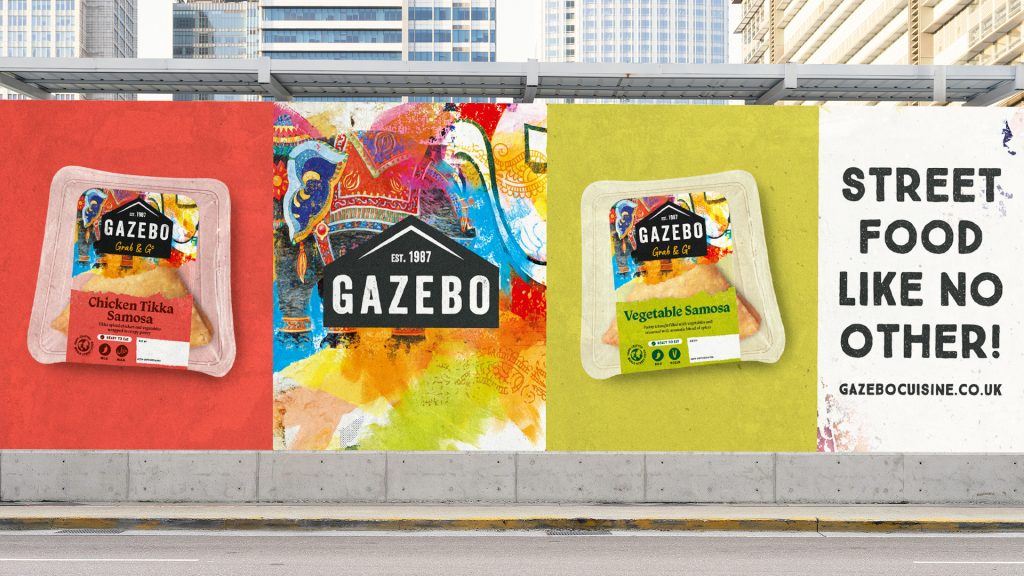
Gazebo teamed up with the London-based branding and packaging design agency Slice Design to create compelling visual illustrations that would help the brand position itself as
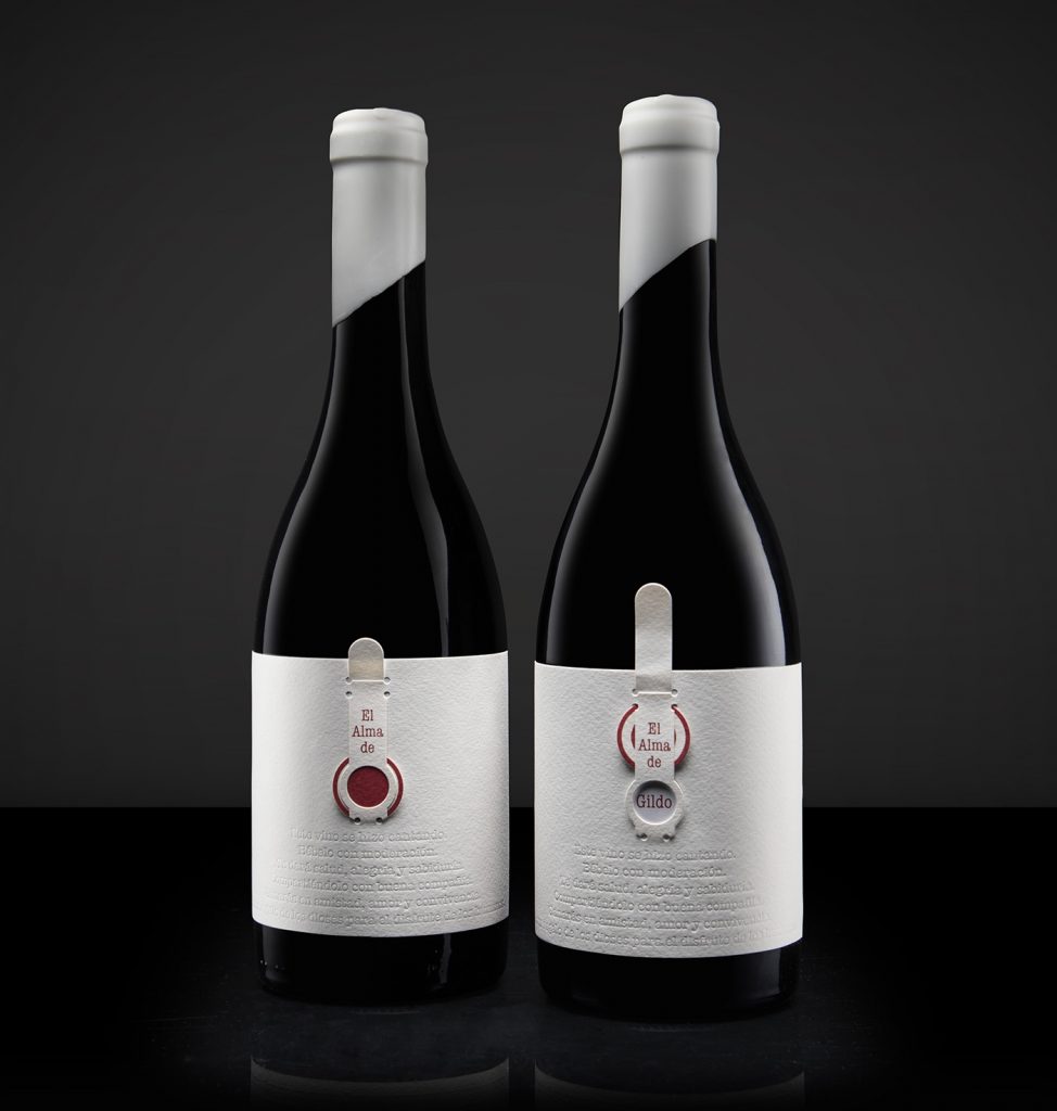
“For the concept we are based on the idea that the soul is something that is there but cannot be seen, it has to be discovered
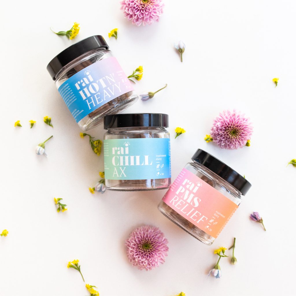
The idea behind the branding and packaging design is to communicate the “heavenly, light, and relaxed” feeling associated with the products.
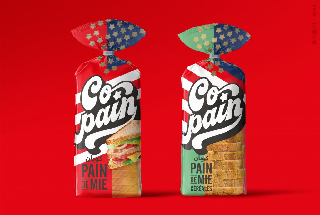
Designed by: Neom | Country: Italy Copain is a French word meaning friends or me and my partner. The French word also has another meaning: the
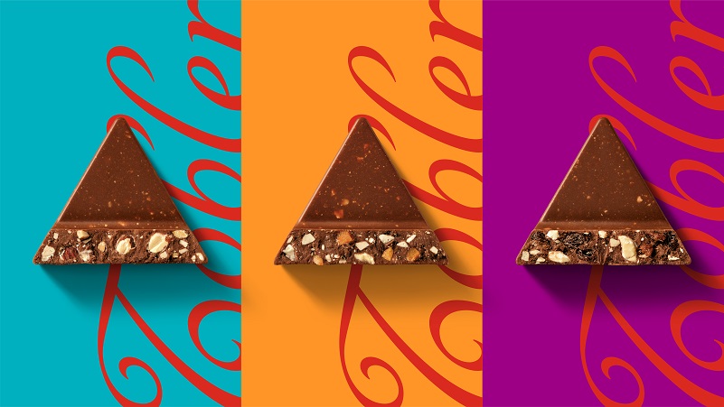
Toblerone teamed up with the London-based design agency Bulletproof to create a new brand story that “pays tribute to the importance of being stubbornly triangle in
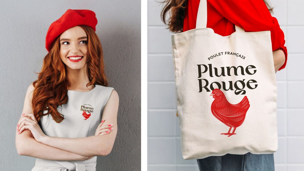
“We are happy and satisfied that our chicken gets a delicious crust when cooked and our brand is after all about expertise rather than ‘absolute Frenchness.’”
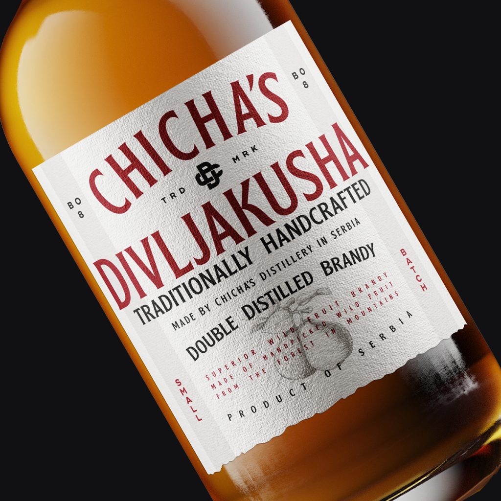
Bobo 88 DSGN, a Belgrade-based design agency, was inspired by American heritage to create these compelling packaging designs. The torn-bottom look of the label gives the
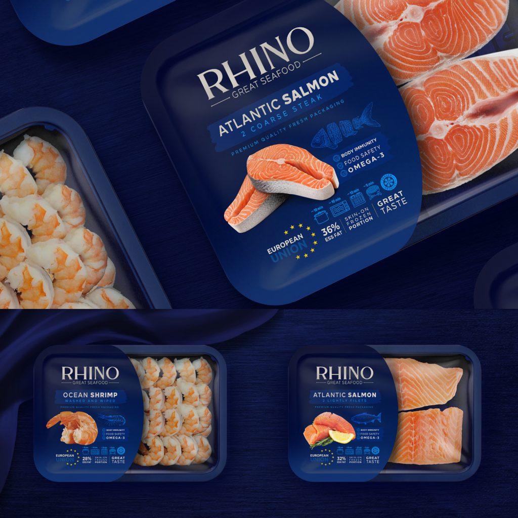
Rhino kept its packaging simple and without labels because it supplied its products to restaurants; however, with the brand‘s ambition to disrupt the seafood market, it
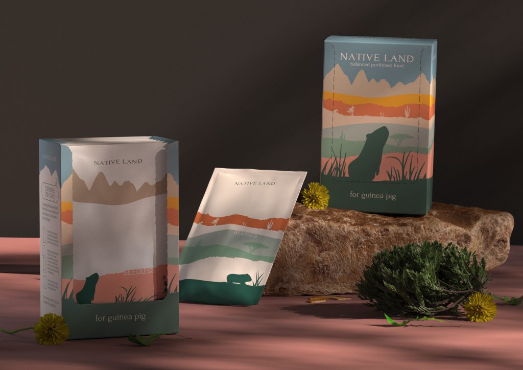
“The habitat of a rodent was chosen as a visual metaphor for the main packaging. This graphic style of packaging directly refers to the natural habitat
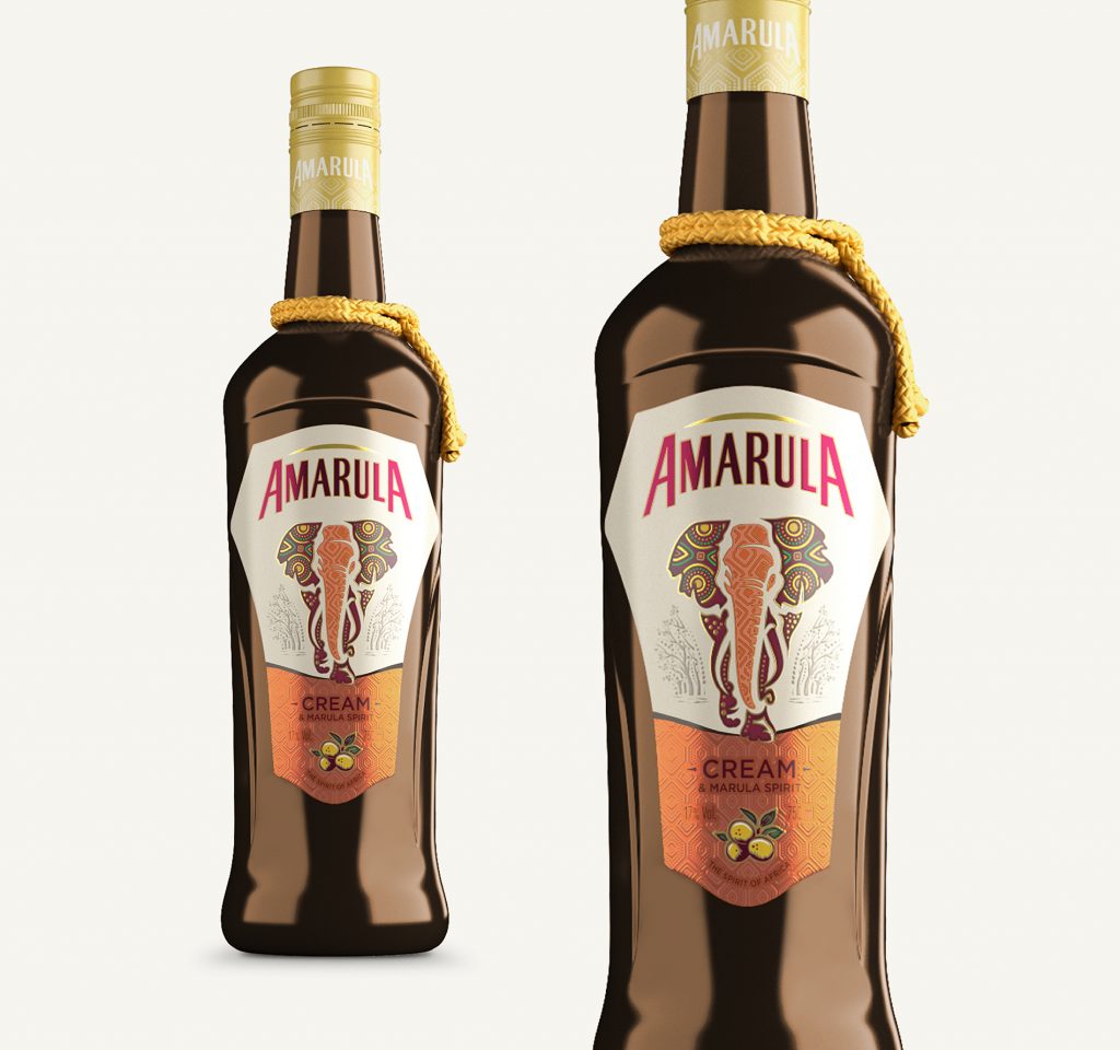
Each bottle celebrates the natural heritage of the country. One of the striking features of the bottle is the way it is sculpted. A closer look
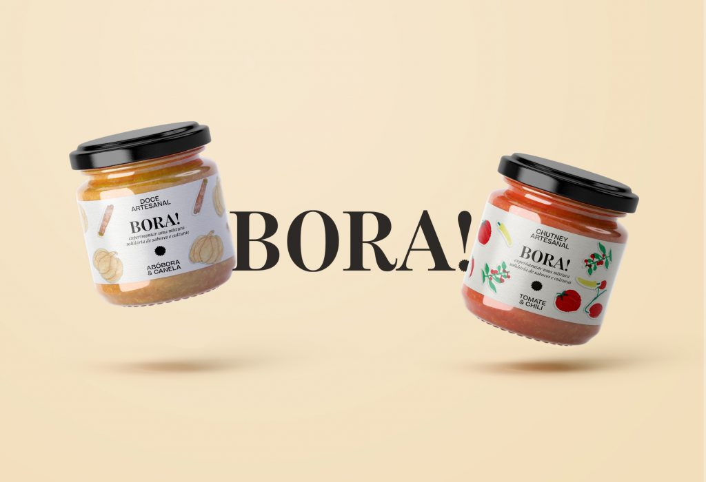
The name “Bora” and the decoration on the label have been created by the children of the refugee community. The illustrations and layouts are simple and
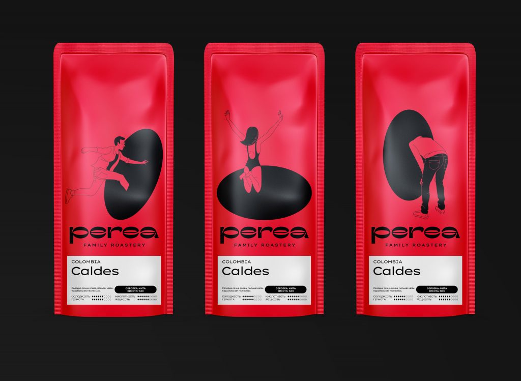
“…Today, the heroes of megalopolises immerse themselves in this world every day, while designer Nastia Churbanova captured and drew them right when their euphoric journey began.
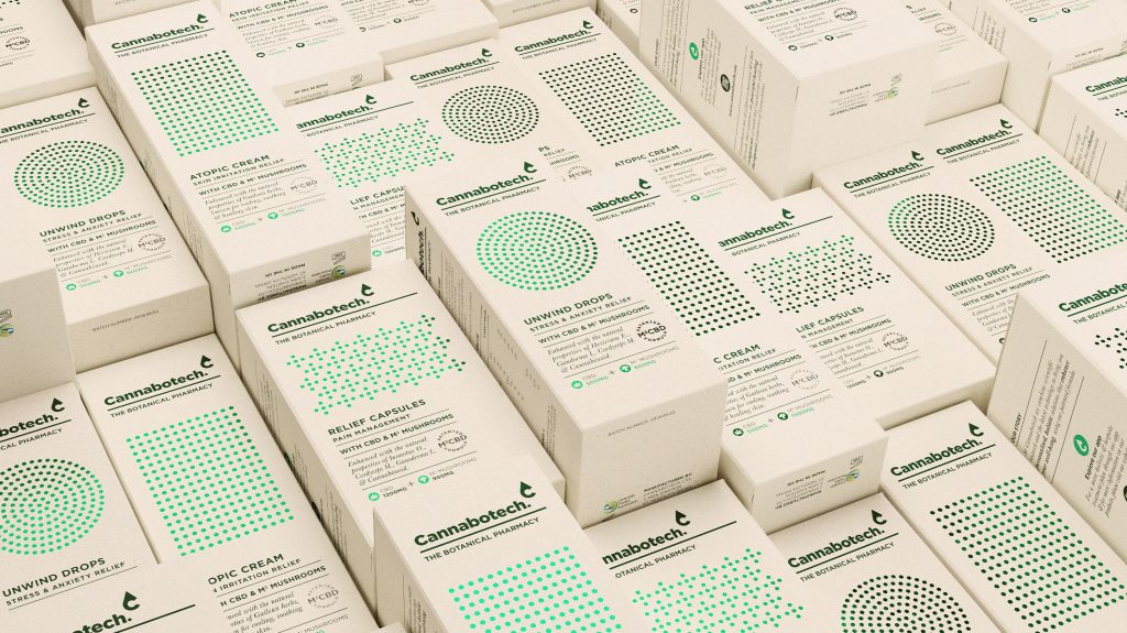
“Wanting to be recognized as the Botanical Pharmacy, Cannabotech combines the latest technology with the power of nature and modern science to provide personalized, holistic, wellness
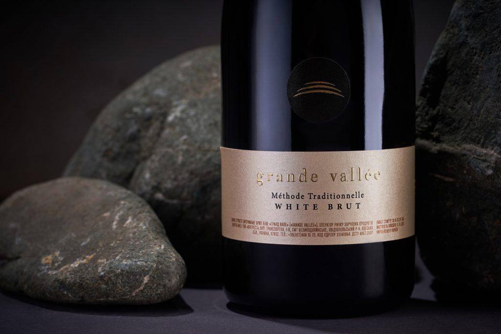
“…The general character of the visual composition is maintained in a strict, premium style, which emphasizes the method of production of this wine, and its special
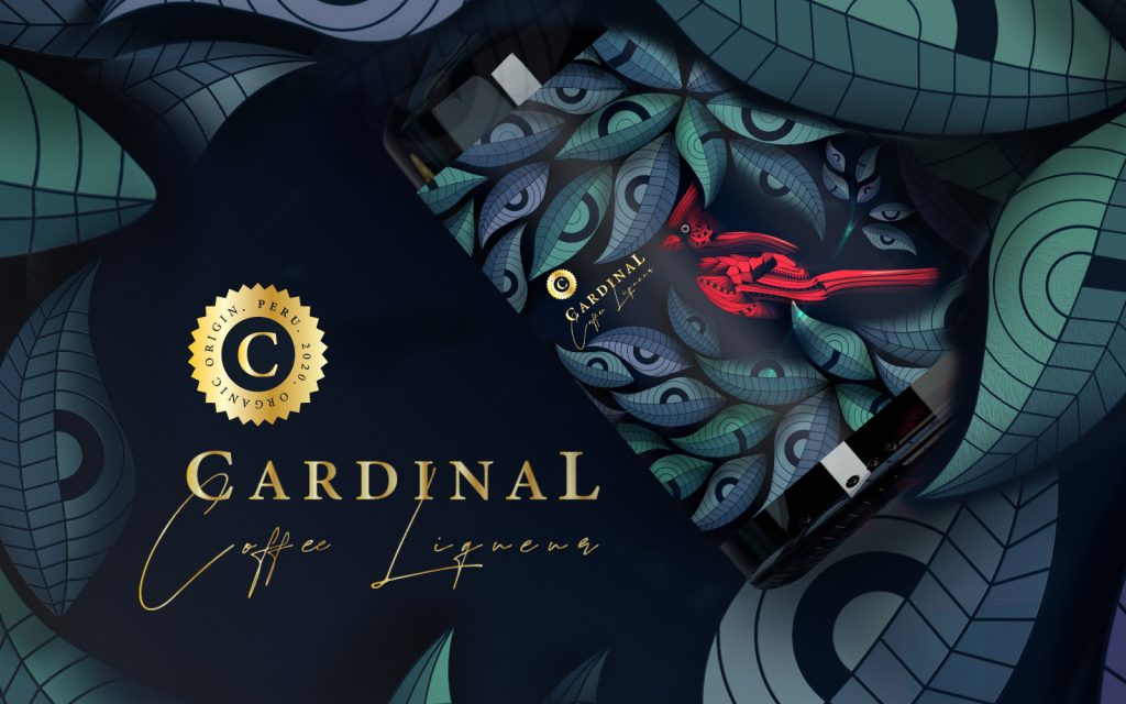
Organic shapes, bright colors, and custom illustrations are what define the brand identity and the packaging. Customers and potential buyers immediately get transported to the exotic
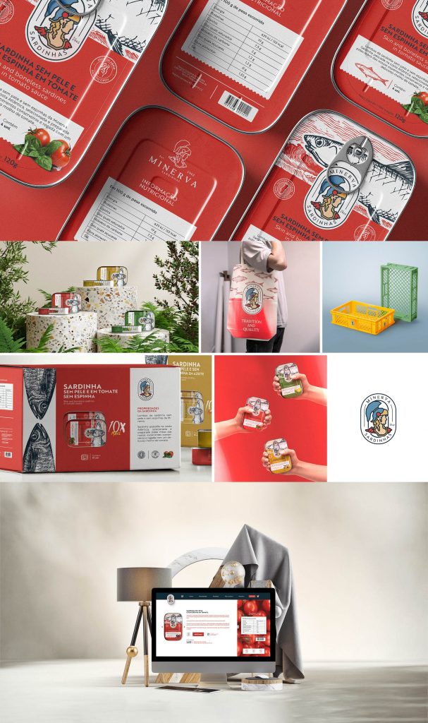
“It's about elegant, minimalist, ironic, vintage, innovative, romantic packaging and more…”
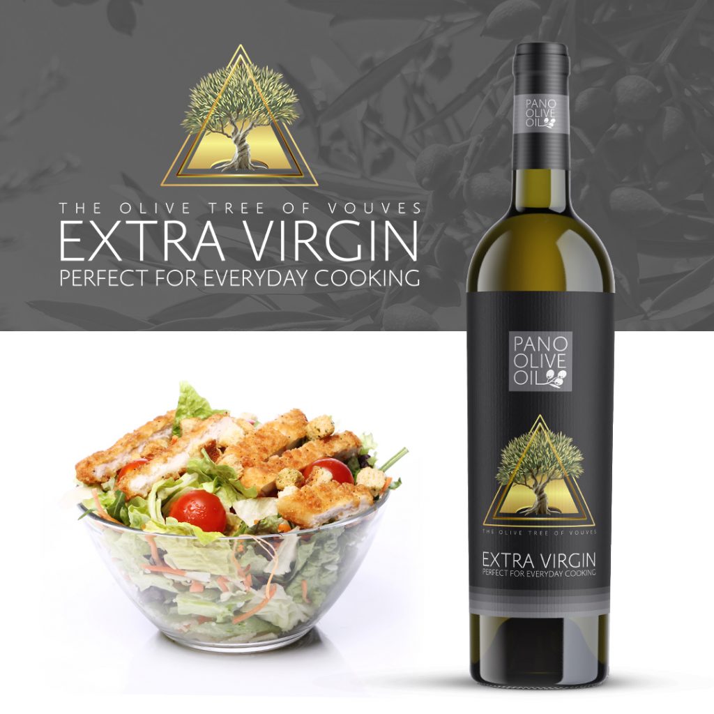
“The center of the design with the symbol of 3 triangles that surround the tree (the triangle is the winner. The triangle is a symbol of


