Latest in package design
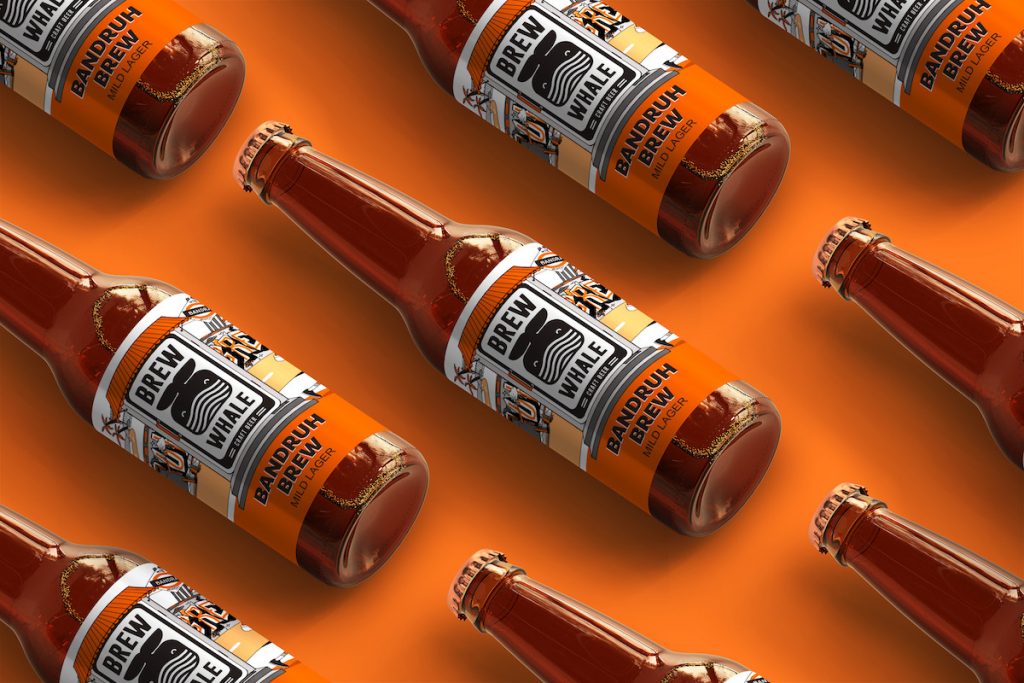
Be it the autorickshaw rushing to its destination or the guitarist strumming away, oblivious to the chaos around him, the packaging creates a true picture of
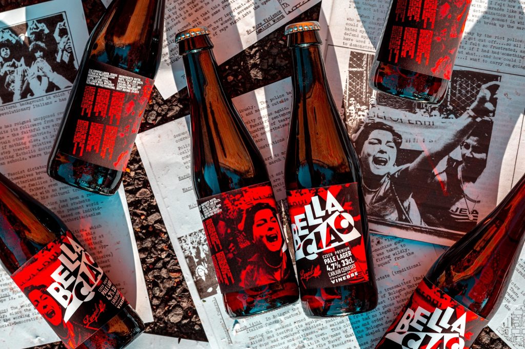
The focus behind the design is to highlight the vigor of the protest. Inspired by the 70s Italian Futurism and Demonstrations, Marcel.net Studio created these striking
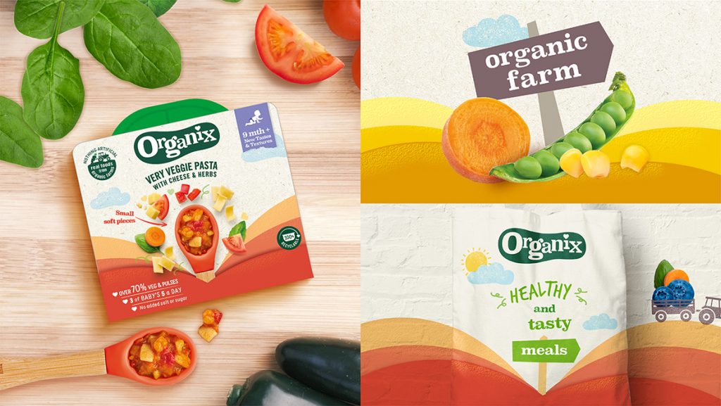
The focus of the design was to highlight the essence of the brand: ‘real food, real taste and real joy.’ The design agency settled to highlight
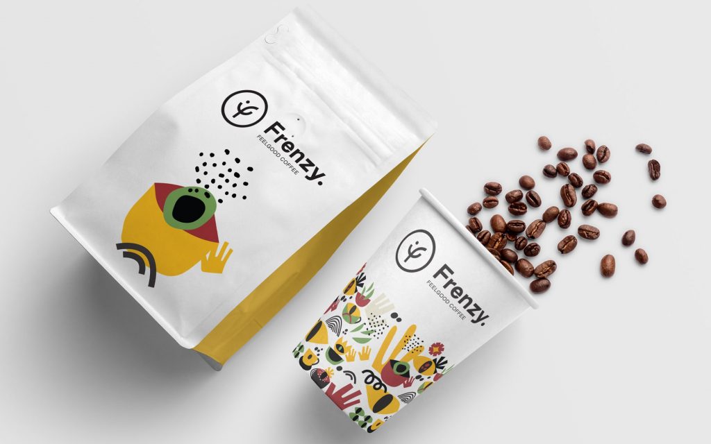
The curved initial ‘f’ resembles a smile, making it easier for the customers to associate with the brand. The color palette has been inspired by the
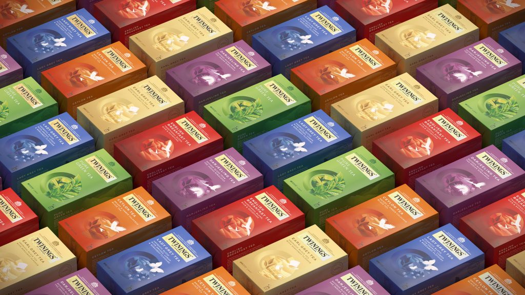
To make the brand feel more premium and contemporary, the design agency selected the Twinings International wordmark to brace the packaging. Furthermore, the packaging was executed
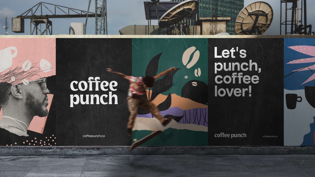
The focus behind the packaging was to let the consumers know that Coffee Punch transcends the set boundaries of complex rituals associated with specialty coffees.
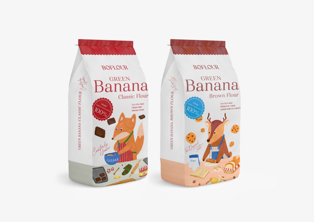
“Green bananas are full of fiber which is good for people with digestive and bowel problems. It is especially beneficial for people with IBS and constipation.
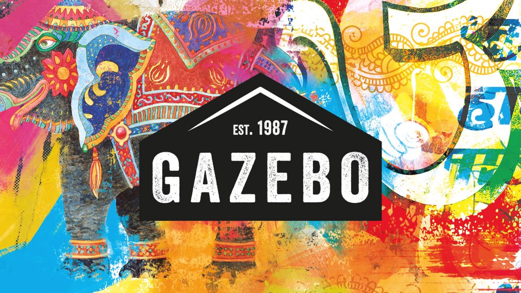
“Peeled-off posters, paint spray and graffiti capture the modern urban environment and evoke the different layers of culinary expertise, discovery of flavors and decades of experience
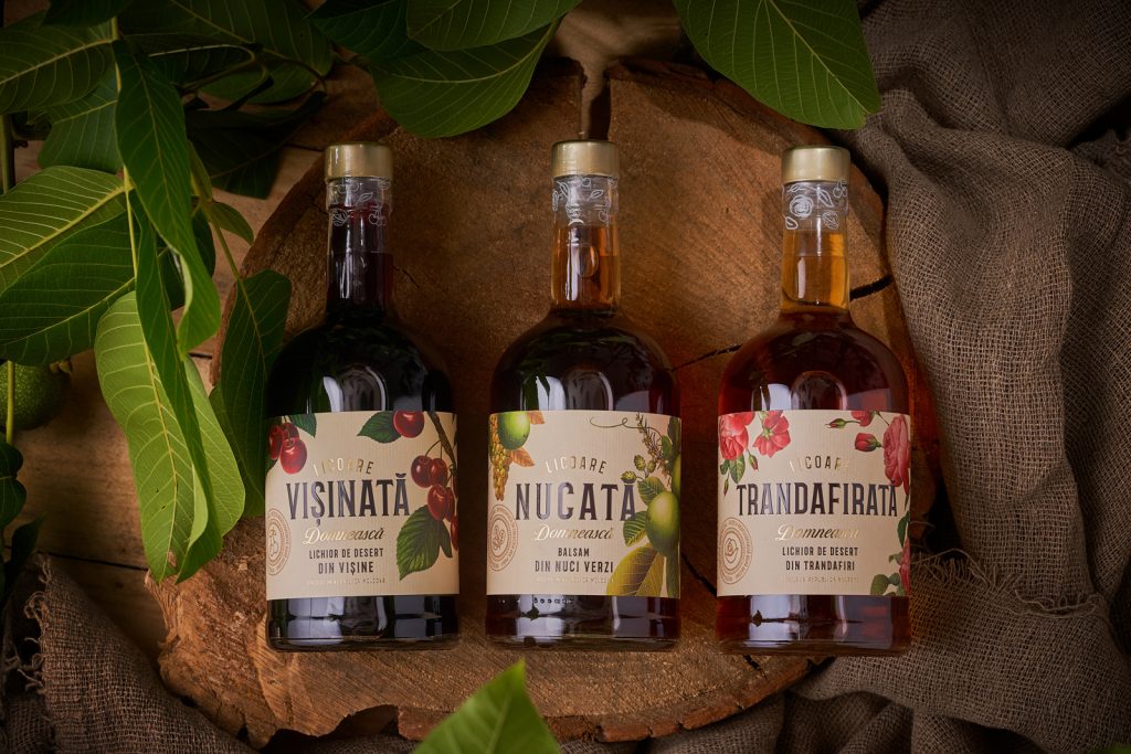
The packaging follows a retro-styled theme, which depicts the botanical illustrations of the herbage. Textured paper and nature-inspired designs have been used in the packaging to
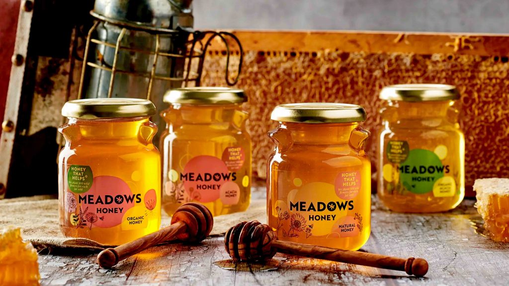
“Our new, fresh, and contemporary visual identity for Meadows Honey communicates the brand’s story through whimsical native wildflower illustrations imbued with summer’s warm rays…”
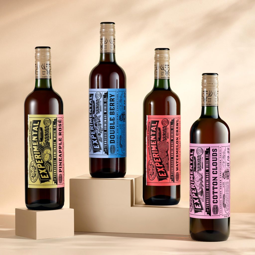
“Due to the large and ever-growing range of this Experimental Series we kept complex changes from label to label minimal. The key differentiators are the large
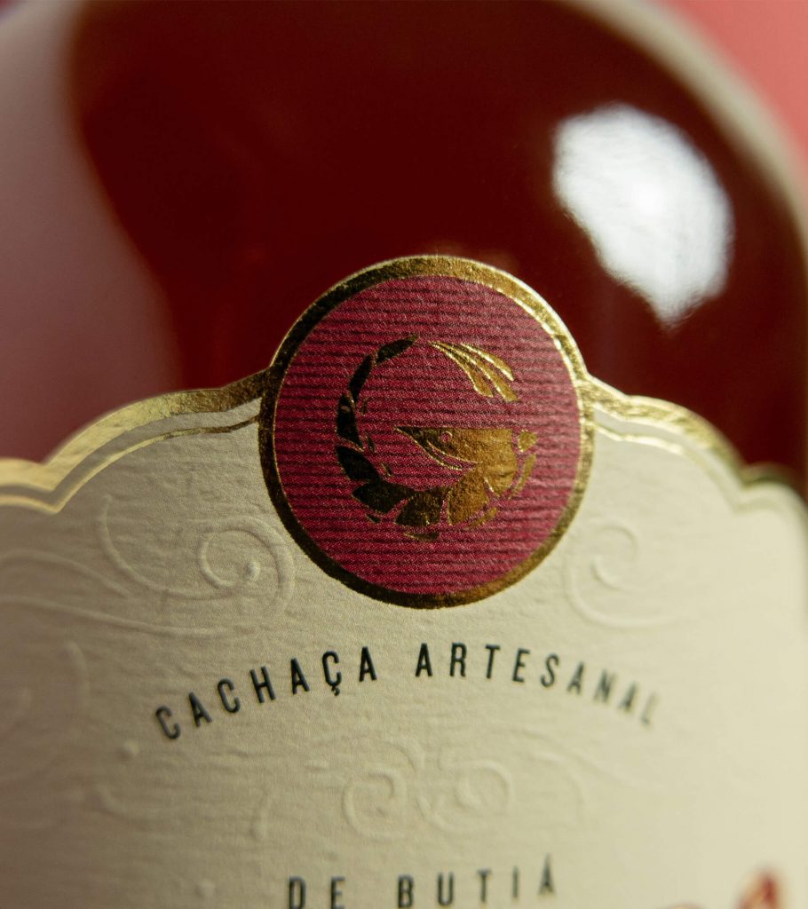
From the bottle to the label, the packaging oozes sophistication. The Cachaça is made from locally sourced ingredients, and that reflects in the packaging of the
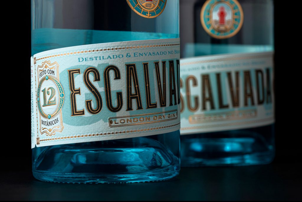
The aesthetics and the details of the packaging are inspired by the origins of Gin production.
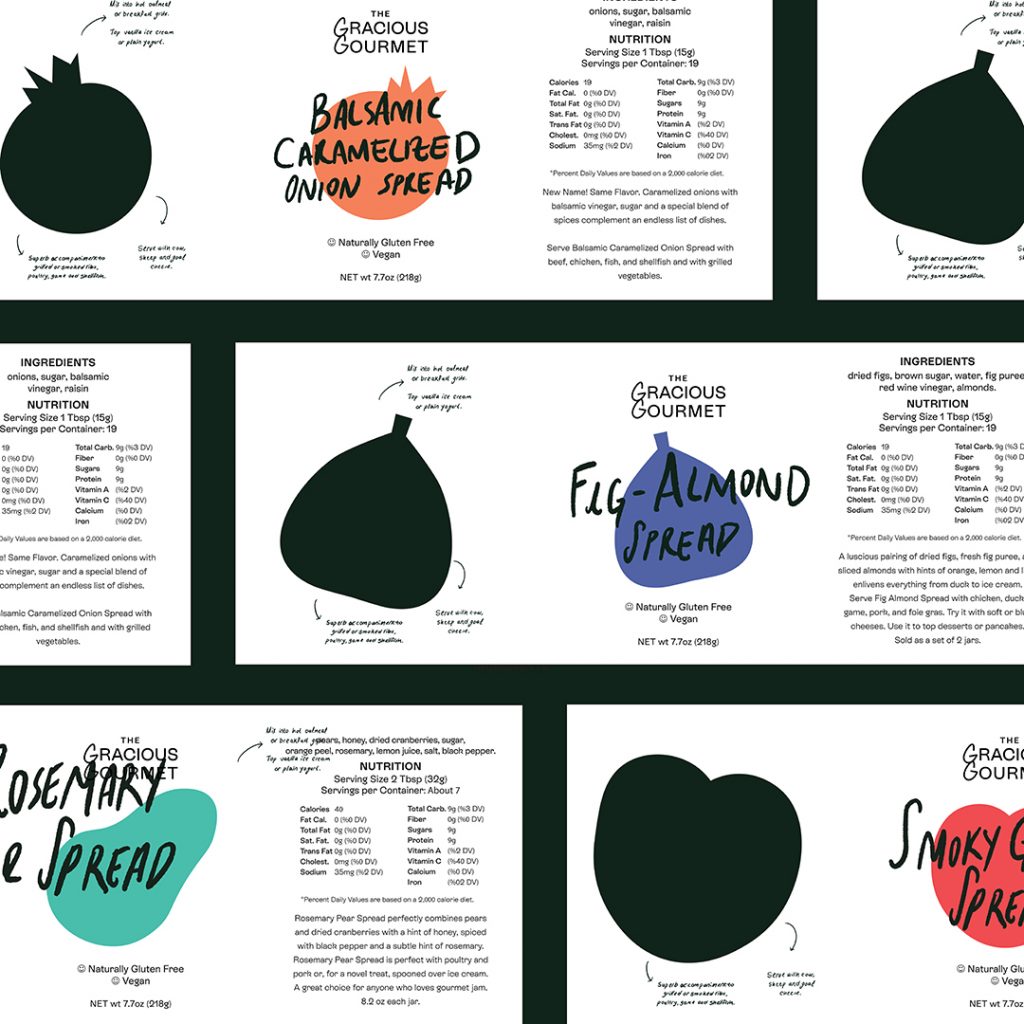
“Handwritten recipes were a huge inspiration for this packaging as well as our focus on the products itself; the textures, colors, shapes and ingredients of each
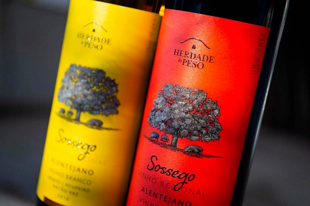
“For its new range of wines, we built a disruptive image, a tribute to Alentejo’s more genuine side, which we wanted to dissociate from the convention."
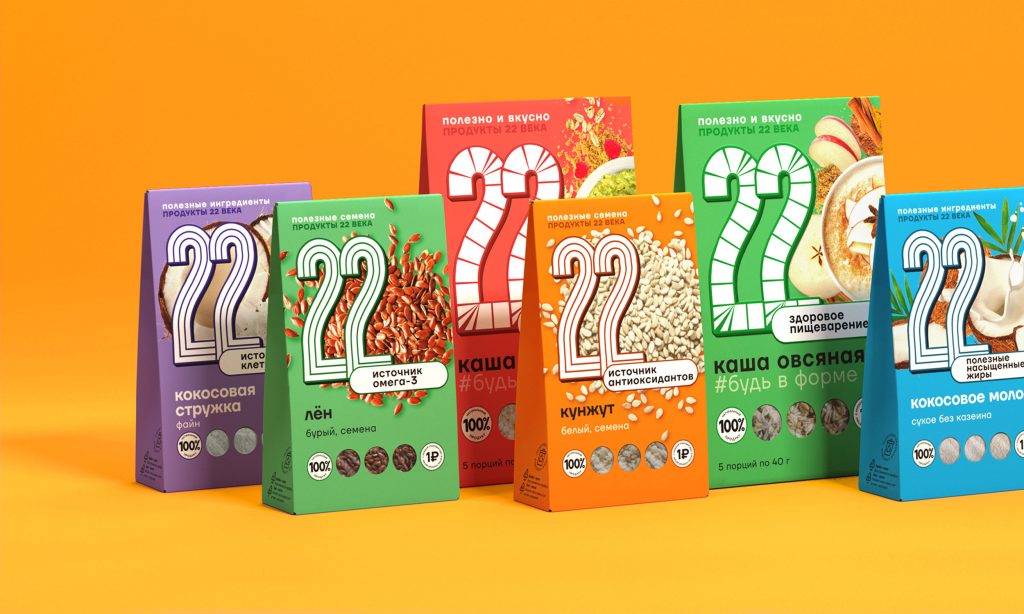
The new bright color palette conveys a cheerful and positive brand personality. Furthermore, proper disposal of the packaging and recycling instructions have been provided to make
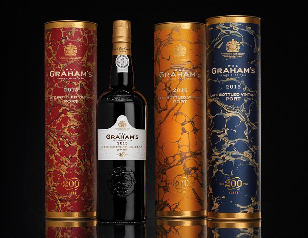
“The tubes were designed using handcrafted marbled paper which reflects the craft and attention to detail of the brand and builds on our heritage in honoring
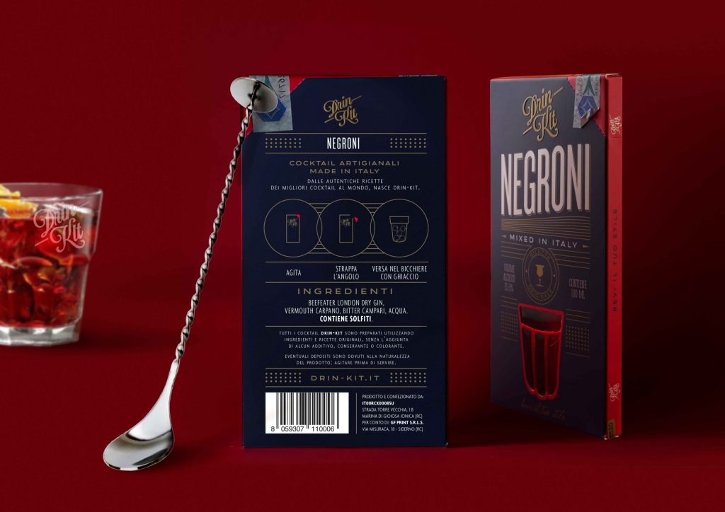
The packaging design of Drin-Kit is simple but communicates the brand personality and what the customers can accept from the product clearly.
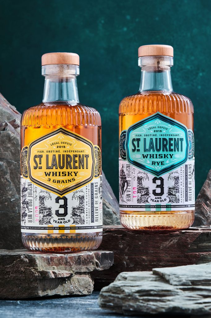
Inspired by the seas and Jules Vernes, St. Laurent’s intricate designs paint the picture of the oceans with the help of multilayered illustrations.
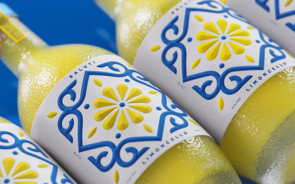
The founder of the company was inspired by “lemon farming and the tradition of Limoncello” to create his brand.


