Latest in package design
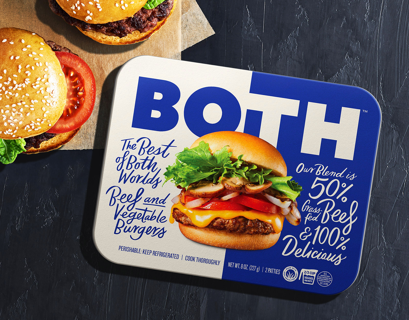
Both partnered with Pavement, an Oakland-based design agency, to create packaging designs that would highlight the duality of the product. The two-color palette and the handwritten
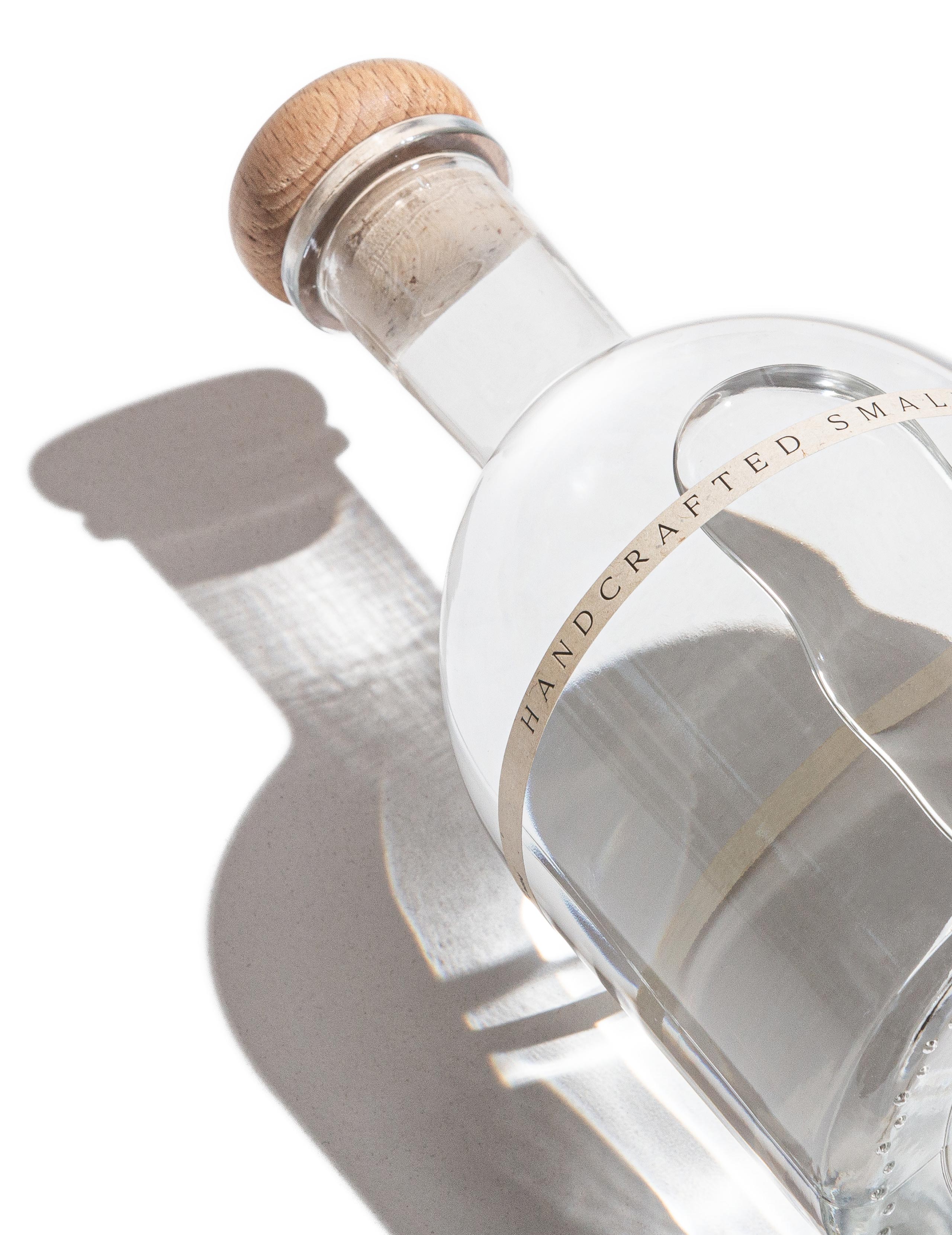
The packaging design depicts the seven stages of development of OSKI. For example, the copper layer of the packaging symbolizes copper alembic, which is used during
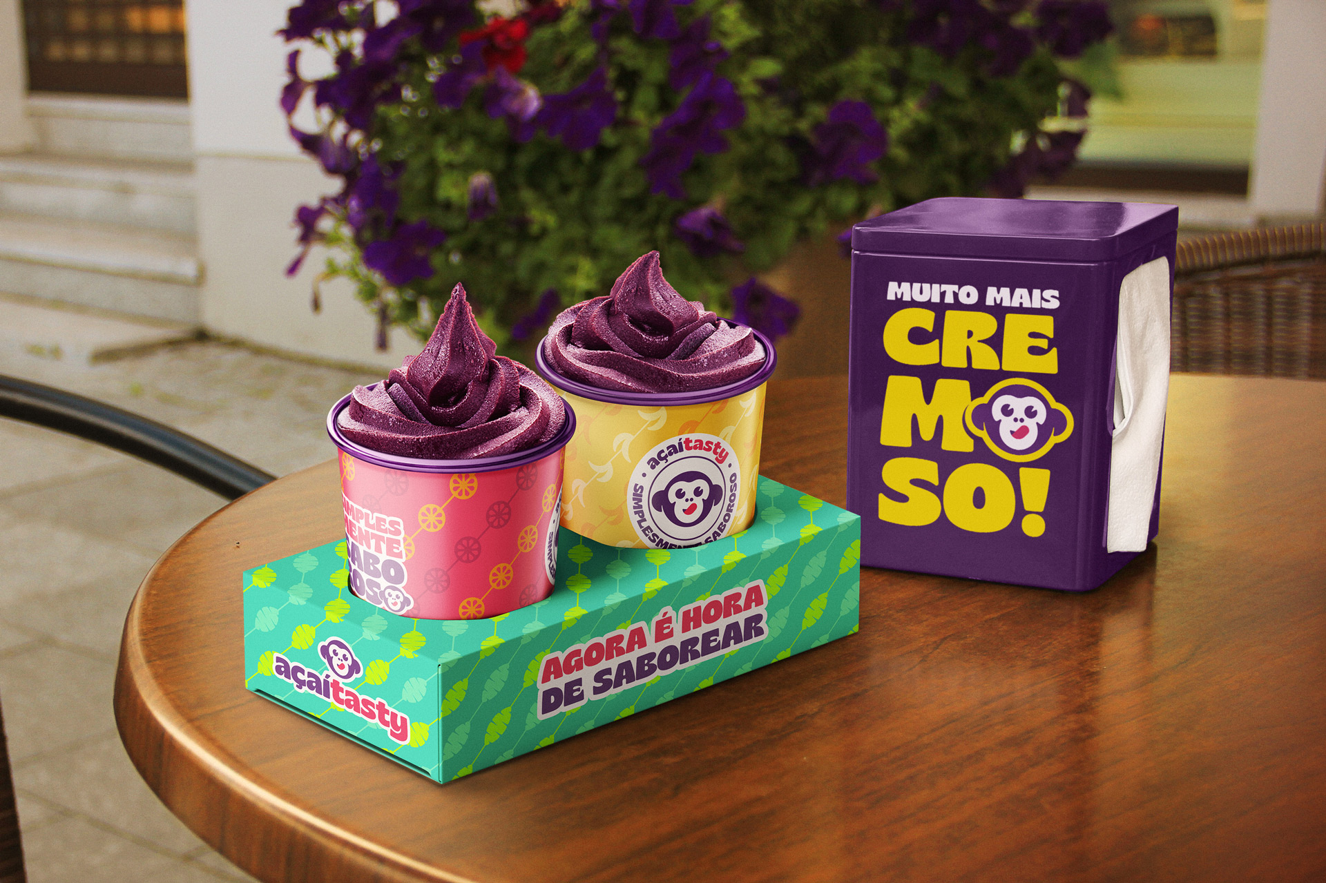
Açaí Tasty partnered with Lucas Coradi, a Campinas-based brand identity designer, to work on the branding and packaging of the company. The creative artist used colors,
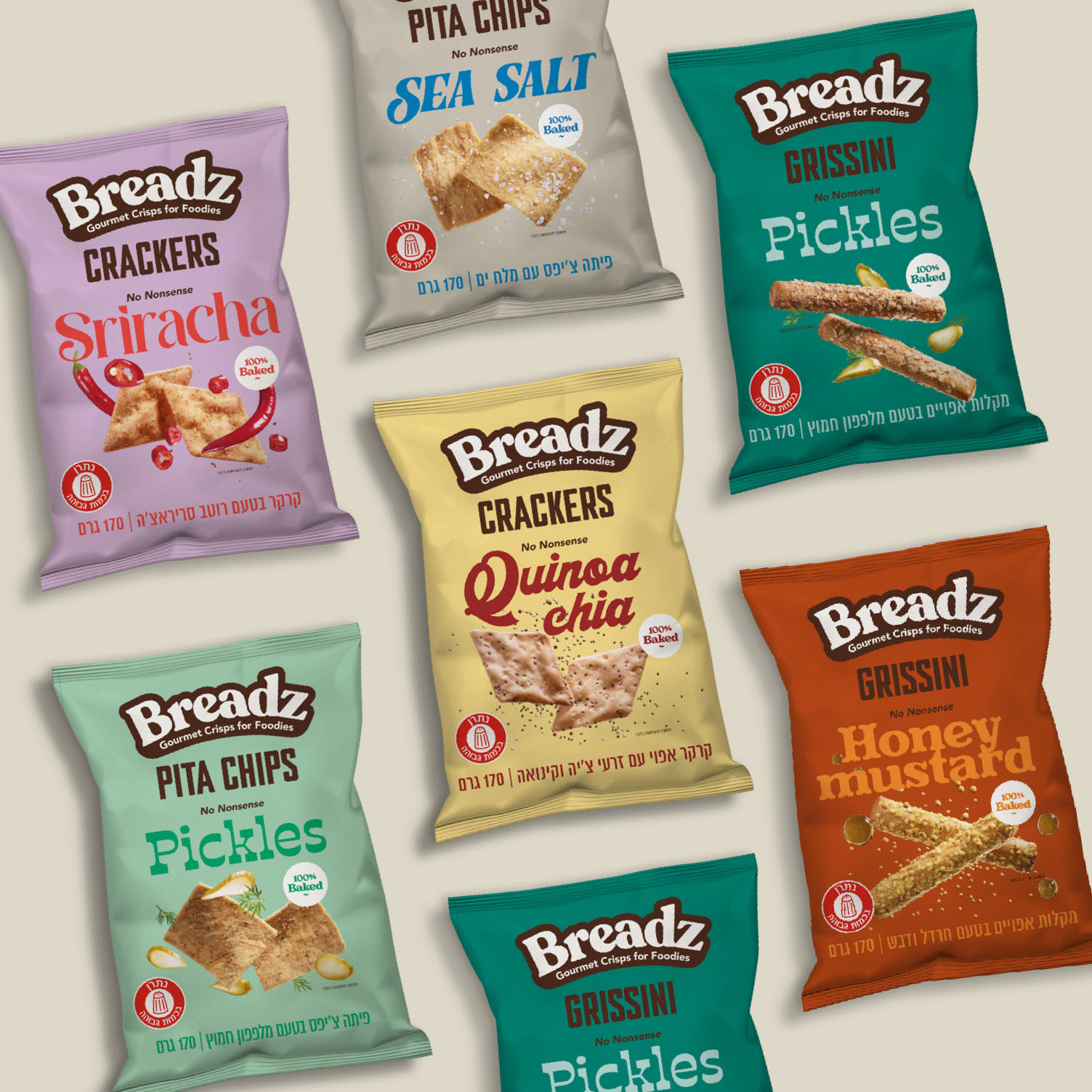
Strauss Group partnered with Open, a Tel Aviv-based design agency, to create packaging designs that would highlight the freshness of the new brand. Trendy color combinations
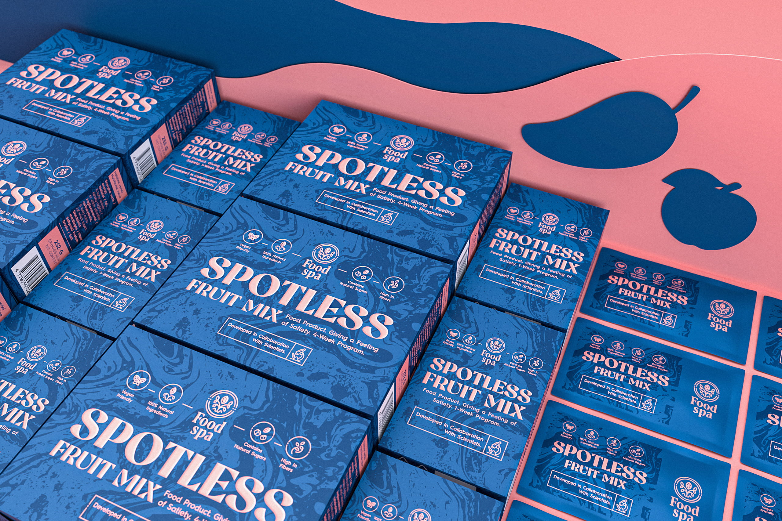
Food Spa combined its efforts with Craft Mark Studio, a Kaunas –based design agency, to create the packaging designs for Spotless. In addition to creating the
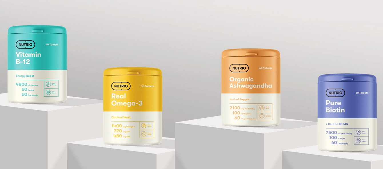
MarkaWorks, the Antalya-based creative studio, created the attractive-looking packaging designs for Nutrio. In addition to using a two-color palette for each product, the design studio used
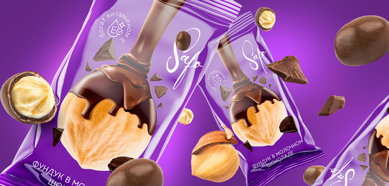
In addition to highlighting the chocolate-covered local delicacies, Minim used bright and vibrant colors to attract customers and increase the shelf value of the products.
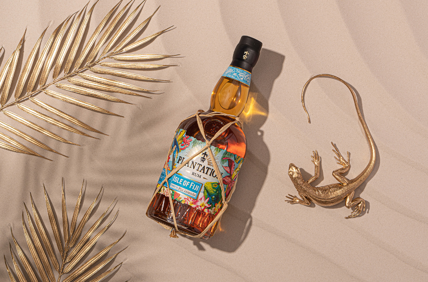
Maison Ferrand teamed up with The Rooster, a Pasadena-based creative agency, to create packaging designs that would highlight “the very essence and beauty of Fiji Islands.”
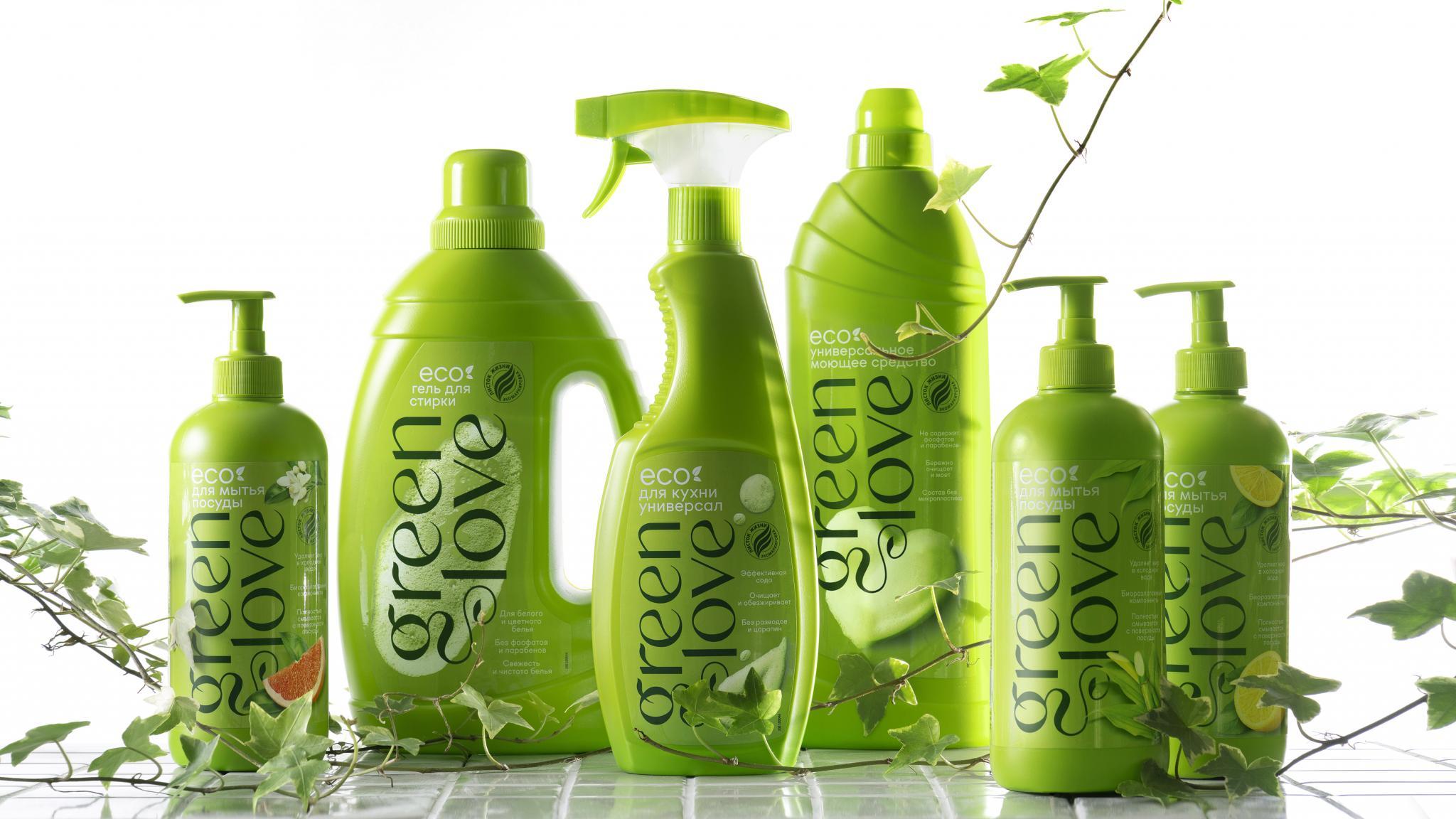
Green Love combined forces with Depot Branding Agency, a Moscow-based design house, to create packaging designs that would reflect the naturalness of the products.
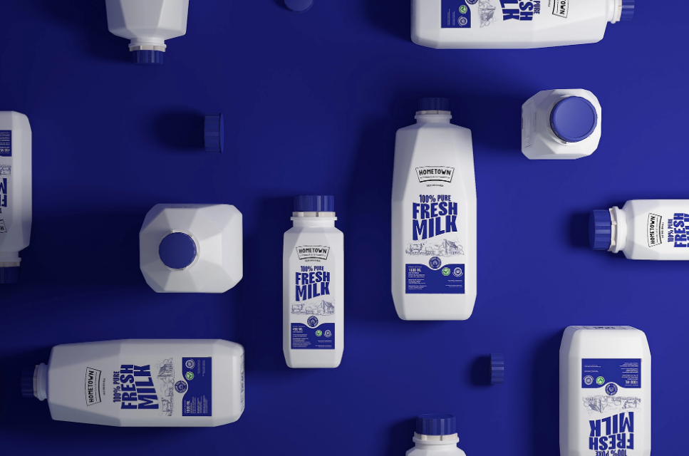
HomeTown partnered with Widarto Impact, a Trenggalek-based creative studio, to create packaging designs that would enhance the shelf value of the products.
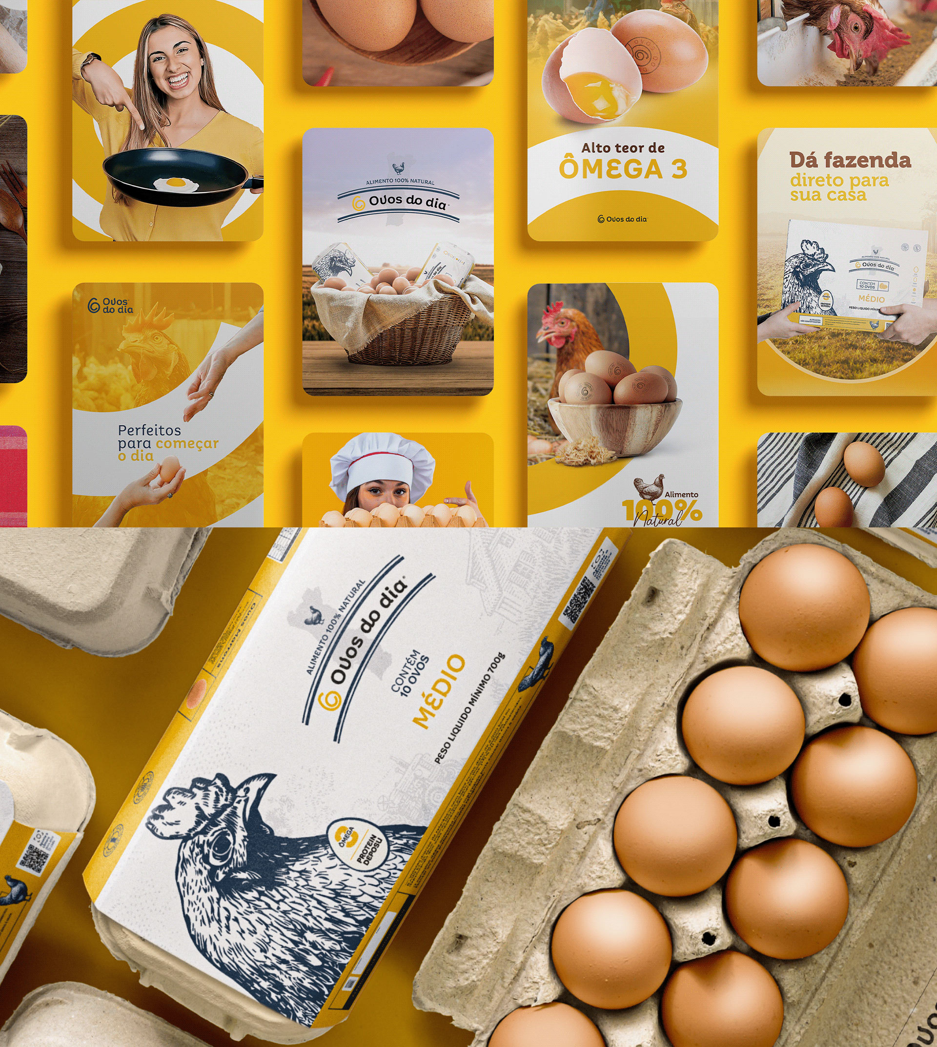
The packaging highlights the brand’s attributes by illustrating its primary product, eggs. In addition to placing a hand-drawn image of a hen on the label, the
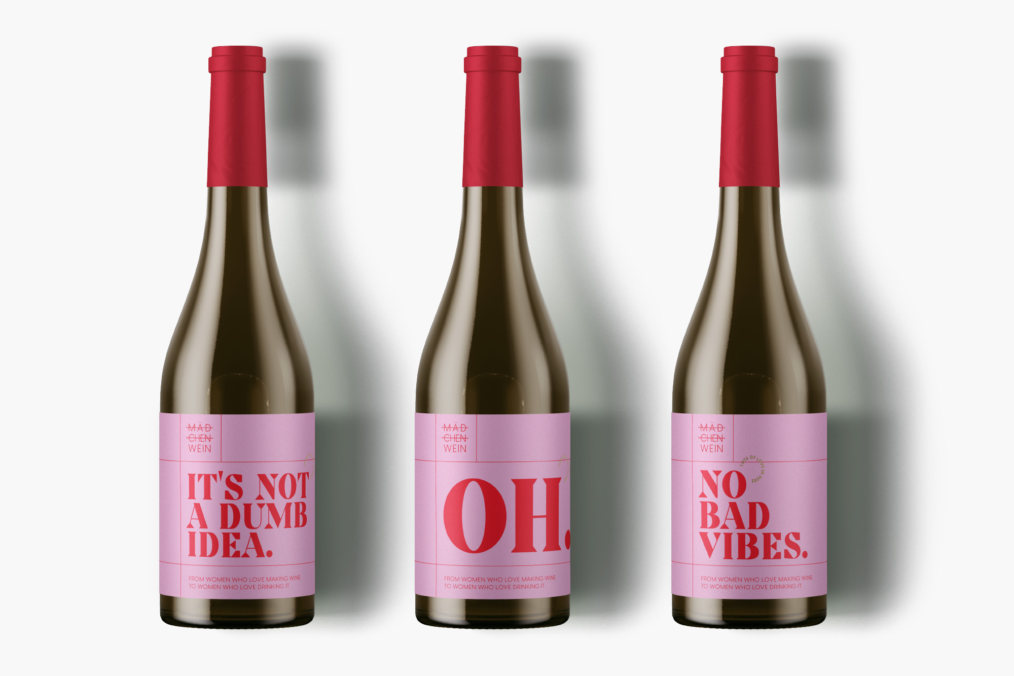
The design agency used a combination of red and pink, which gives the brand a contemporary touch. Furthermore, the grid of red lines makes the brand
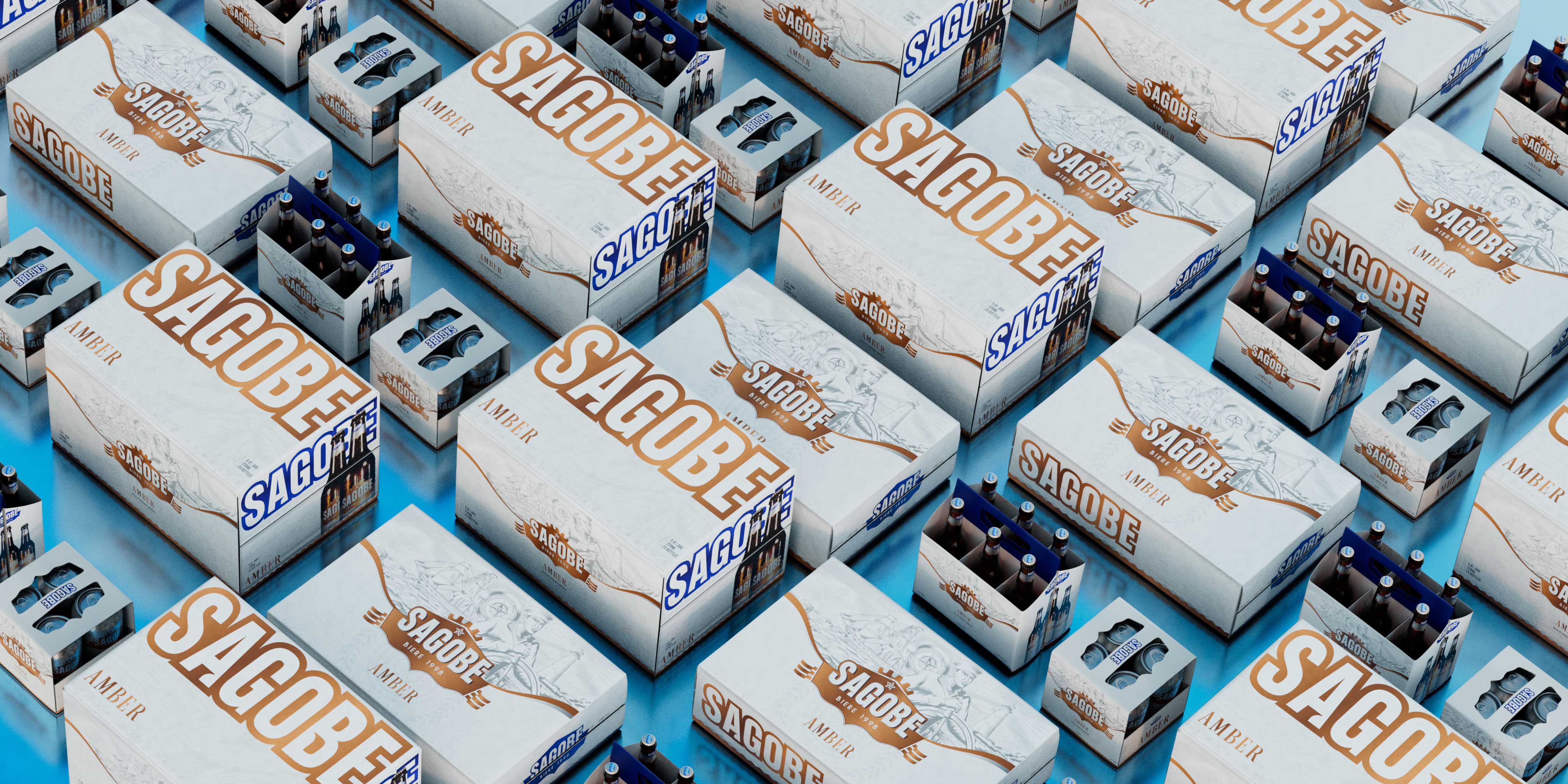
Sagobe combined its forces with the Ho Chi Minh City-based creative company, Bracom Agency, to create packaging designs that would easily communicate the brand identity to
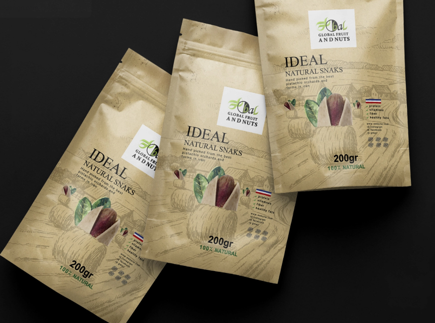
For the packaging, Azadeh used minimal design elements and an attractive color palette to highlight the naturalness of the product. The creative artist also used vector
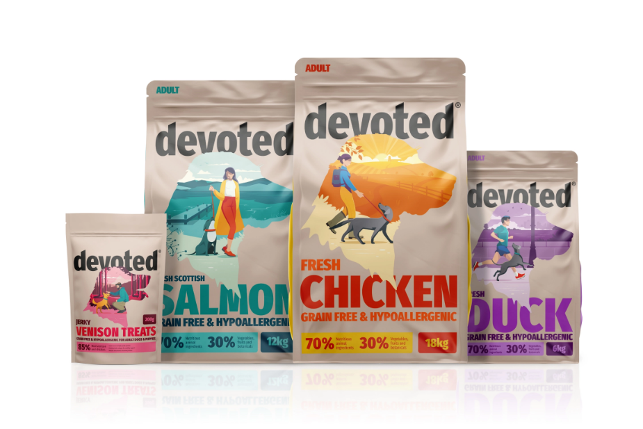
For the packaging, Pencil Studio created a series of illustrations that had silhouettes of dog heads and pet owners. The new packaging sets the brand apart
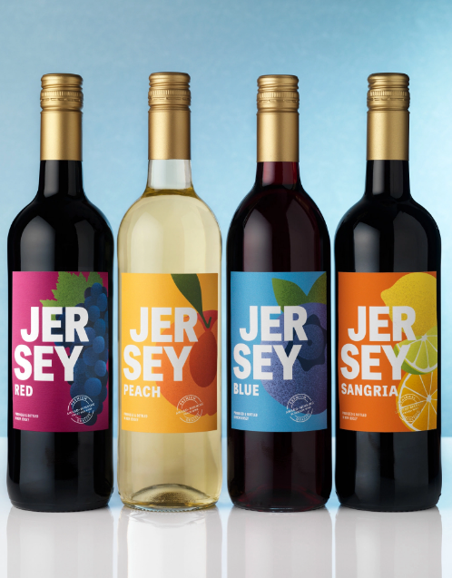
“The New Jersey wordmark was printed in a clean white to contrast the vibrant labels and make the brand name pop. A seal was developed to

Tooth & Nail combined its forces with Studio Ethur Ethur, a San Luis Obispo-based creative agency, to create packaging designs for the company’s new line of
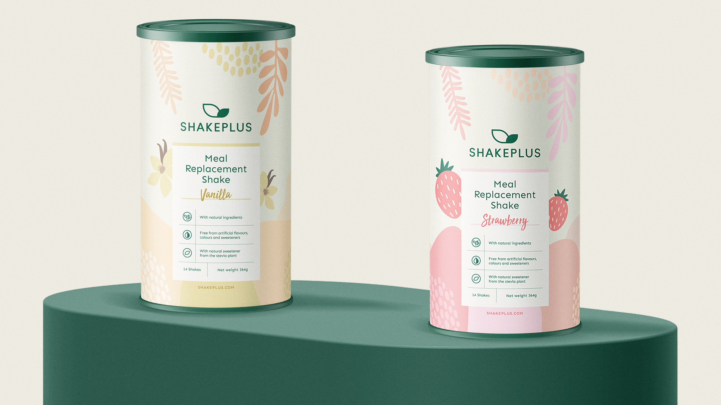
MarkaWorks based its packaging design ideas on the aroma of each product. Varied illustrations and symbols are used on the label that connects the content with
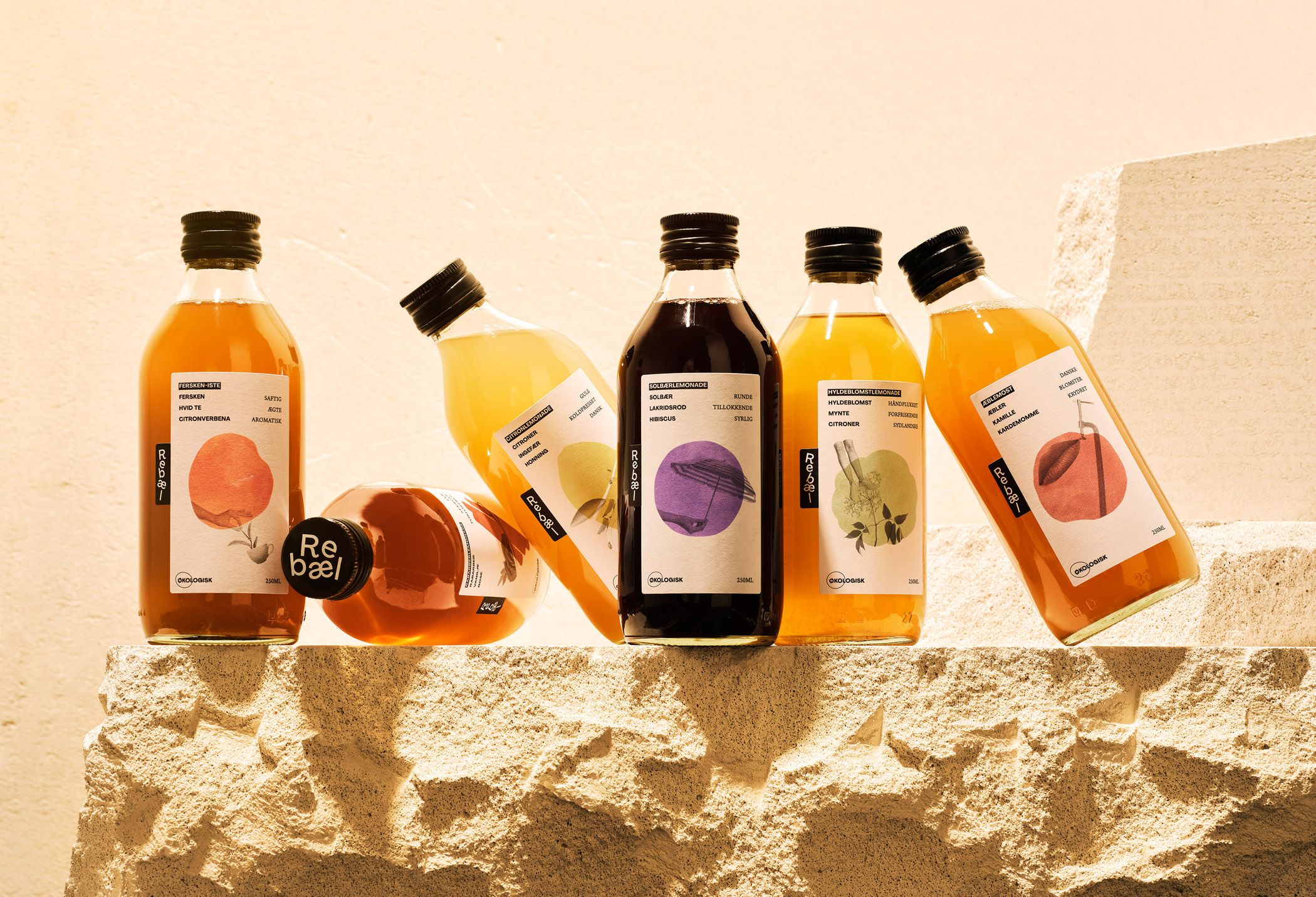
“The Rebæl brand design is alive, complex, yet straightforward. It reflects the flavors and fits the occasion. Only a true rebel would dare to embrace this
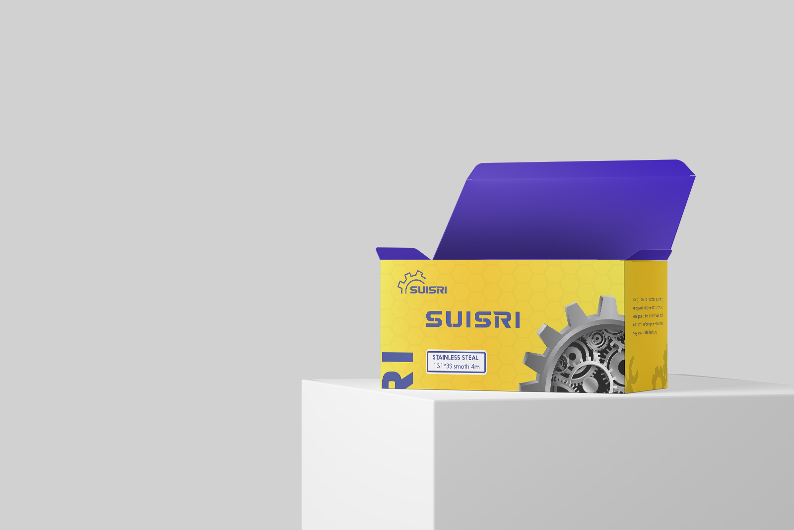
The centerpiece of the packaging design is the logo. Inspired by the shape of metal gear, the Suisri logo portrays the company’s “product-making cycle.” Furthermore, yellow


