Latest in package design
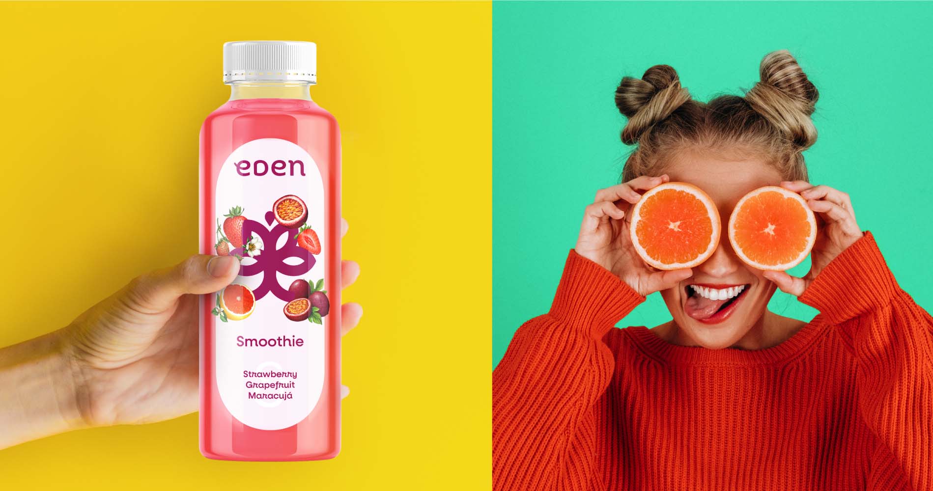
“Eden is a hypothetical brand of smoothie with a young, sparkling and environmentally conscious target that pays particular attention to carefully selected BIO raw materials and
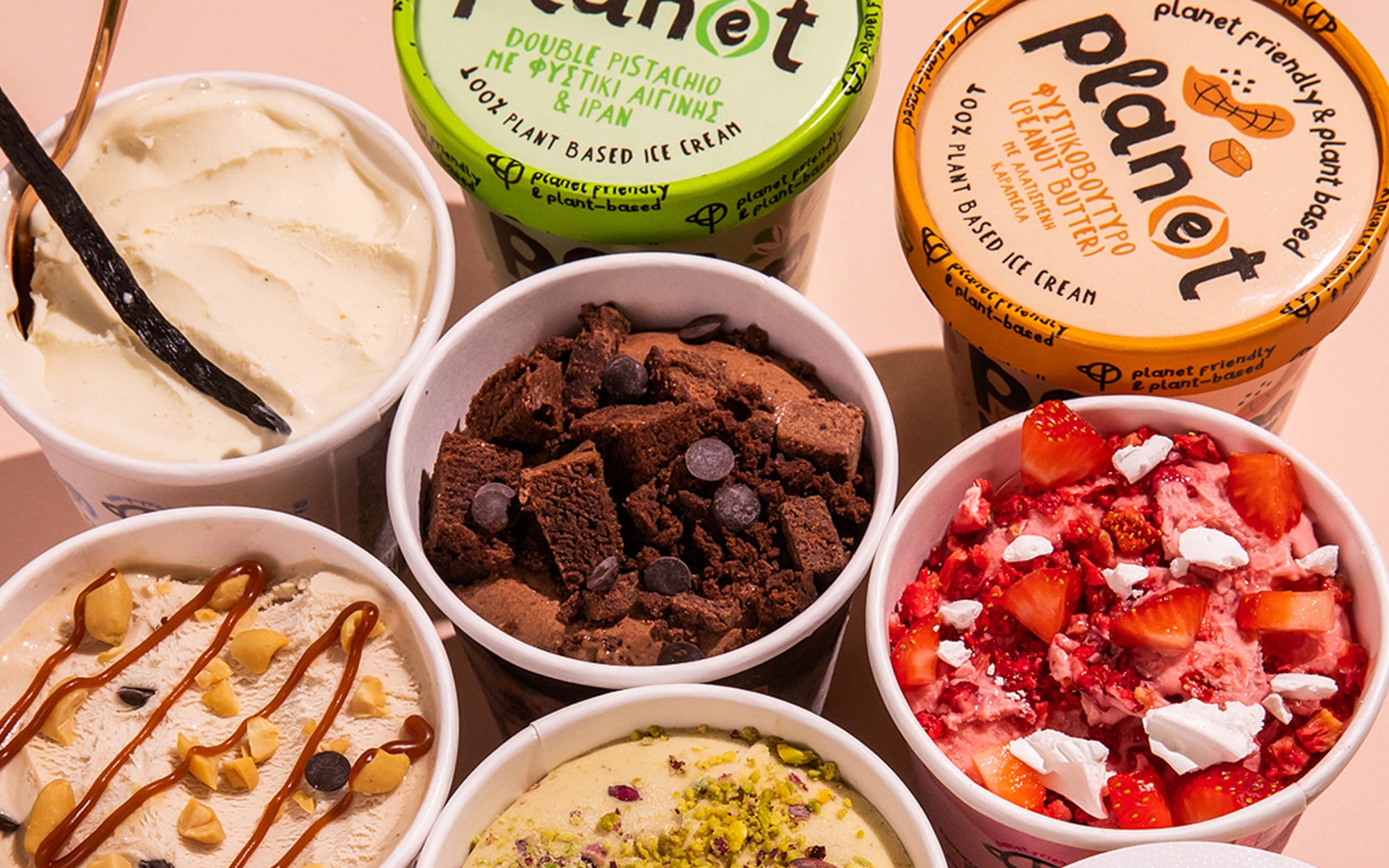
The packaging aims at highlighting the brand’s efforts toward protecting the planet. Bright color palettes, chunky typeface and primal brushstrokes work together to highlight the naturalness
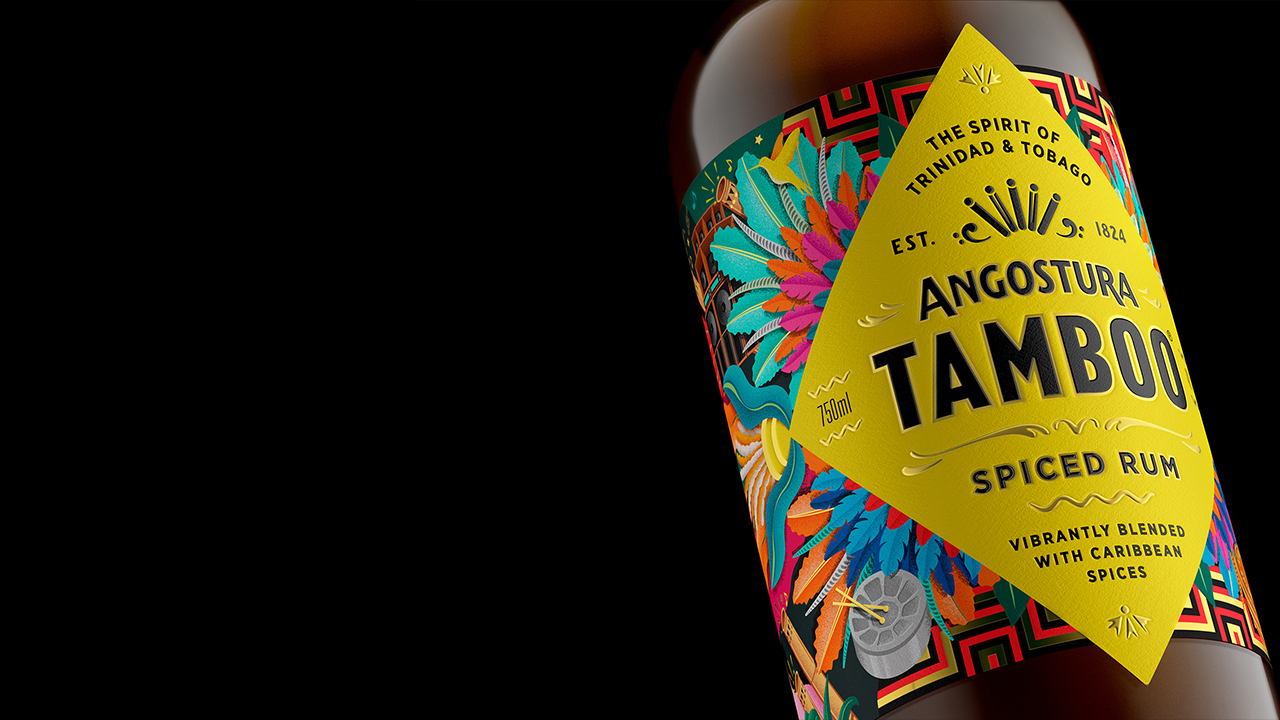
The packaging reflects the Carnival vibes with its layered illustrations. The metallic foil and color palette reflects the “mix of different cultures and traditions” seen in
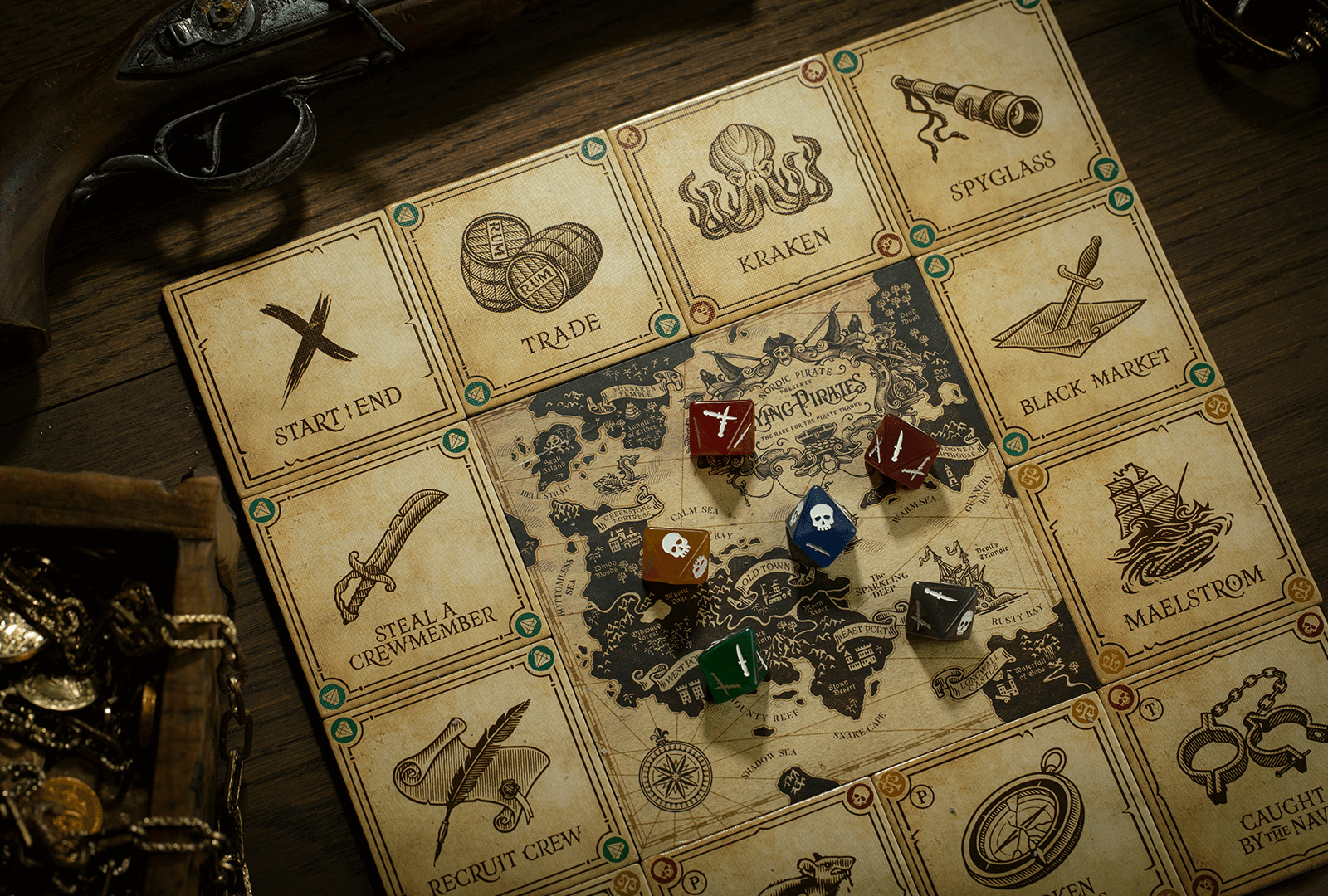
Every little detail seen in the board game has been designed by Widdack Design. From the dice to the illustrations, all the components seen on the
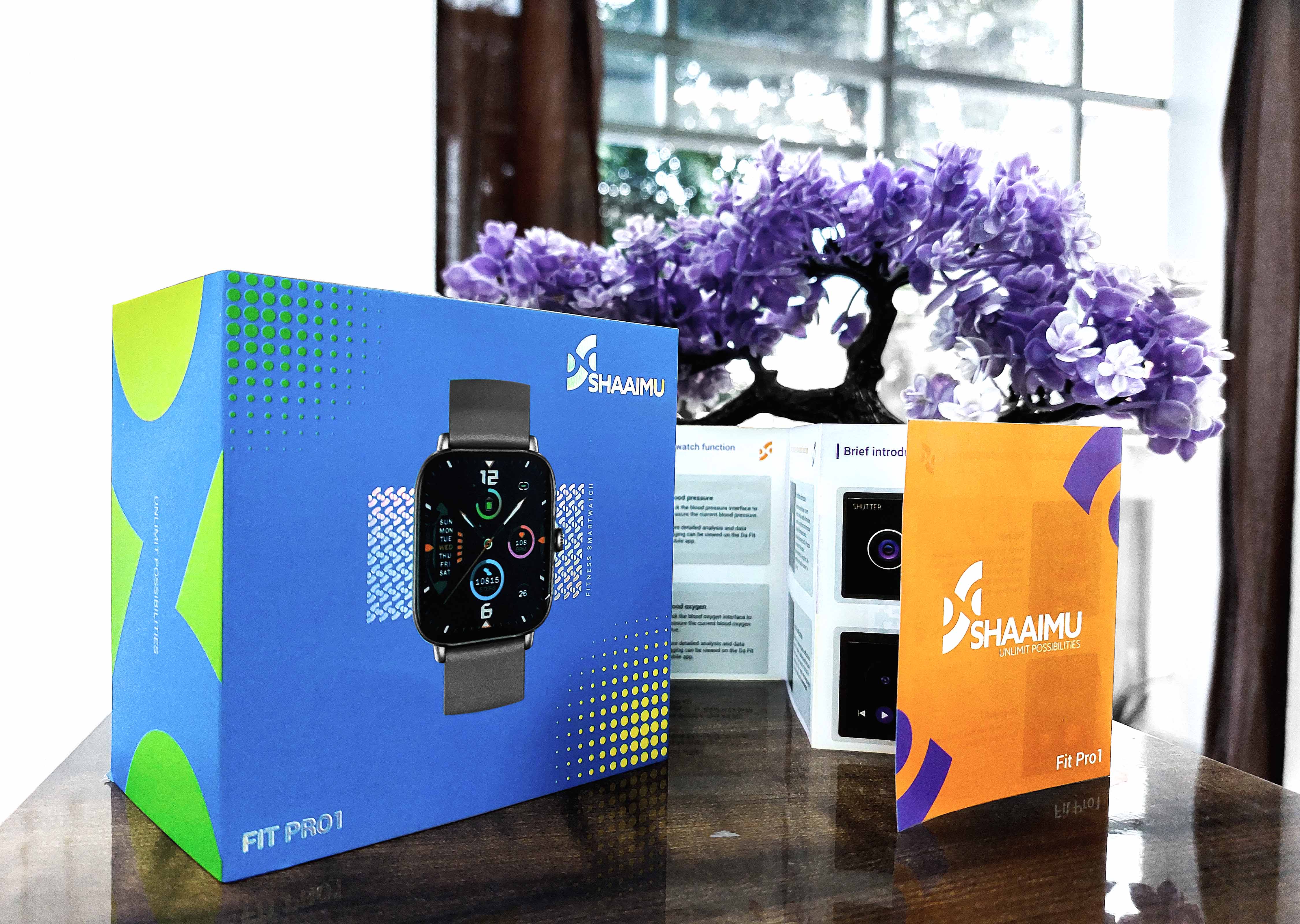
“We transformed their complete brand identity through strategic visual design to bring alive their belief in the fusion of cutting-edge technology and innovative design creating quality
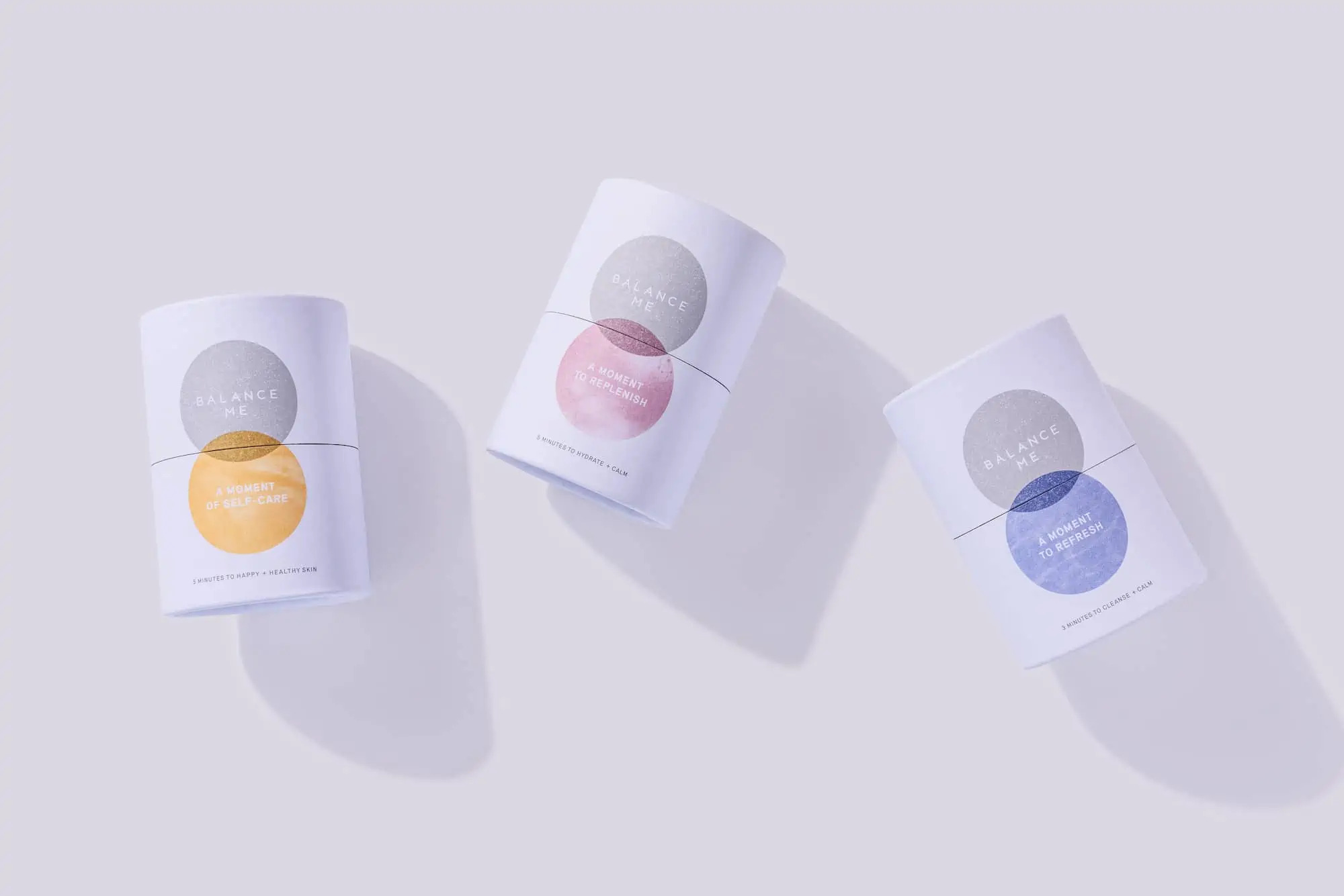
Balance Me teamed up with the Wheatley-based design agency Maxipos to enhance its packaging. The idea behind the packaging redesign was to highlight the company ethos,
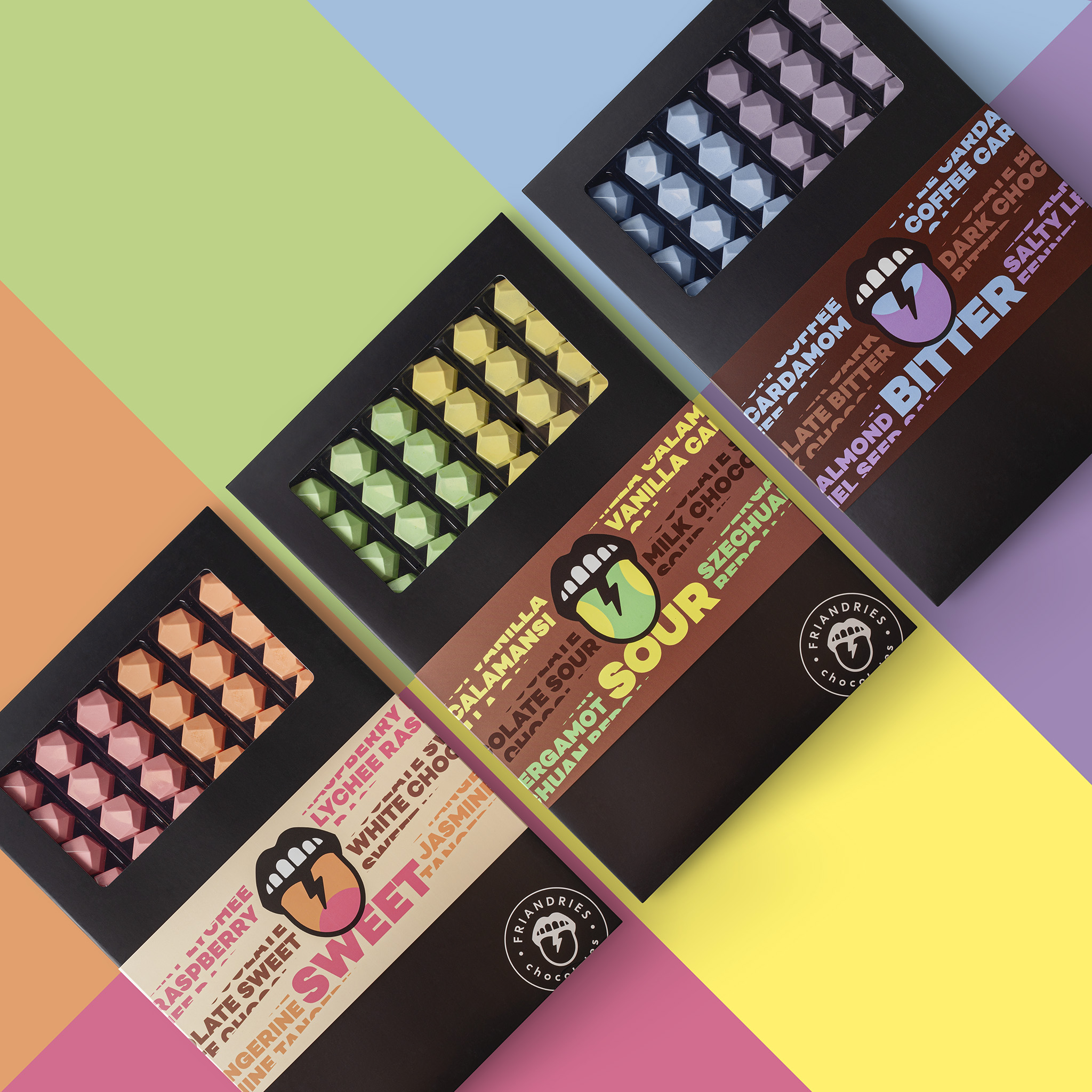
The packaging highlights the “6 different flavors in 3 different taste categories; sweet, sour and bitter.” The selection of different colors matches the corresponding flavors in
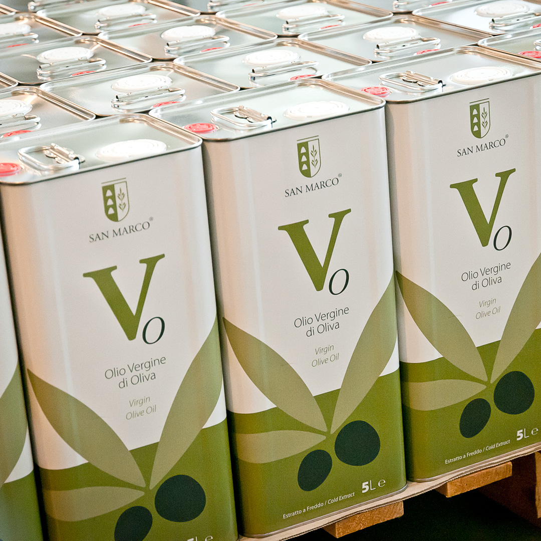
“...the first thing that we did was to create a totally new color palette that has as its source of inspiration the light brown shades of
"The bars are handmade with activated, slow roasted chickpeas, organic seeds, and fragrant spice blends, baked with a touch of organic brown rice syrup and macadamia
Designed by: Alexey Lysogorov | Country: Kyrgyzstan Morojenka, a new Kyrgyzstan-based ice cream brand, is set to take the Asian market by storm. “Morojenka” is another
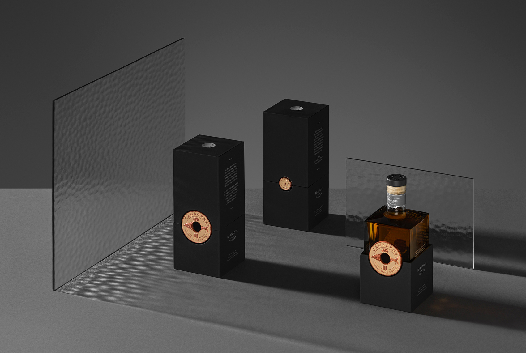
“…Full of character and vibrancy, these whiskies needed a story and identity that not only stamped their debut on the market, but also honored the eons
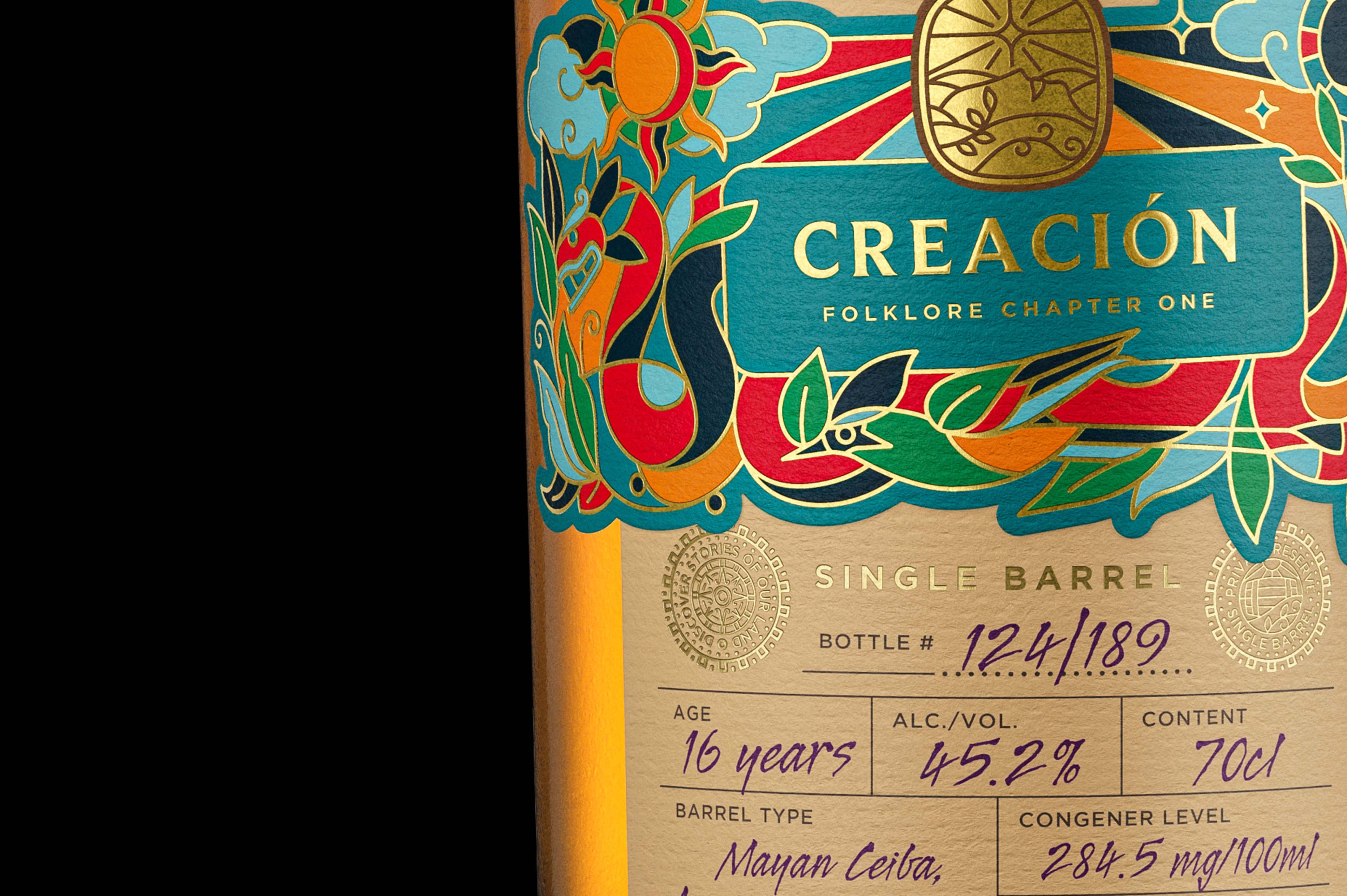
Designed by the Paris-based creative agency Appartement 103, the new edition of Cihuatan focuses on highlighting the “essence and Mayan heritage” of the brand. Not only
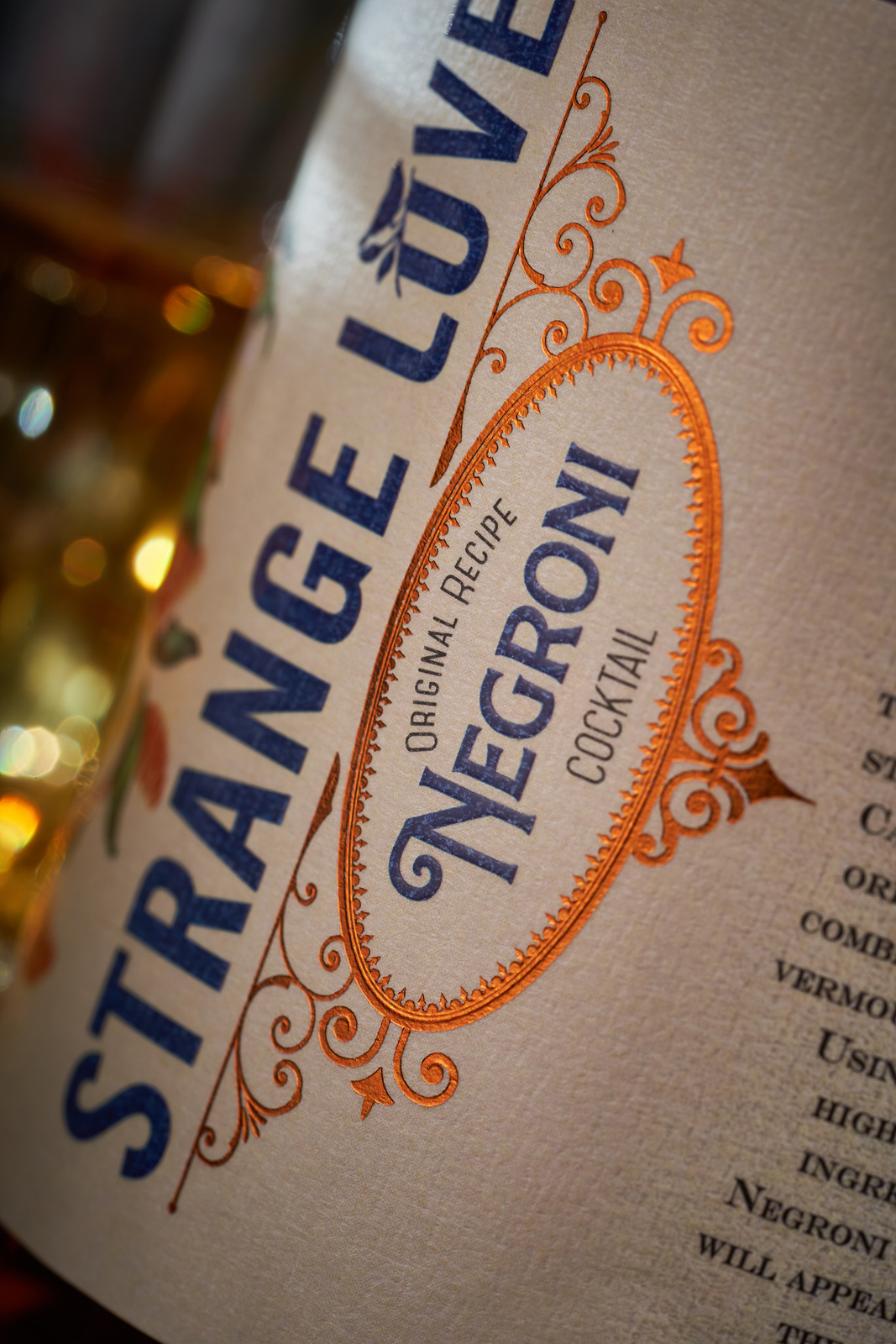
“The logical step in the development of the label design for the new drink was to preserve the general style of the original gin, with the
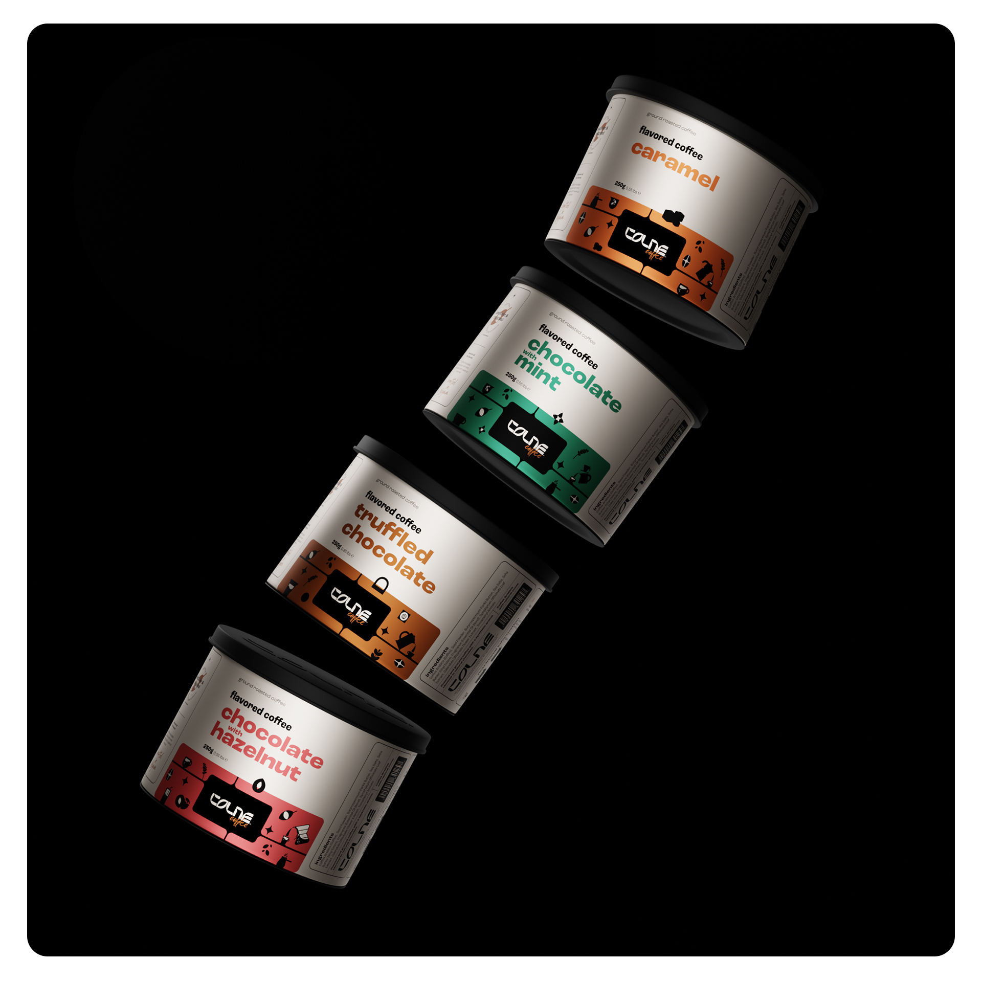
The Londrina-based design studio was responsible for creating “brand strategy, brand architecture, naming, product design, visual identity, packaging, and 3D design.” The varied color schemes used
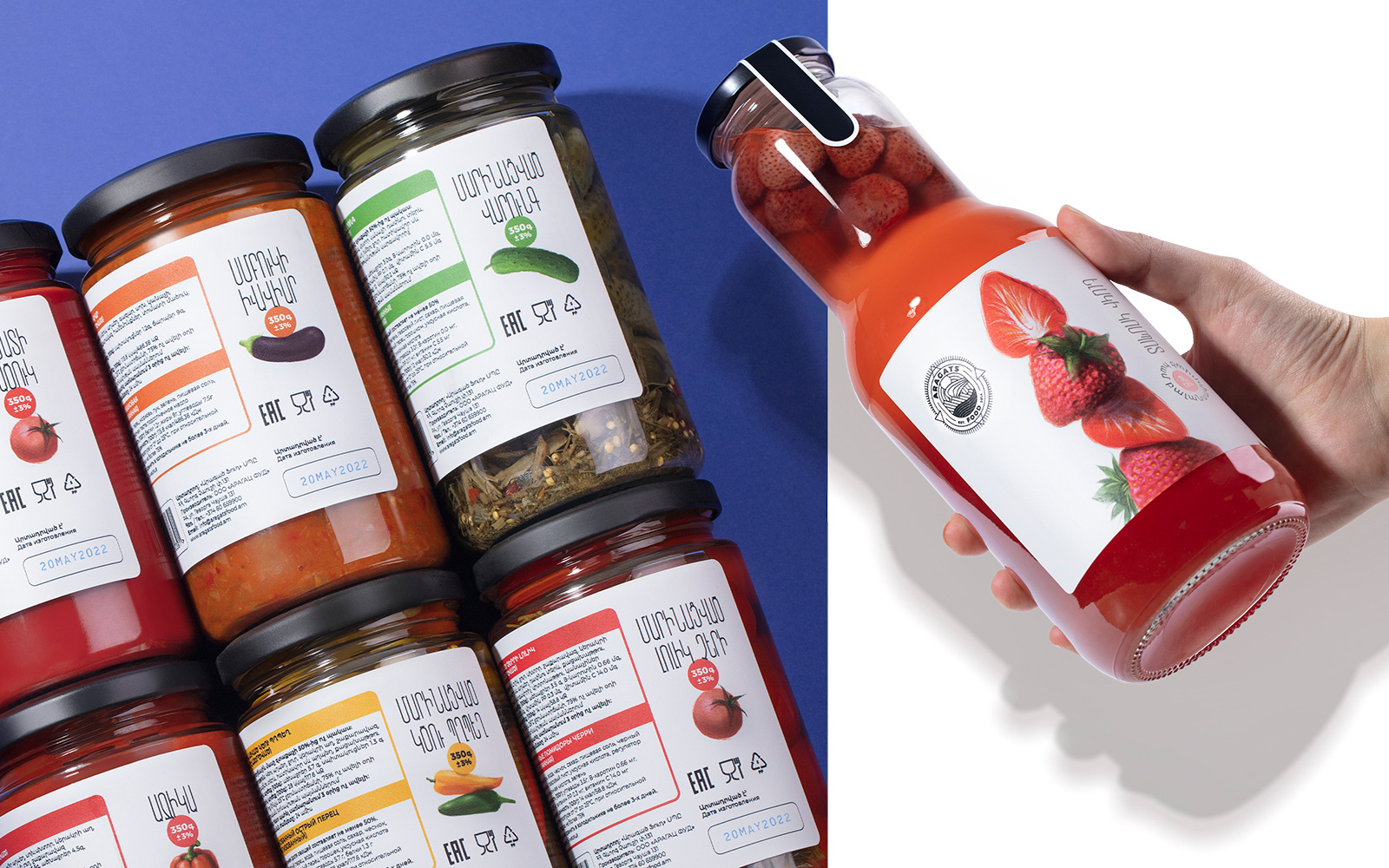
The packaging design focuses on highlighting Aragats’ perfectly balanced products. The new tagline, “Balance Flavor,” along with the packaging design, highlights the brand’s new positioning.
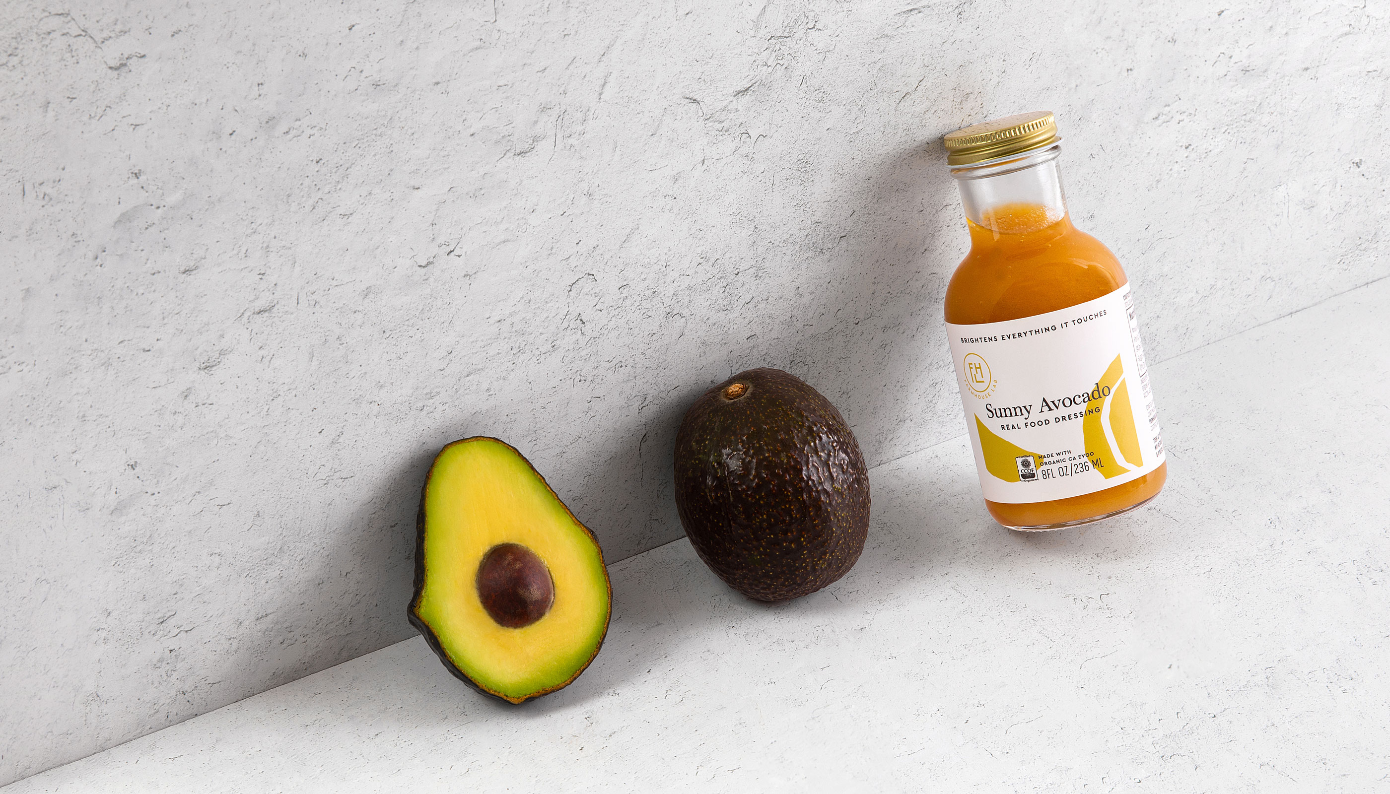
The idea behind the packaging redesign was to heighten the “approachability” and attract customers and potential buyers with its “warmth and craft quality.” Plus, these new
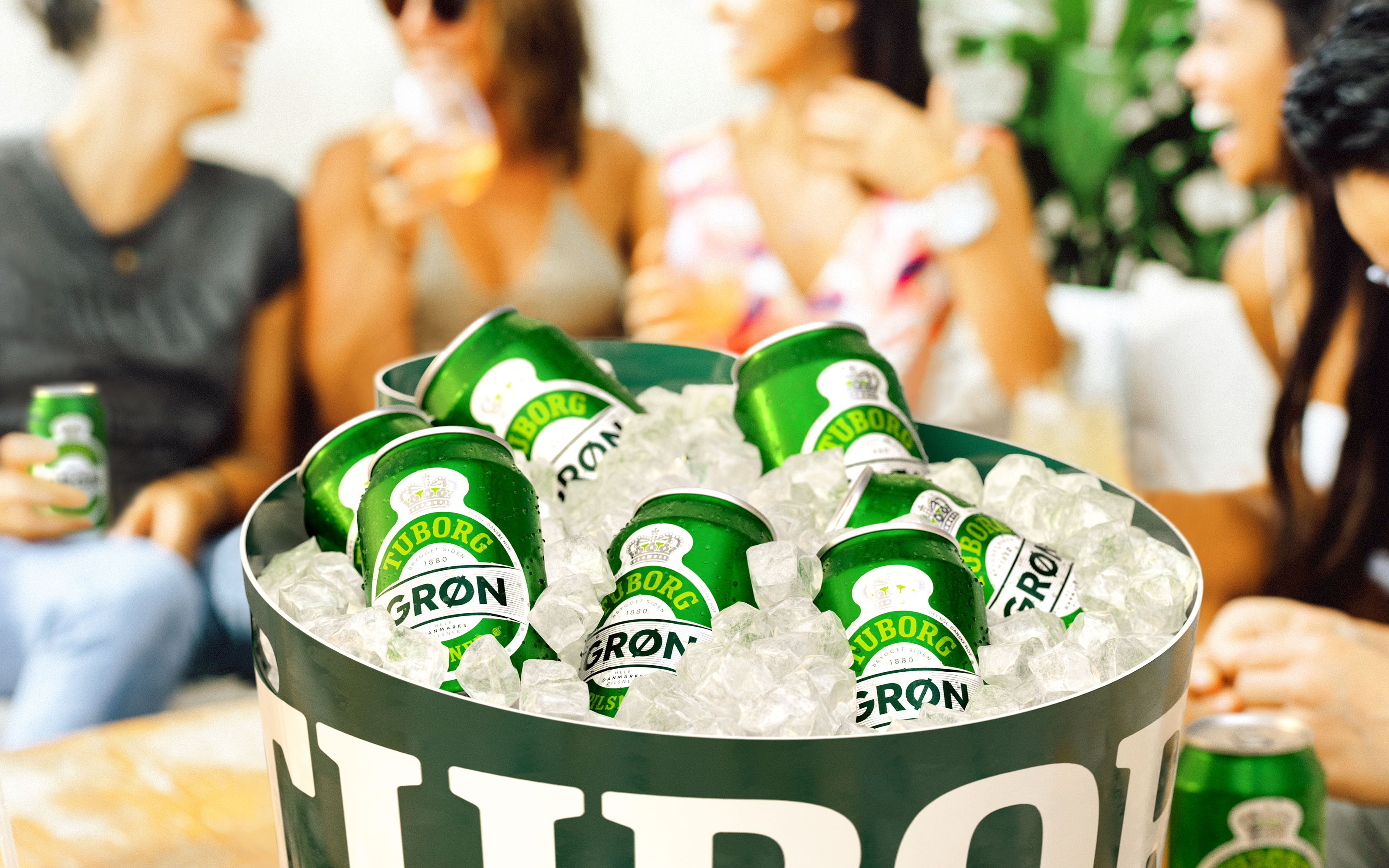
The prime focus of the refresh was to highlight Tuborg as a “proud parent brand.” In addition to redesigning the beer brand’s product, Robot Foods also
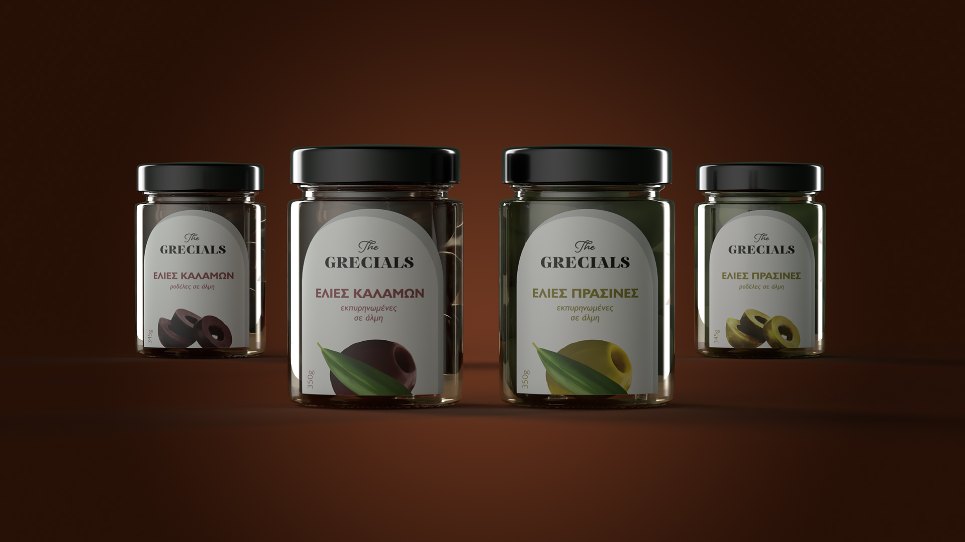
“Respect for the Greek earth and tradition is at the very heart of the brand. It is a labor of love by people who cultivate their
“…To make this artwork as authentic and magical as our vision, our team put together a color palette that was as vibrant as the Colombian culture,
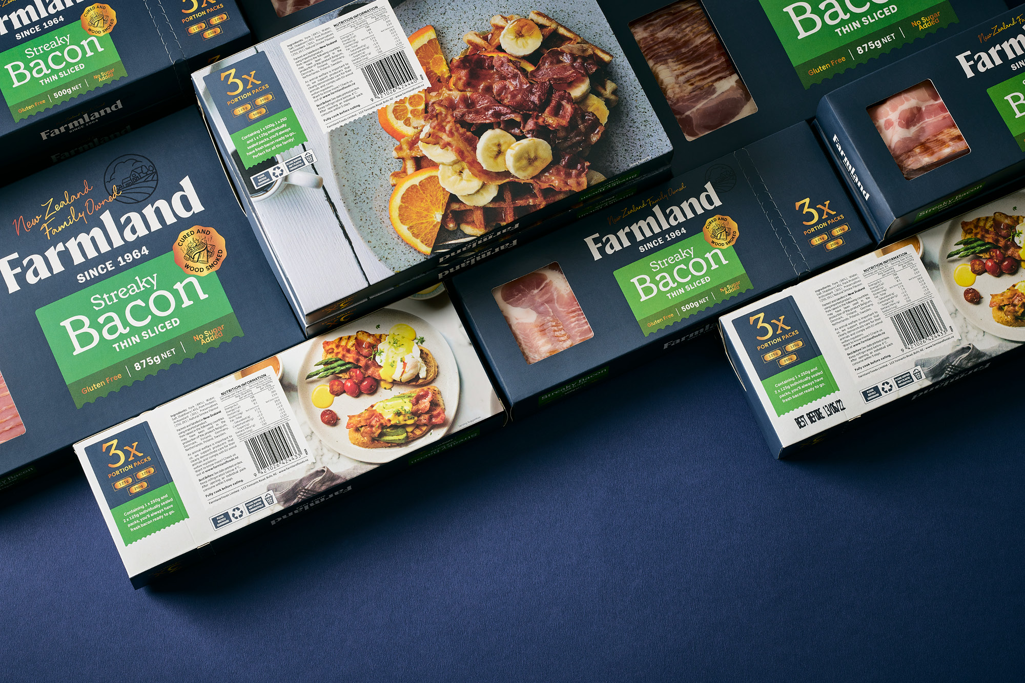
“A new brand strategy was developed. Focusing on the family-based business, the brands’ new goal is to bring people together around the dinner table – delivering


