Latest in package design
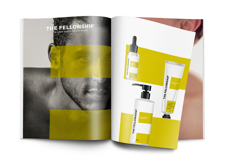
"The bright, accented color palette we've chosen conveys just the sense of modernism that The Fellowship and its target customers embody, and also ensures the products
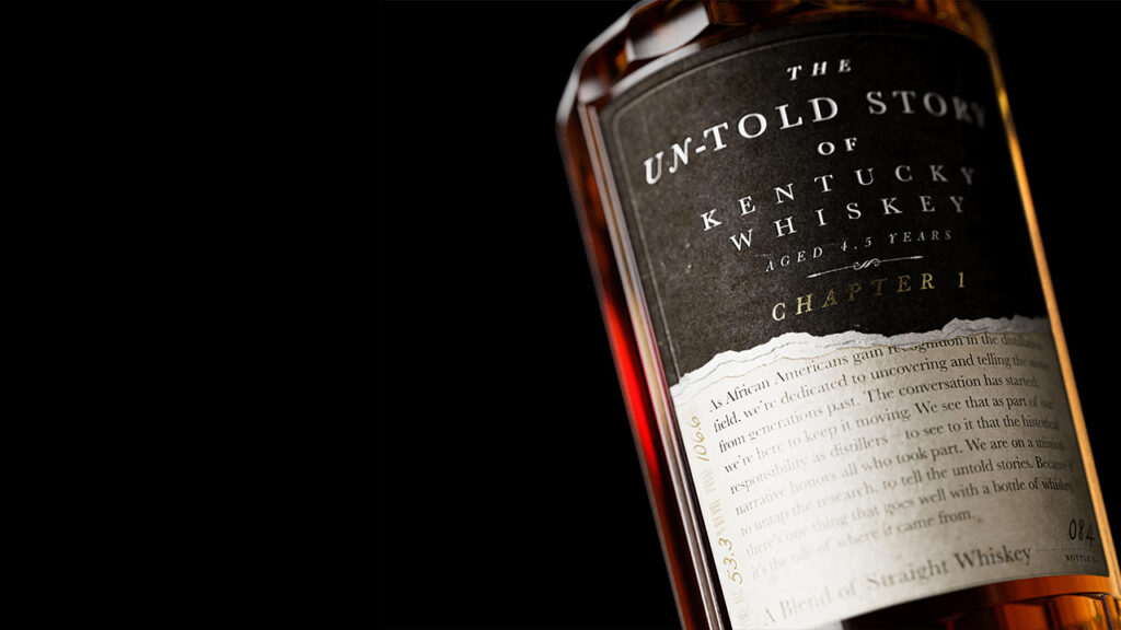
“Released in collaboration with the Kentucky Black Bourbon Guild–with a bottle designed by Stranger & Stranger–The Untold Story will help write a new narrative of American
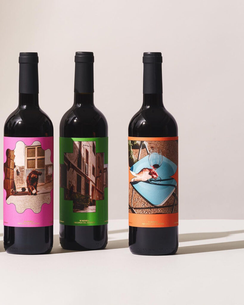
“We conceived the label to be a memento of Masroig, capturing its life on each label differently…” —Atipus, Design Studio
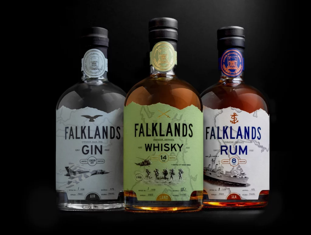
The combination of various military artifacts graphically displayed through the packaging labels makes the brand look premium and modern.
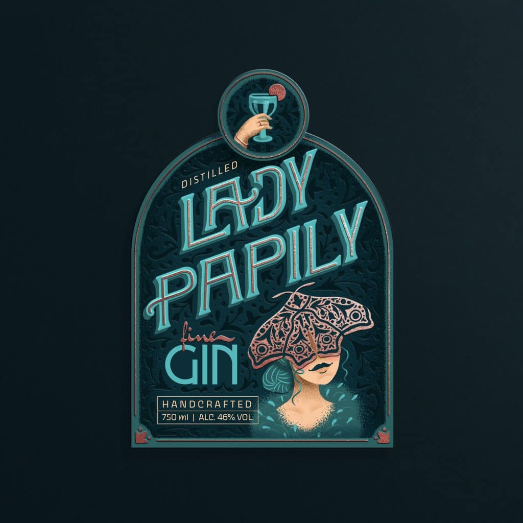
The primary focus behind the branding and packaging of Lady Papily is to visually communicate the mysterious and enigmatic personality of the brand.
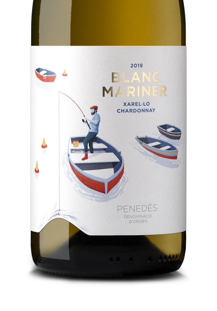
“...Our concept with Blanc Mariner was to take the eponymous sailor (mariner) and create an innovative, ingenious visual element in which the illustrated figure interacts with
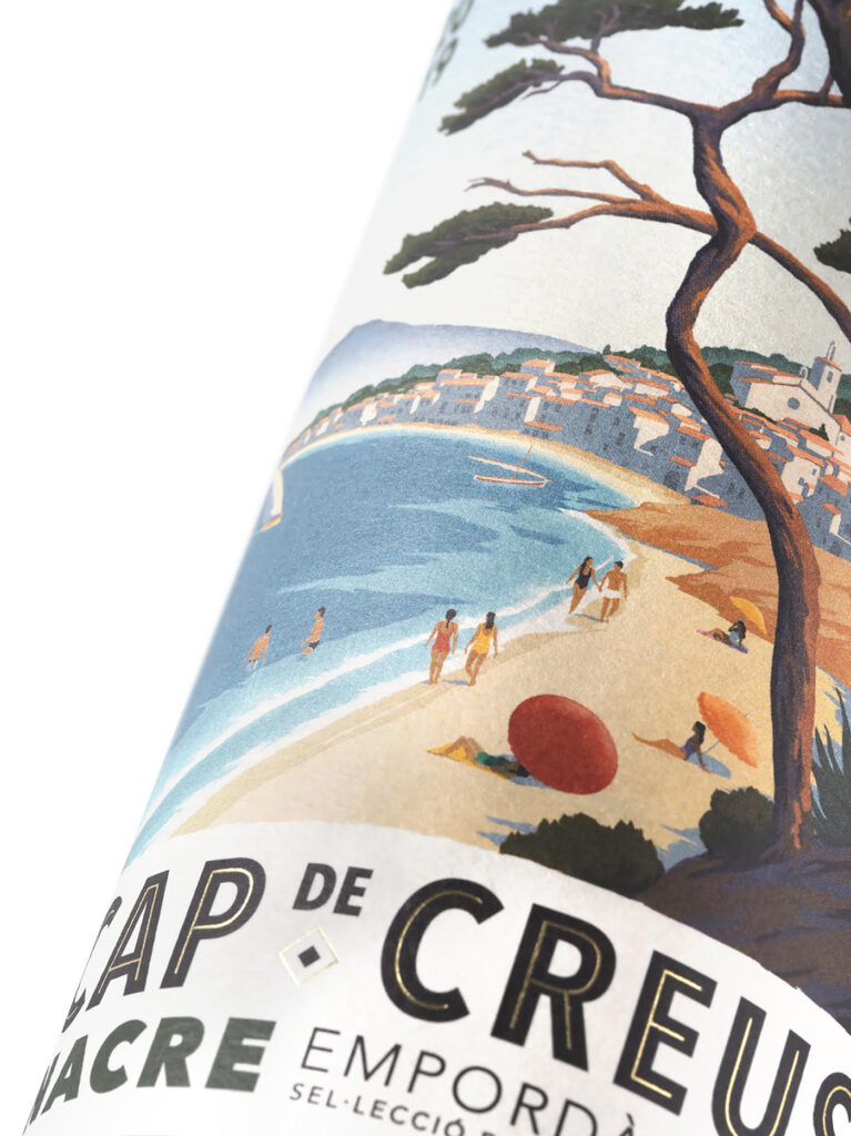
“To create a striking, evocative visual for these wines, we paid tribute to the region with labels inspired by vintage promotional posters...” —Dorian
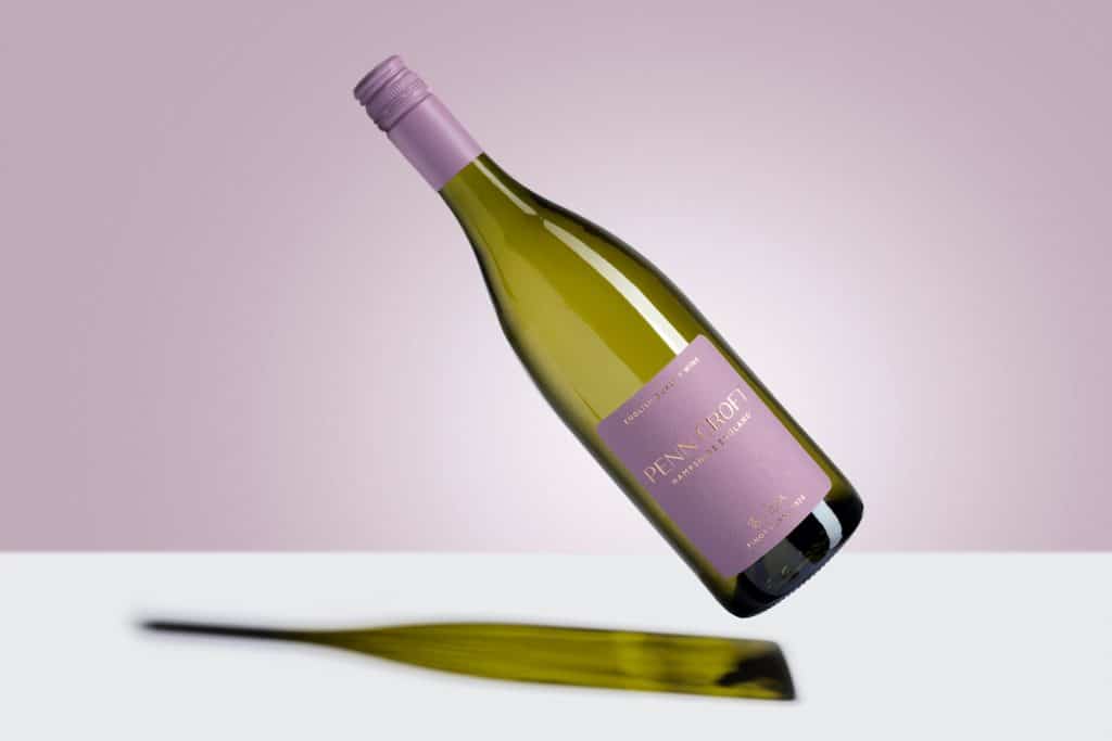
The branding and packaging highlights English winemaking. According to the design brief, the packaging had to be “premium and sustainable.”
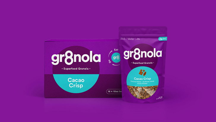
London-based branding and packaging design agency Deuce Studio has added fun illustrations along with creating a flavor naming system, which adds an extra level of personality
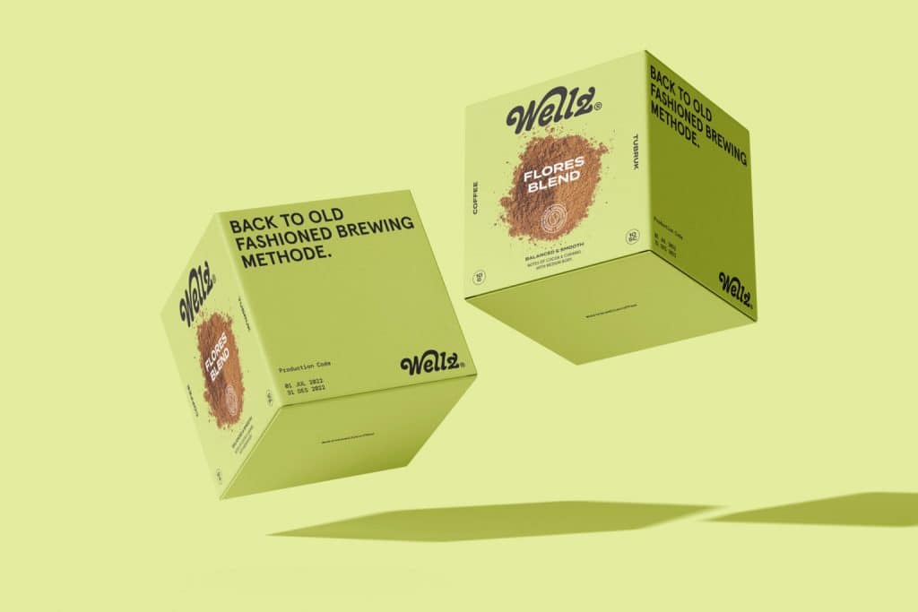
“By displaying the “Old Fashioned Brewing Method” product value, we want the packaging design to become a strong brand identity and have a competitive value in
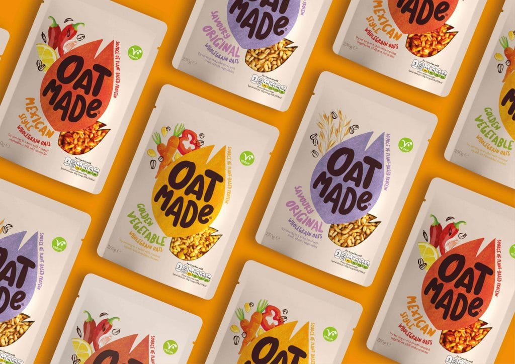
With OatMade, the centuries-old company, Morning Food, found a way to break away from the confines of the breakfast category to ‘anytime’ food.
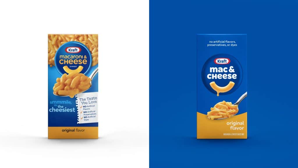
“There is a familiar, crave-able, positive comfort to Kraft Mac & Cheese that makes it so special and iconic to millions of people across the world,
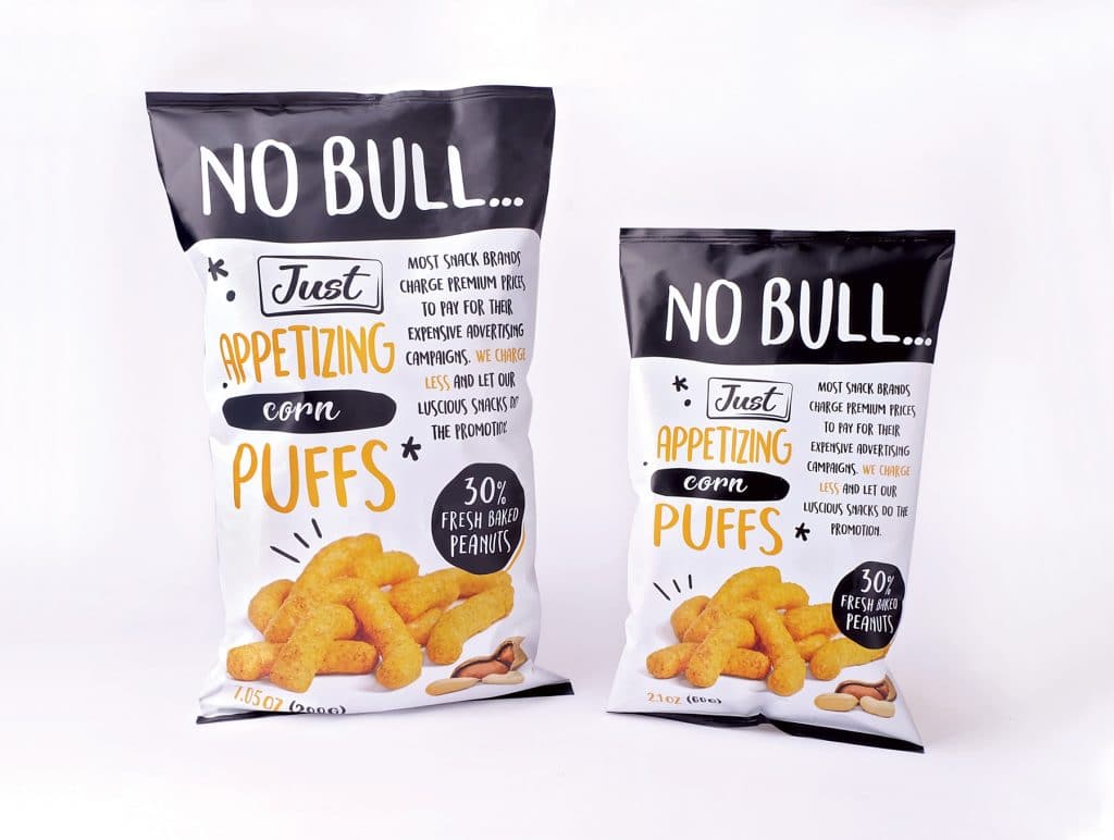
The idea behind the creation of the brand is to get the best value for money.
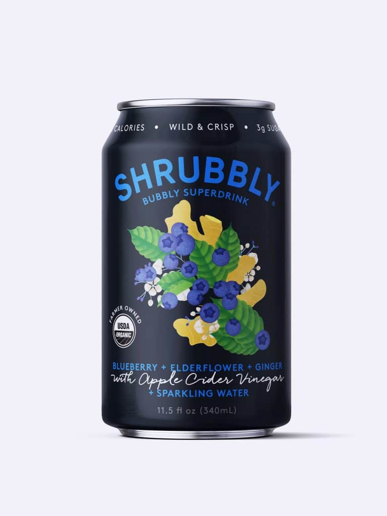
“…Buyers have expressed more confidence in their ability to sell the new cans. They expect customers to be very attracted to the new cans. Customers who
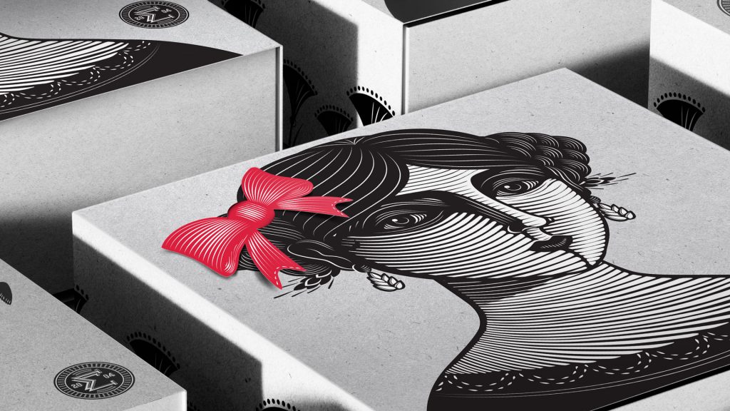
“…Instead of throwing away the leftover papers, we are reusing them as a final touch. The packaging only uses black ink and the bows red pantone
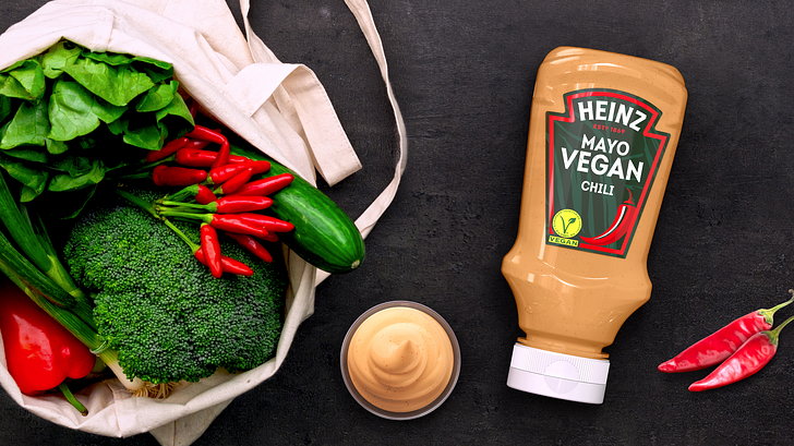
"Our aim was to elevate and reinvigorate the vegan experience and remove the perceived blandness from the category,” Lloyd Moffatt, Creative Director at PB Creative
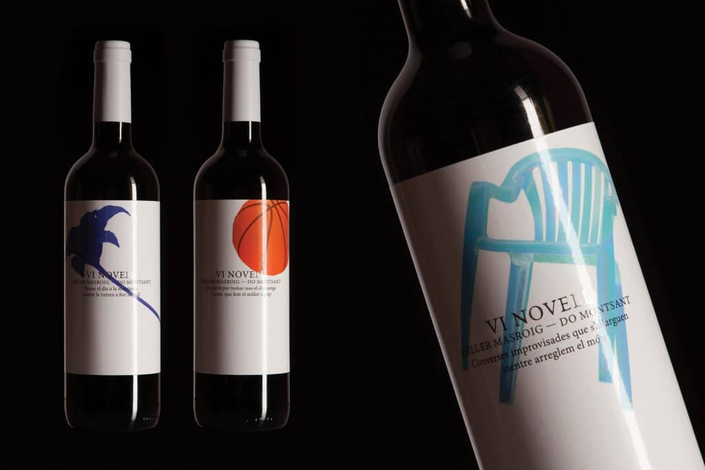
Not only does the new design describe the straightforward nature of the brand, but it also celebrates the beginning of the season.
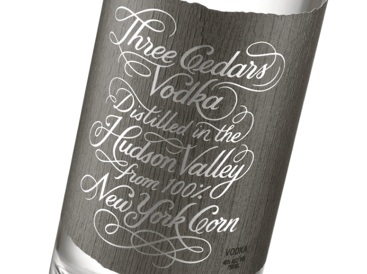
"...The lettering style is influenced by and pays homage to the Colonial history of the Hudson Valley, creating an uncomplicated and sleek look sure to attract
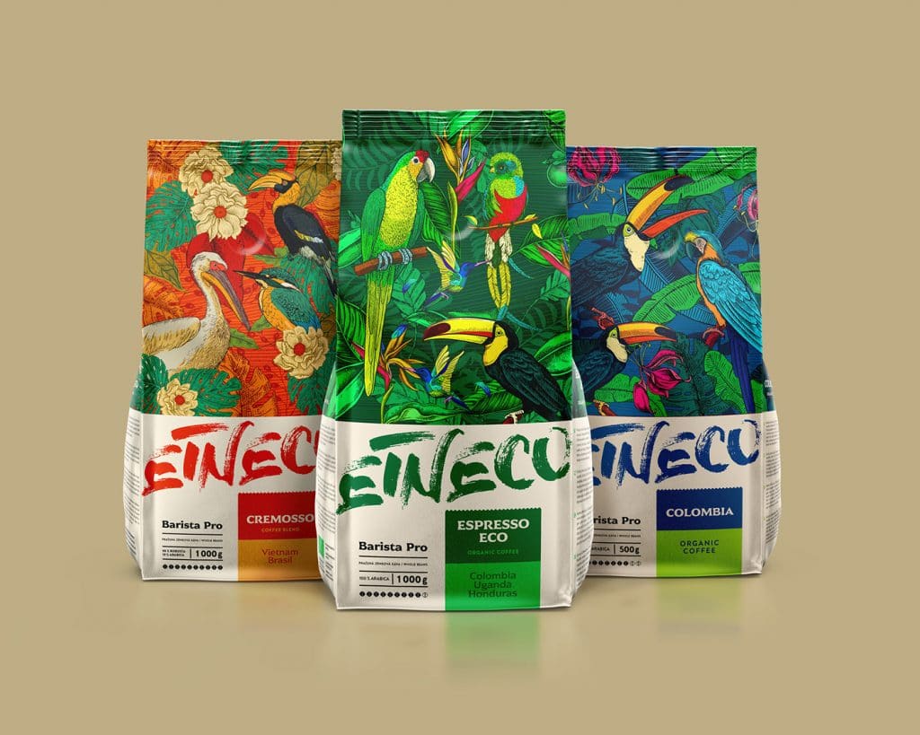
The idea behind the packaging was to evoke the feeling of freedom and happiness that birds flying in the wilderness experience.
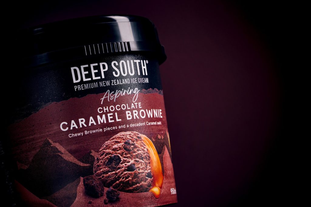
While the new packaging is attractive, it does not deviate from its root—South Island.


