Latest in package design
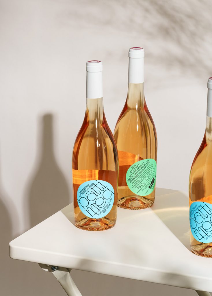
Atipus, a Barcelona-based design studio, created the packaging design with summertime in mind. The packaging conveys energy, warmth, positivity, and happiness.
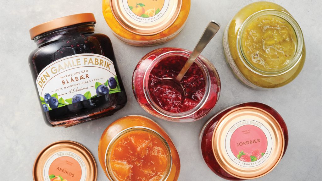
Everland created a new brand universe to make the customers fall in love with the old brand again. The rebranding highlights the rich craftsmanship and the
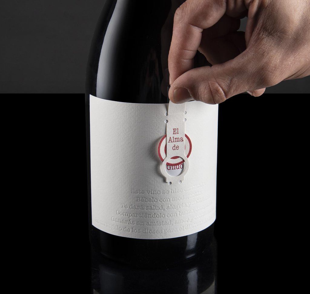
The idea for the packaging comes from the concept of the soul, which always remains hidden. Only the wisest can pierce through oneself to meet his
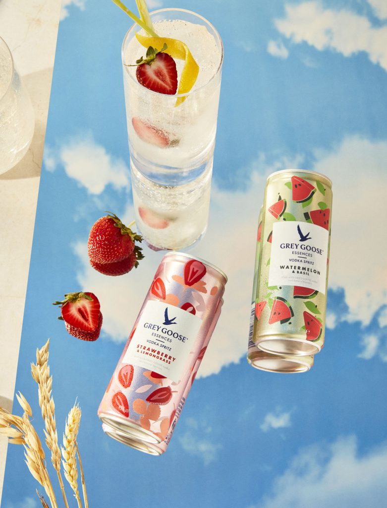
“…Whilst the design is very simple, a story is told about the ingredients and liquid quality and a consumption occasion is suggested. These visual plays on
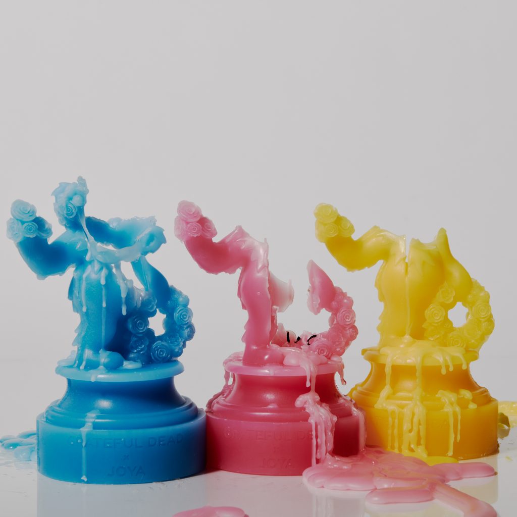
The manufacturers of fragrances and scented items celebrated the iconic band’s 50th anniversary of the music album ‘Europe 72’
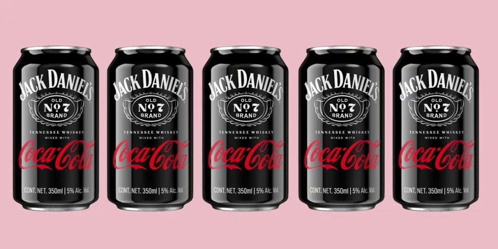
“This relationship brings together two classic American icons to deliver consumers a taste experience they love in a way that is consistent, convenient, and portable…” —
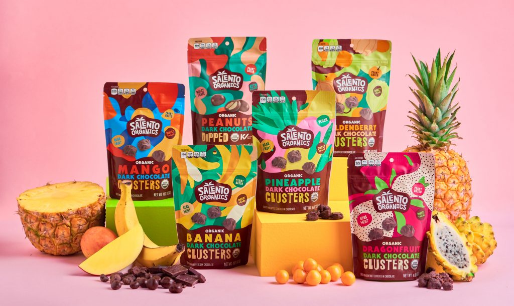
The packaging is focused on highlighting the unique flavors of the organic ingredients mixed in chocolate.
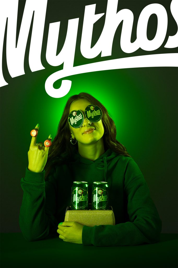
The centerpiece of the packaging design is the unicorn and the italic typography. The typography provides a sense of motion, letting the consumers know that a
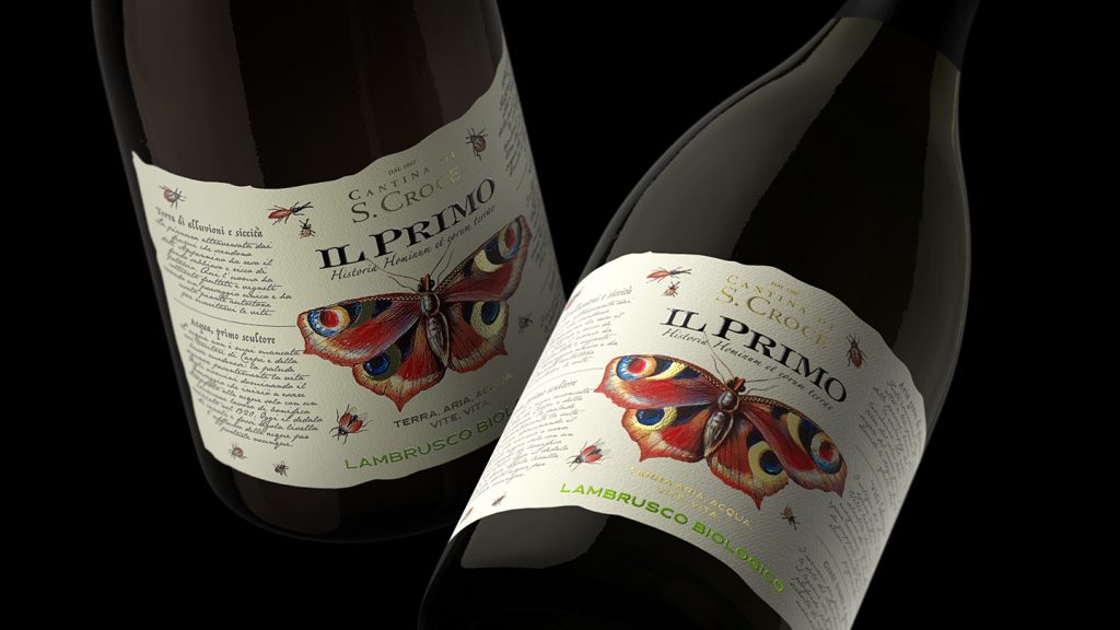
“The colors, the illustrations of butterflies and insects and the naturalistic layout are the key elements of this illustrated tale, in which nature and elegance are
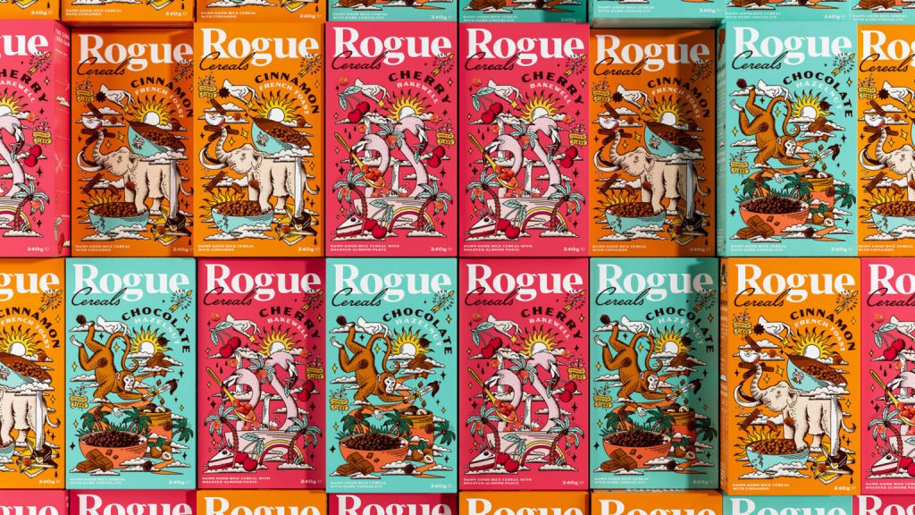
Rogue’s new breakfast cereal comes in three distinct flavors depicted by monkeys, elephants, and flamingos on the packaging. Boundless used the tattoo-based illustrations from Rogue’s jams
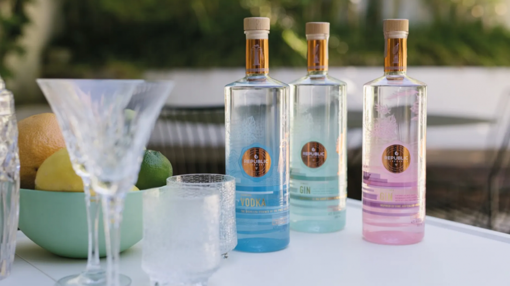
“…We wanted to develop something that celebrates our origin, unique distilling process and provenance at every pour, proudly standing out from other brands,” — John McVeigh,
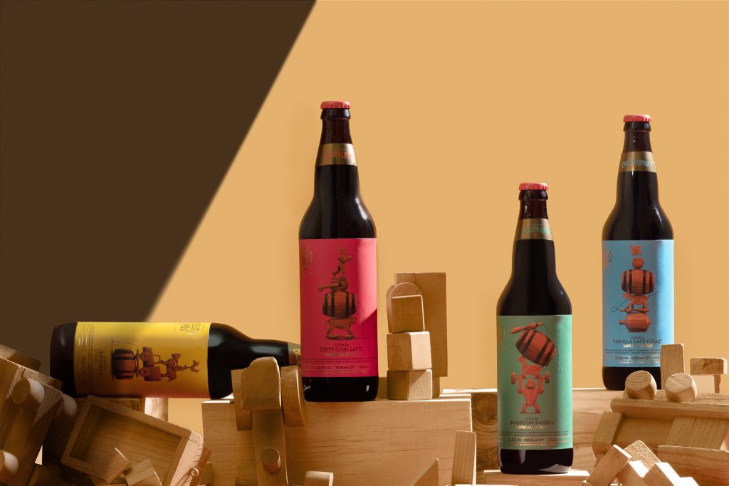
The combination of toys and barrels in the packaging takes the design to a whole new level. Not only are the designs attractive, but they connect
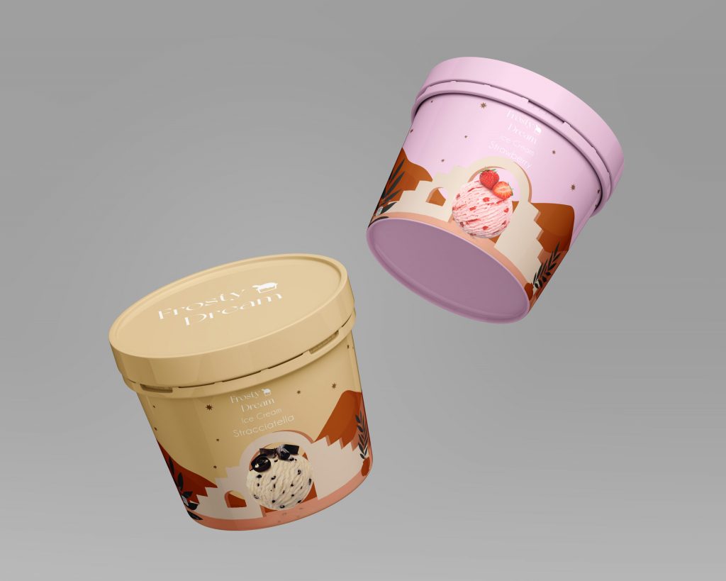
The Italian ice cream company focused on promoting itself as a loveable and memorable brand through its latest packaging redesigns.
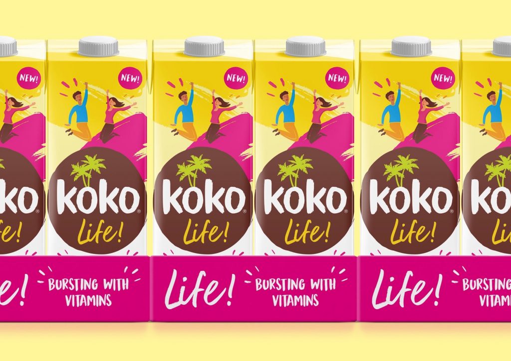
Koko Life is “a vitamin-enriched coconut milk which contains enhanced nutritional benefits for both physical and emotional well-being.”
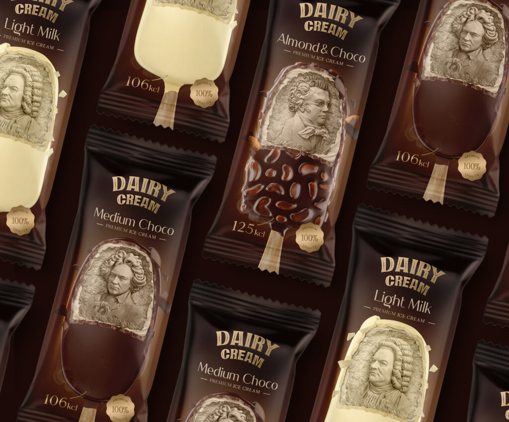
The centerpiece of the packaging design is the use of famous political personalities of the past.
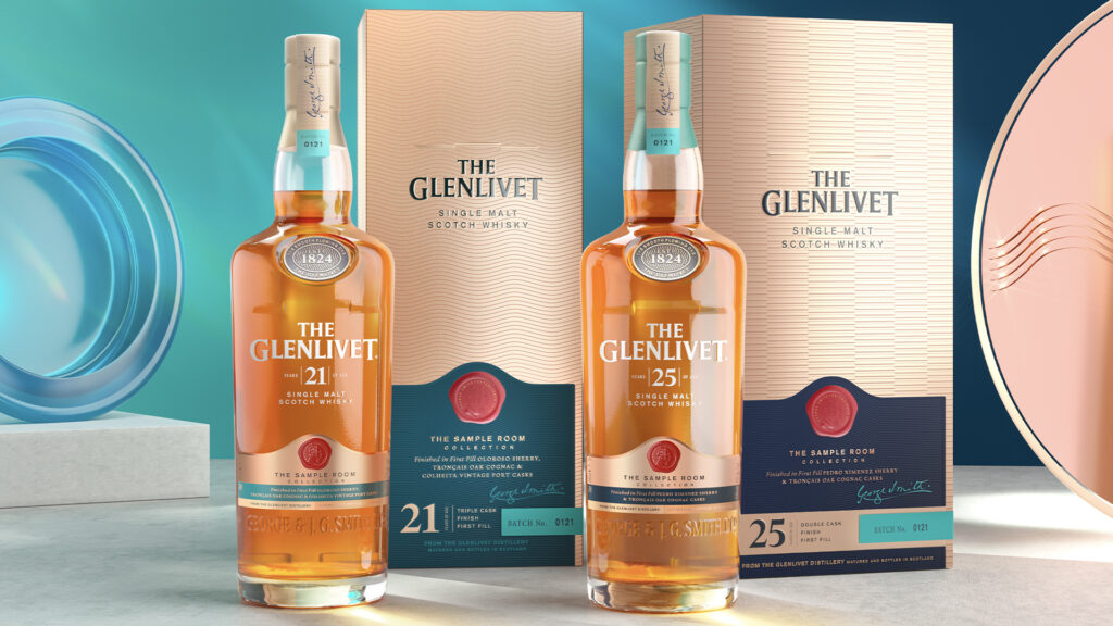
“As other whisky brands cling to tradition, The Glenlivet embraces creativity as a way to evolve with the discernible, yet curious tastes of the next generation
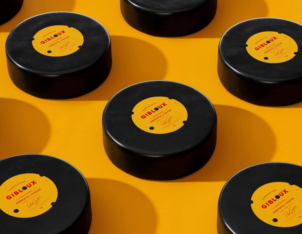
Gibloux is a district in the western region of Switzerland and is linked to the master cheese maker’s family
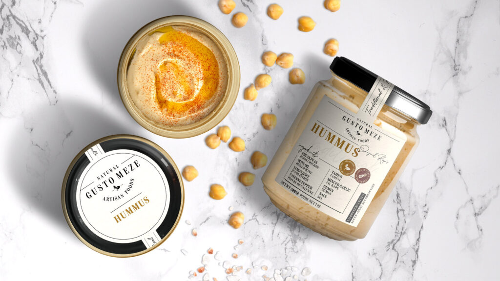
“We used a simple and understandable design language on textured paper, so you can feel the naturalness as soon as you touch them.”
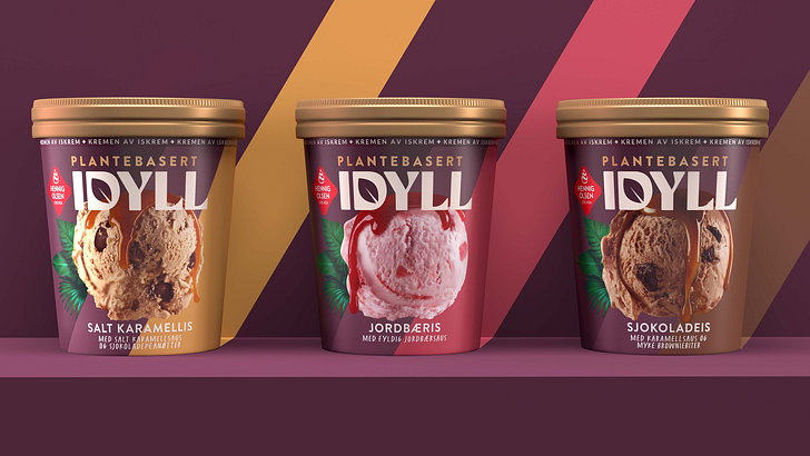
Among the noticeable features of the packaging design are the use of vibrant colors, quirky typeface and hidden leaves to symbolize its vegan proposition.
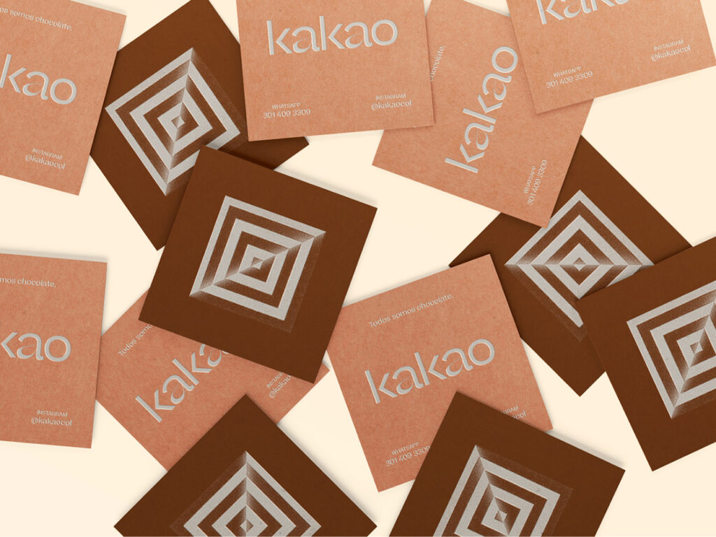
Kakao is a local venture that has set its eyes on taking advantage of the different varieties of cocoa readily available in Columbia.


